-
-
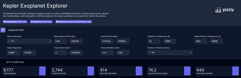
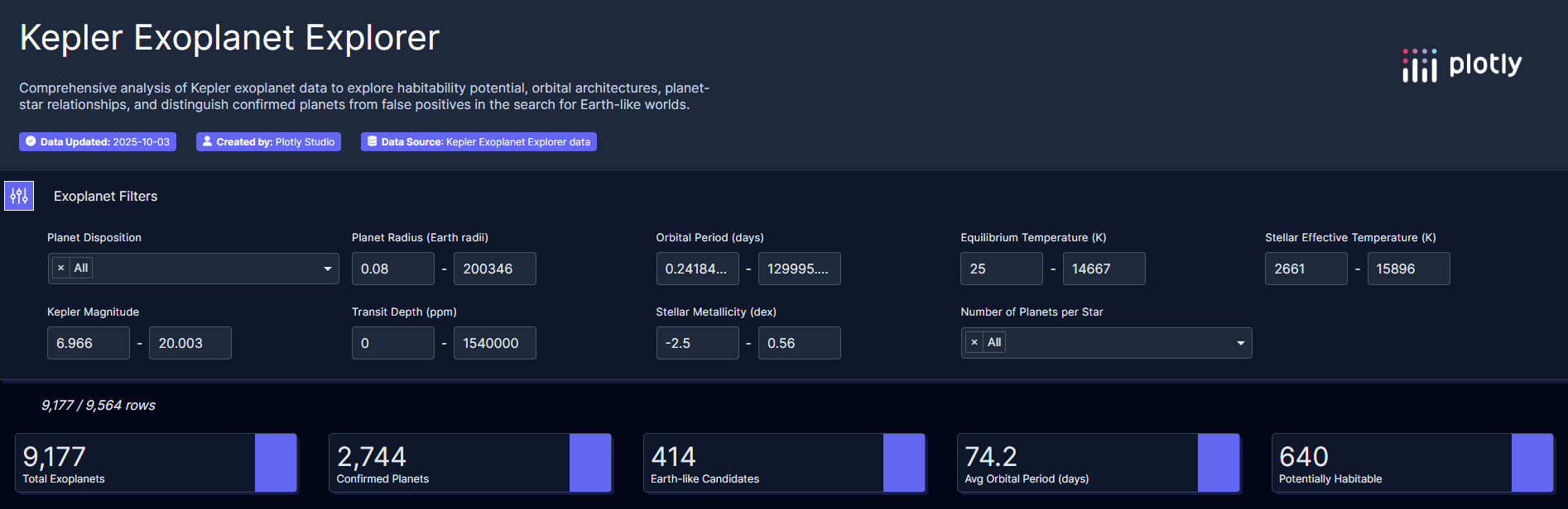
Filter features and clear high level overview!
-

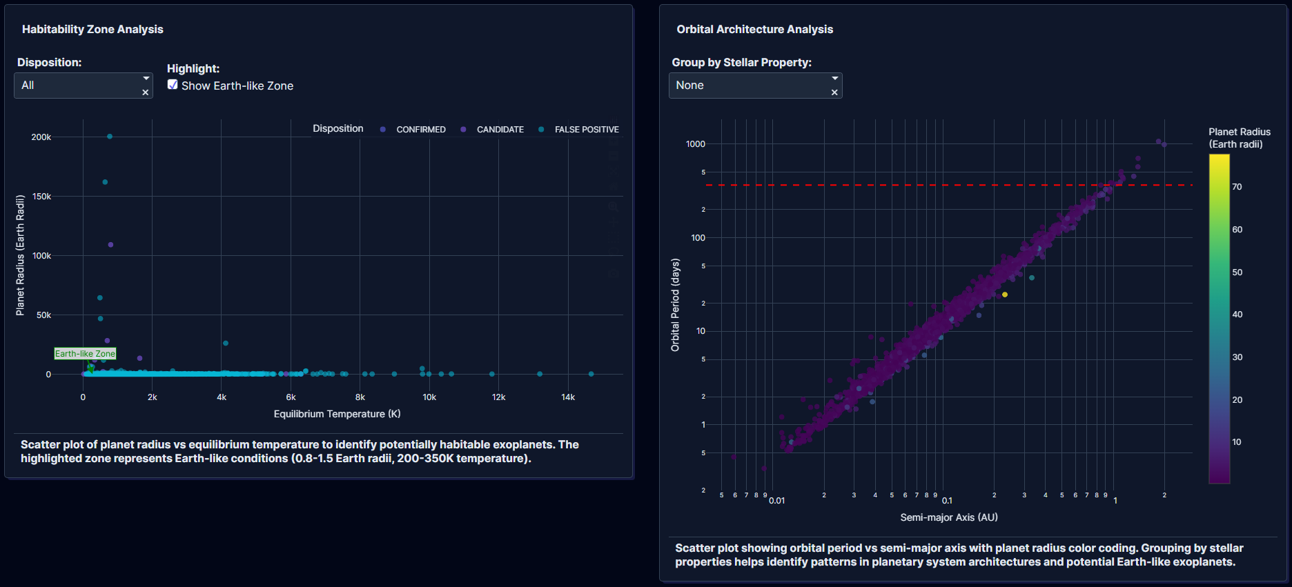
Habitability Zone & Orbital Architecture Analysis
-
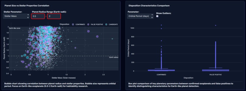
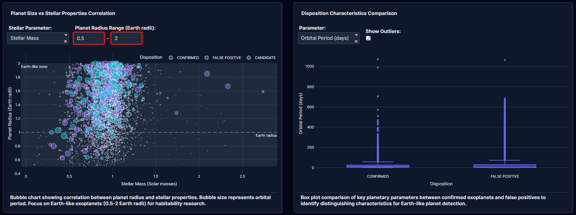
Planet Size vs Stellar Properties Correlation & Disposition Characteristics Comparison
-
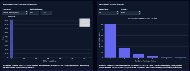
Extreme Exoplanet Parameter Distributions & Multi-Planet Systems Analysis
-
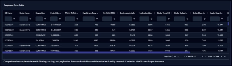
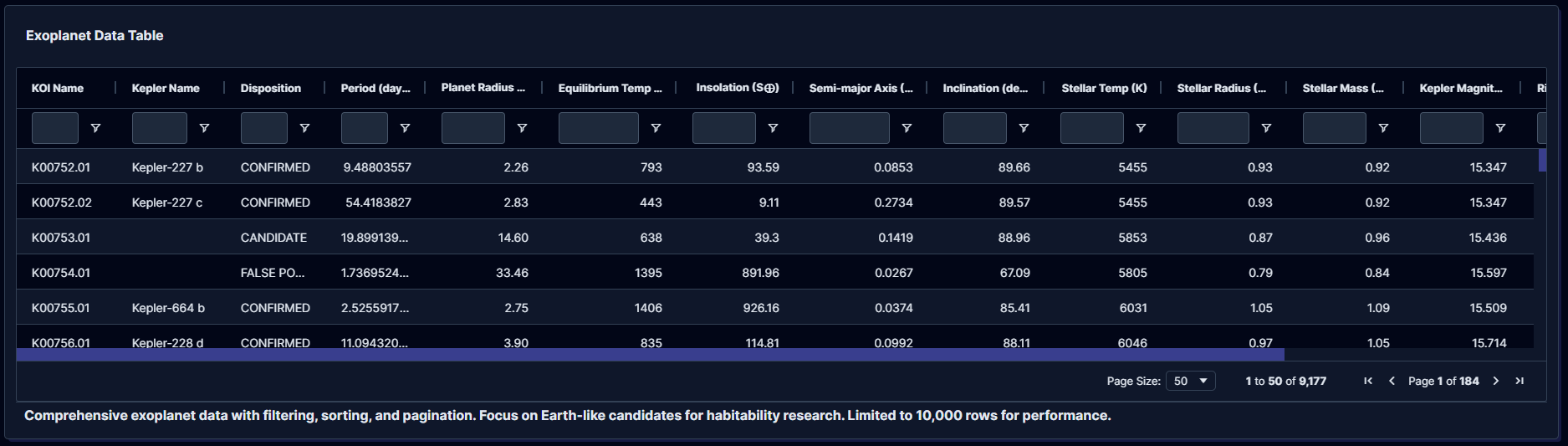
Original searchable data set on dashboard too!

Inspiration
Ever since NASA’s Kepler mission revealed thousands of distant worlds, one question has driven scientists and dreamers alike: Are we alone?
OrbitLens was inspired by this curiosity — to transform raw NASA exoplanet data into an interactive window on potential new planets. With so much information hidden in the Kepler dataset, I wanted to make exploration intuitive, visual, and open to anyone with an interest in space and data science.
I was also inspired by the challenge of turning massive astrophysical tables into elegant, AI-driven dashboards that reveal trends in planetary systems — from hot Jupiters to Earth-like candidates — in just a few clicks.
What it does
OrbitLens is an interactive Plotly Studio app that visualizes the NASA Kepler exoplanet dataset to explore patterns in:
- 🌍 Habitability potential — planets with radii between \( 0.8R_\oplus \) and \( 1.5R_\oplus \), and equilibrium temperatures between 200–350 K.
- 🪐 Orbital architectures — how orbital period (P) and semi-major axis (a) cluster by stellar type.
- ☀️ Planet–star relationships — correlations between stellar mass \(M_*\), metallicity \([Fe/H]\), and planetary radius \(R_p\).
- 🔍 False positive discrimination — visual comparisons of confirmed, candidate, and false-positive detections.
- 💫 Outlier discovery — automatic highlighting of extreme exoplanets (largest, hottest, or longest-period).
Through dynamic scatterplots, boxplots, heatmaps, and histograms, users can filter, zoom, and compare exoplanet populations — turning thousands of Kepler records into visual, explorable insights.
How it was built
Dataset: NASA’s Kepler Exoplanet Archive (2025 release, ~9,500 rows).
Platform: Built entirely with Plotly Studio, using AI-assisted app generation and iterative refinement to design multi-card dashboards.
Preprocessing: Cleaned and transformed columns such as koi_prad, koi_teq, koi_steff, and koi_disposition to define habitability zones and filtering logic.
Visual components:
- Scatter plots: \( R_p \) vs. \( T_{eq} \) and \( P \) vs. \( a \)
- Box plots: Disposition-based comparisons
- Histograms: Outlier distributions
- Bubble charts: Stellar–planet correlations
- Bar charts: Multi-planet system counts
AI-enhanced insights: Plotly Studio’s natural language interface helped generate and refine cards through conversational prompts — translating scientific intent into data visualization logic.
A key calculation behind habitability classification:
$$ \text{Habitable} = \begin{cases} 1, & 0.8R_\oplus \le R_p \le 1.5R_\oplus \ & \text{and } 200K \le T_{eq} \le 350K \ 0, & \text{otherwise} \end{cases} $$
Challenges I ran into
- Data dimensionality: The Kepler dataset has over 200 columns; identifying the most meaningful variables required domain insight.
- AI token efficiency: Plotly Studio’s AI generation budget required careful iteration — refining existing cards instead of regenerating.
- Balancing science and simplicity: I wanted to preserve physical meaning (e.g., semi-major axis from orbital period via Kepler’s third law \( a^3 = \frac{GM_*P^2}{4\pi^2} \) while keeping the visuals accessible.
- Performance: Some charts initially lagged due to large data loads — optimized by downsampling and aggregating key metrics.
Accomplishments that I'm proud of
- Built a fully interactive, multi-view dashboard that turns complex astrophysical data into an intuitive exploration tool.
- Revealed clusters of potentially habitable worlds — planets with Earth-like radii and moderate equilibrium temperatures.
- Developed an AI-augmented data exploration workflow combining astrophysics, data visualization, and machine intelligence.
- Made NASA’s exoplanet data approachable to scientists, students, and enthusiasts alike.
What I learned
- How to translate scientific questions into AI-driven visualization prompts.
- How stellar properties (mass, metallicity, temperature) shape planetary diversity.
- How small tweaks in visualization design (color scales, legends, tooltips) transform data comprehension.
- How to collaborate effectively with Plotly Studio’s AI to build polished dashboards rapidly.
I also deepened my understanding of planetary system formation — seeing, in data, the traces of cosmic processes billions of years old.
What's next for OrbitLens — Track, visualize, and explore beyond our world
- 🚀 Integrate TESS and JWST datasets for multi-mission comparisons.
- 🤖 Add machine learning modules to predict habitability probabilities or classify unknown signals.
- 🛰️ Incorporate real-time NASA API updates for dynamic planet discovery feeds.
- 🌌 Expand into 3D orbital visualization and stellar neighborhood mapping.
Built With
- ploty
- studio

Log in or sign up for Devpost to join the conversation.