Inspiration
We were inspired by the huge amounts of data on many opioids being prescribed, we wanted to find out what was the cause of such a huge consumption and try to find solutions
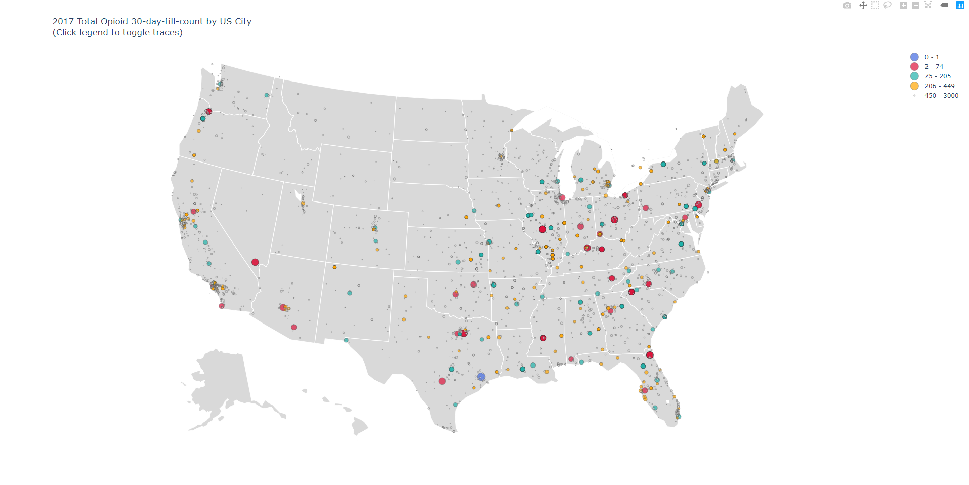
What it does
Provides a map of the total amount of 30-day prescription fills that were with any opioid
How we built it
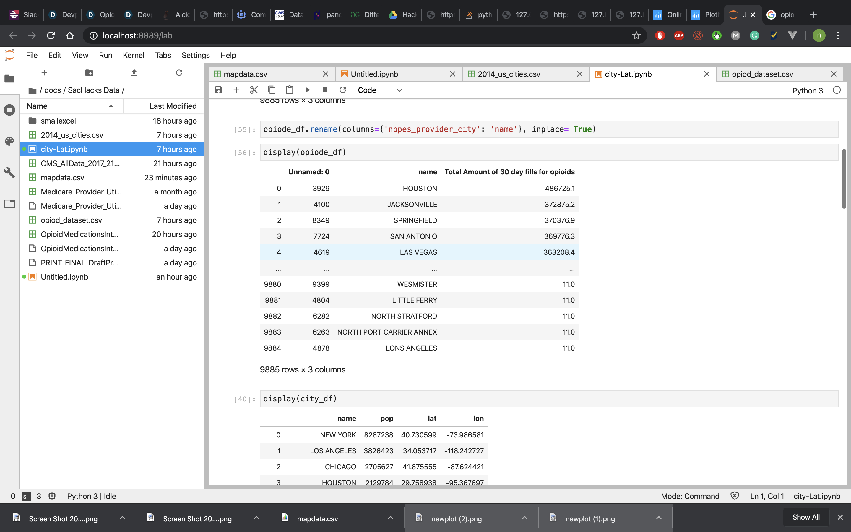
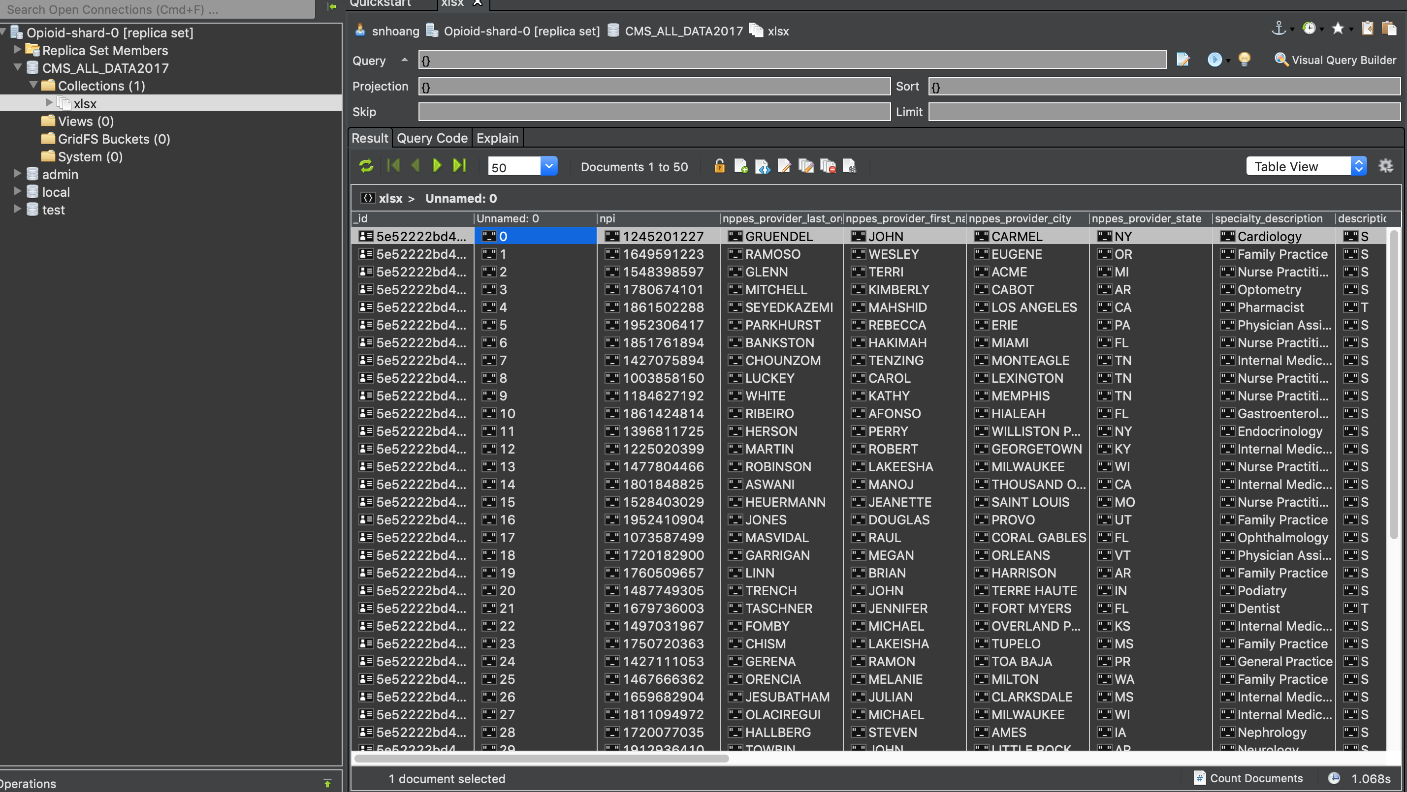
we used pandas on google cloud as well as plotly, website was made in html and css as well as hosted on domain.com
Challenges we ran into
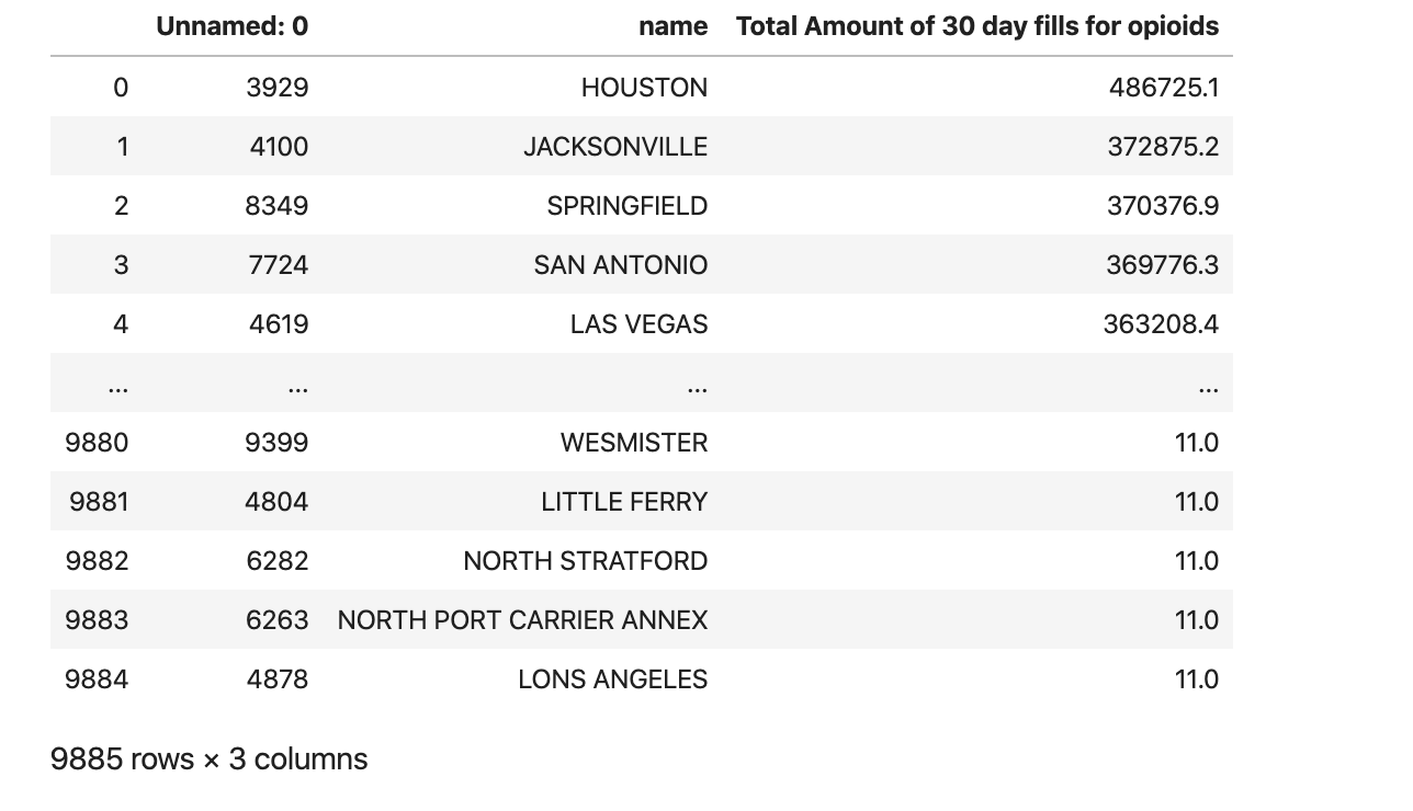
cleaning the data was a huge problem as well as processing the dataset.
Accomplishments that we're proud of
making the website as well as the bubble map
What we learned
how to process large amounts of data as well as present it in a conceivable way
What's next for OpioidRadar
making more bubble maps on different social-economical factors as well as crime rate around the area


Log in or sign up for Devpost to join the conversation.