-

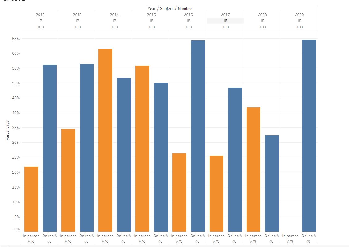
IB 100 A rate in online and in person session
Inspiration
Our hypothesis is that online courses tend to have a higher overall grade than in-person courses do. The factors we are considering are year (Term), subject (department), and the level of the courses (1xx vs. 3xx). The assumptions on these factors are that 1. there is university-wide inflation on GPA by years, we want to make sure whether the inflation on the grade of online courses is higher than that of in-person courses. 2. we think some departments might give a strict gpa cutoff guideline, so the GPA in the course might be lower for these departments compared to other departments with a flexible gpa curve. 3. For upper-level courses, student's gpa performance tend to be even for both online and in-person courses
What it does
Using tableau to compare student performence by checking percentage of students gets A. You can change the course and sections that a course has to view the online and in person course A rate comparison. Note that a course must have both an online and in person session.
How I built it
First, we used the gpa dataset as starting point, then we modified it by adding new column to identify whether a course is a online course or a in person course. Then, we pick those ones with both online and in person sessions. By stacking different sections of one course together, we visualized the data using tableau.
Challenges I ran into
Accomplishments that I'm proud of
What I learned
What's next for Online and inperson course student performance comparsion
We would like to also compare with the general gpa inflation trend across the department
Built With
- javascript
- jupyter
- python
- tableau


Log in or sign up for Devpost to join the conversation.