Inspiration
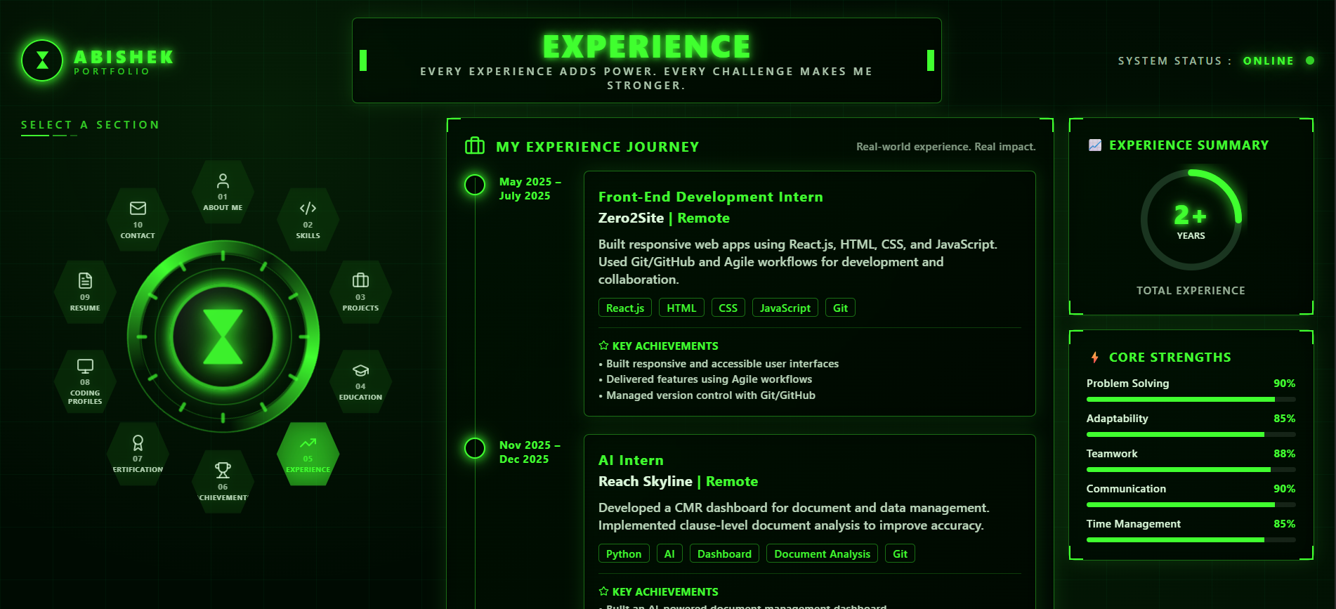
Most developer portfolios look the same: a plain page with a list of skills. I wanted mine to feel like an experience. I grew up watching Ben 10, and the Omnitrix is a perfect idea for navigation: you turn a dial, pick a form, and transform.
I also noticed a real problem. Recruiters and judges spend only a short time on each portfolio, so a creative design must never slow them down. My goal was a portfolio that is memorable but still fast to use, where visitors reach my projects, skills, resume and contact in a few clicks.
What it does
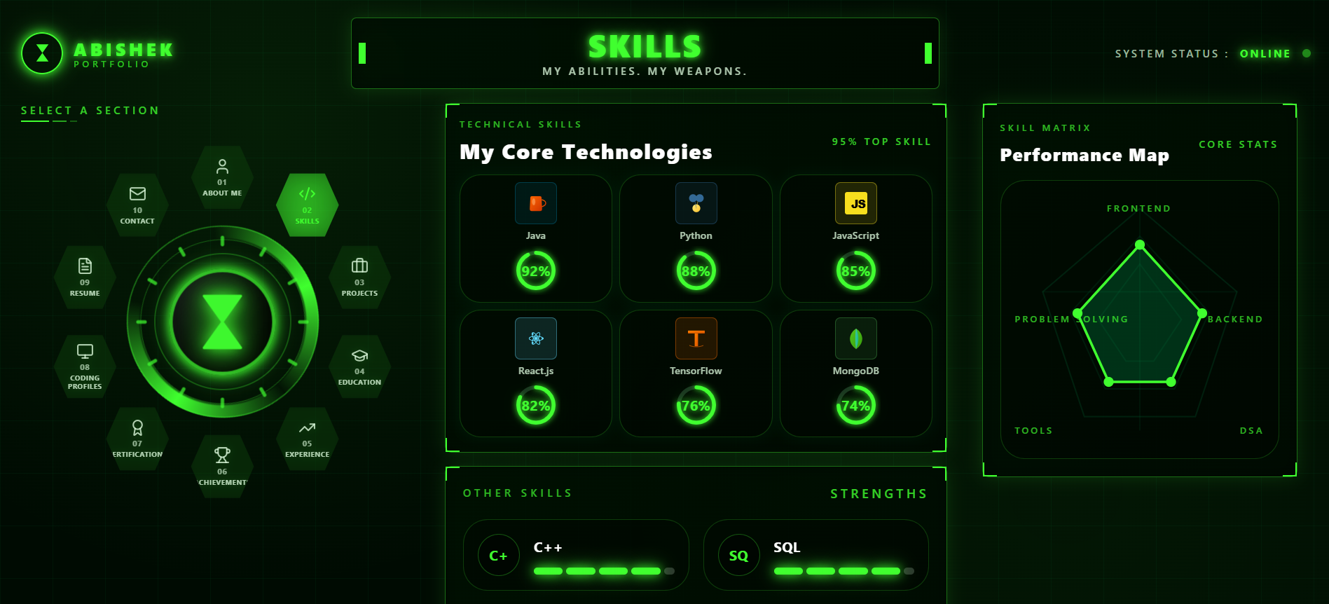
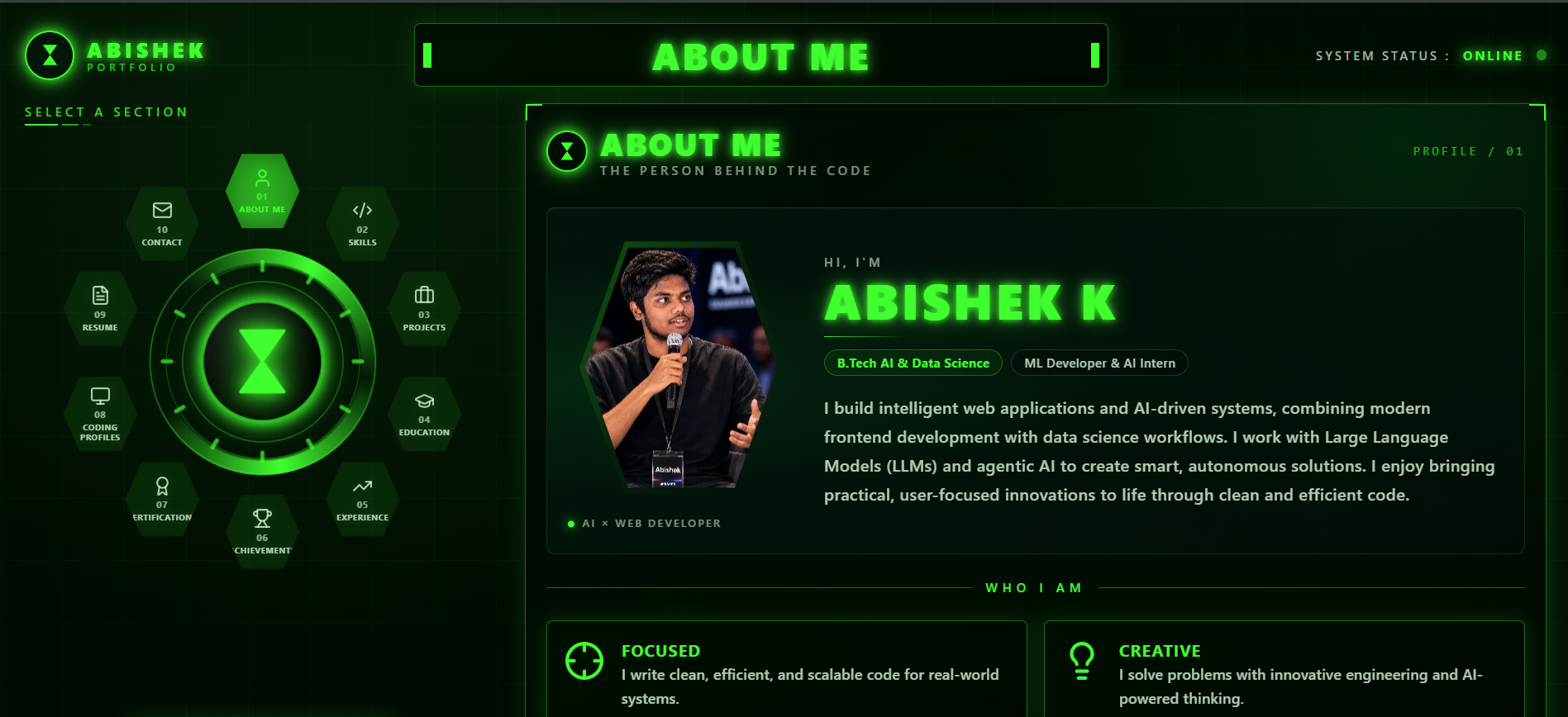
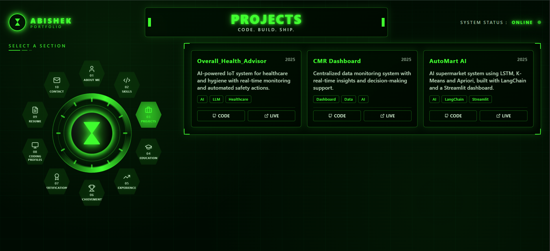
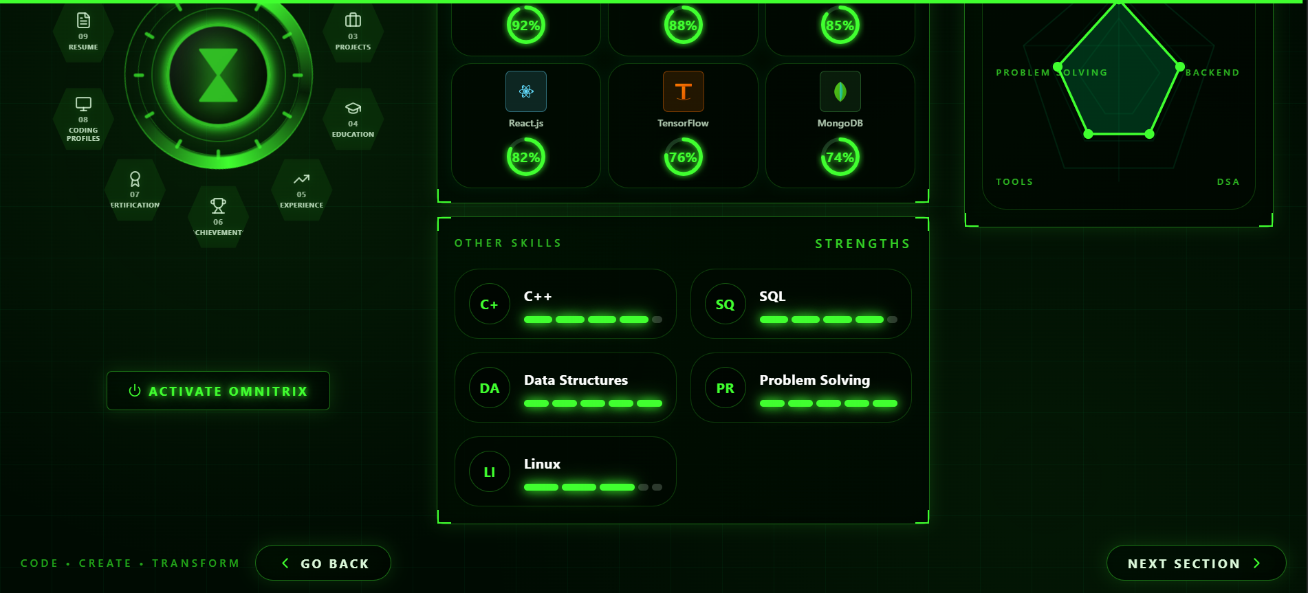
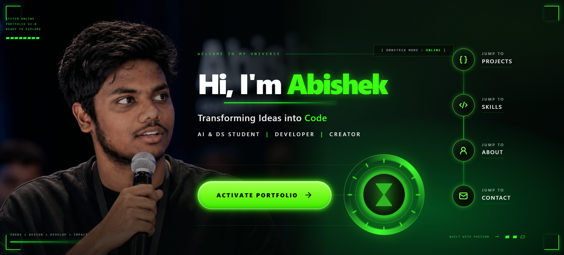
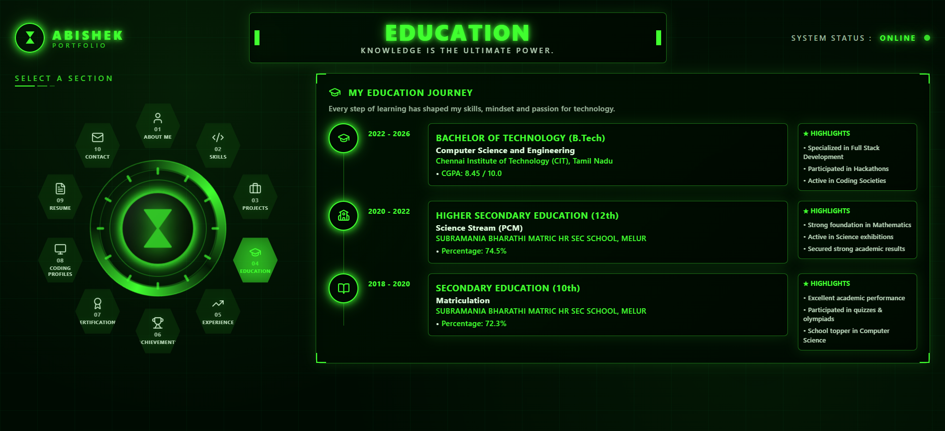
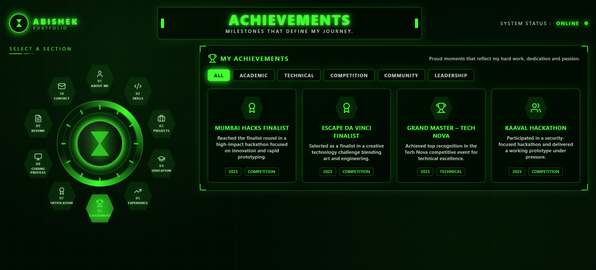
Omnitrix Portfolio is an interactive developer portfolio with a sci-fi HUD look.
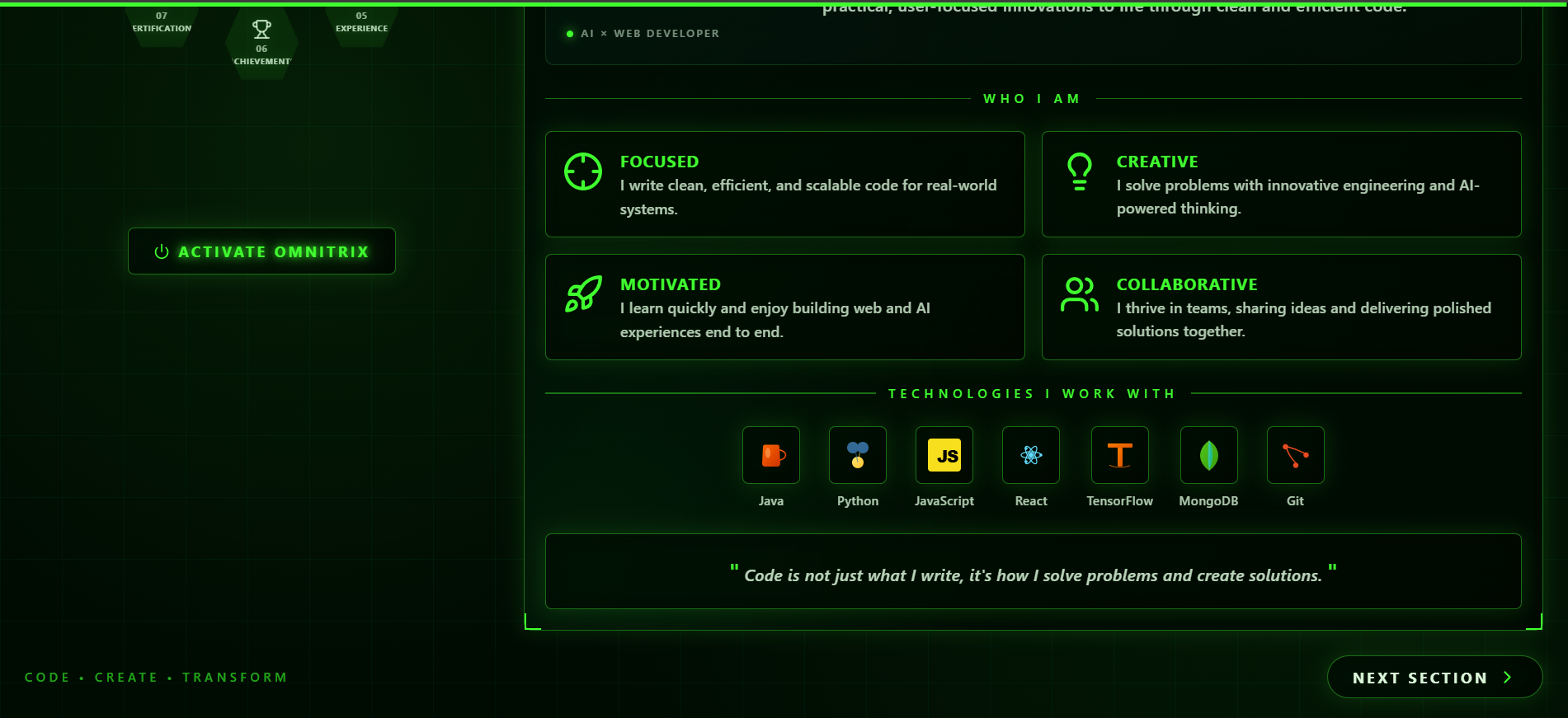
- A cinematic opening page with a button to Activate Omnitrix
- A rotating dial menu that jumps to About, Skills, Projects, Resume and Contact
- Smooth page transitions, scroll progress and staggered animations
- One-click resume download and links to GitHub, LinkedIn, LeetCode and Codeforces
How I built it
- Framework: TanStack Start, React 19 and TypeScript
- Styling: Tailwind CSS v4 and shadcn/ui with a custom neon-on-black design system
- Animation: Framer Motion for load-in sequences, scroll reveals, hover effects and the dial rotation
- Performance: compressed WebP hero image, route preloading on hover, font preloading
- Deployment: [Deployxa / Cloudflare]
- Design process: [Figma or sketches, if any]. I started from my earlier Omnitrix portfolio and refined it: softer glow, better contrast, a top menu, and smoother motion.
Challenges I ran into
- Too much glow. Neon effects looked cool but made text harder to read. I reduced the glow and kept green as an accent only.
- Slow first load. The hero image was a 2.3 MB PNG. Converting it to WebP and preloading it fixed the delay.
- Animation overload. Many animations at once felt heavy. I switched to short, staggered motion and added support for reduced-motion settings.
- Theme versus usability. A themed menu can confuse visitors, so I added clear labels and a standard top bar beside the dial.
What I learned
- Good design starts with the visitor's goal, not with effects.
- Contrast, spacing and restraint matter more than glow and decoration.
- Smooth animation needs planning: timing, easing and stagger.
- Performance and accessibility are part of design, not extras added at the end.
Accomplishments I'm proud of
- A signature interaction (the Omnitrix dial and activation effect) that visitors remember
- A consistent visual identity across every section
- [Add a real number if you have one, like a Lighthouse score]
What's next
- A fully responsive mobile experience
- An accessibility panel with reduced motion, high contrast and text size options
- A short design case study explaining my decisions
- More projects with live demos and screenshots
Built With
- cloudflare
- framer-motion
- lucide-react
- radix-ui
- react
- react-hook-form
- shadcn-ui
- tailwindcss
- tanstack-router
- tanstack-start
- typescript
- vite
- zod

Log in or sign up for Devpost to join the conversation.