-
-
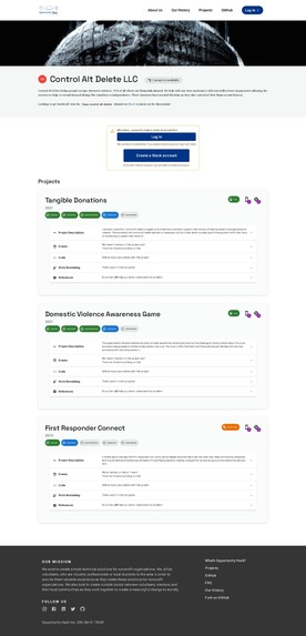
Individual Project Page
-
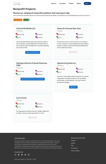
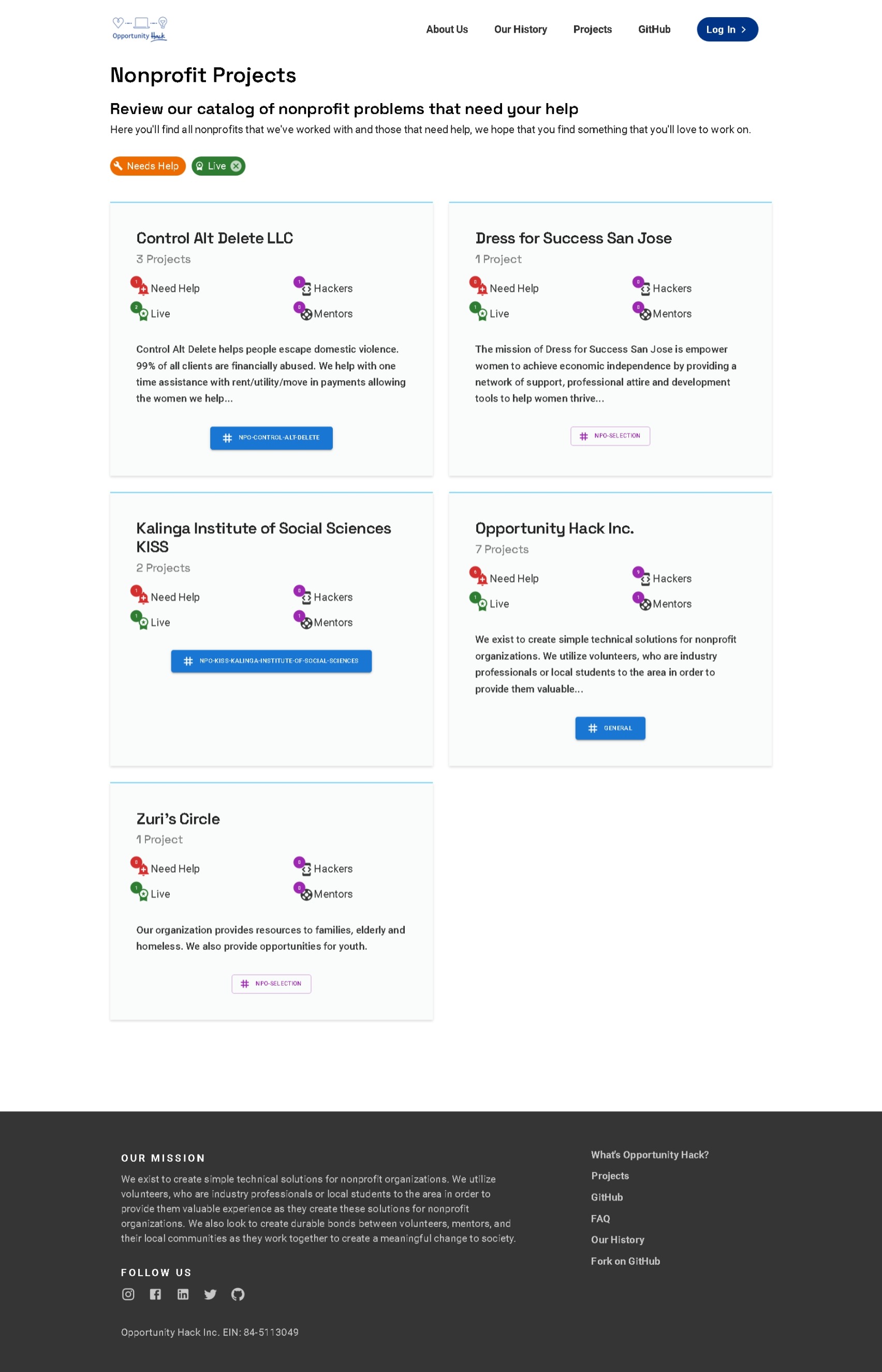
Project Page
-
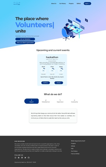
Landing Page


Project Details
We chose to tackle Issue #13: Update our UX. Exploring the website, we identified a few issues:
- Inconsistent theme, colors, font and sizes
- Difficult navigation, keeping important links in the footer with unnecessary links
- Poor affordance misleading the user on the interaction with components
- Cognitive overload by providing a lot of information to the user at a single time (project cards)
- Pages which are not viewable on other devices (responsiveness)
- Generally not very visually appealing or attractive, with minimal interactivity
With this, we redesigned the website to tackle these issues by:
- Choosing a more visually pleasing theme color, with consistent fonts and colours throughout the redesigned pages
- Redesigned to include important links in the header, removing unnecessary links
- Use of affordance to help guide the user on components which are interactable
- Limit the projects to a single card per row reduced clutter in each card to reduce the amount of information present on the screen at any given time
- Ensured that the redesigned pages are viewable on various screen sizes
- Added animations and interactions to modernize the website's look and feel
How we built it
We extended the current design to reuse the current React with MUI framework as much as possible. We tried to embrace good MUI practices to the best of our knowledge to ease further extensions in the future (we did not have much previous experience with it, sadly).
Built with love and care by ReactLovers.
Built With
- css
- html
- mui
- nextjs
- react
- visual-studio


Log in or sign up for Devpost to join the conversation.