-
-

Landing Page
-

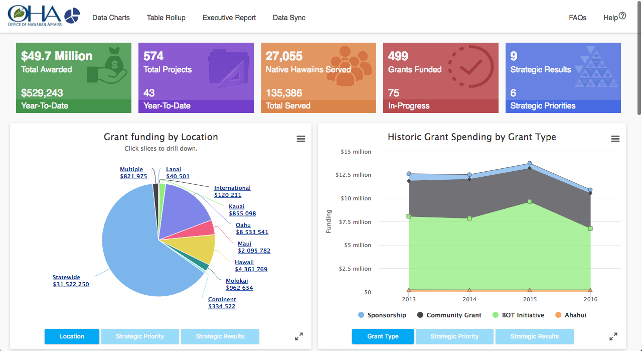
Drill Down Chart
-

Export Data
-

Filterable Data Table
-

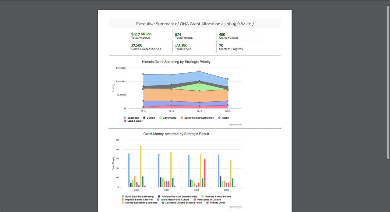
Executive PDF Report
-

FAQs
-

Help Example


We are Team Progress Bars!
- Anees Merzi (@yaboyanees)
- Noah Higa
- Sid Savara (@sidsavara)
- Nicole Hanabusa (@nhICS314)
We are that shining beacon of hope reminding you that you are one step closer to reaching the finish line!
TLDR
Our project gets after #7 on the HACC 2017 Department Challenge: OHA Grants
- See Our Live App
- Final Mockup v3. Earlier versions we built on: Mockup v1, Mockup v2
- Github Repo
Why Liberate and Visualize OHA Grant Data?
Right now, data is publicly provided by OHA on how grant money is being allocated by OHA to support Native Hawaiians.
The challenge though is with nearly 6,000 data points in spreadsheet form, there is no easy, intuitive way for the public to understand the data.
How can you slice and dice, and visualize data...when you don't even know what the data contains?
Fortunately, now there is a solution to that:
Solution: OHA Grants Dashboard
Team Progress Bars built a dashboard for prospective grant requestors, curious citizens and anyone else interested in how the OHA grants have been allocated over the past years.
Through this refined, single-page app accessible on desktop, mobile and tablets, visitors are provided a simple interface to understand where the nearly $50 million dollars in grants is allocated.
Benefit for Users
+Users can view card rollups across the top to get a quick birds eye view of the data. +Through the graphs users can slice/dice and drill down to the data in various ways +The data table at the bottom allows detailed drill downs on a project-by-project basis. +The executive report can be exported to provide point in time statistics in a printable PDF.
Throughout the application there are image and data export options, allowing users to take their hard work with them for use in other documents.
OHA Grants Visualization Design: Deliberate, Modern and User Centric
Rather than simply diving in and beginning coding, we first developed a paper prototype that we discussed within our team. Immediately we saw some shortcoming of our first design, and after scribbling back and forth and passing the page around - we came up with our first "Alpha" version to show.
Phase 1: We mocked it up: Mockup v1, and showed it to Joe Pong from OHA. Result: DISASTER. We faithfully followed the requirements, and it was NOT what the user wanted. We had taken it literally, and not approached it with any creativity.
Phase 2: Enter...Mockup v2. A total rewrite. From 4 pages, we refined it down to one, following the modern design principle of a SPA - single-page-app. No navigation, but still fully featured. This time we were closer to the mark. We got feedback from project sponsor Tiger Li, and he had some additional ideas.
Phase 3: This led to our Final Mockup v3. We knew we had hit the mark after showing it to Tiger and his assistant. We took this final mockup. and turned it into our app-
Phase 4: Live app available at https://hacc2017-progress-bars.herokuapp.com - Major additions from the last mockup is we incorporated last minute requests for an executive summary PDF as well as a spotlight, in-context tutorial walkthrough
Over the course of the entire design process, we considered modern design elements such as responsive design and Material Design.
App's Ease of Use
One of the biggest pieces of feedback we learned was the expected users are not teach savvy. Even though the original requirements called for broadly allowing slicing and dicing the data, too many options would overwhelm users.
Instead, we designed the dashboard with card roll ups across the top that would answer the most common questions - without needing to dig into the data at all.
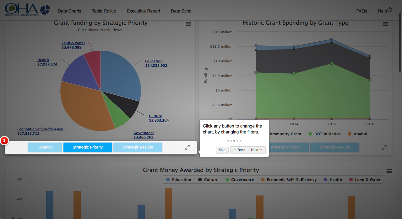
Second on the page then was the meat of the data dashboard - graphs that allowed drilling down, filtering, showing only certain values and switching between views.
The last way the data is visible on the page is in a table that can be easily filtered and expanded. It can even be exported raw right below the table
At the very bottom of the page is a FAQ with various terms and conditions
In order to reach the maximum number of users, a tooltip tutorial walkthrough was implemented as well. Clicking help activiates this in-context walkthrough which darkens the whole screens, highlights parts of the screen and explains to users how to user the website.
Creativity and Innovation
The biggest deviation we did to traditional hackathons is we spent 75% of the time creating mockups, even as we continued to work on the prototype in parallel.
This allowed us to test many different design paradigms at once and get feedback on them, while the main development team worked on the infrastructure of the database, the organizing of the data and getting the overall app wired up.
While the user interface in the browser is what people interact with, the "front end" of the website can look dramatically different with relativey small amounts of change in code. A few lines of code can be the difference between a design that confuses & frustrates, and a design that flows effortlessly.
The difficulty is not in the volume of code to write for the interface: it is in understanding the users and use cases so that the interface is intuitive and serves the purpose.
This is where we placed our emphasis, to design an application that is immediately usable and relatable.
Scaling/Standards
The app is built on Ruby on Rails following the Model-View-Controller architecture. Scaling is handled through use of Heroku which can scale the app up or down as desired.
Overall Quality
The app was built to be an "application" and not "just a hack" from the beginning. For example, our development team followed best practices in Ruby on Rails vs "just hacking something together."
We used HighCharts, Heroku and other "best of breed" technologies, even though they were more complex to set up initially. And yes...the code is documented as well with comments.
The only "hacked" part of this app is how quickly it was put together.


Log in or sign up for Devpost to join the conversation.