-
Wellbeing Explorer
Driven by the belief that data can illuminate hidden stories and inspire impactful change, I set out to build the OECD Wellbeing Inequality Explorer with Plotly Studio. My main inspiration came from observing global discussions around quality of life, where averages are often highlighted while critical disparities go unnoticed. I wanted to move beyond surface-level metrics and create a tool that not only visualizes wellbeing across countries and regions, but actively exposes inequalities and enables users to discover actionable insights.
Starting with the OECD Wellbeing dataset, I began my journey exploring variables connected to life satisfaction: income, health, education, environment, and more. Plotly Studio’s natural language and AI-driven features made the process of generating visually compelling, interactive charts accessible. Early on, I established clear project goals: help users identify where wellbeing gaps are largest, understand what drives these differences, and simulate how policy changes or targeted interventions might improve outcomes for the most vulnerable groups.
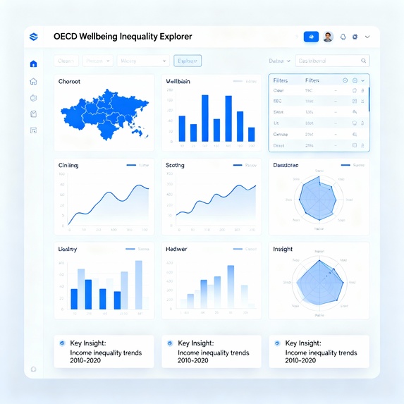
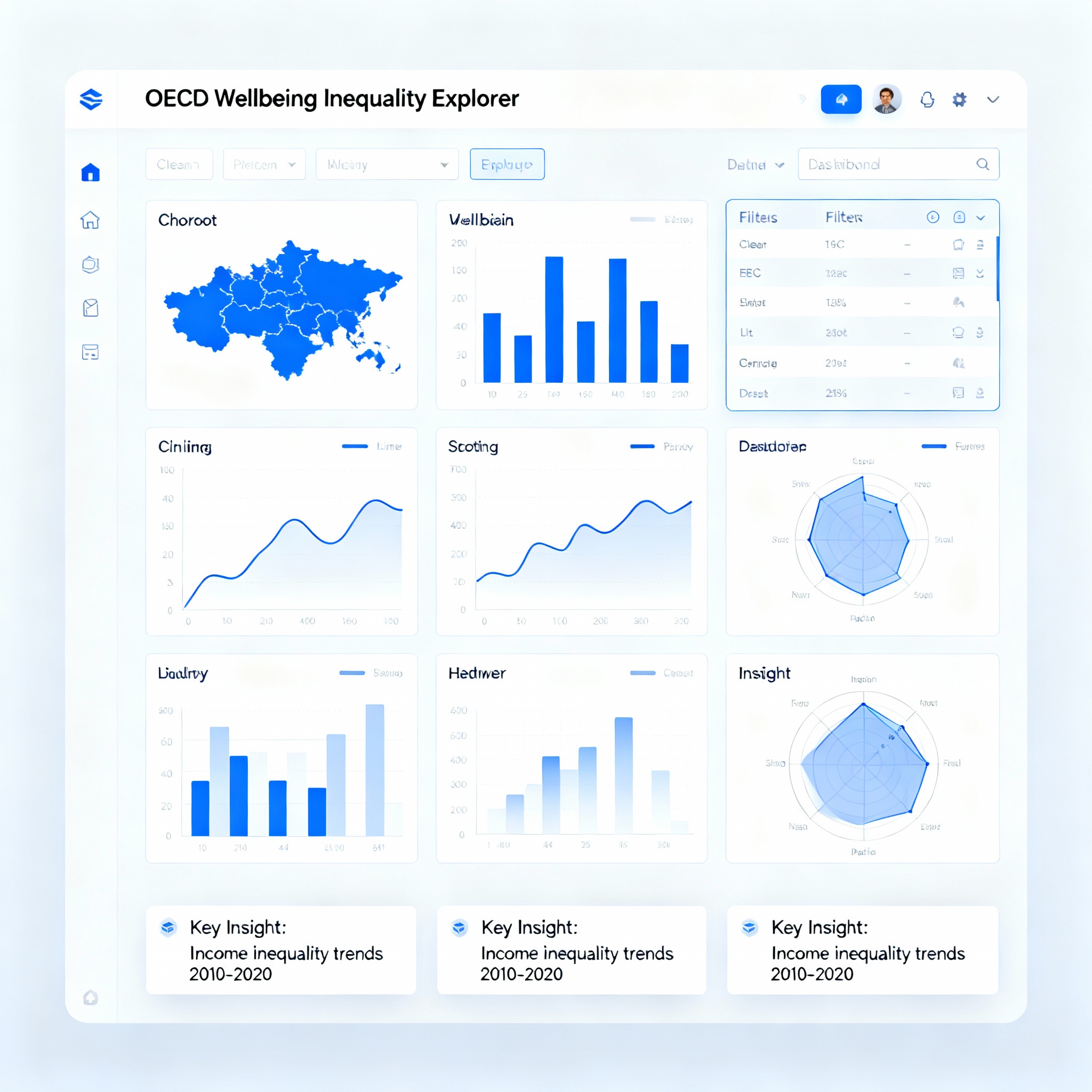
The technical process involved importing and cleaning complex multidimensional data, designing chart outlines that would best showcase disparities and drivers, and layering in interactive filters for country, region, year, gender, age, and education level. I crafted a dashboard experience using choropleth maps to depict country-level wellbeing, bar and line charts to illustrate demographic trends and changes over time, and scatter plots and radar charts to expose relationships among key variables. An essential feature of my app is the “What If?” simulator, which allows users to model the effects of improving income, education, or health access. Automated “insight cards” highlight major findings and make the data relatable to anyone—whether a policymaker, educator, or member of the public.
Throughout development, I faced several challenges. Balancing the need for breadth (multiple richly detailed visualizations) with clarity and usability required careful design decisions. Managing the AI token budget while still maximizing creativity and interactivity tested my planning and strategic skills. Slow initial app generation prompted me to refine data and context inputs for optimal results. Above all, communicating complex data relationships in a friendly, engaging format was both a challenge and a rewarding learning experience.
By the project’s completion, I gained a deeper understanding of how wellbeing is measured and how disparities are formed and perpetuated. I also learned new skills in interactive app-building, data cleaning, and user-centered design. The end result—a fully interactive dashboard that uncovers hidden wellbeing gaps and simulates solutions—demonstrates the power of agentic analytics to not only inform, but to inspire change. Moving forward, I’m excited to expand this platform with new datasets, richer simulations, and community-driven storytelling.
Ultimately, my hope is that the OECD Wellbeing Inequality Explorer empowers users to see beyond the averages, uncover stories that matter, and help close the gap in global wellbeing—one data-driven insight at a time.
Built With
- plotliy


Log in or sign up for Devpost to join the conversation.