Inspiration
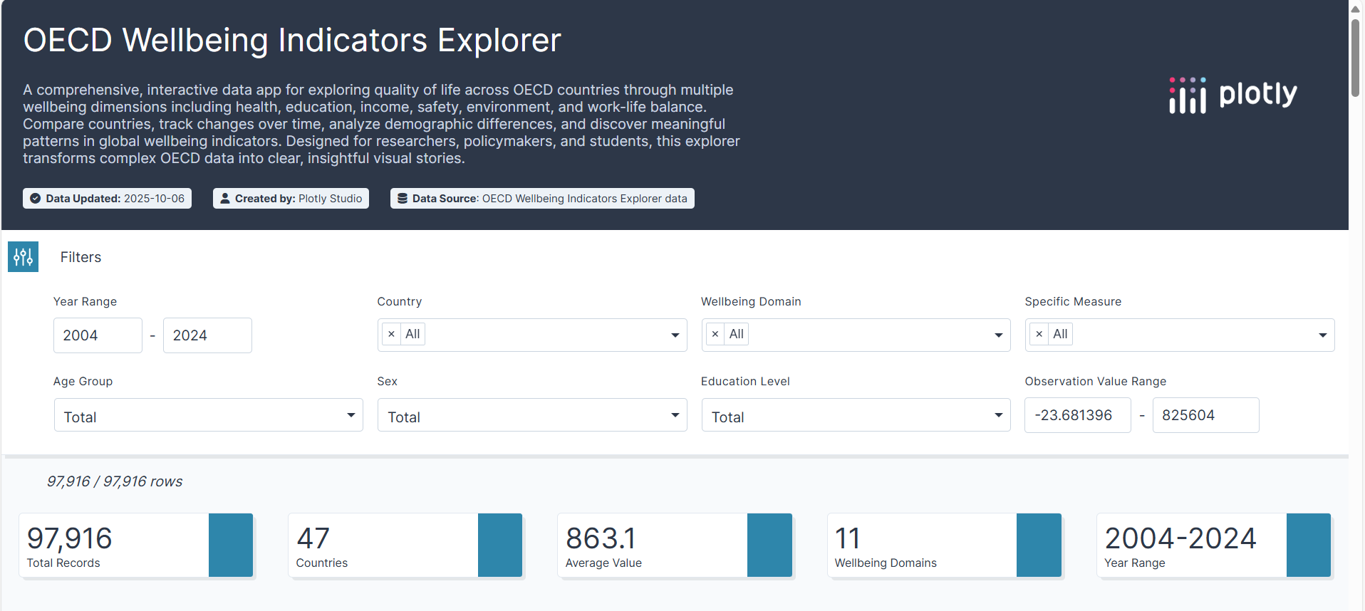
We were inspired by the need to make global wellbeing data accessible and actionable. OECD datasets are rich but complex, and we wanted a platform where students, policymakers, and researchers can explore patterns, trends, and disparities across countries and wellbeing dimensions in a simple, interactive way.
What it does
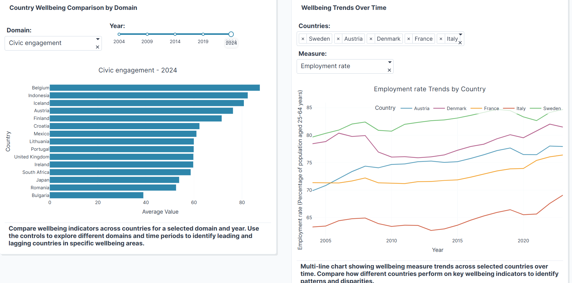
The OECD Wellbeing Explorer is an interactive dashboard that allows users to: Compare 47 countries across 11 wellbeing dimensions (health, education, income, safety, environment, work-life balance, etc.) Track trends over time and across demographics Visualize correlations and top performers Explore global patterns via maps, heatmaps, radar charts, and tree maps
How we built it
We leveraged Plotly Studio to build a fully interactive, visually compelling dashboard, combining bar charts, line charts, heatmaps, scatter plots, tree maps, and choropleth maps. Dynamic dropdowns, sliders, and filters allow users to explore data intuitively, and a professional blue-green theme ensures clarity and accessibility.
Challenges we ran into
Handling large and multidimensional OECD datasets while keeping the dashboard responsive Choosing chart types that clearly convey insights without overwhelming users Ensuring interactive filtering and visualization remained intuitive across multiple dimensions
Accomplishments that we're proud of
Built a cohesive, story-driven dashboard that combines interactivity, analysis, and visual clarity Incorporated top-performer tracking, demographic insights, and global maps Made complex OECD data accessible to both experts and students Created a professional theme and design that highlights insights while remaining user-friendly
What we learned
How to transform raw multidimensional data into meaningful visual stories The importance of interactivity and user-centered design in dashboards Techniques for highlighting trends, disparities, and correlations in a clean and accessible way
What's next for OECD Wellbeing Explorer
Adding AI-generated insights and narrative descriptions for each chart Supporting customizable composite indices and predictive analytics Expanding to more datasets and indicators, allowing users to explore wellbeing in even greater depth Optimizing for mobile and tablet responsiveness to reach a wider audience


Log in or sign up for Devpost to join the conversation.