-
-
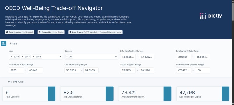
OECD Well-Being Trade-off Navigator — Overview filters and KPI summary cards
-

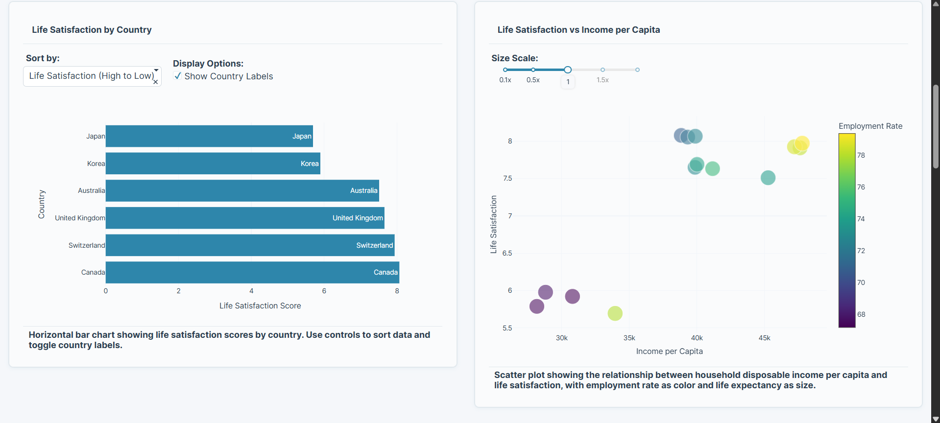
Country-level Life Satisfaction and its relationship with Income per Capita
-
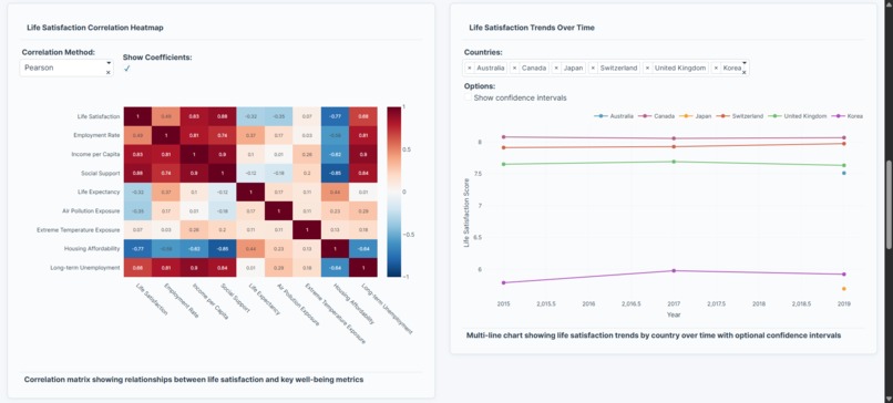
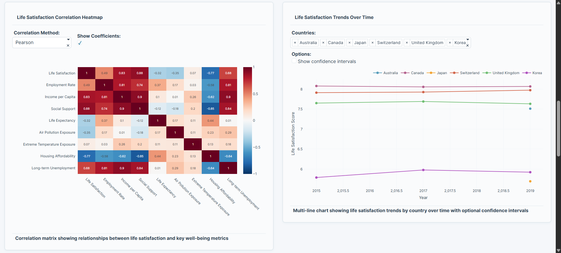
Correlation Heatmap and Life Satisfaction Trends across OECD countries
-

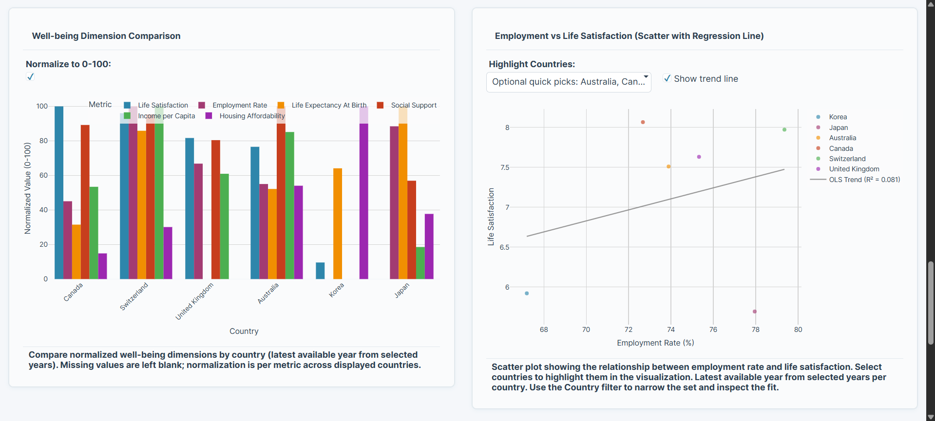
Well-being Dimension Comparison — normalized country metrics (0-100), Employment vs Life Satisfaction, regression insight with R² trend line
-
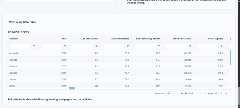
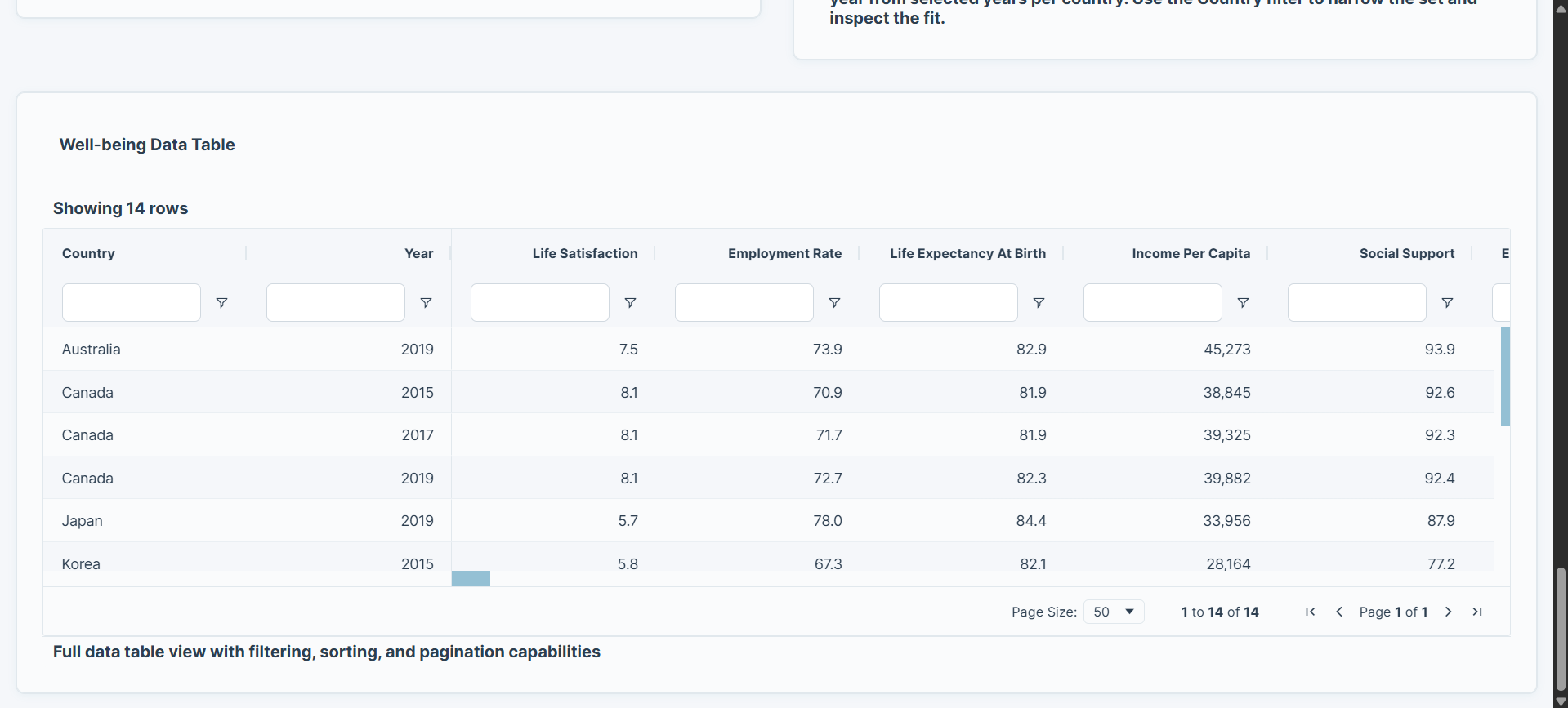
Data Table

Inspiration
Happiness and prosperity often move together — but not always. I wanted to explore what truly drives well-being across nations: income, jobs, social support, or health? Using the OECD Better Life dataset, I built this project to visualize the trade-offs between key life quality indicators.
What it does
The OECD Well-Being Trade-off Navigator is an interactive Plotly Studio dashboard that helps users:
- Compare Life Satisfaction across OECD countries and years
- Examine relationships with Income, Employment, Health, and Environment
- Understand correlations between multiple well-being drivers
- Explore temporal trends and multi-dimensional comparisons at a glance
How we built it
Built entirely in Plotly Studio, leveraging its AI-powered app builder to connect the OECD dataset, design layouts, and generate interactive visuals.
The project includes:
- Dynamic filters for year, country, and key metrics
- Linked charts: bar, scatter, correlation heatmap, and trend lines
- Grouped bar comparison for normalized well-being dimensions
- Regression-based insight view showing employment vs. life satisfaction
Challenges we ran into
- Optimizing filters to synchronize all charts dynamically without losing default data display.
- Replacing non-responsive radar charts with grouped bar visualizations that preserve clarity.
- Designing for both analytical depth and visual simplicity within limited AI credits.
Accomplishments that we're proud of
- Created a clean, professional, multi-chart dashboard that runs seamlessly in Plotly Studio.
- Showcases real-world analytical storytelling through interactive visualization.
- Balances accessibility (no coding) with analytical rigor.
What we learned
- How to design for exploratory analysis in a no-code environment.
- The value of strong visual structure: small multiples, consistent color themes, and data-linked insights.
- That the combination of income, social support, and employment rate consistently predicts higher life satisfaction across countries.
What's next for OECD Well-Being Trade-off Navigator
- Adding AI-generated insight summaries per chart.
- Extending the dataset to include subjective well-being trends post-COVID.
- Publishing as a reusable template for data literacy and policy-analytics education.
Built With
- oecd

Log in or sign up for Devpost to join the conversation.