-
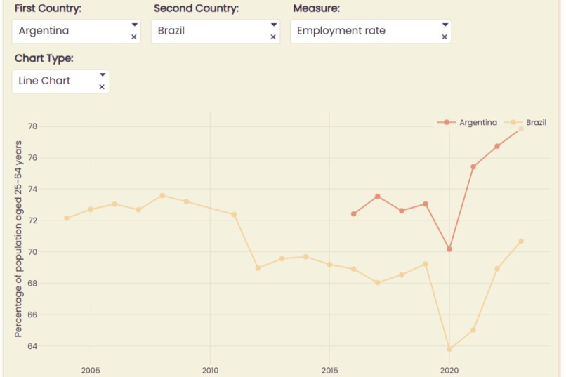
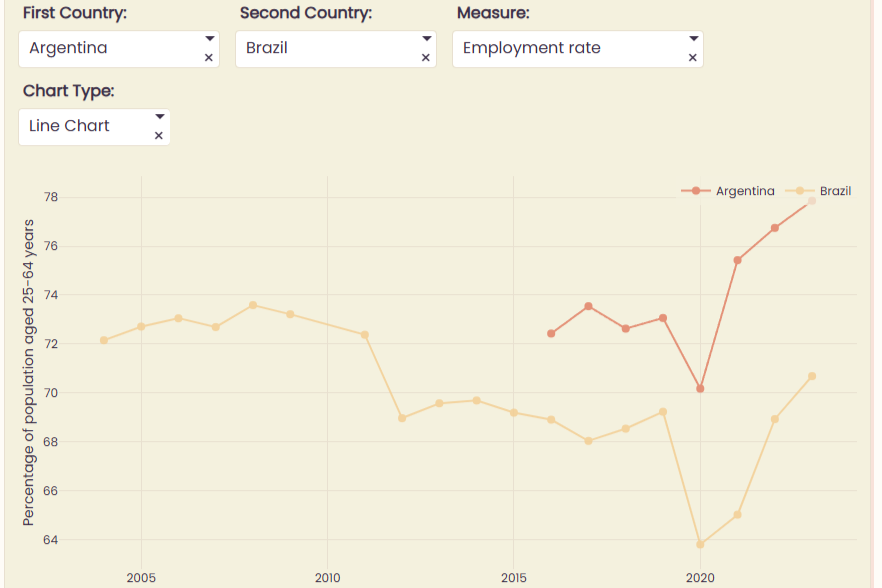
Versus
-
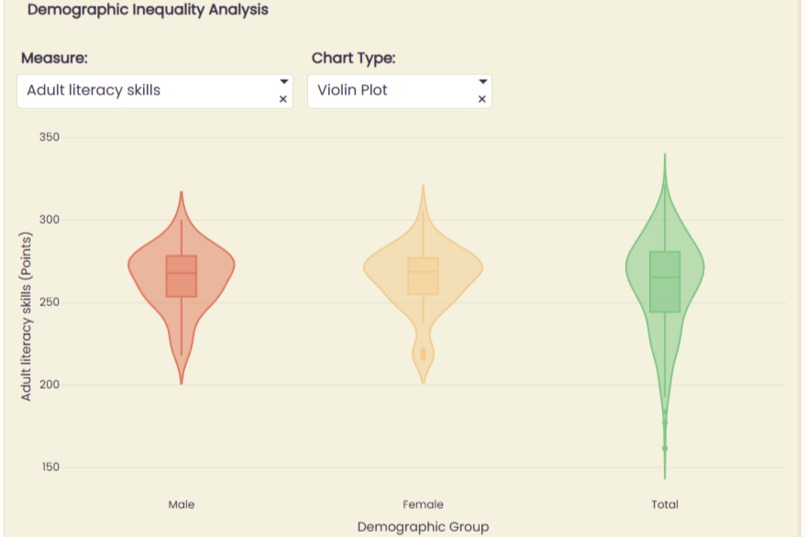
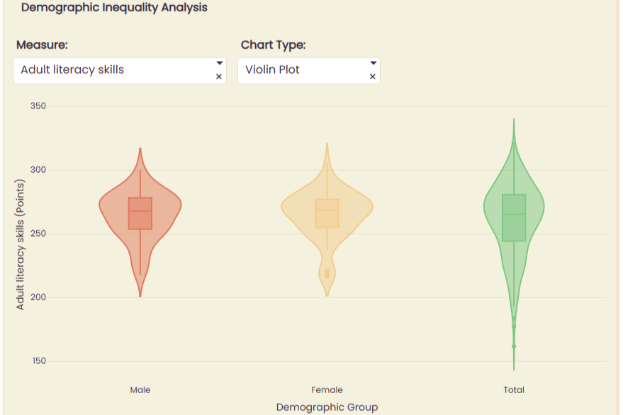
By Gender
-
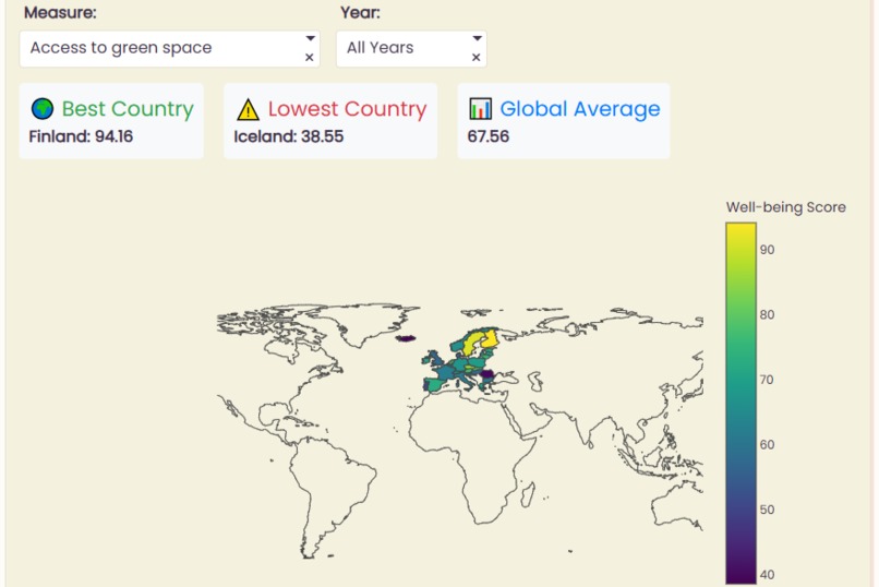
World

About the project
OECD Well-Being Playground is an interactive dashboard designed to explore how people live, feel, and thrive across the world. Using Plotly Studio, I built animated bubble maps, comparison charts, trend lines, and heatmaps to make global well-being data engaging and accessible.
Filters like year, country, domain, measure, and sex allow users to dive into the data freely. The Solar Harmony theme gives the dashboard a warm, optimistic feel, while keeping visuals clear and inclusive.
This project taught me a lot about interactive visualization, multidimensional data, and designing dashboards that are both informative and inviting. 🌍
Built With
- plotly
- plotlystudio

Log in or sign up for Devpost to join the conversation.