-
-

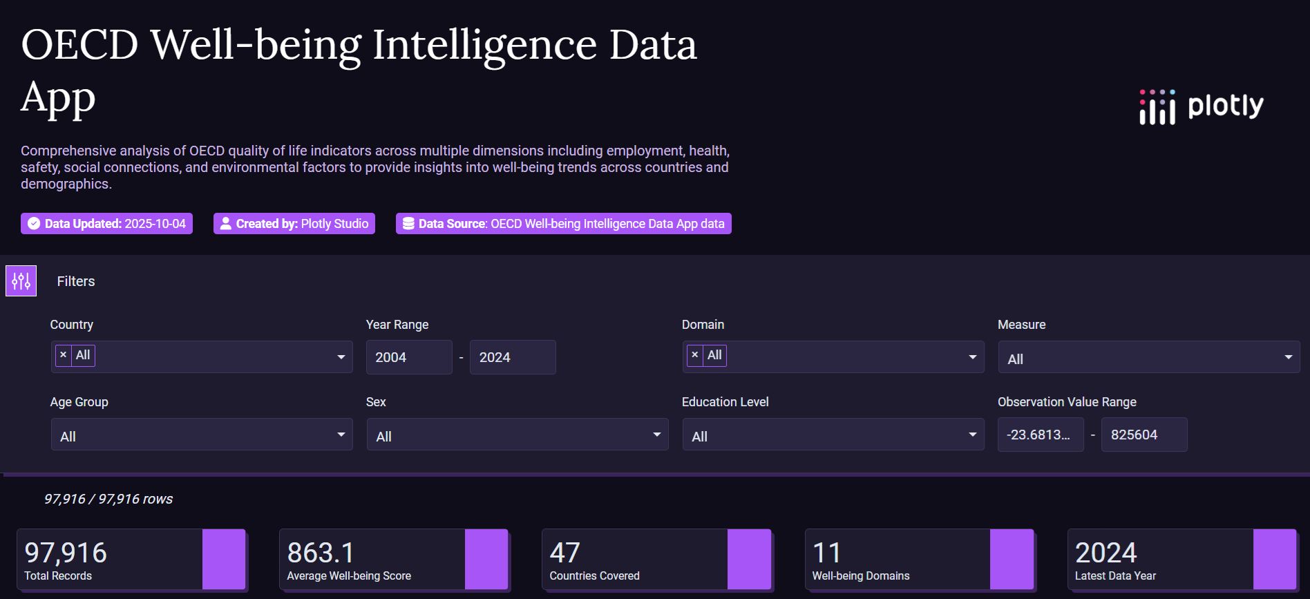
Dashboard
-
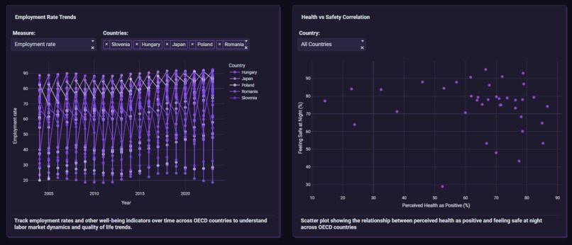
Charts 1 and 2
-
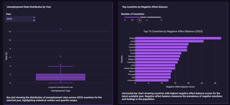
Charts 3 and 4
-
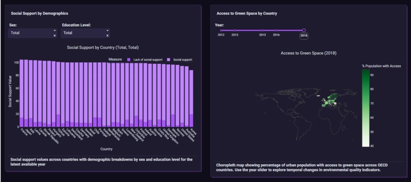
Charts 5 and 6
-
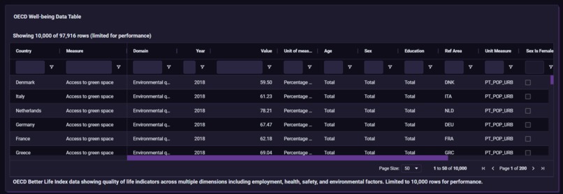
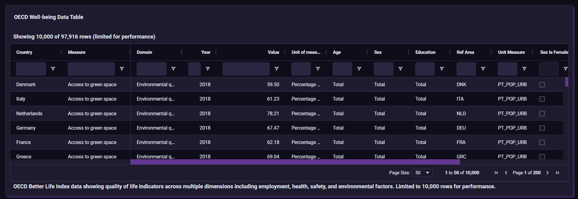
Data Table


This data analytics was built fully in Plotly Studio.
It describes the OECD Wellbeing Dataset in 6 charts. Axis 1: Time & Trends (Line Chart) Axis 2: Correlation (Scatter Plot) Axis 3: Distribution & Outliers (Box Plot) Axis 4: Ranking & Comparison (Horizontal Bar Chart) Axis 5: Demographic Disparity (Stacked Bar Chart) Axis 6: Geographic Context (Choropleth Map)
I did not want the app to look or be static. So, I deployed 8 global filters in the charts for users to engage. For the app to look good, I gave it a dark purple theme - something similar to Plotly Studio itself. The lines/bars/chart have a lighter color, making it easy and better to look at. Plotly Studio was very user-friendly and created all the charts in minutes - however, making the prompts was a bit hard.
And that's all about the app. It was a great experience!


Log in or sign up for Devpost to join the conversation.