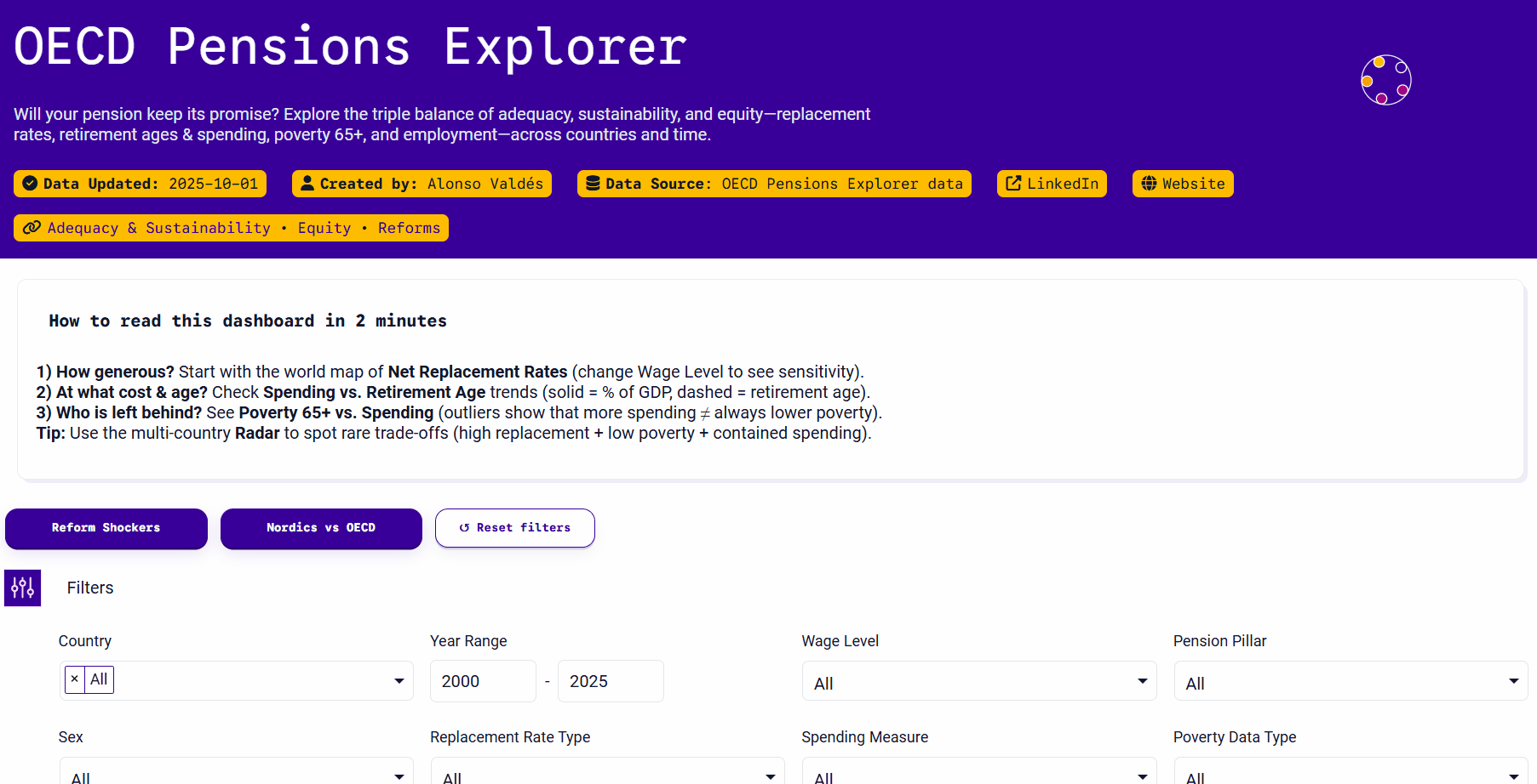
OECD Pensions Explorer
Will your pension keep its promise?
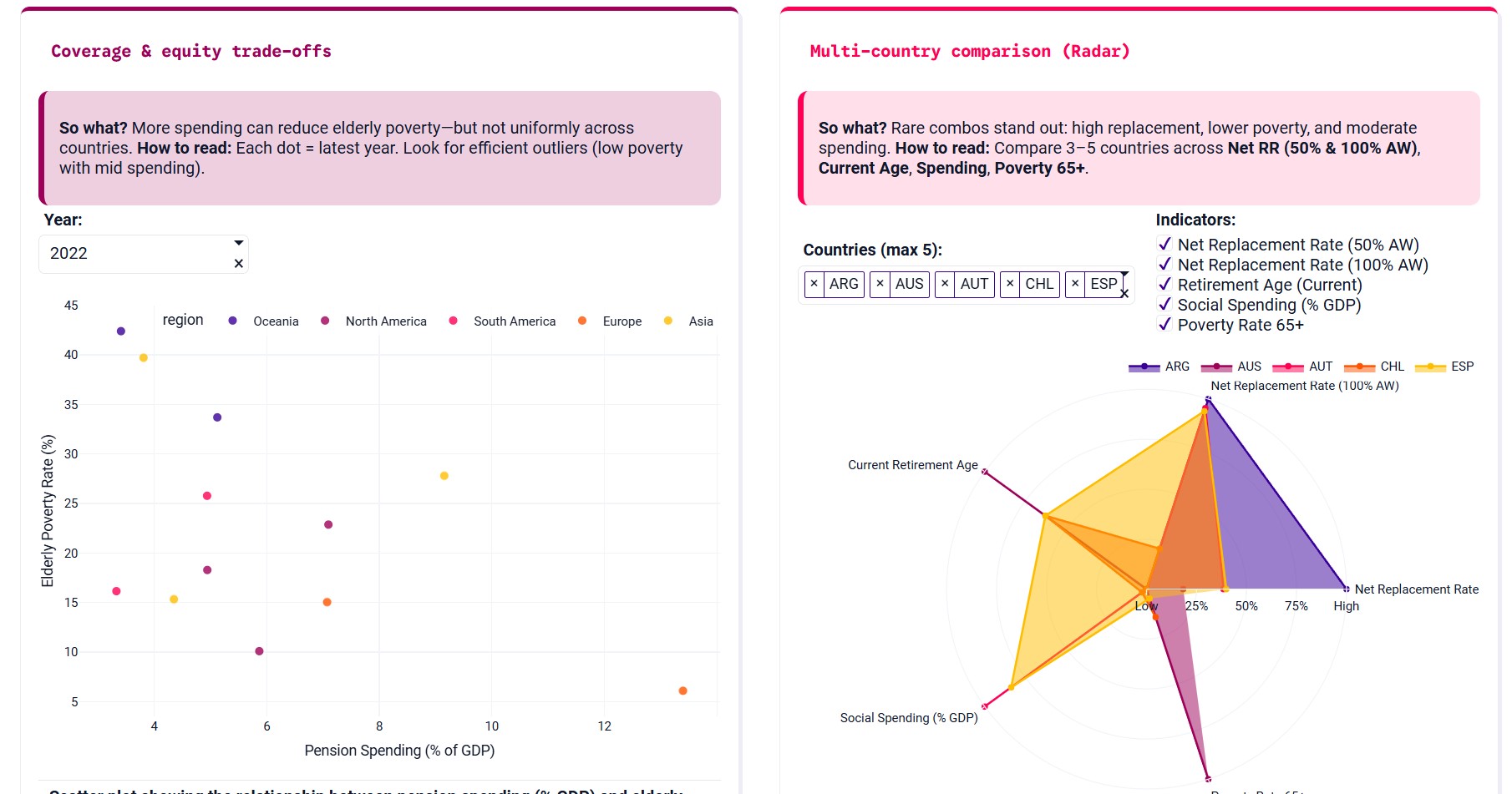
Pension systems involve a delicate balance — ensuring adequate benefits, maintaining fiscal sustainability, and reducing inequality in old age. This app visualizes those trade-offs through clear, interactive comparisons across OECD countries.
Inspiration
I wanted to turn complex policy indicators into something intuitive and explorable. Too often, pension debates rely on isolated metrics; this project connects them — replacement rates, spending, retirement age, and elderly poverty — so users can see how countries perform on multiple fronts.
How it was built
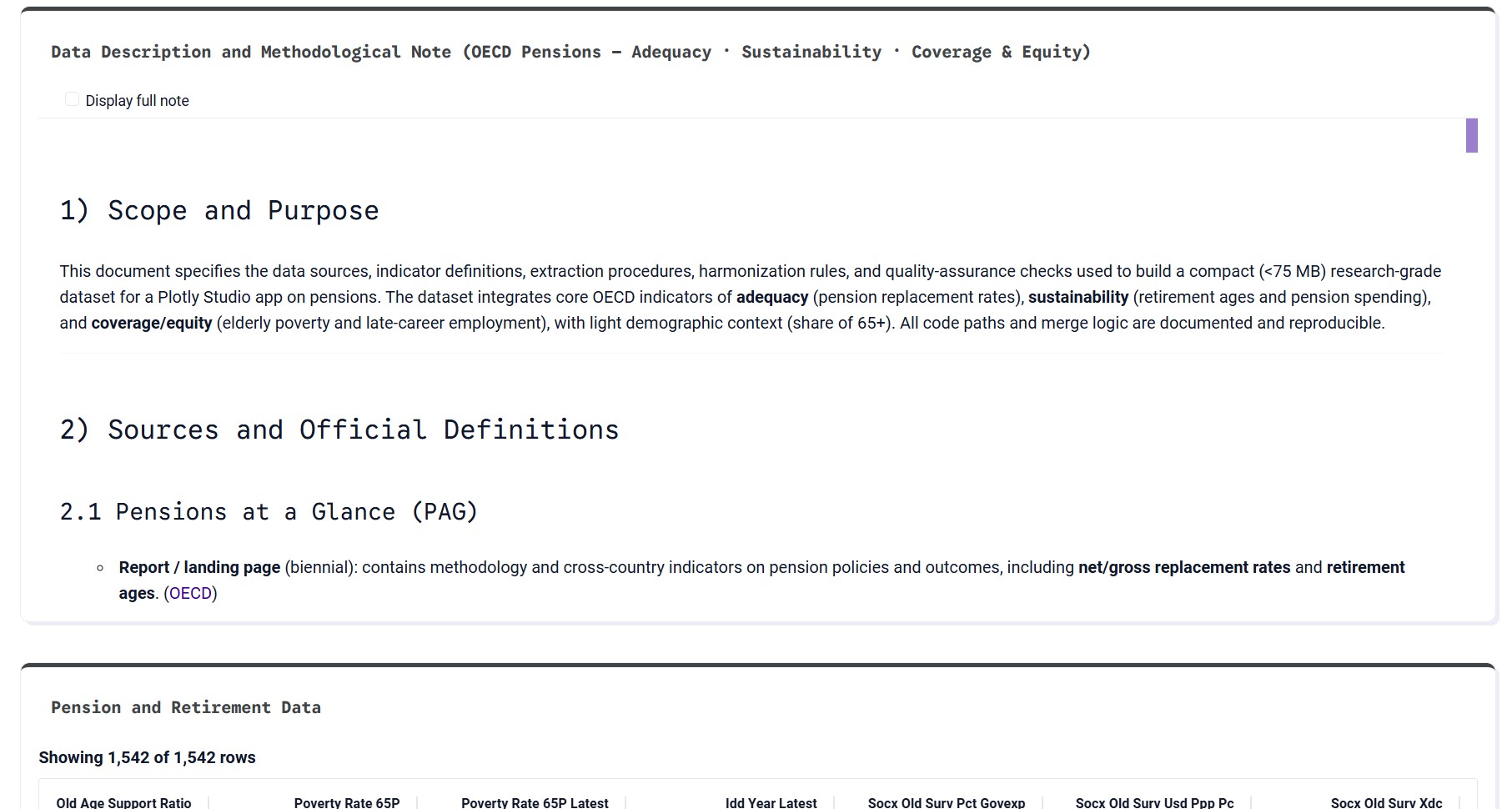
The dashboard was designed entirely in Plotly Studio Pro, using only the built-in components and a compact dataset (<75 MB). The data were curated from OECD Pensions at a Glance, SOCX, and LFS sources, harmonized and merged into a reproducible dataset.
Each card tells a story:
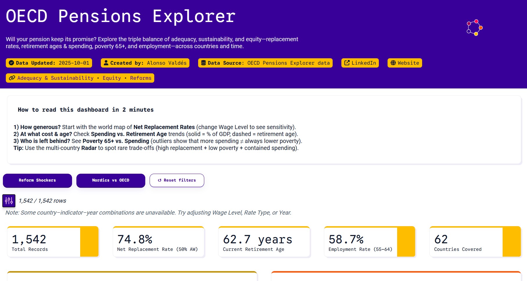
- Choropleth → How generous are pensions?
- Line chart → At what cost and age?
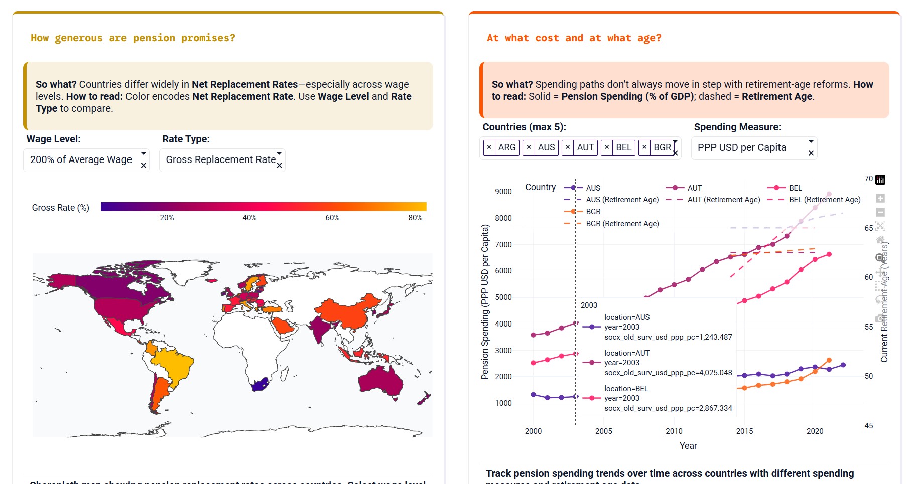
- Scatter → Who is left behind?
- Radar → How do countries compare?
What I learned
Plotly Studio is remarkably effective for rapid prototyping — it allows data stories to come alive with minimal setup, yet offers the control needed for analytical depth. It was also a lesson in designing for clarity: how to express complex ideas with the least possible friction.
Challenges
The main challenge was fitting multiple indicators and layouts into a single coherent narrative without code customization. Balancing color, density, and interactivity to preserve readability took several iterations, but the result is a clean, policy-ready visualization.


Log in or sign up for Devpost to join the conversation.