-
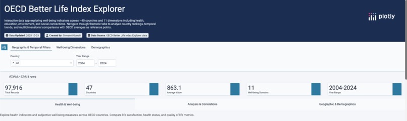
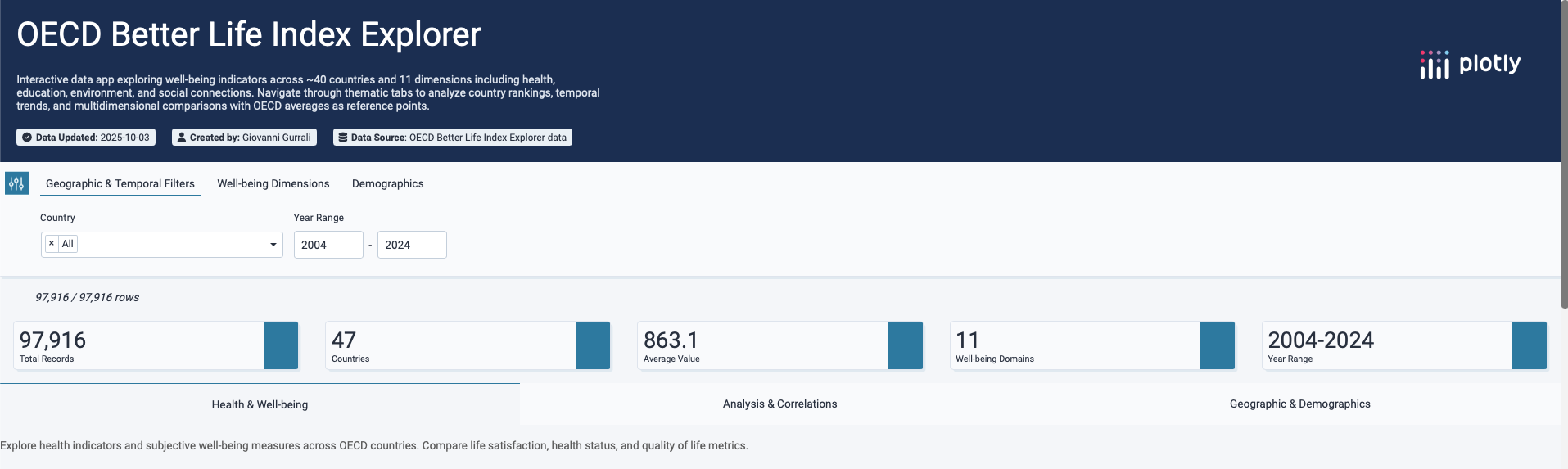
Homepage pt.1
-

Homepage pt.2
-
Homepage pt.2
About the Project
Inspiration 🌍
The OECD Better Life Index has always fascinated me because it goes beyond GDP to measure quality of life. Numbers like income or GDP are not enough to explain how people actually live. Health, education, work-life balance, safety, and environment are equally important.
This project was inspired by the idea of bringing these dimensions together in a single, interactive tool — so that anyone can compare countries, explore correlations, and understand trade-offs in well-being.
What We Learned 📚
Building this project was a crash course in data storytelling.
- I learned how to think about data not just as numbers, but as a narrative that can be explored step by step.
- I discovered the power of Plotly Studio’s no-code AI generation: with natural language prompts, I could create advanced dashboards without writing a single line of code.
- I deepened my understanding of OECD indicators, seeing how metrics like life expectancy and life satisfaction sometimes diverge, raising interesting policy questions.
How We Built It ⚙️
The app was built entirely in Plotly Studio, using the built-in AI workflow:
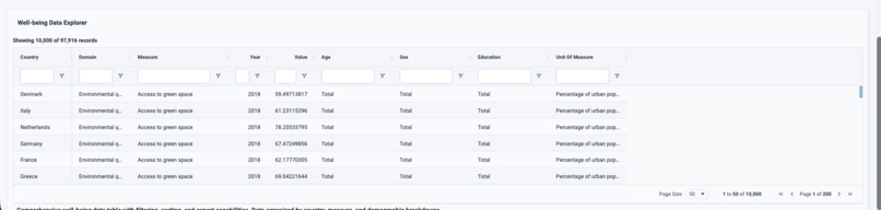
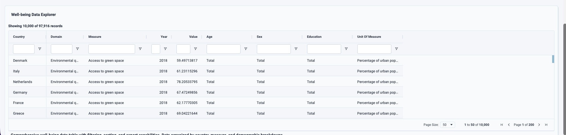
- Dataset: OECD Well-Being dataset (11 dimensions, ~40 countries).
- Prompting: Context in English to guide the AI — requesting multiple thematic tabs, interactive filters, and diverse visualizations.
- Visualizations:
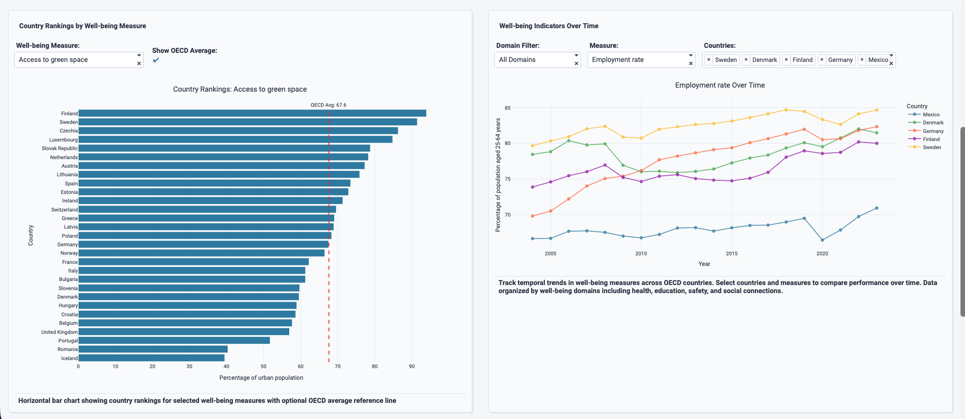
- Choropleth maps to show geographic patterns
- Bar charts for rankings and comparisons
- Radar charts for multi-dimensional profiles
- Scatter plots to uncover correlations (e.g. income vs life satisfaction)
- Line charts to show trends over time
- Choropleth maps to show geographic patterns
- Interactivity: Dropdown filters for countries and sliders for years, making every chart responsive to user input.
- Design: Clear tab structure, concise insights, and annotations for OECD averages.
All of this was done through Plotly Studio’s no-code interface, validating that even beginners can build professional dashboards with the right guidance.
Challenges Faced 🚧
- Balancing complexity and clarity: With 11 dimensions and dozens of countries, it was easy to overwhelm users. I had to design a structure that remained accessible: tabs, summaries, and filters were essential.
- Guiding the AI: At times, the first generated outline wasn’t perfect — missing charts or misaligned filters. I learned to iteratively refine the prompts and outlines until the app matched the vision.
- Performance considerations: Ensuring the app remained responsive while handling a dataset with multiple indicators and years required careful testing in preview mode.
👉 In the end, the project delivered a clean, interactive, and engaging way to explore OECD well-being — true to the hackathon’s spirit of combining creativity, data, and storytelling.


Log in or sign up for Devpost to join the conversation.