Inspiration
Climate change involves numbers—gigatons of carbon, megawatt-hours of energy—but these numbers often feel abstract and disconnected from daily actions. We realized that while there is an abundance of open energy data available (from sources like the World Bank, National Grid, and smart meters), there is a lack of accessible tools to meaningful interpret it. We wanted to bridge the gap between raw data and actionable sustainability. Our inspiration was to build a "Translator for Energy": a tool that doesn't just show you a chart, but tells you exactly how to save energy, money, and the planet, instantly.
What it does
OctoGreen is an intelligent, all-in-one energy analysis platform. It empowers users to:
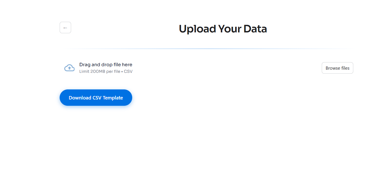
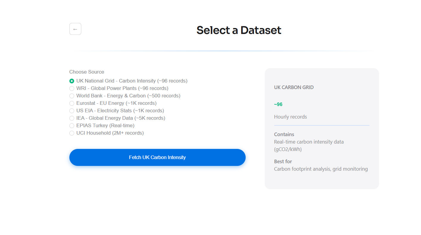
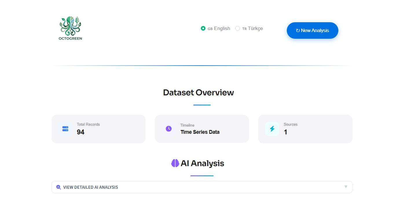
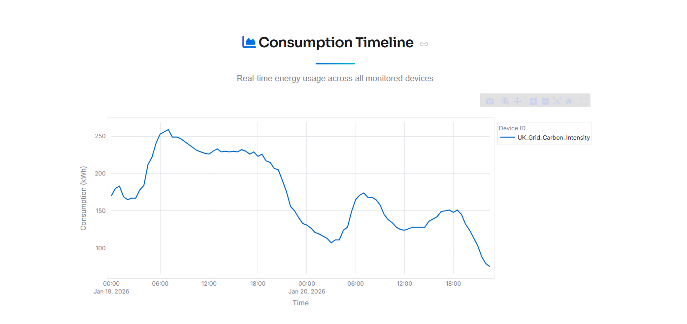
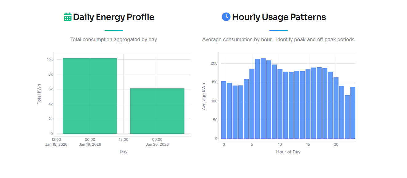
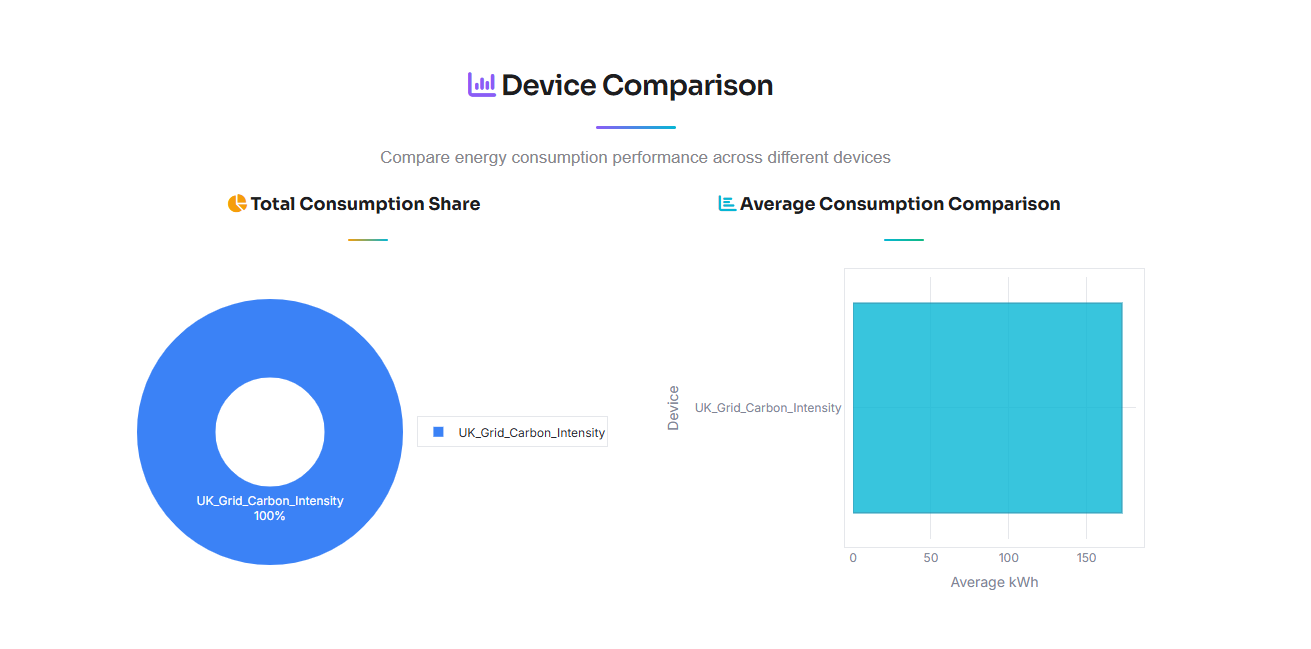
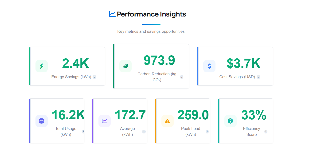
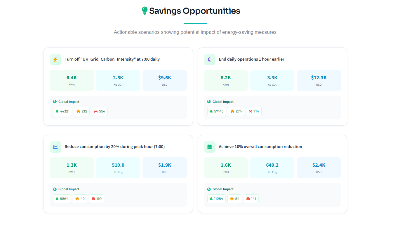
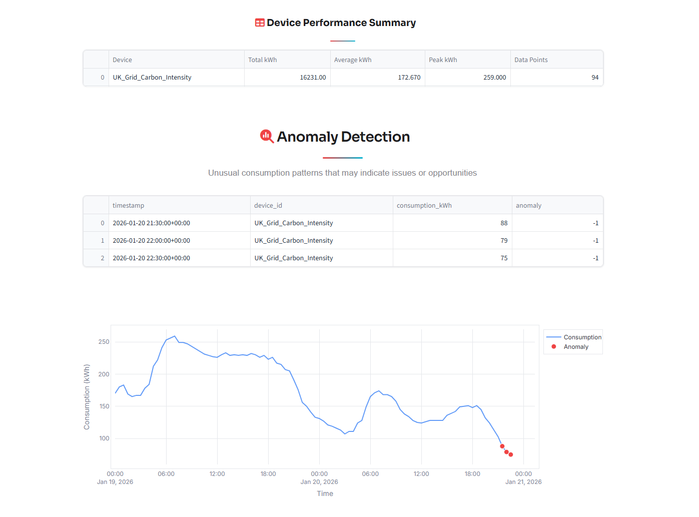
Aggregate Data Seamlessly: Users can upload their own energy CSV files or instantly fetch live data from global repositories like the UK National Grid, World Bank, IEA, and EPIAS. Visualize Instantly: It transforms complex time-series data into beautiful, interactive dashboards that display consumption trends, peak loads, and energy breakdowns. AI-Powered Insights: Leveraging Google Gemini AI, OctoGreen acts as a virtual energy consultant. It detects anomalies (like unusual spikes at 3 AM), calculates inefficiency scores, and generates personalized text explanations. Actionable Simulations: The "Savings Calculator" simulates real-world scenarios (e.g., "What if I turn off devices 1 hour earlier?"), quantifying the impact in kWh saved, USD saved, and Carbon emissions reduced.
How we built it
We built OctoGreen using a robust, data-centric stack designed for speed and interactivity:
Core Engine: We used Python for its powerful data manipulation capabilities. Data Processing: Pandas and NumPy handle the heavy lifting of cleaning, normalizing, and structuring diverse datasets from different APIs. Frontend: We utilized Streamlit, pushing it to its absolute limits with custom CSS and HTML injection to create a premium, "Apple-style" glassmorphism UI that breaks away from the standard data app look. Artificial Intelligence: We integrated the Google Gemini API to analyze statistical summaries of the data. The AI processes these metrics to generate human-readable "Key Findings" and identify savings opportunities in natural language. Visualization: Plotly was used to render interactive, responsive charts that users can zoom and explore.
Challenges we ran into
Data Normalization: Every open data source (UK Grid vs. World Bank vs. CSV uploads) has a different structure. Creating a unified internal schema that could ingest all these formats and present them on a single standardized dashboard was a significant logic puzzle. Breaking Streamlit's UI Limits: Streamlit is great for prototyping, but we wanted a "Product-Ready" look. fighting against default padding, forcing custom fonts, and implementing a stable "Dark Mode/Light Mode" aesthetic required extensive custom CSS hacking and overriding default component behaviors. AI Context Management: Ensuring the AI provided specific, mathematical advice (e.g., "Save $15") rather than generic advice (e.g., "Turn off lights") required careful prompt engineering and pre-calculating metrics to feed into the model context.
Accomplishments that we're proud of
The UX/UI Design: We are incredibly proud of the clean, modern interface. The "Glassmorphism" cards and smooth transitions make the tool feel like a native app rather than a data script. Multi-Source Integration: Successfully connecting to 8+ different data sources (including live APIs and static datasets) and having them all work seamlessly in one interface. The "Savings Engine": Building a logic layer that translates abstract "15% reduction" concepts into concrete monetary and environmental values (Trees planted/Cars off road) that users can emotionally connect with.
What we learned
Data Storytelling is Key: Data without context is noise. We learned that adding a simple text explanation or a "Carbon Impact" badge is often more effective than a complex graph. The Power of LLMs in Analytics: We discovered that LLMs aren't just for chat; they are excellent at interpreting statistical summaries and acting as a reasoning layer on top of hard data. CSS in Python: We mastered the art of injecting CSS into Python apps to control every pixel of the user experience.
What's next for OctoGreen – AI Sustainability Optimizer
IoT Integration: Direct connection to smart home devices (like Philips Hue or Nest) to not just suggest savings, but automate them. Gamification: Adding a leaderboard feature where companies or households can compete to see who has the best "Efficiency Score." Mobile App: Converting the responsive web design into a dedicated React Native mobile app for on-the-go monitoring. Predictive Forecasting: Using LSTM machine learning models to predict next month's energy bill before it arrives.

Log in or sign up for Devpost to join the conversation.