-
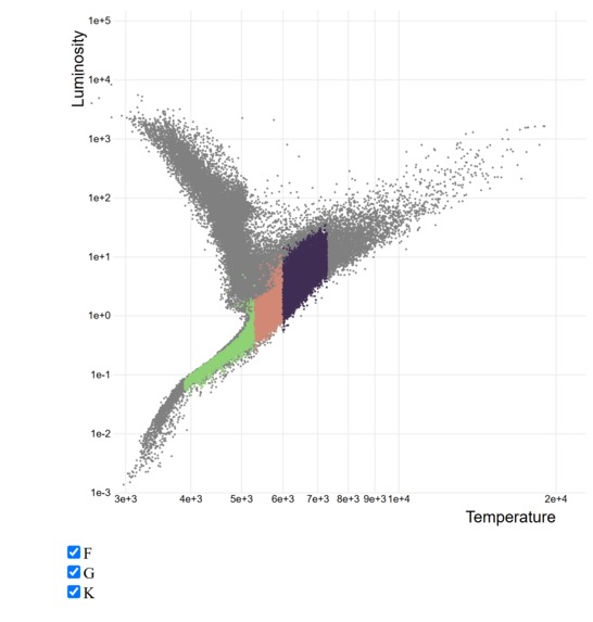
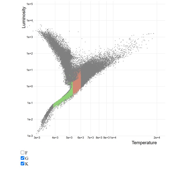
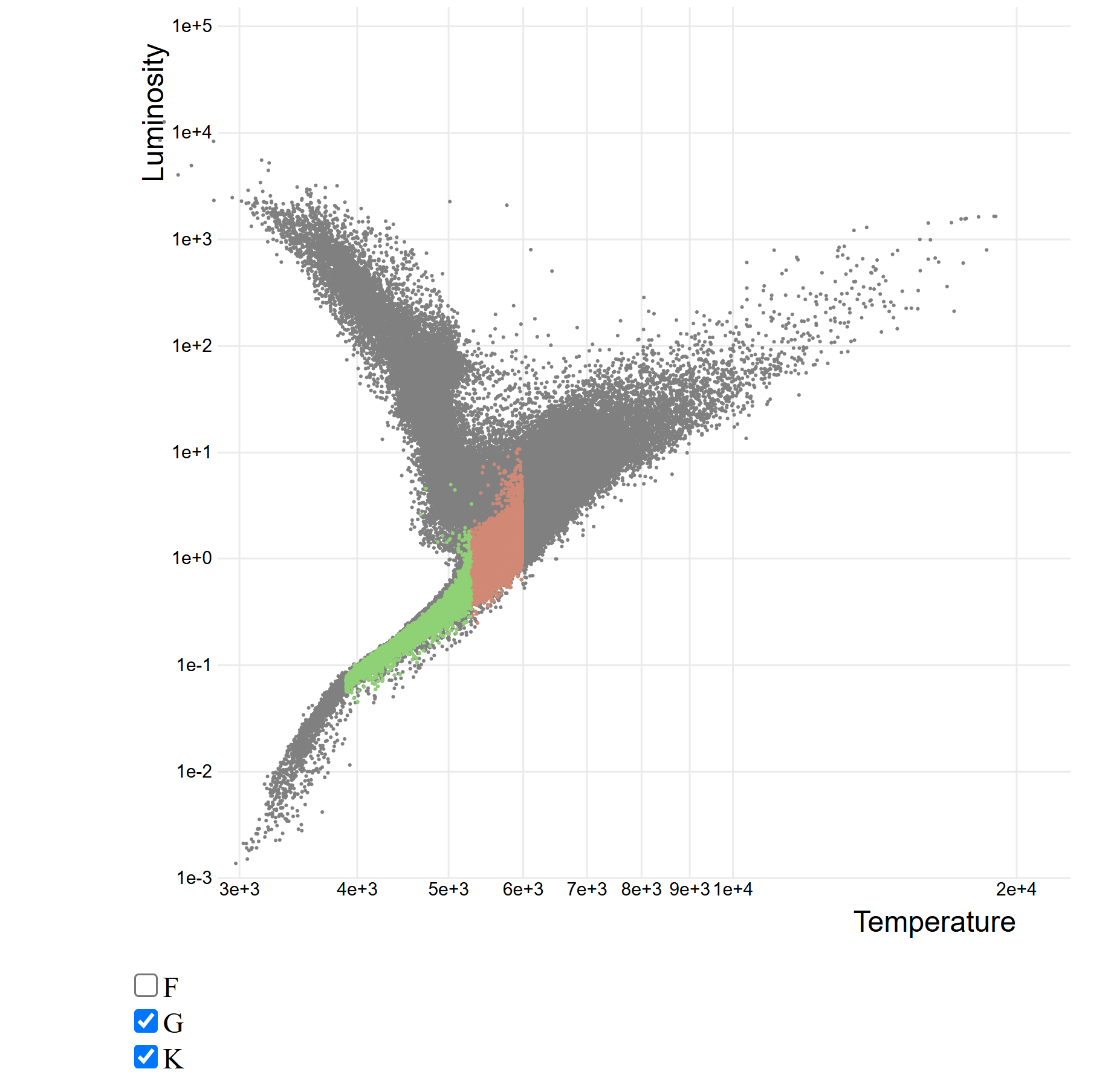
The visualisation of our stellar sample! We can toggle between FGK classes
-
-

-
-
-
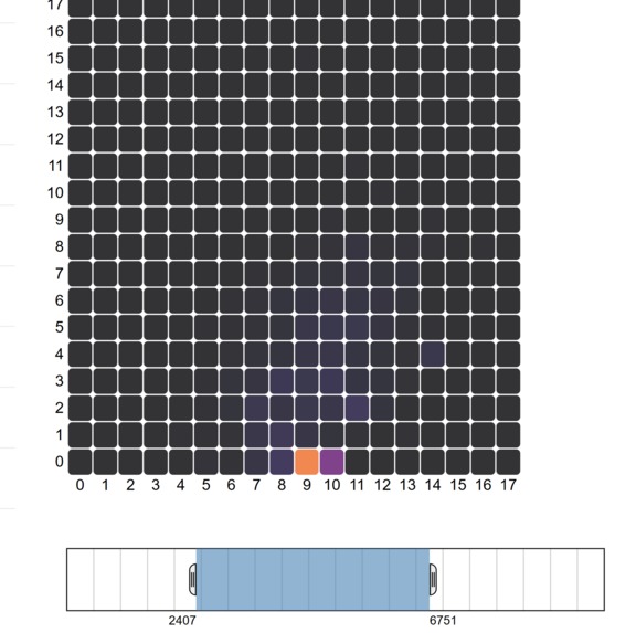
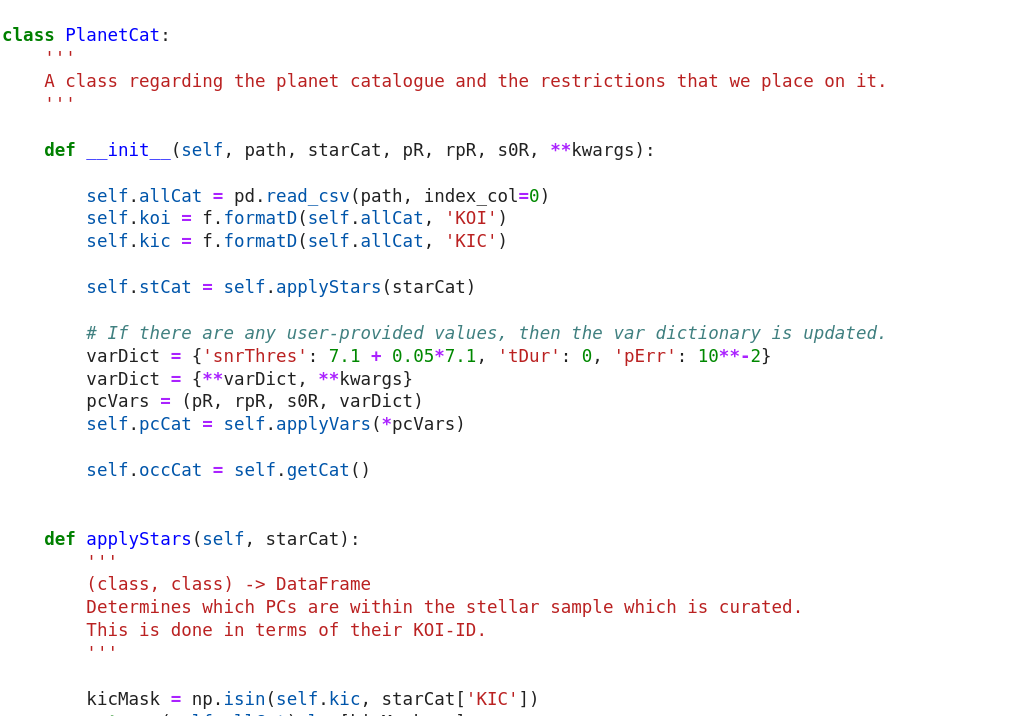
The beginning of our heatmap visualisation in D3
-
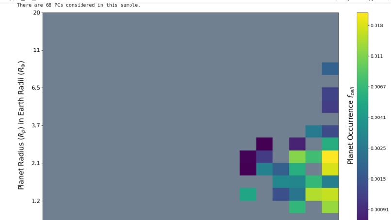
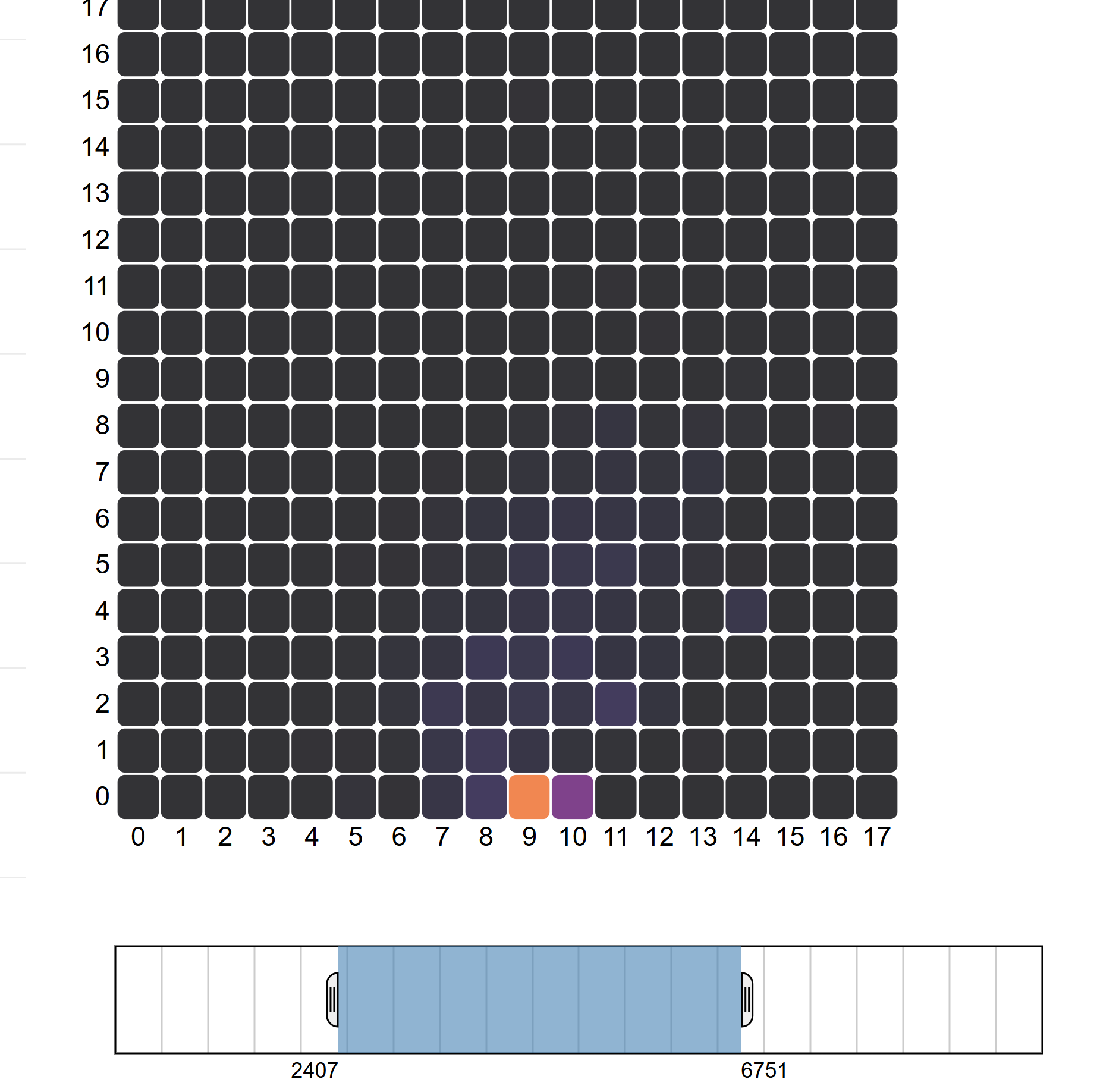
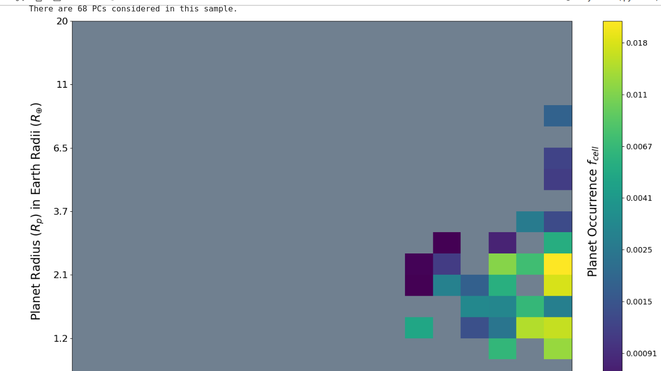
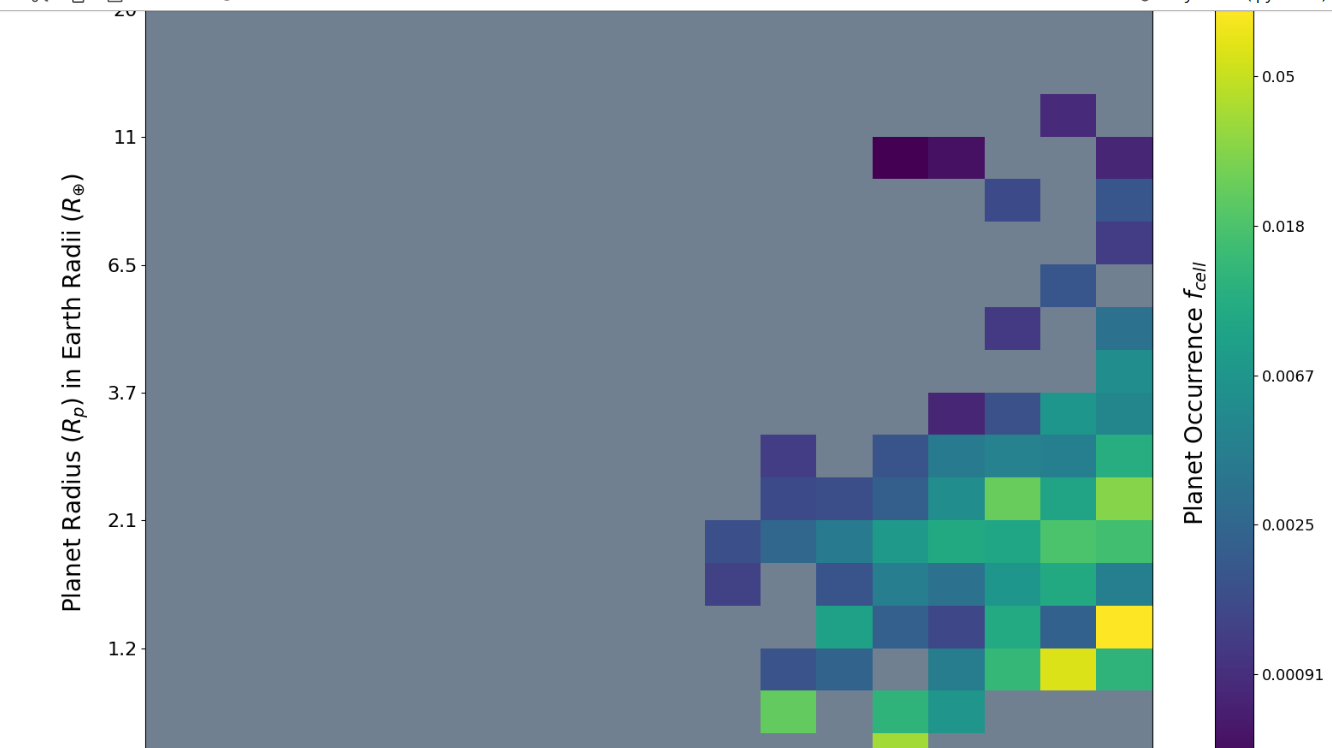
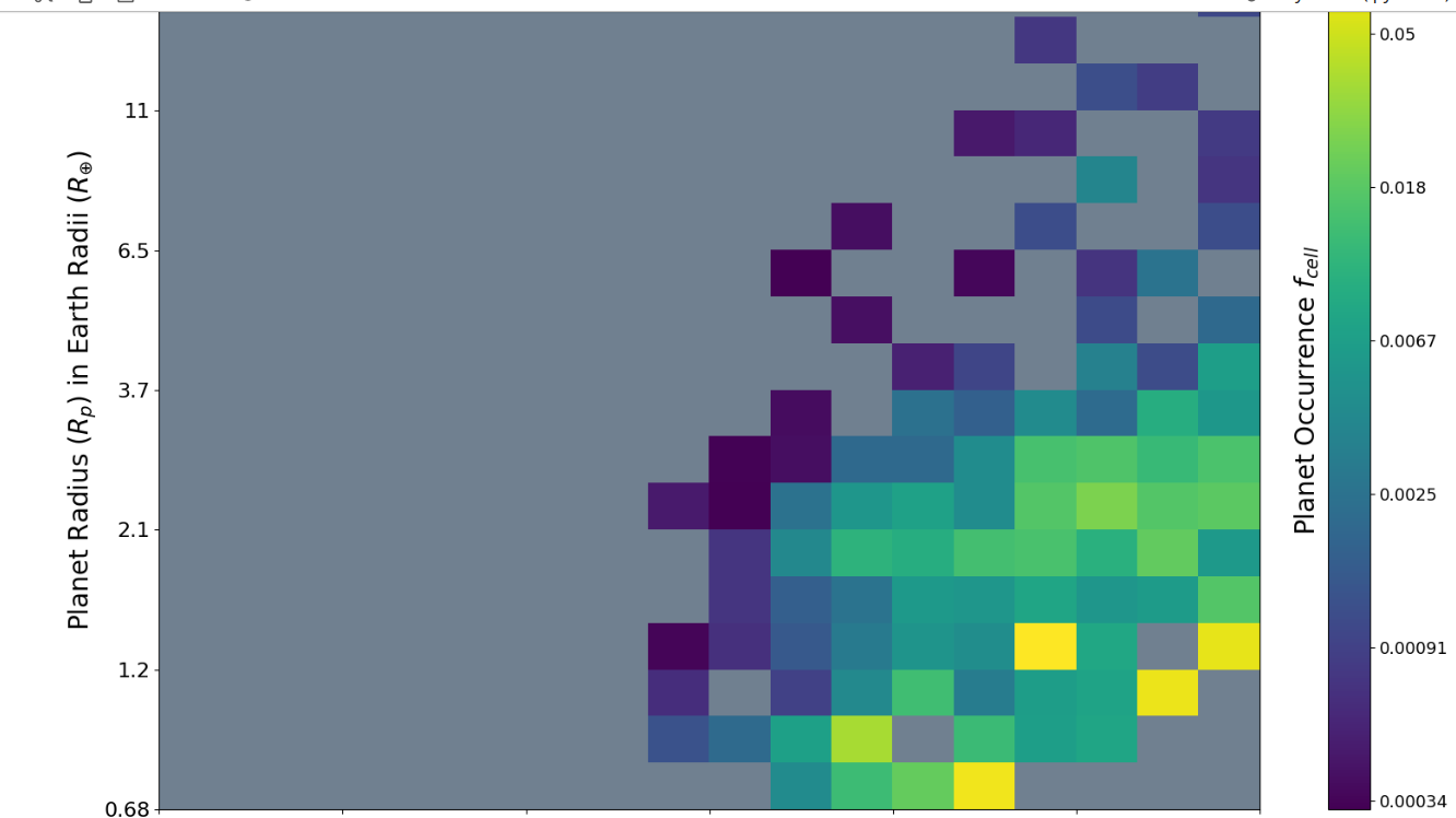
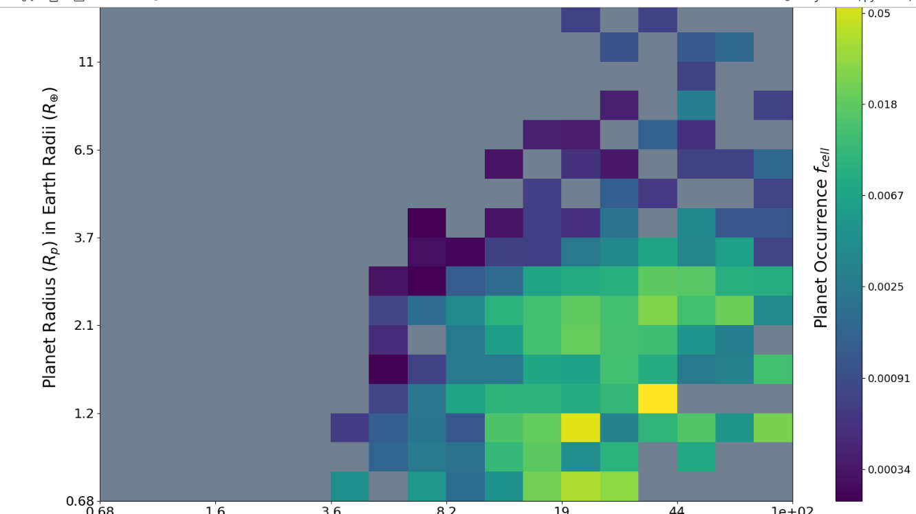
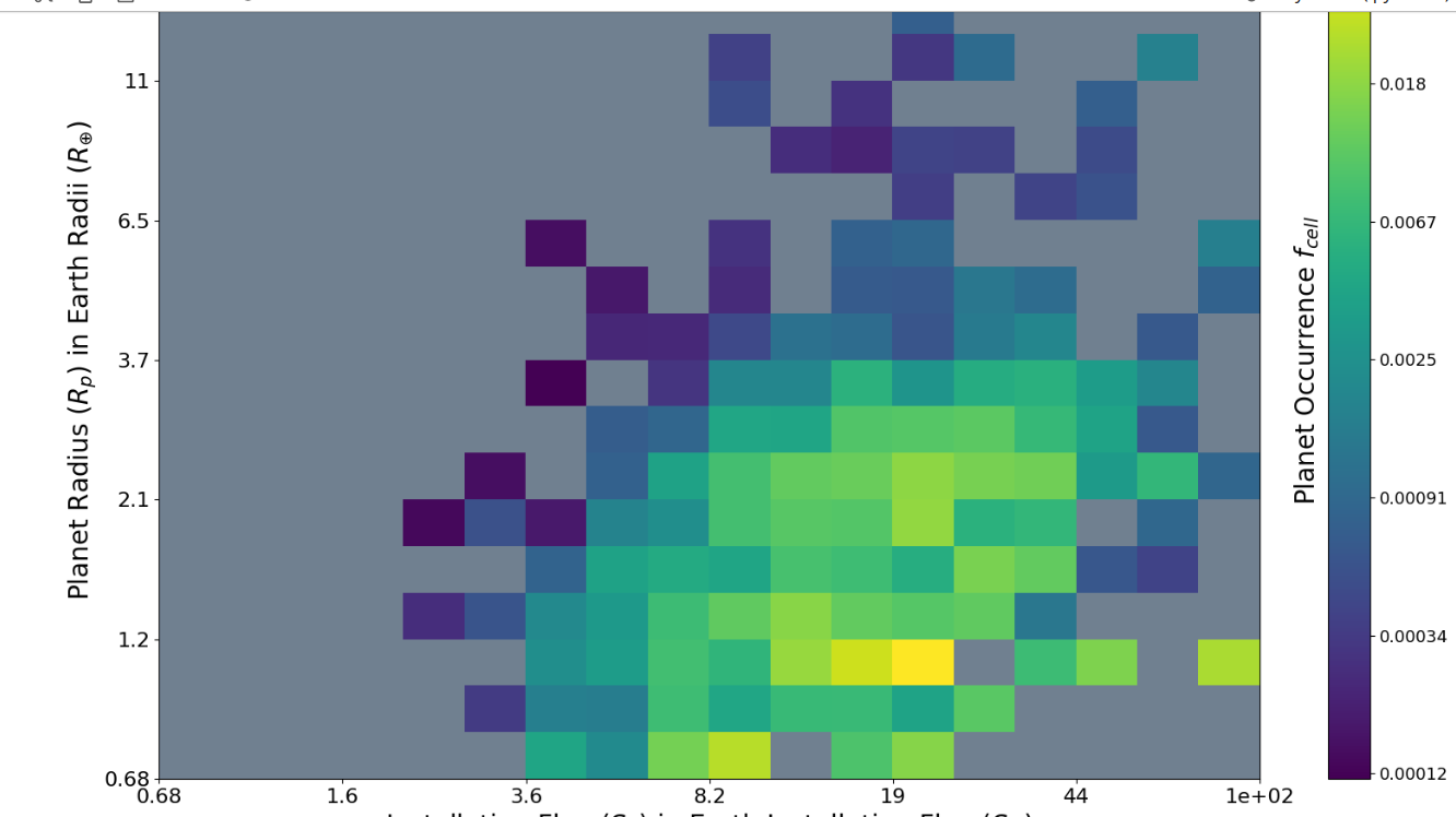
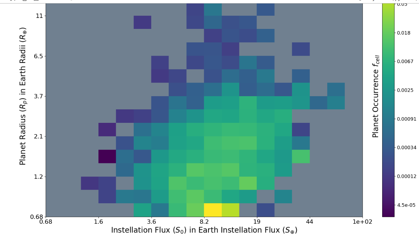
The graphs produced in Python for a period-radius grid.
-

The y-axis is radius and the x-axis is period.
-
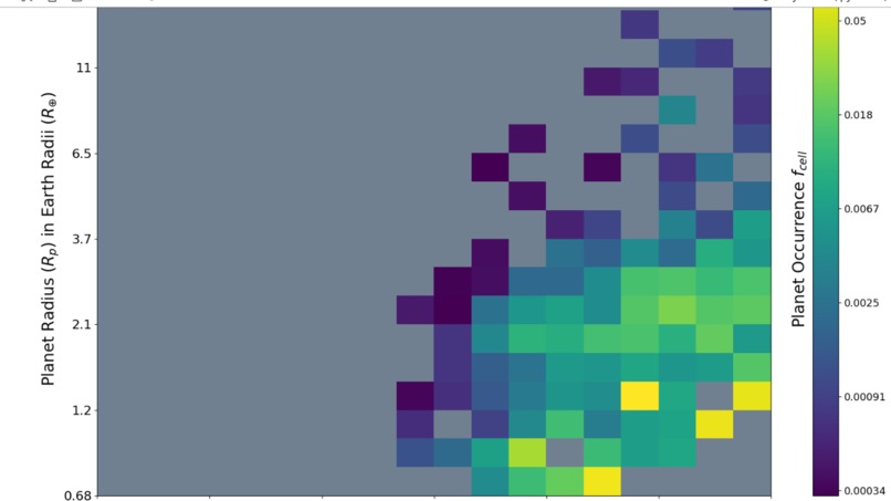
Moving between these images, we see how the occurrence rate shifts with instellation flux
-

As instellation flux increases, we see the occurrence shift to lower periods and higher radii.
-

Such is reflective of the period-gap gap discussed in literature.
-

It would likely be better showcased with toggling between FGK stars as well.
-


Context
Launched in 2009, the Kepler Mission was NASA's first exoplanet-hunting mission - one of our preliminary steps in searching for life within our universe. But, despite collecting a massive amount of data, Kepler couldn't resolve all the gaps in our knowledge. The frequency (the probability of occurrence) of Earth-sized planets within their host star's habitable zone remains bound by wide uncertainties. Even the borders of said habitable zone, the region around a star where a rocky planet would encounter an appropriate amount of radiative flux for its surface to have liquid water, are fuzzy. Building robust catalogues of planet candidates (PCs) and quantifying exoplanet, extrasolar planets, demographics through occurrence rate calculations are our way to move forward now.
What it does
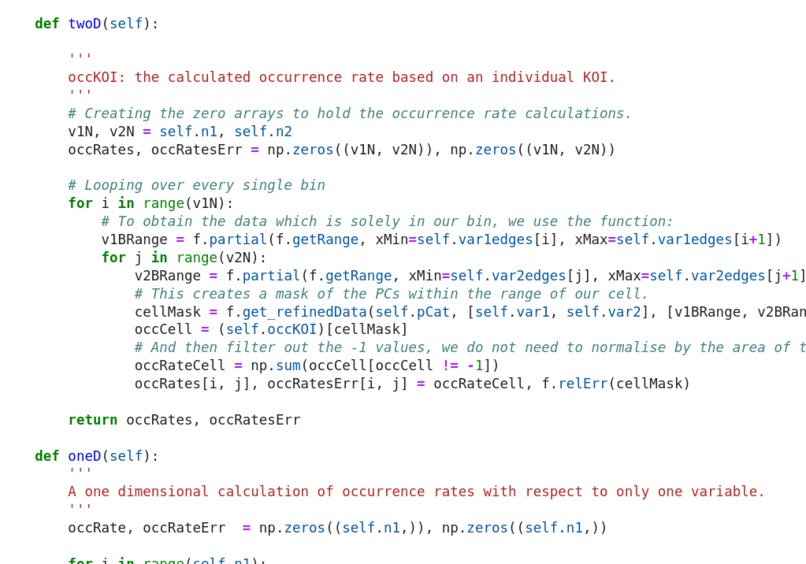
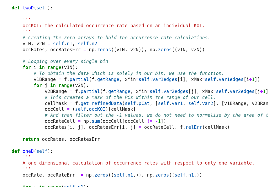
With a planet catalogue and a catalogue of stars, we calculate the occurrence rate of planets based on their orbital period, radius and the amount of energy they proportionally receive from their host star. Our calculations are based in Python, and our goal is to then export it to D3 for an interactive experience!
An optional functionality is about being able to select which stellar types occurrence rate is calculated around, as well as visualise the stellar sample that is being used. The great achievement is that our occurrence rates can be calculated in three lines of code! Our planet and stellar catalogues are objects in Python which allows for customisation of both samples! Check out the github repo for the full code and the data.
Challenges we ran into
Visualisation was trickier than we thought! We also wanted an additional plot of one-dimensional occurrence rate with respect to each variable. Even though our code does work in one-dimensional, we wanted to fit the broken power law to the distribution rather than the power law, and the math didn't math.
What's next for Occurring in 3D
We'd love to better visualise this information in D3 with an interactive heat map and a way to select which PCs we want to include in our calculation. We'd also hope to add in the one-dimensional plot for occurrence.

Log in or sign up for Devpost to join the conversation.