-
-
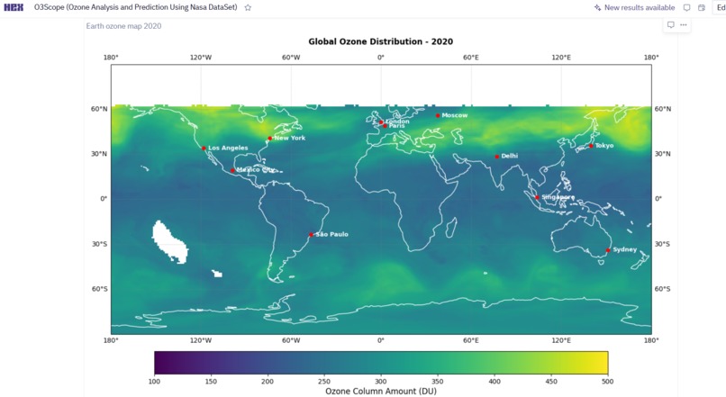
Global Ozone Visualization
-
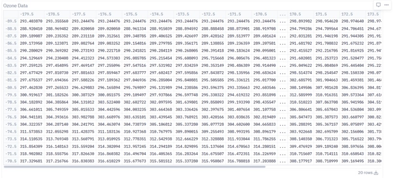
Data Analysis
-
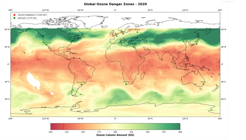
Ozone Depletion Analysis and Visualization
-
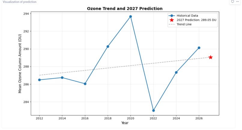
Future Ozone Prediction
-
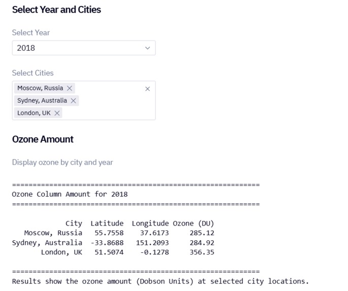
Interactive Part of Project
Inspiration
The depletion of the ozone layer is one of the most pressing environmental challenges, affecting UV radiation exposure, human health, and ecosystems.
I was inspired by the idea of making satellite data tangible, turning complex NASA ozone measurements into interactive insights that anyone can explore, from global trends to city-level risks.
What I Built
I created a Hex-powered interactive app that allows users to:
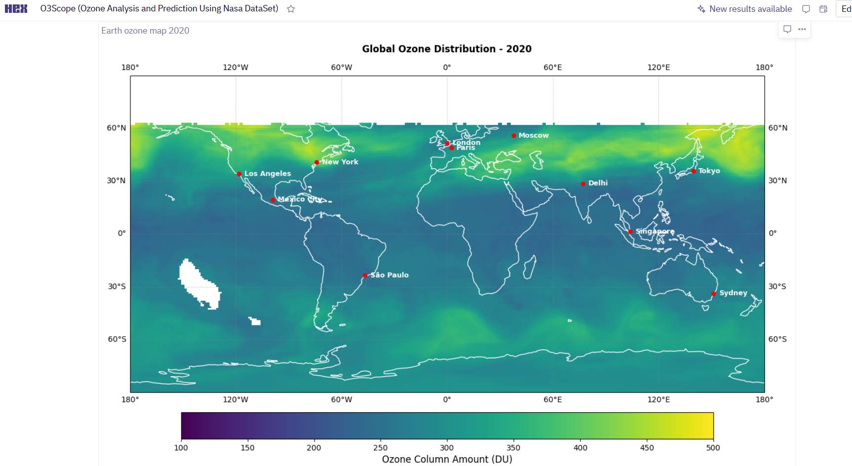
- Explore global ozone distribution on a world map.
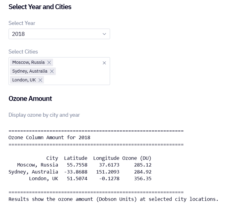
- Select specific years (2012–2026) and cities to see ozone levels in Dobson Units (DU).
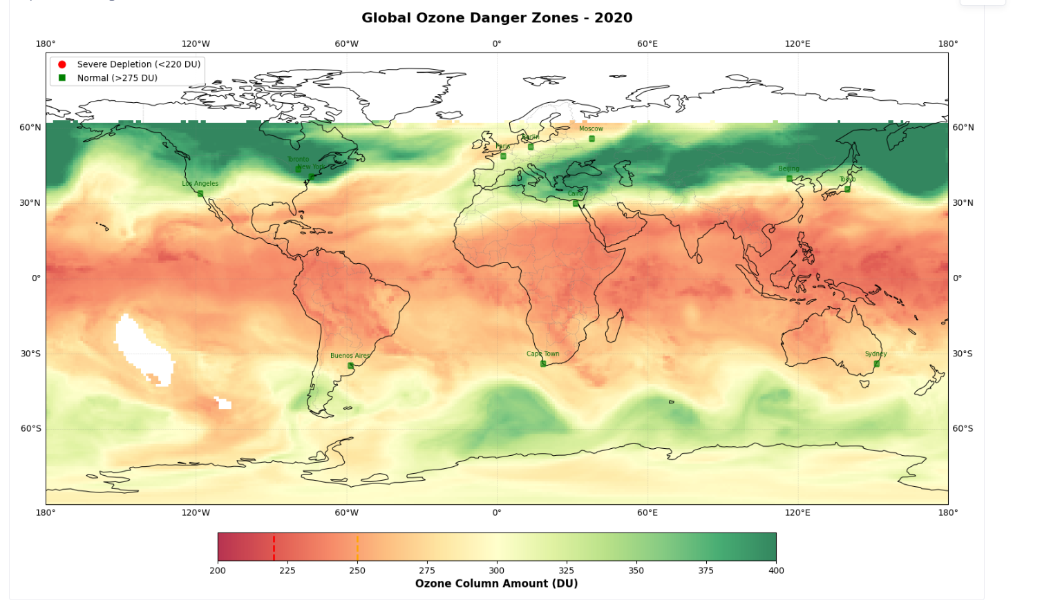
- Classify cities into Normal, Warning, and Severe Depletion zones, providing a human-centric perspective on ozone risk.
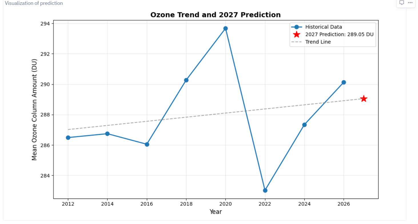
- Analyze historical trends and predict 2027 ozone levels using a simple linear regression model powered by Hex AI.
How I Built It
Data Collection
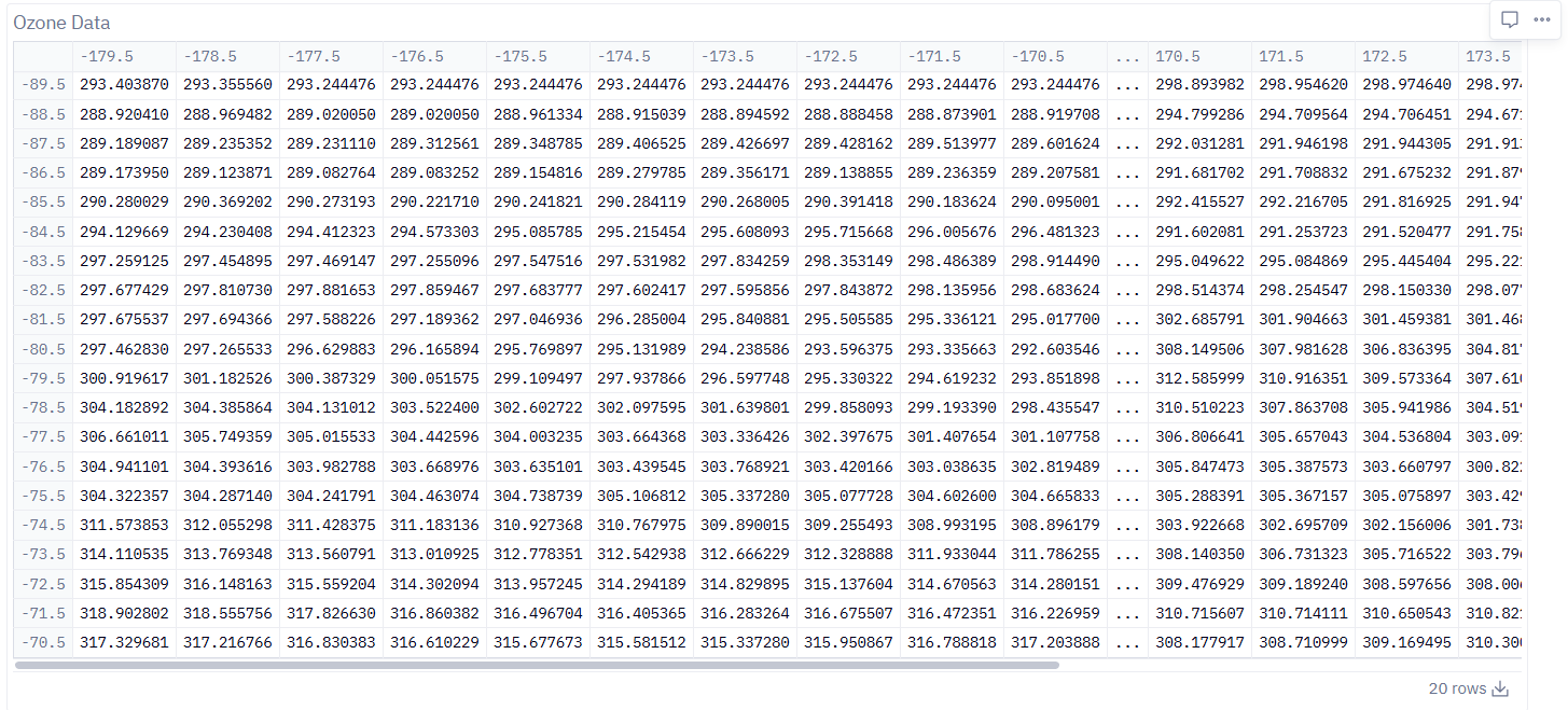
I used NASA OMPS datasets. Each HDF5 file contains latitude, longitude, and ozone column amounts.Data Processing & EDA
- Extracted 2D ozone arrays for each year.
- Calculated global and city-level averages.
- Identified patterns and anomalies over time.
- Extracted 2D ozone arrays for each year.
Visualization
- Used
matplotlibandcartopyto create interactive maps. - Added city markers and color-coded ozone levels.
- Used
Prediction
- Trained a Linear Regression model on historical yearly averages to predict 2027 ozone:
- Trained a Linear Regression model on historical yearly averages to predict 2027 ozone:
$$ \hat{Ozone}_{2027} = \beta_0 + \beta_1 \times Year $$
- Displayed trend lines and predicted values directly in the app.
- App Interactivity
- Created Hex dropdowns and checkboxes for selecting cities and years.
- Made outputs dynamic, showing maps, tables, and textual insights.
- Created Hex dropdowns and checkboxes for selecting cities and years.
Challenges Faced
- Data size and format: HDF5 files required careful handling to extract meaningful 2D arrays and align them with latitude-longitude grids.
- Visual clarity: Displaying global ozone data in a readable way while highlighting city-level information took several iterations.
- Prediction limitations: With limited data points, predictions needed to be accompanied by clear explanations of uncertainty.
What I Learned
- How to handle, clean and analyze complex datasets like NASA OMPS.
- How to work with HDF5 satellite datasets and extract meaningful information.
- How to map gridded geospatial data to cities using latitude-longitude coordinates.
- How to build interactive Hex apps for real-world scientific storytelling.
- The importance of communicating uncertainty and real-world implications in predictive modeling.
Reflection
This project reinforced that by combining visualization, interactivity, and prediction, users can explore ozone trends in a way that is both educational and actionable.

Log in or sign up for Devpost to join the conversation.