Inspiration
Every year New Yorkers call 311 to report rats, and every year city inspectors write up restaurants for the same problem. Both records are public. Nobody had put them next to each other and asked whether they agree. We didn't want to build another map of where rats get reported, we wanted to know whether the city's response actually lines up with where the problem is, or whether it's really just measuring who calls.
What it does
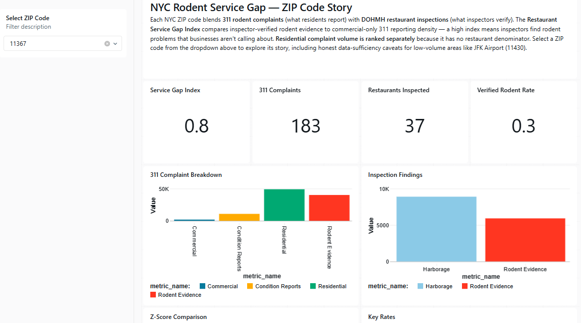
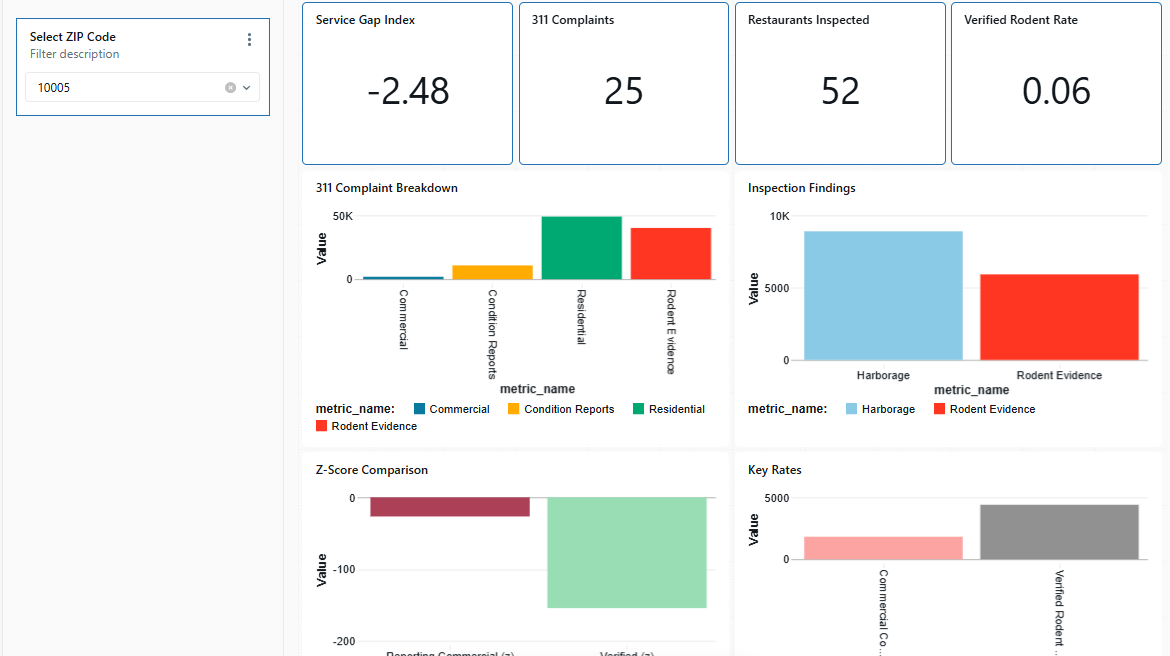
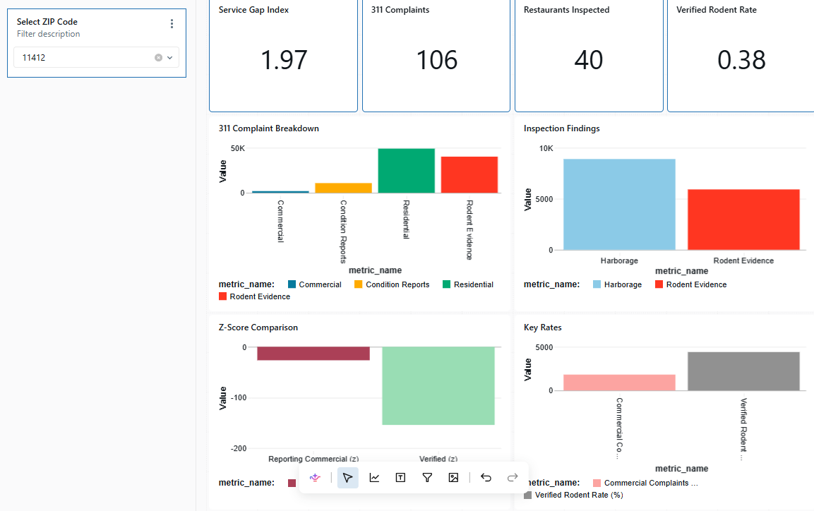
We built a Service Gap Index for every NYC ZIP code from two independent signals: resident-reported 311 rodent complaints and inspector-verified restaurant violations. A dashboard lets anyone type in a ZIP and get an honest, data-backed answer including ZIPs with almost no restaurants or residents, like JFK, where the dashboard says plainly that there isn't enough data rather than faking a score. A Genie space lets you ask the same questions in plain English and get answers pulled straight from the cleaned tables, not the raw ones.
How we built it
Everything runs in Databricks. We ingested the two raw CSVs, cleaned them for nulls, duplicates, and bad ZIP codes, then built a silver layer that classifies every 311 complaint as either rodent evidence (a sighting) or a condition report (garbage/harborage, no rodent seen), and every restaurant violation by its actual code (04K/04L for verified rodent evidence, 08A for harborage conditions). An index table called zip_service_gap table joins both sides on a normalized 5-digit ZIP, computes z-scores across ZIPs with enough data to be trustworthy, and flags thin or empty ZIPs instead of scoring them. On top of that we built a Lakeview dashboard with a ZIP filter driving KPI cards, a complaint-mix breakdown, and a citywide comparison scatter that highlights the selected ZIP against every other one plus a Genie AI/BI space seeded with example questions and written rules for restaurant counts so it answers correctly instead of guessing.
Challenges we ran into
Before we could analyze the data, we had to figure out what we could actually trust: zipcode was a float with nulls and dozens of rows secretly from New Jersey; grade was 49% null; boro had rows that were just the string "0". But the real challenge was one we almost missed. Our first version of the index divided 311 complaints by restaurant count to measure "reporting intensity" and it was backwards. Three diagnostic queries showed that ~70% of 311 rodent complaints are about apartment buildings, not restaurants, and restaurant count is essentially uncorrelated with complaint volume. Dividing an unrelated denominator into the numerator inverted our ranking: the neighborhoods with the most rodent complaints in the city were being labeled "over-reporters," and quieter ZIPs were flagged as hidden service gaps. We rebuilt the metric from scratch as two honest, separately-scoped scores instead of forcing one composite number across two different populations.
Accomplishments that we're proud of
Going in none of us had experience with Databricks. By the end we'd worked through the whole platform end to end: ingesting raw CSVs into Delta tables, writing the SQL to profile and clean them, building a layered table architecture (raw data → clean data → index table), using a Genie space and teaching it to reason over our schema instead of guessing, and wiring a Lakeview dashboard with a live ZIP filter. Each block taught us something the last one didn't: Block One forced us to actually interrogate the raw data instead of assuming it was ready. Block Two's rule against touching the dashboard until the tables were clean and described turned out to be the single most important constraint in the whole project; writing a description for every column before building anything visual is what let a tool like Genie answer correctly instead of confidently guessing wrong. And Block Three brought the project together by turning our analysis into an interactive experience, with a Genie space, a working dashboard ZIP code filter, and testing to make sure the dashboard handled different levels of available data appropriately.
What we learned
We went in not knowing Databricks at all, and came out having built a real project on it end to end — uploading data, cleaning it, joining tables, building an AI agent, and wiring up a live dashboard. Along the way we learned that a number can look like an insight and still be exactly backwards if you're comparing two things that don't actually match up and the fix wasn't a fancier formula, just separating the two things we'd mixed together. We also learned that 311 complaints show who calls the city, not necessarily where the problem is. And we learned that when you're working with an AI tool like Genie, how well you describe your own data is basically what teaches it to answer correctly, the descriptions aren't just notes for us, they're what the AI actually reads to figure things out.
What's next
Extending the same evidence-vs-report framework to other 311 categories — heat/hot water, sanitation, noise — where the same reporting-bias problem almost certainly exists. Adding a time dimension to catch seasonal patterns instead of one flat window.
Built With
- databricks
- sql


Log in or sign up for Devpost to join the conversation.