-
-
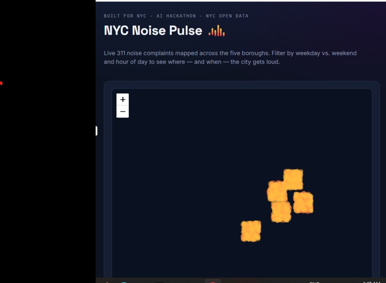
Live Map
Inspiration
NYC 311 receives hundreds of thousands of noise complaints every year, but that data mostly disappears into a database — it's not something a resident, a landlord, or a city planner can actually see. I wanted to take one of NYC's most-used but least-visualized datasets and turn it into something anyone could glance at and immediately understand: where the city gets loud, and when.
What it does
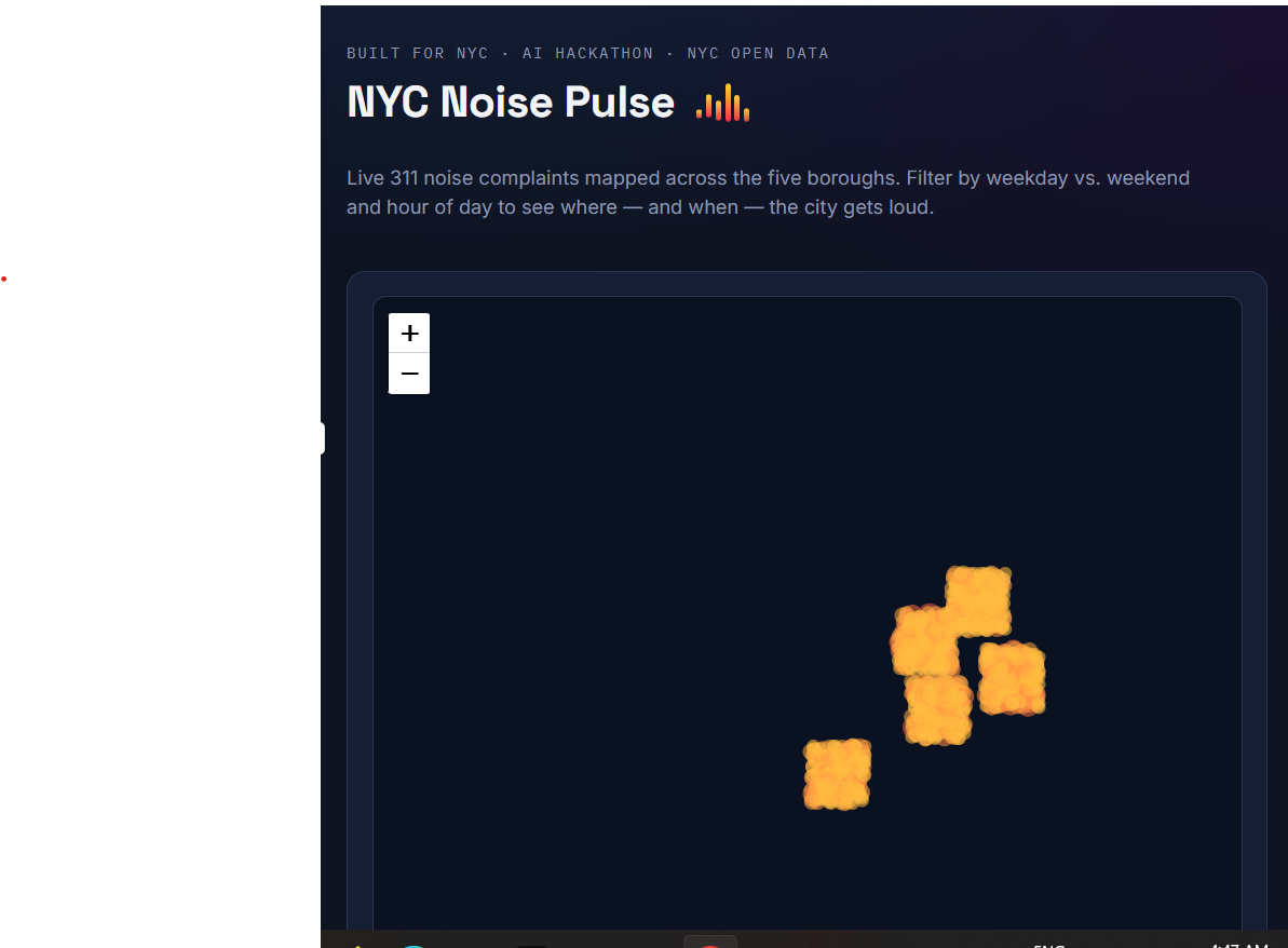
NYC Noise Pulse is a live map that visualizes NYC 311 noise complaints as a density map across the five boroughs. Users can:
- Filter complaints by hour of day (0–23) to see how noise patterns shift from daytime to late night
- Toggle between weekdays and weekends to compare patterns (e.g. weekend nightlife noise vs. weekday residential noise)
- View a live stats panel showing total complaints, peak complaint hour, the three loudest boroughs, and the three loudest neighborhoods
- See density rendered as color-coded clusters — yellow (fewer complaints) fading to red (more complaints)
How I built it
The app is a single-page, dependency-light web app built with:
- Leaflet.js for the interactive map, with a custom grid-aggregation layer (no external heatmap plugin) so complaint points are bucketed into cells and colored/sized by density
- NYC Open Data's 311 Service Requests API (Socrata), queried live for noise-related complaints from the last 90 days
- Vanilla JavaScript for filtering, aggregation, and stats calculation — no framework, kept intentionally lightweight
- A hand-built ZIP-to-neighborhood lookup table to translate raw 311 ZIP codes into recognizable NYC neighborhood names (e.g. "Bushwick," "Astoria") for the stats panel
- AI-assisted "vibe coding" throughout — I used AI to scaffold the map logic, the grid-density aggregation, and the responsive layout, then iterated on top of that base myself
Challenges I ran into
- API reliability on public wifi — Socrata's public API isn't guaranteed to be reachable from every network, so I built a fallback: if the live fetch fails, the app generates a realistic synthetic dataset instead of showing a blank map. This meant designing two data paths that had to produce the same shape of data.
- Turning ZIP codes into neighborhoods — NYC 311 data reports ZIP codes, not neighborhood names, and there's no single official ZIP-to-neighborhood mapping. I built a manually curated lookup covering the most common NYC ZIPs, which works well but isn't exhaustive — a good example of scoping a feature to fit the time available.
- Keeping it usable on mobile — since judging happens in person, I made sure controls, sliders, and the map itself resize and remain tappable on a phone screen, not just a laptop.
Accomplishments that I'm proud of
Building something that pulls live government data, not a static demo dataset, and turns it into an interactive, genuinely useful tool in a single sitting — while keeping the whole thing dependency-light enough to run as one HTML file with no build step or server.
What I learned
How to work with the Socrata Open Data API (used by NYC Open Data and many other city/government portals), how to build a lightweight custom density visualization without relying on heavier mapping libraries, and how to design a data pipeline that gracefully degrades when a live API isn't available — which turned out to be just as important as the visualization itself.
What's next
- Expand the ZIP-to-neighborhood table to full NYC coverage
- Add other 311 complaint types (heat, sanitation, illegal parking) as toggleable overlays
- Let users click a neighborhood to see a time-series trend instead of just a single-day snapshot
- Explore correlating noise complaint density with other open datasets (e.g. nightlife permits, transit density) to explain why certain areas spike
Built With
- 311-data
- css3
- data-visualization
- generative-ai
- html5
- javascript
- leaflet.js
- nyc-open-data
- open-data
- socrata-api
- vibe-coding

Log in or sign up for Devpost to join the conversation.