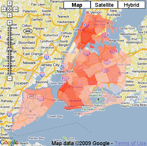
Users can compare results from the Community Health Survey with demographic information from the 2000 US Census on a map. Data is shown as a thematic map (coloured polygons), using Google Maps as a base.
Users can switch very quickly between different health layers (like "percent of the population who currently smokes") and demographic information (like "median income").

Log in or sign up for Devpost to join the conversation.