-
-

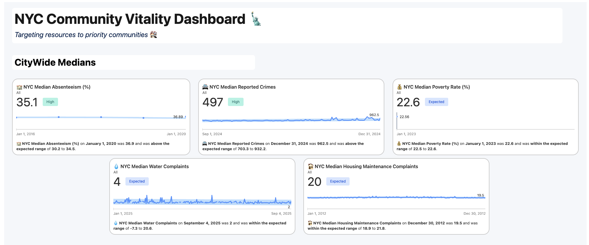
CityWide Medians View
-
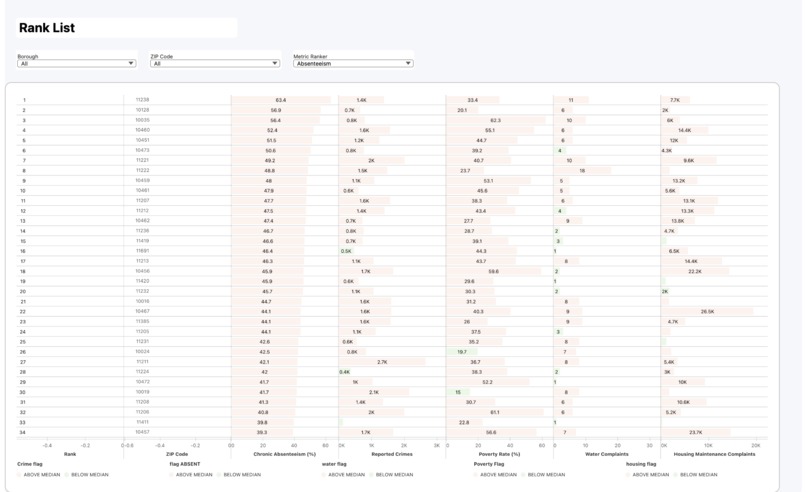
Rank List View

Inspiration
New York City publishes extensive public data, from absenteeism reports and crime statistics to poverty rates, housing complaints, and water issues. The problem is that this data is fragmented and hard to compare. Without a unified view, policymakers and community leaders often make decisions without knowing which neighborhoods are most in need. I was inspired to solve this by building the NYC Community Vitality Dashboard, a tool that translates scattered datasets into a clear priority list.
What it does
The dashboard benchmarks each NYC ZIP code against citywide medians across five key metrics: absenteeism, crime, poverty, housing complaints, and water complaints. Instead of just showing raw numbers, it produces a priority ranking list that highlights the ZIP codes most in need of funding and resources. I also integrated Agentforce, which allows users to ask natural language questions of the data, making it easy to explore insights conversationally.
How we built it
I created the dashboard using Tableau Next starting with a semantic model to unify datasets across schools, crime, poverty, housing, and water. I then created calculated fields for medians, and ranks to ensure different metrics could be compared fairly. The dashboard design emphasizes clarity: dynamic ranking lists, and easy-to-read indicators. Finally, I integrated Agentforce on top of this structure, enabling conversational analytics and plain-language exploration of the rankings.
Challenges we ran into
One major challenge was mapping DOE absenteeism data, since it was only reported at the school (DBN) level. To make it usable at the ZIP level, I built a custom DBN-to-ZIP mapper that aggregated results by neighborhood. I also had to handle messy file formats, including columns with spaces that caused upload errors. The crime data presented another obstacle: Tableau Next has strict file size limits, so I had to split the 2025 dataset into multiple tables and then union them back together. Unlike regular Tableau, this wasn’t a manual drag-and-drop — I had to explicitly specify identical columns across the files to get the union to work properly. Beyond that, I needed preprocessing to unify data types and align all metrics at the ZIP level. Building the ranking system required replacing Tableau’s built-in RANK() with a parameter-driven INDEX() approach to make the priority list update dynamically. Finally, I made sure to incorporate historical data so that the medians reflected long-term trends rather than one-off snapshots.
Accomplishments that we're proud of
Built a semantic model to unify multiple datasets, which can be reused as a foundation for other dashboards and analyses.
Became comfortable with Tableau Next’s format and interface, learning how to design effective ranking views.
Went beyond the provided sources by identifying and integrating additional datasets, strengthening the overall analysis.
Added an Agentforce conversational layer, making the dashboard more accessible through natural language queries.
What we learned
How to build and apply a semantic model across datasets, which can be extended into other dashboards.
The importance of designing priority ranking views that are intuitive for end users.
How Agentforce can make analytics more inclusive by enabling natural language interaction with data.
That some advanced views (like geospatial mapping) aren’t always available in Tableau Next, which pushed me to think creatively about integrations.
What's next for NYC Community Vitality Dashboard
Next, I plan to implement a composite score that combines all five indicators into a 1–10 index to provide a clearer measure of neighborhood priority. I also want to add alternative views such as time series and trend comparisons, and extend the semantic model into geo tools so ZIP codes can be visualized on an interactive map. Beyond visualization, I see opportunities to integrate Slack for real-time alerts when a ZIP exceeds median thresholds and to expand Agentforce capabilities with proactive insights and more complex query handling. Finally, I aim to scale the framework beyond NYC, turning it into a reusable model for community health and equity analysis in other cities.
Built With
- agentic
- tableau


Log in or sign up for Devpost to join the conversation.