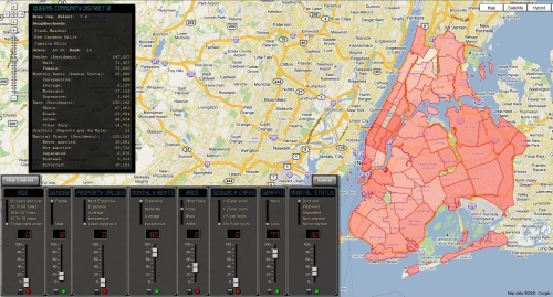
The NYC Community Mixer combines various data sets from the NYC.gov Data Mine and displays them in the form of a heat map of New York City broken down by community districts. Users can combine multiple categories of data to generate the map using a mixer-like control.
Preferences can be selected from several mixer components and the sliders on the components can be set to indicate the importance of the selections. When the Submit button is clicked, the application calculates a score (weighted average) for each community district and displays it as a shade of red on the map. Districts that more closely match the selections will be darkest. Hovering over the community district will display the score, the data used to calculate the score, and the rank of the selected district as compared to the others.

Log in or sign up for Devpost to join the conversation.