-
-
Logo!
-
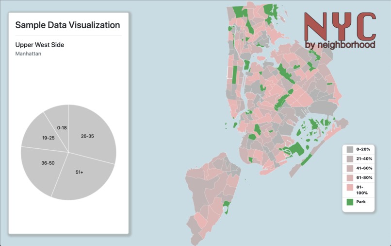
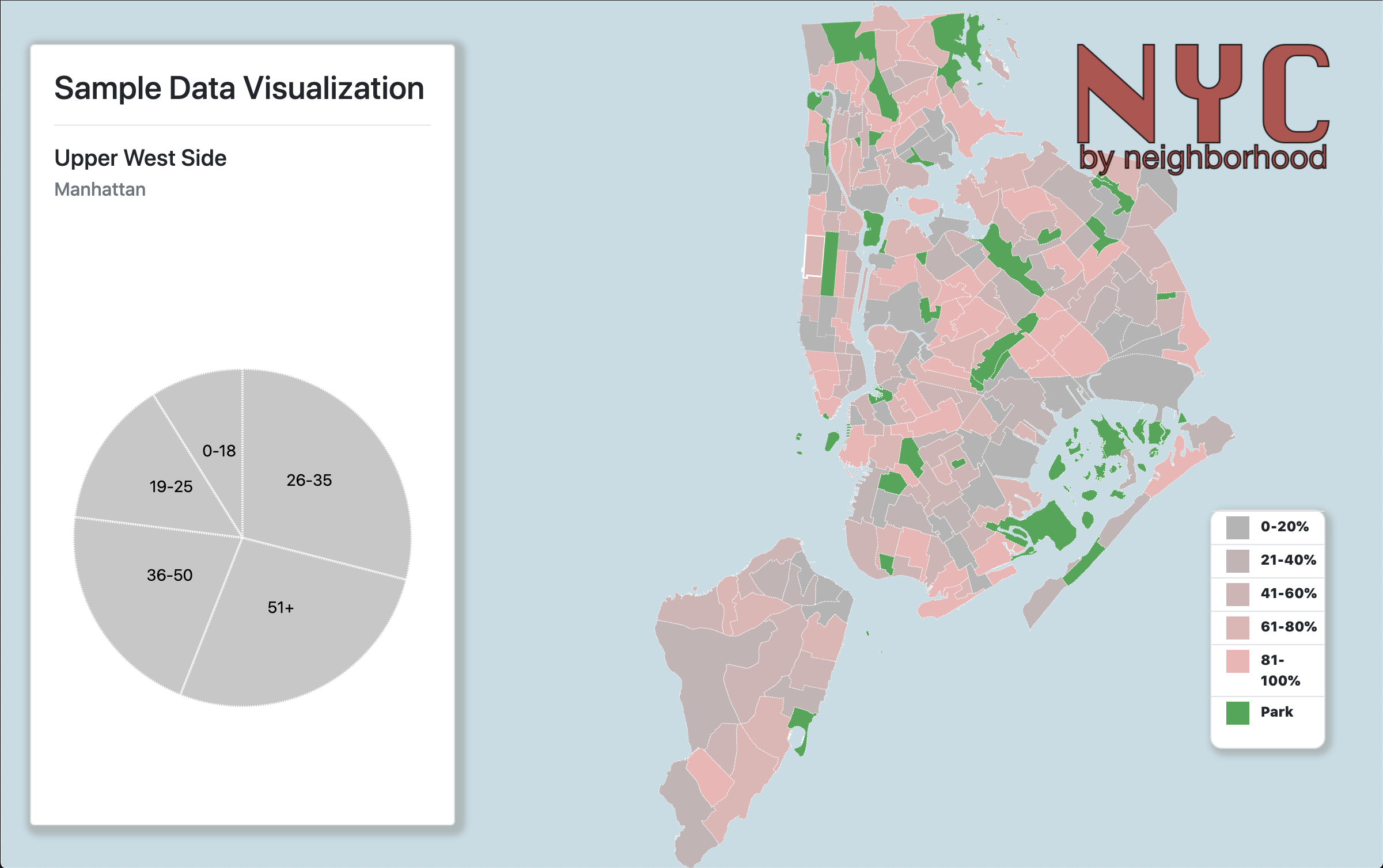
Our application!
Inspiration
During these unprecedented times, we aimed to create a way to visualize data relating to the entirety of New York City and COVID-19. There are many correlations in data that can be found between active COVD-19 cases and data such as alcohol sales, crime rates, and business closures. We hoped to create a way to visualize this data.
What it does
NYC by Neighborhood has the capability of breaking different datasets down by neighborhood, and comparing these datasets against each other on this divided basis. This gives a more intimate understanding of how COVID-19 is affecting New York City, using this smaller scale.
How we built it
We created an SVG using D3 using GeoJSON objects to represent each of the neighborhoods. We then allowed for the possibility of color-coding on the map, as well as additional data representation on the side.
Challenges we ran into
We initially aimed to show different data compared to COVID-19 cases over time in each neighborhood of New York City. We first needed a way to visualize the data on the map, so we began handling that first. We soon realized that this was a bigger task than we had expected, and thus settled for simply setting up a framework to eventually present other data in a visually pleasing way. Additionally, it was hard to find data presented in the same divided areas as our map, and we therefore had to consider creating our own data from other datasets in order to properly fill it. These are our next steps for the future.
Accomplishments that we're proud of
While it was challenging, we obviously were working remotely due to these unprecedented times.
What we learned
We learned a lot about D3, including what it does and how to use it!
What's next for NYC by Neighborhood
Eventually adding in real data!

Log in or sign up for Devpost to join the conversation.