-
-

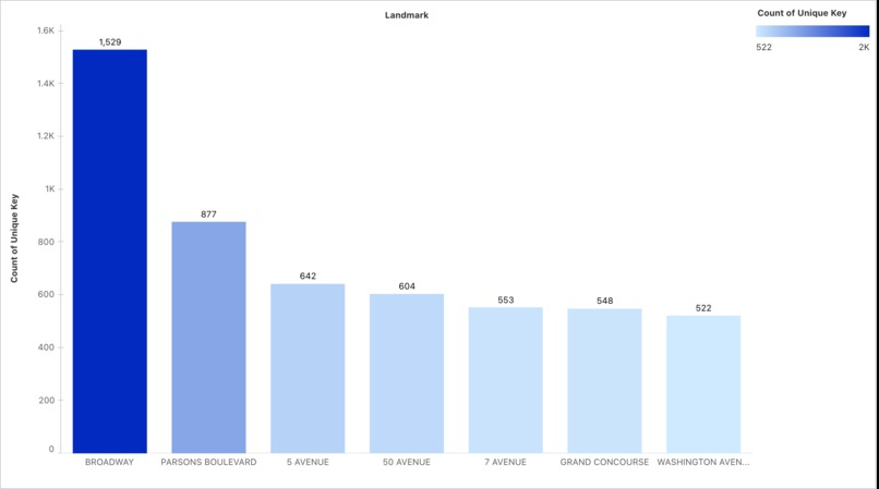
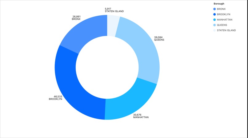
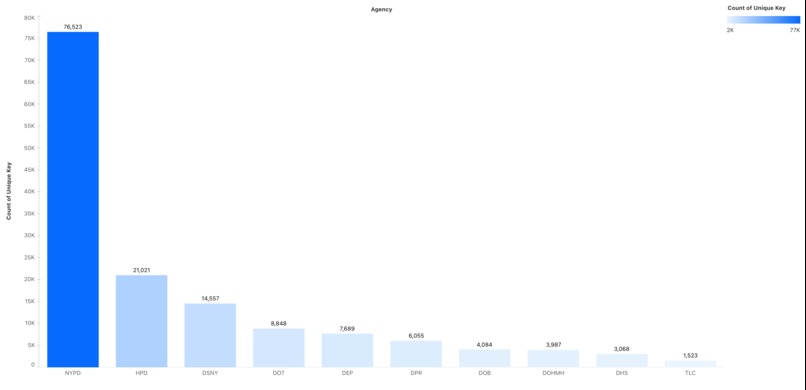
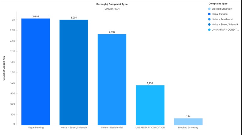
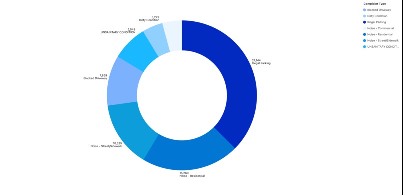
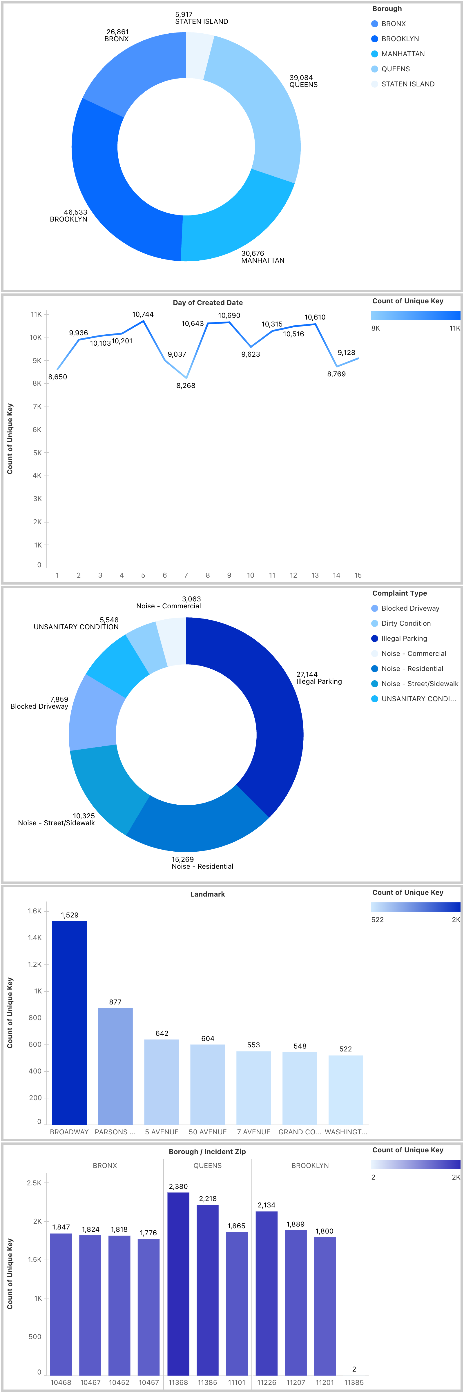
Complaint analysis for 1st - 15th September 2025
-
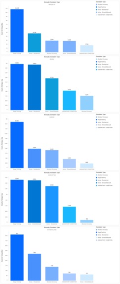
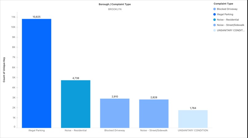
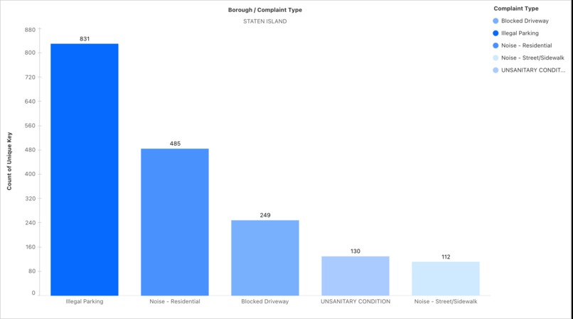
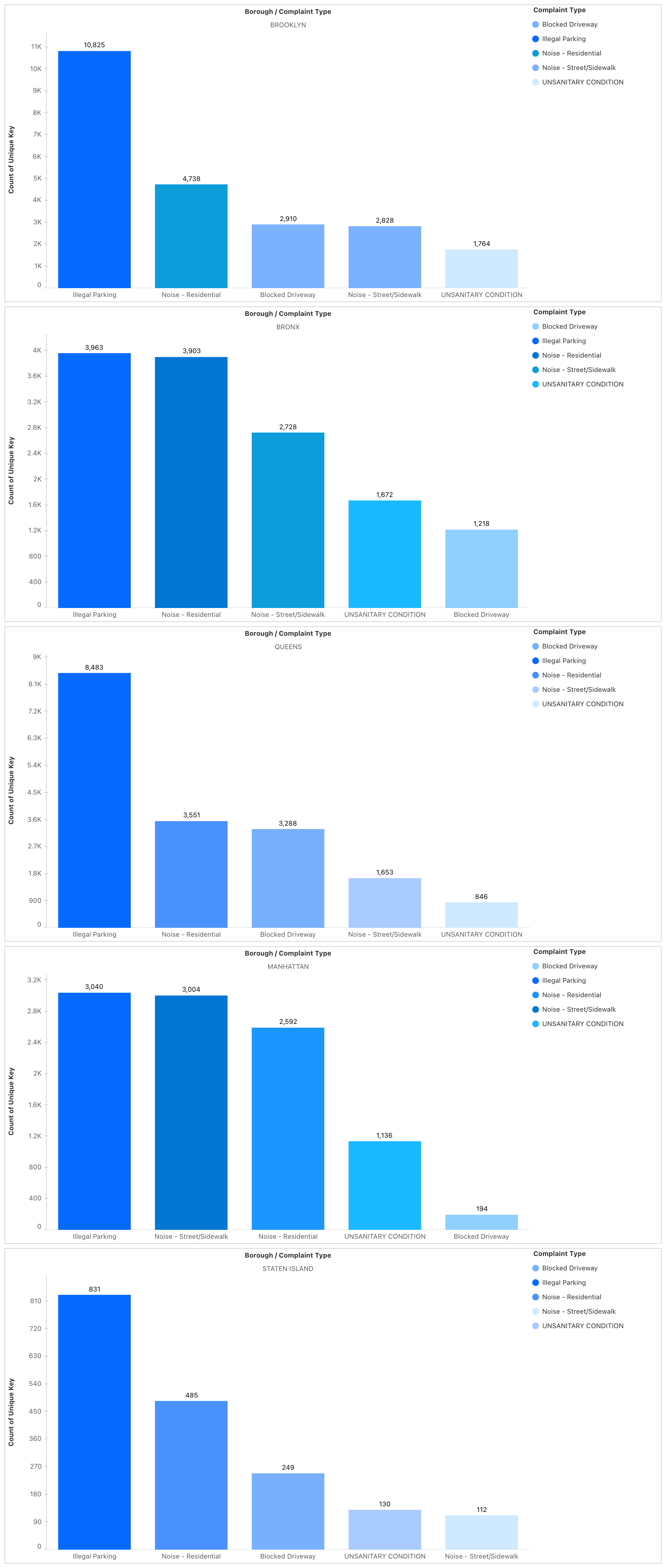
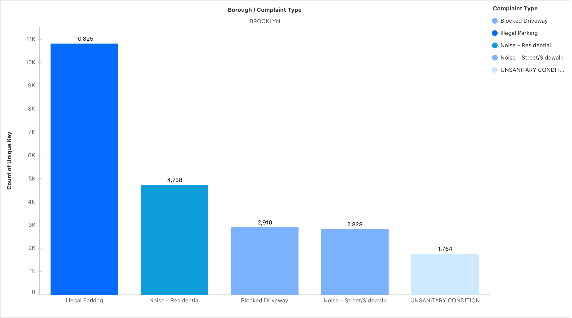
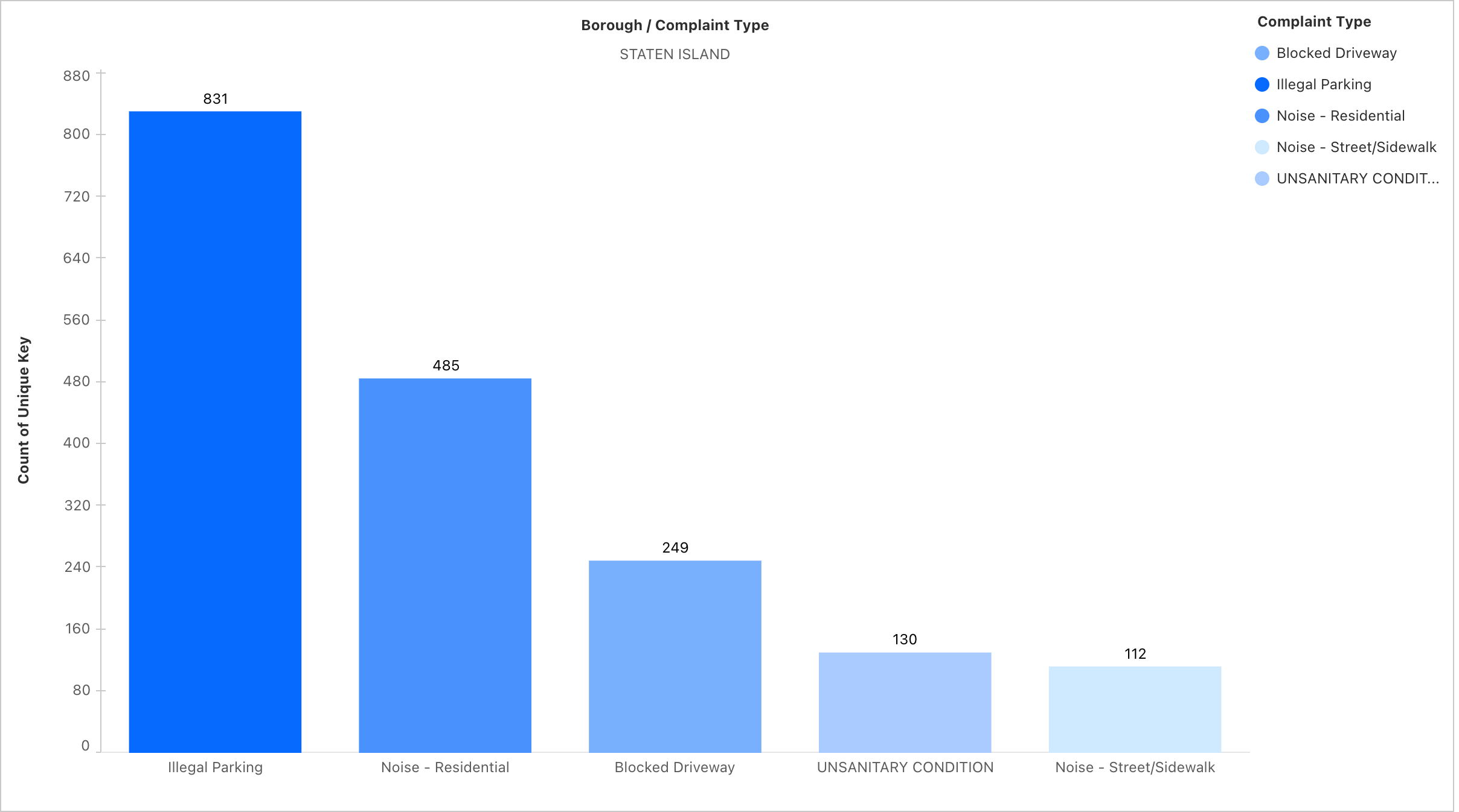
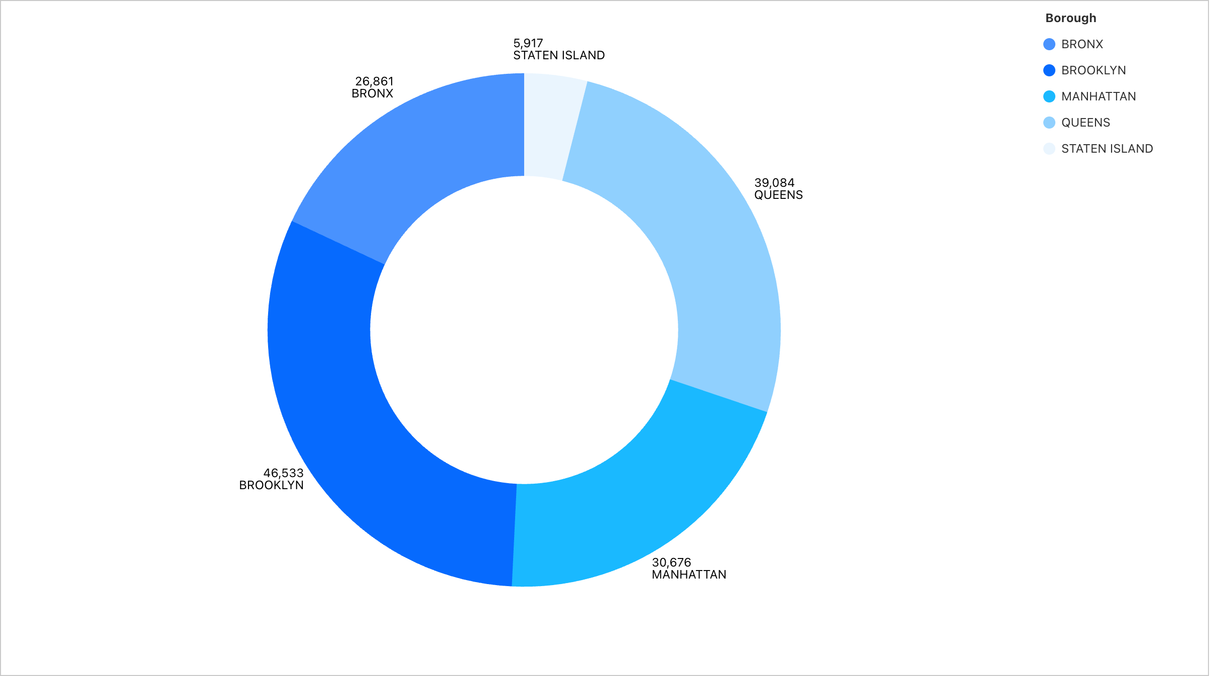
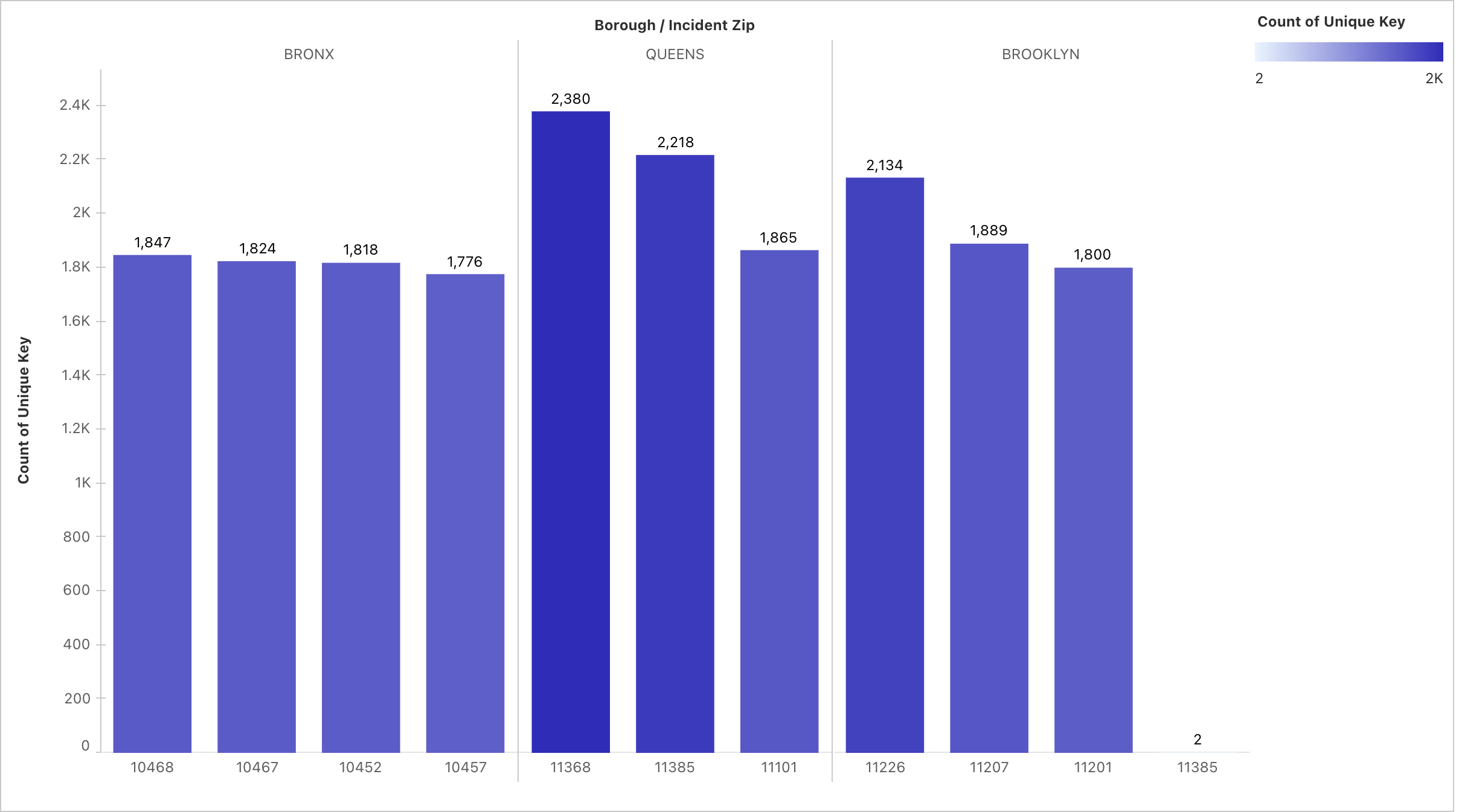
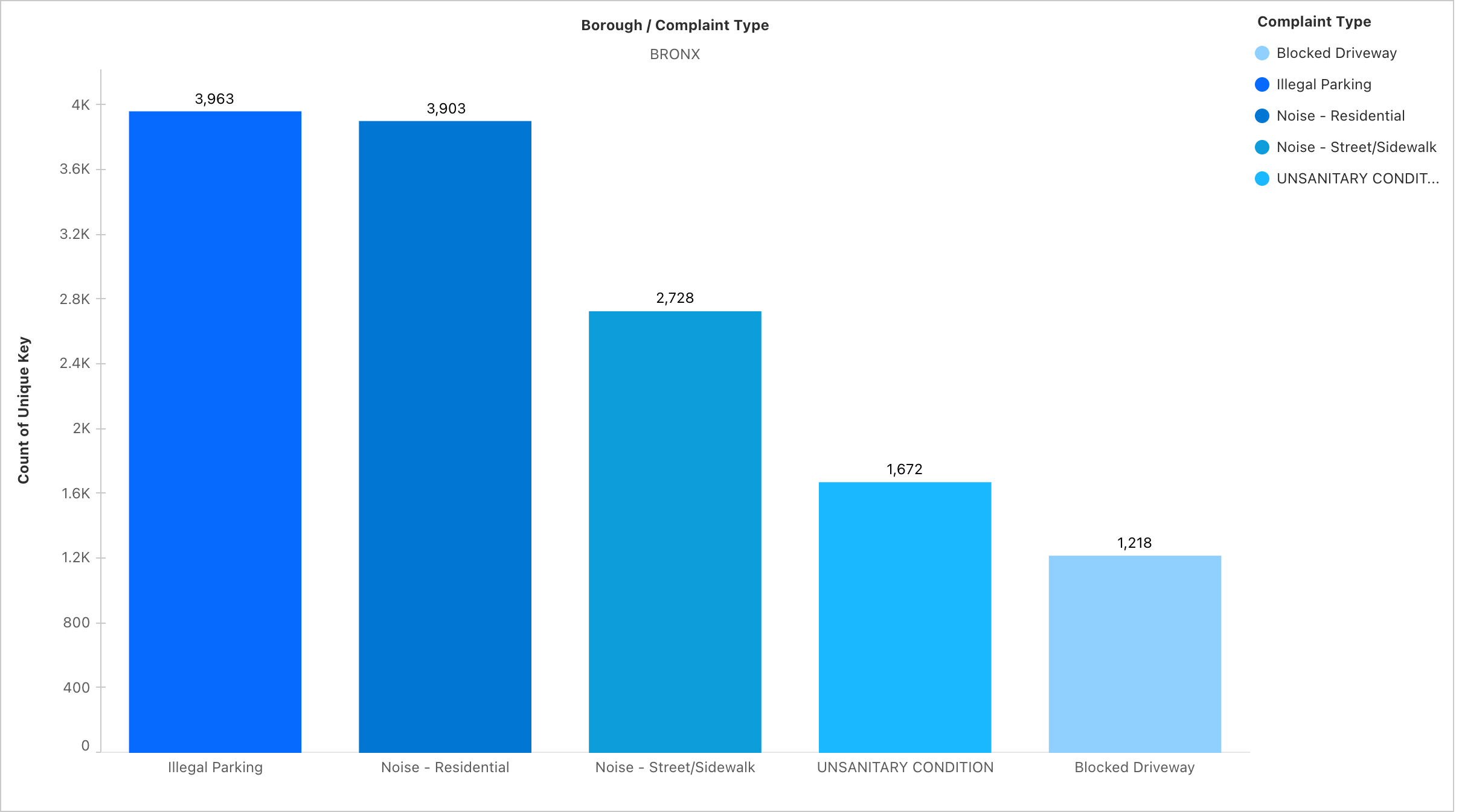
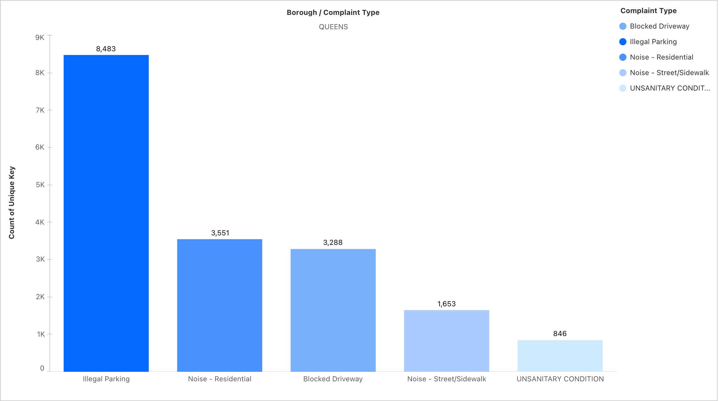
Borough level complaint analysis
-

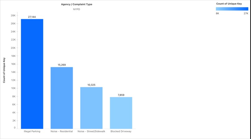
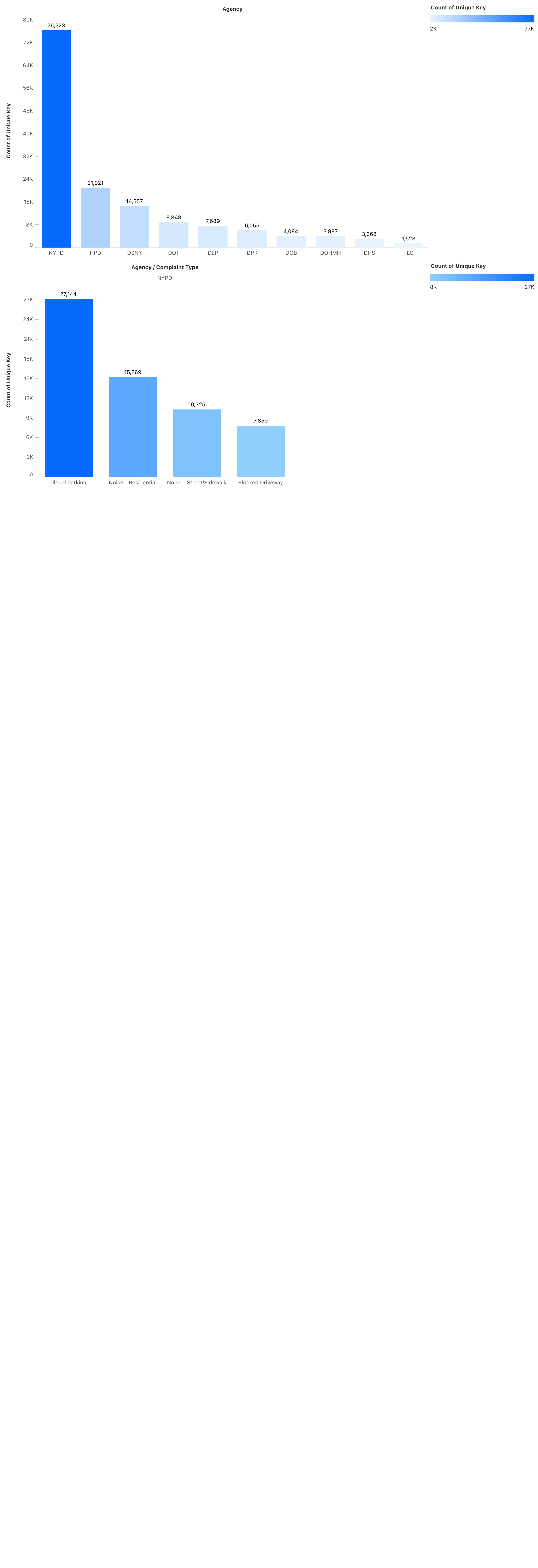
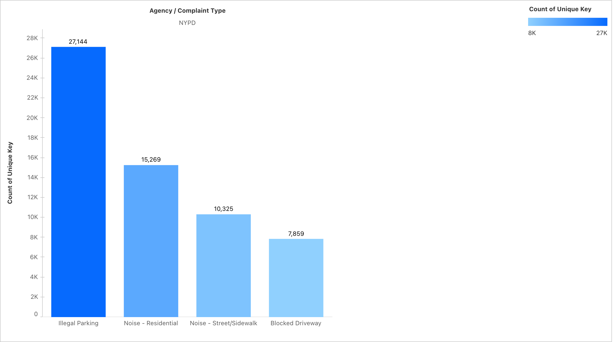
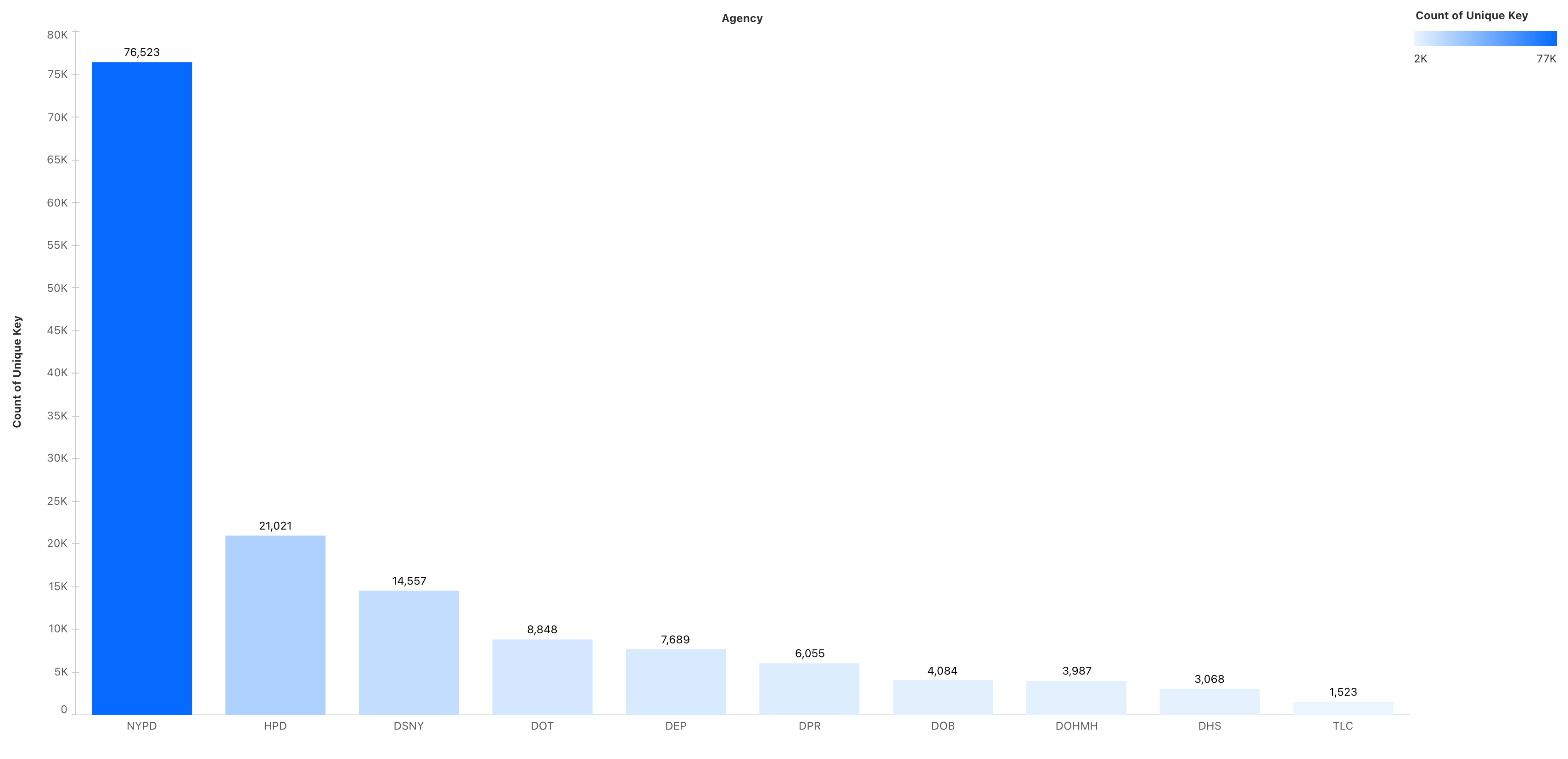
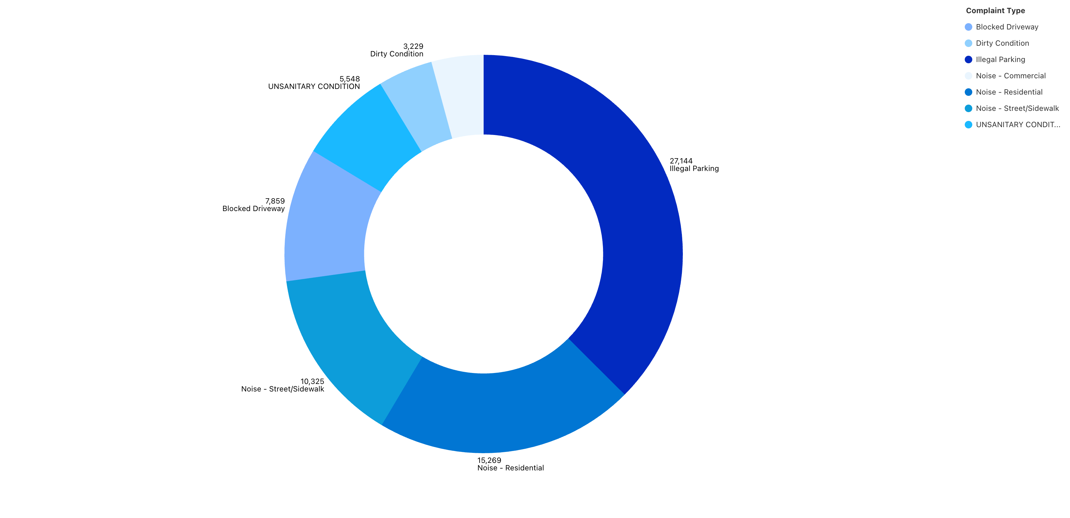
Agency level complaints analysis
-
-
-
-
-
-
-
-
-
-
-
-
Hackathon Project Story: NYC 311 Complaints Analytics
Inspiration
I recently visited New York City and, while exploring, I personally saw many problems in the city — from noise to traffic congestion and sanitation. It made me wonder: how is this considered the best city in the world if daily life issues remain unresolved?
Fortunately, I came across the NYC 311 dataset, which contains complaints filed from 2010 to the present day. This gave me the perfect opportunity to analyze patterns and validate what I experienced firsthand.
Due to a 100 MB limit in Salesforce Data Cloud, I was only able to use 15 days of September 2025 data. Otherwise, I could have covered many more years and explored long-term complaint trends.
How I Built the Project
1. Data Acquisition
- Downloaded the NYC 311 dataset (NYC Open Data Portal) for Sept 1–15, 2025.
- Reduced file size (<100 MB) to comply with Salesforce Data Cloud import limits.
2. Data Upload into Salesforce
- Used the Salesforce Data Import Wizard to upload the dataset.
- Selected a custom object called
NYC_Complaints. - Mapped key fields during import:
Created Date→ DateTimeClosed Date→ DateTimeComplaint Type,Descriptor,Borough,Agency→ TextIncident Zip→ Text (not Number, so leading 0’s aren’t lost)Latitude,Longitude→ NumberResolution Description→ Long Text
- Dropped non-essential columns (e.g., Vehicle Type, Bridge Highway) to keep the dataset clean.
3. Building the Data Model in Salesforce
- Defined a primary unique key (
Unique ID) for each complaint to avoid duplicates. - Created relationships so that records could be queried across dimensions (Borough → Complaint Type → Status).
- Set up metrics in Salesforce Data Cloud:
- Complaint Count =
COUNT(Unique ID) - Status-based metrics (e.g., Open vs Closed complaints).
- Complaint Count =
This created a single-source data model that Tableau Next could easily consume.
4. Connecting to Tableau Next
- Connected the
NYC_Complaintsobject in Salesforce Data Cloud directly to Tableau Next. - Published the dataset as a data source.
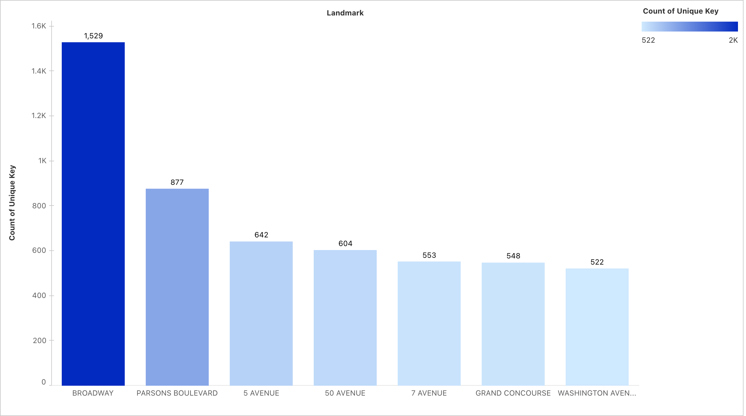
- Built visualizations:
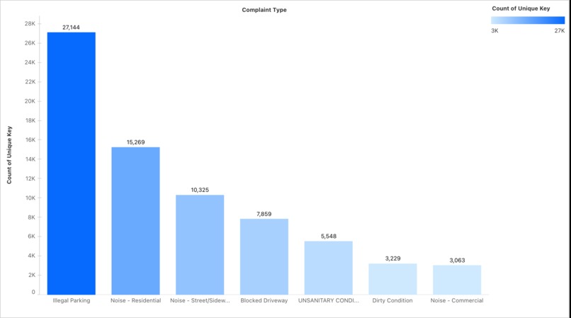
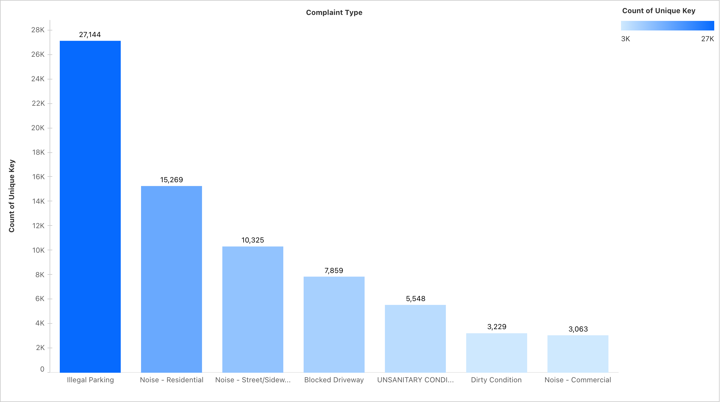
- Top 10 Complaint Types – Horizontal bar chart, sorted descending.
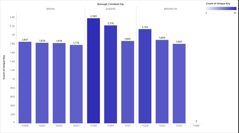
- Complaints by Borough – Distribution snapshot.
- Daily Complaint Trend – Line chart (Sept 1–15).
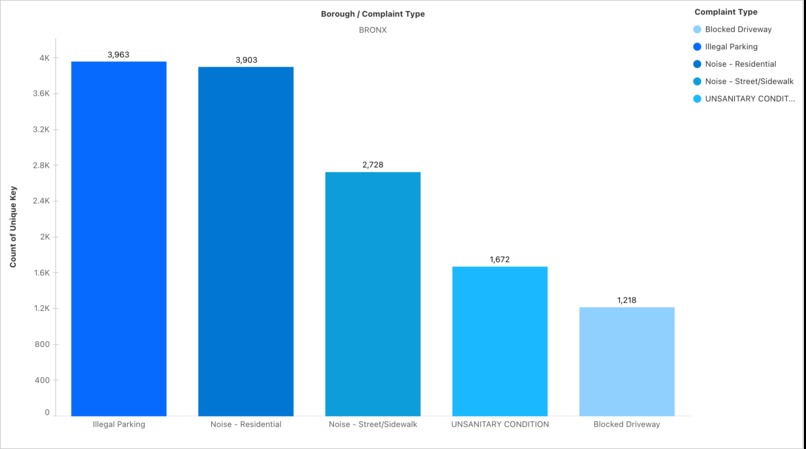
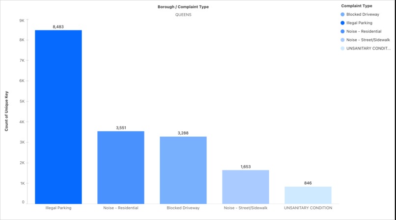
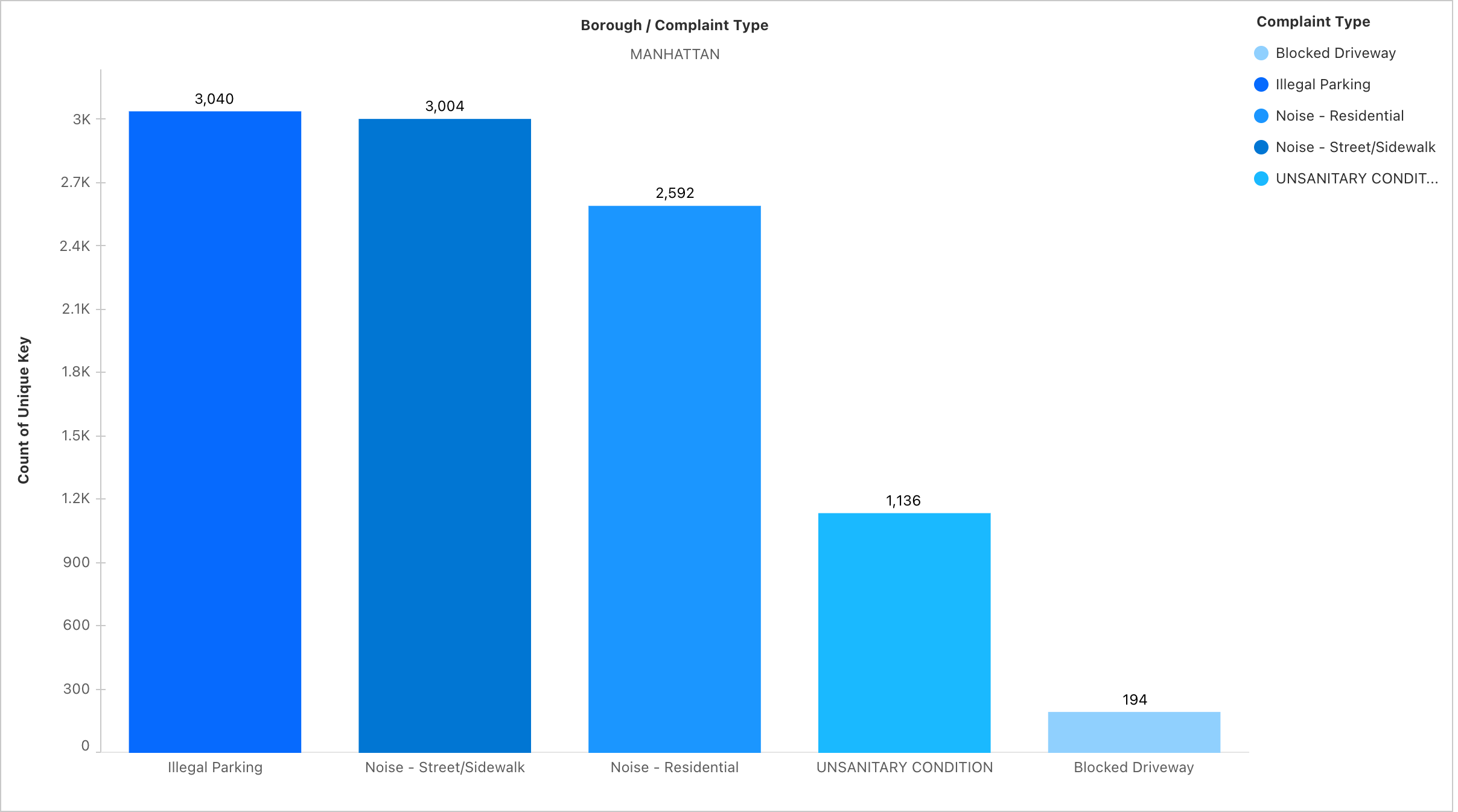
- Borough × Complaint Type Heatmap – Highlights borough-specific issues.
- Agencies vs Complaint Types – Bar chart showing NYPD, HPD, and DOT workload.
- Donut Charts – For borough-level complaint proportions.
- Top 10 Complaint Types – Horizontal bar chart, sorted descending.
Business Value
- Agencies can see which boroughs need urgent attention.
- Policy makers can prioritize resources based on most common complaint categories.
- Citizens gain transparency into what issues dominate their neighborhoods.
Challenges Faced
Data Size Limitation
- The 311 dataset is massive (millions of rows).
- Had to filter down to 15 days to meet Salesforce’s 100 MB limit.
- The 311 dataset is massive (millions of rows).
Tableau Next vs Tableau Desktop
- Tableau Next is quite restrictive compared to Tableau Desktop.
- It took time to learn Salesforce Data Cloud and Tableau Next together, since I’m more used to Tableau Desktop’s flexibility.
- If I had Desktop, I could have built richer visualizations, but this challenge taught me to adapt to constraints and still solve a real business problem.
- Tableau Next is quite restrictive compared to Tableau Desktop.
Field Mapping Restrictions
- Couldn’t create custom fields during import.
- Solved by pre-cleaning the CSV and aligning columns with Salesforce schema.
- Couldn’t create custom fields during import.
Data Cloud Performance
- Initial queries ran slow.
- Improved speed by dropping unused columns and optimizing metrics.
- Initial queries ran slow.
Learning Outcomes
- Learned how to connect open datasets into Salesforce Data Cloud.
- Designed a data model from scratch with metrics and relationships.
- Understood how Tableau Next + Salesforce Data Cloud integration creates a seamless pipeline.
- Appreciated the importance of storytelling with analytics, not just raw dashboards.
Conclusion
This project shows that even a short timeframe dataset can uncover powerful insights about urban life. By combining Salesforce Data Cloud + Tableau Next, I built an analytics pipeline that can help city agencies prioritize resources, respond faster, and improve citizen satisfaction.
Built With
- csv
- data
- model
- nyc-311-online
- salesforce
- sql
- tableau


Log in or sign up for Devpost to join the conversation.