-

NY Traffic Dashboard
-
-
Contributing Factors to Accidents List
-
-

Inspiration
I found inspiration for the Traffic Dashboard from other related projects I saw on Reddit related to dashboards with COVID related statistics.Using the Smart North Florida hackathon rubric, I chose to build a solution that was built on real data. For this, I chose to use the New York Open Data API to find information on vehicle and pedestrian related collisions. With this API, I could build an application that would not only be a theoretical prototype, but would be a service that works with real, current traffic data.
When planning and designing an application around the API, I chose to build a solution that would be targeted toward policy and decision makers. This application is designed to provide important data in a meaningful way so that decision makers with limited resources can prioritize resources and make the roadways safer. By supplying real data in a user friendly way, policy makers would be able to track statistics and visualize if certain changes or legislation successfully makes improves traffic safety. For example, if a design proposal was tested for using roundabouts as opposed to four way stops, the traffic dashboard could be instrumental in proving one safety system over another. If the roundabouts were a successful implementation, leaders would expect to see fewer collisions and injuries due to better traffic control and flow. With the Traffic Dashboard being the middleman supplying information, it can be a service that solves a multitude of problems by providing easy access to information instead of solving one specific problem.
What it does
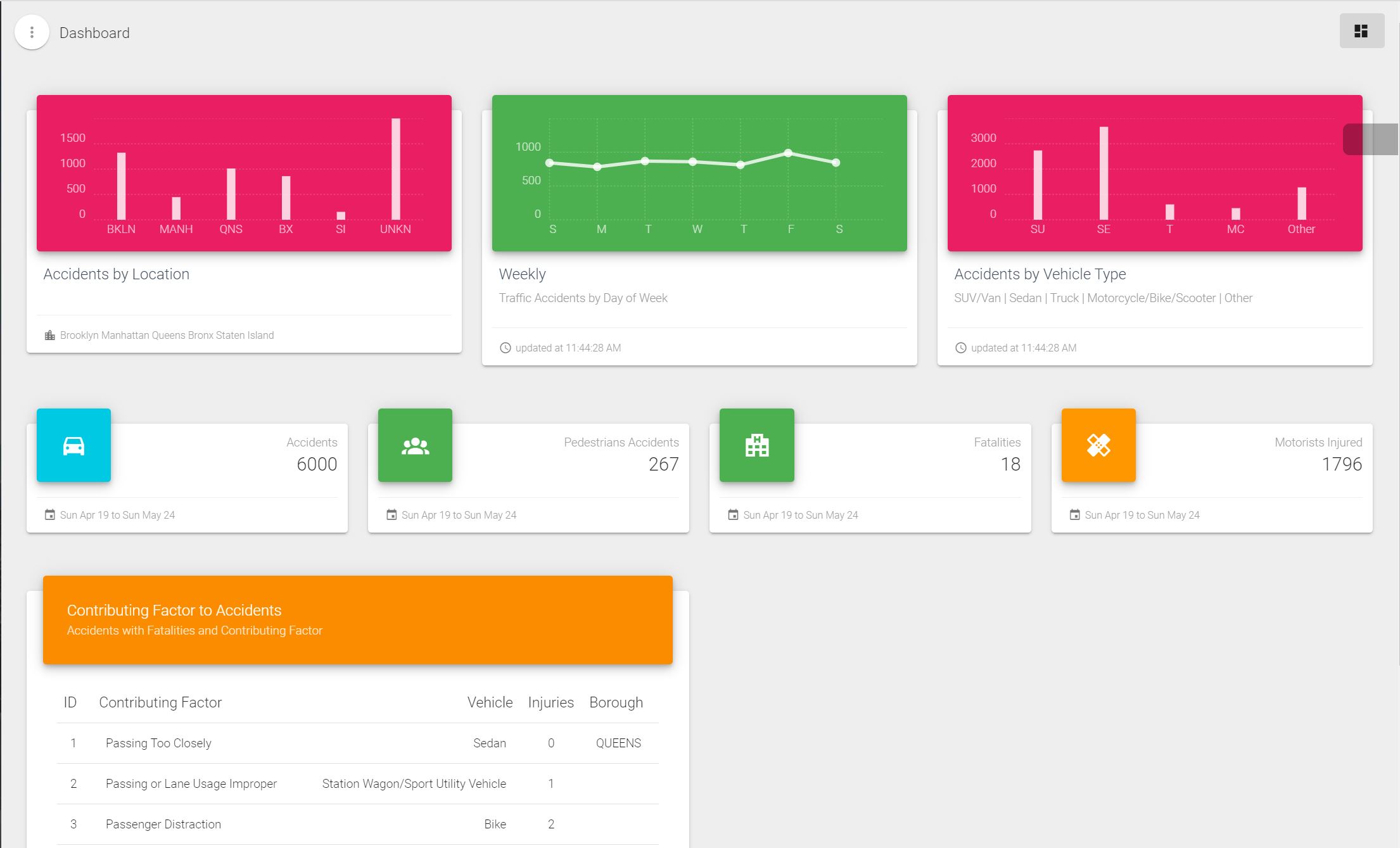
Below we can see the NY Traffic Dashboard with current, real data from the last month from April 19th to May 24th. With the dashboard, a user can see higher risk boroughs that have more accidents. For example, you may notice Manhattan has much fewer collisions that other locations such as Brooklyn. With this information, proper funding and location safety can be prioritized to higher risk areas.

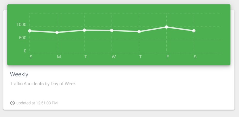
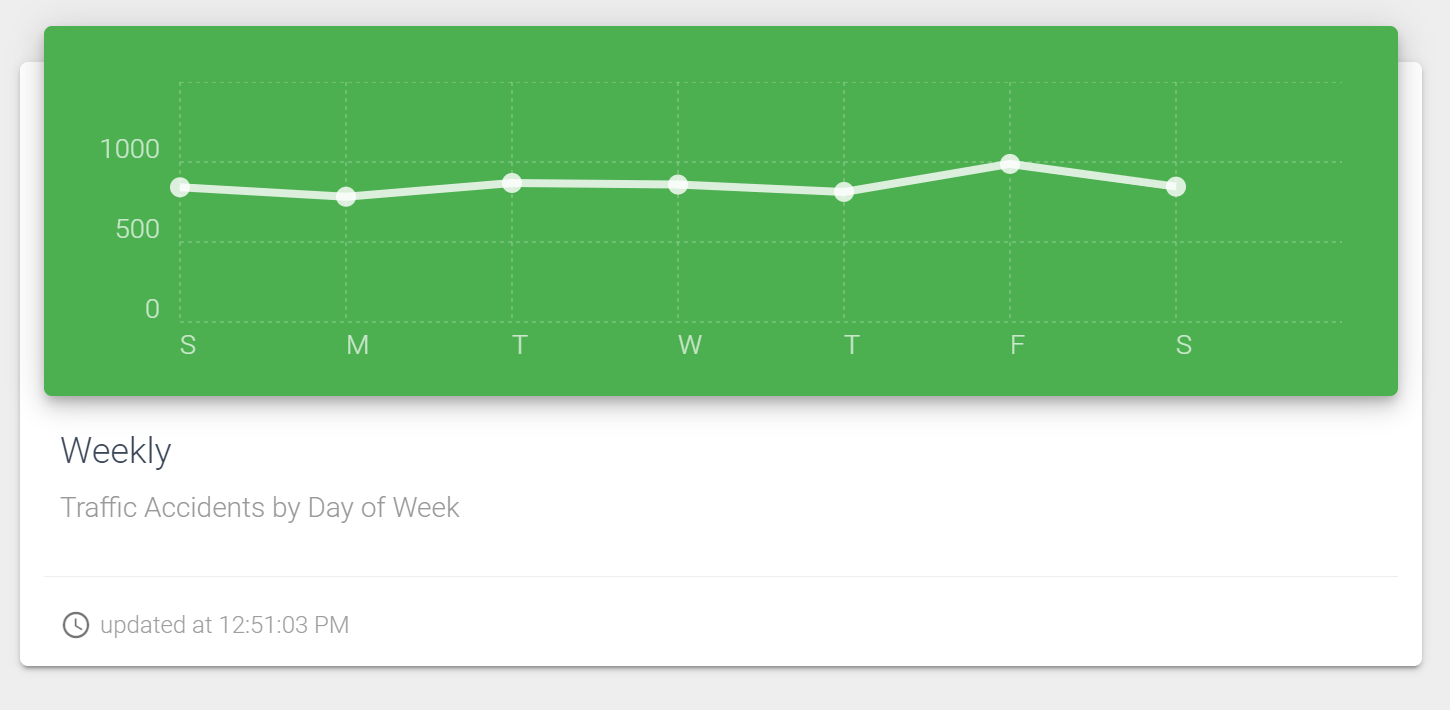
Next there is a bar graph which separates the 6,000 collisions by day of the week. This chart can be used to show or plan for traffic safety processes during certain days. For example, leaders may suggest implementing specific traffic solution over New York specifically for the weekend, since there are considerably more accidents on the weekend.

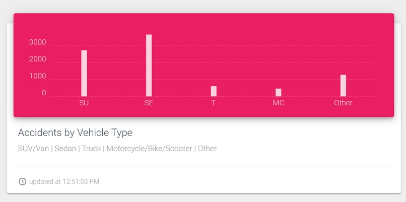
The last bar chart shows the accidents separated by vehicle type. As you can see, the vehicle most involved in accidents are the sedan vehicle type. Other vehicle types shown are Sports Utility Vehicles or Vans, Sedans, Trucks and Motorcycles or Bikes.

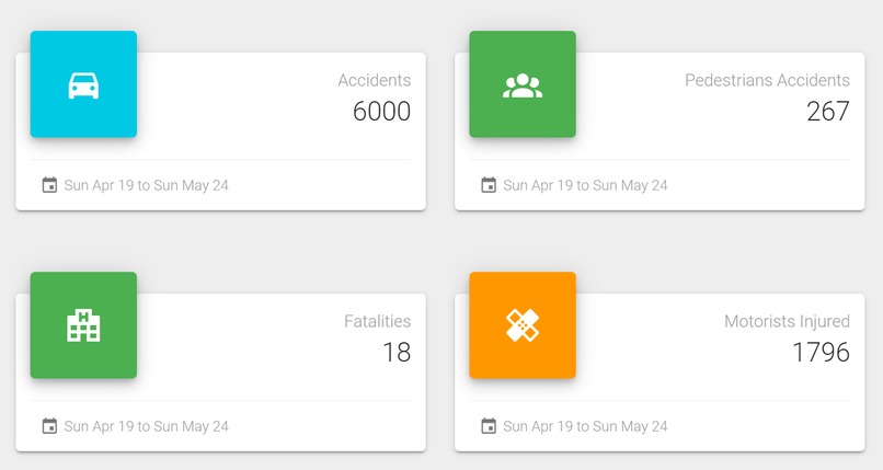
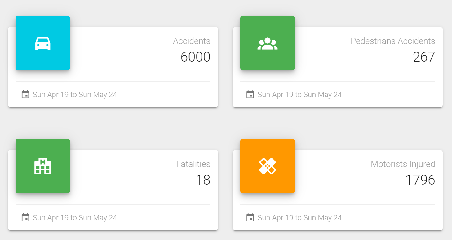
The next section is arguably the most important section for data that is pertinent to safety research and legislation. The next section in the traffic dashboard contains cards with different data points such as total accidents over the time frame, pedestrians involved in accidents, total fatalities in the accidents, as well as people who were injured in an accident. Each of these cards can be traffic to identify best safety measures and plans to create safe traffic solutions.

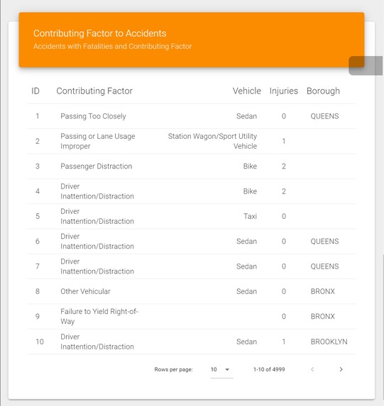
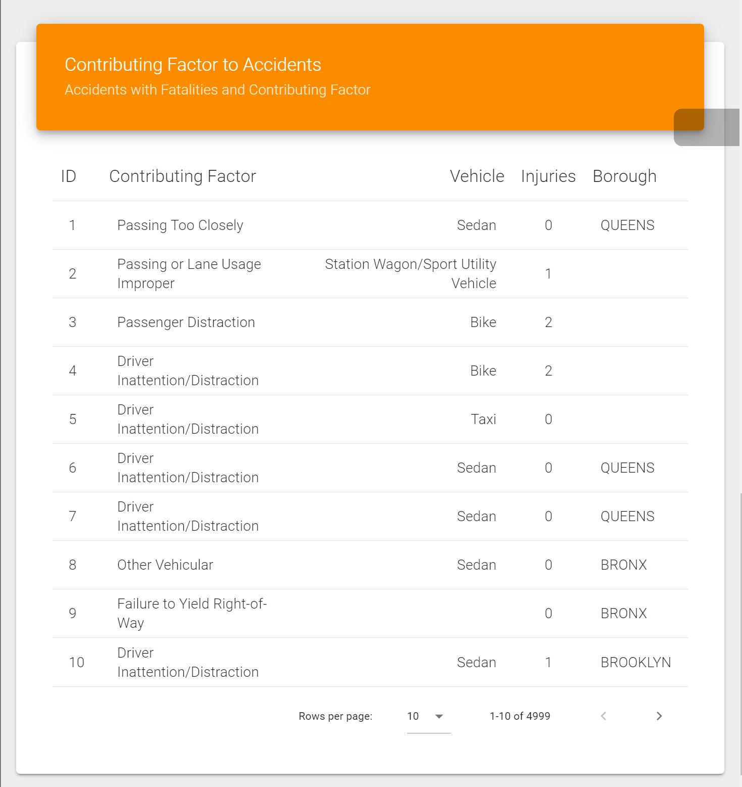
Finally, a user can see specific information related to traffic accidents. The interesting piece, is that the NY Traffic API supplies information relating to the “Contributing Factor” to accidents. With the Traffic Dashboard, I decided the contributing factor information could be important in adding another dimension to traffic incidents by knowing the cause of the accident specified by the police officer at the scene. The user can scroll through thousands of accidents and identify trends that would otherwise be unknown to decision makers and researchers. The Contributing Factors card has many different data sources. The card shows the number of collisions with a reported contributing factor, the vehicle type involved in the accident, the injuries reported in the accident, and if the borough was recorded in the accident information. As you can see below, a researcher could justify allocating funding to Driver Distraction / Inattention because this may be related to texting and driving and other causes.

With real, current traffic information, the Traffic Dashboard can be used by many professionals to develop safe traffic solutions such as researchers, legislative leaders, traffic workers, as well as citizens wanting to know current traffic trends. One of the selling points for the Traffic Dashboard is that it is Free, Scalable, and Understandable. Since the Traffic Dashboard is built with a modern front end framework, Vue.js, it is a static website, meaning it is server-less. Because it is server-less, it is Free to host and easy to deploy. Small municipalities could deploy custom traffic dashboards using their traffic API in under a day, freeing up time and funds to target their goal for traffic safety, not maintaining a resource heavy web application. Since the traffic dashboard is a web application, it is Accessible. With the dominance of the world wide web, users all over the globe would have instant access to important traffic related data. Finally, the traffic dashboard is not a theoretical prototype. It is a real, working solution modeled on New York Traffic information that anyone can use. It can be found at the demo link in the references. Below, you can find the technology used to build the NY Traffic Dashboard as well as the link for the source code.
How I built it
Since the main function of the application is interacting with the New York Open Data API (Application Programming Interface), I could build a server-less web application that could be extremely scalable as well as load quickly since it would be a static site built with a modern, front end framework.
For the front end, I chose Vue.js for its rich documentation for the Vuetify user interface components and the material design dashboard design found at Creative Tim. For the web hosting for static websites, I chose Netlify since it was easy to integrate and make changes through GitHub pushes.
What I learned
I learned the power of Vue.js and how it can be used to easily integrate data from different data sources. It was interesting to gain experience in how modern front end frameworks are used to interact with data and components that are changed frequently. Additionally, I learned the design philosophy of developing applications with a detached frontend to build quick, scalable applications for the end user that doesn't require a server to process information. This also allows for cheap hosting and amazing security.
What's next for Traffic Dashboard
Currently, the Traffic Dashboard only works with New York City due to its Open Data API for traffic safety information. To scale the Traffic Dashboard out to other municipalities and cities, the cities would bring in their traffic information and API with the Traffic Dashboard. The neat thing about the Traffic Dashboard, is that each city theoretically could have their own traffic dashboard for leaders, researchers, and citizens.
References
New York Open Data API Source Code NY Traffic Dashboard Demo Link
Built With
- netlify
- ny-open-data
- vue.js


Log in or sign up for Devpost to join the conversation.