-
-
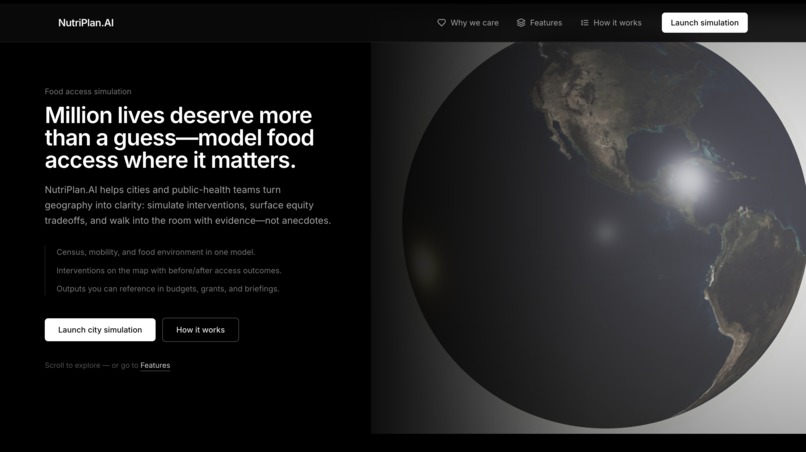
Landing Page SS
-
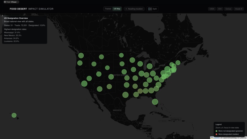
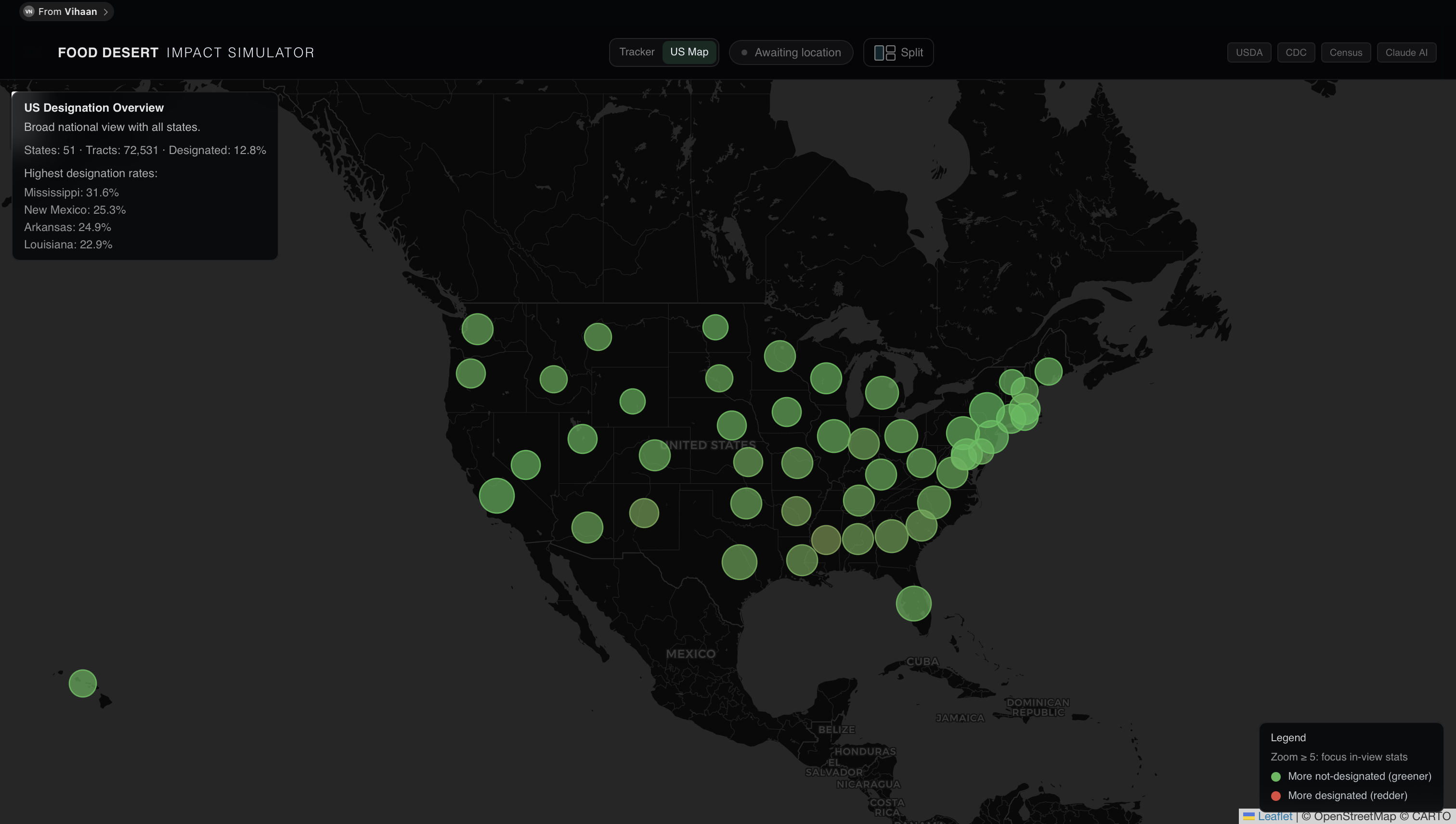
Food Desert and Stats Visualization map
-
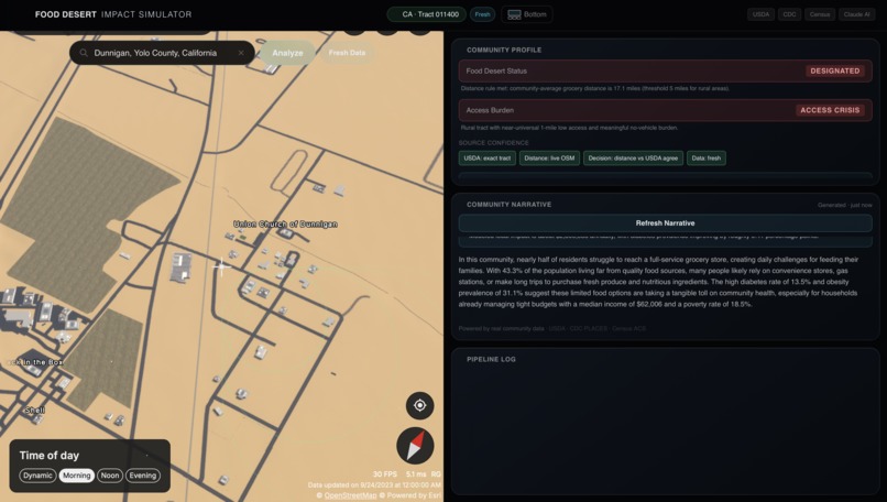
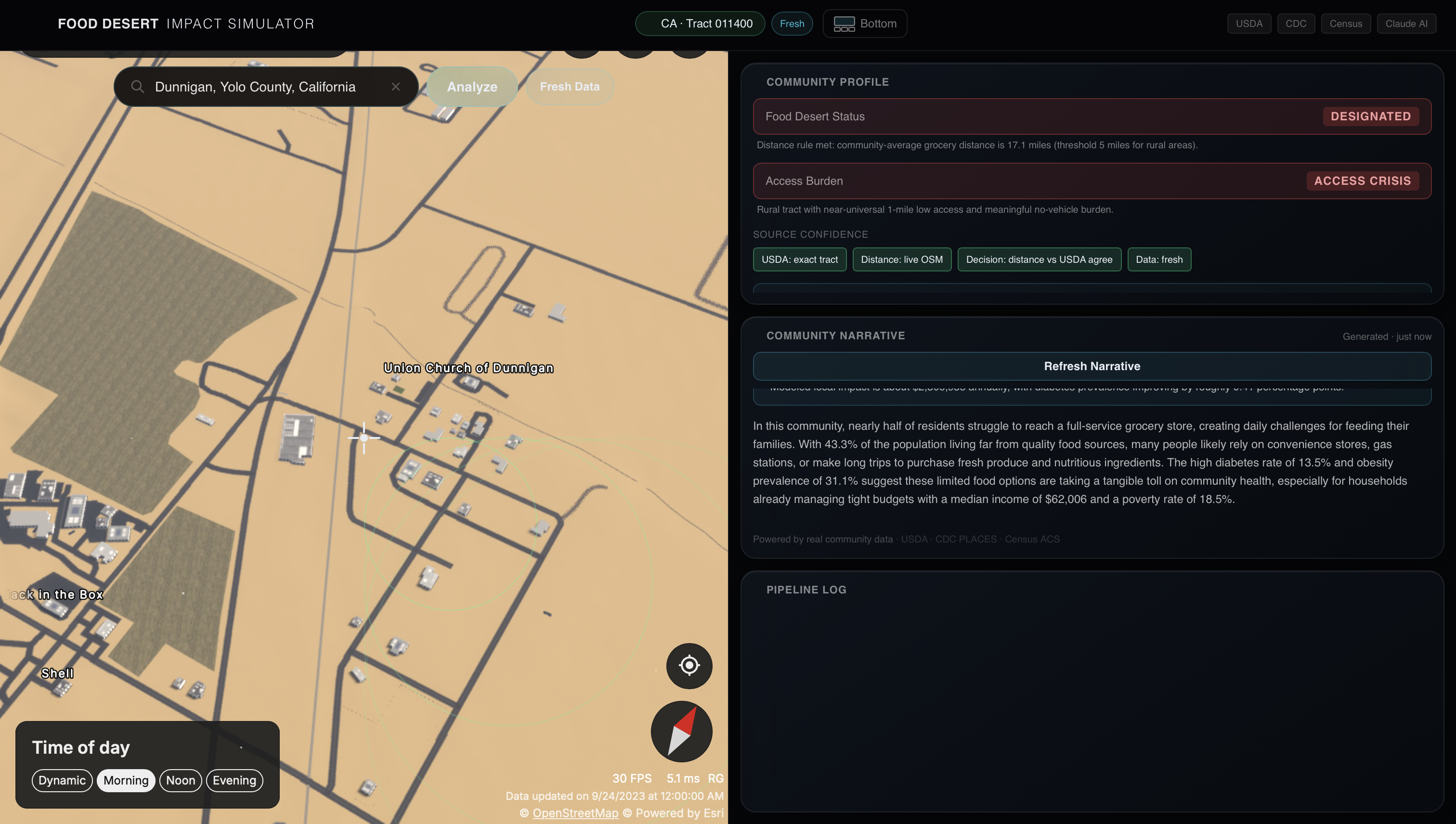
Example of Designated Food Desert with AI Input
Inspiration
While volunteering at Second Harvest Food Bank and Sacred Heart Community Service, we saw how uneven food access can be even within the same city. Some families heavily relied on food assistance programs because healthy and affordable groceries were simply not nearby or not realistically accessible.
What stood out most wasn’t just the need itself, but the situation was behind it. Two neighborhoods that looked close distance-wise may have completely different aspects such as transportation limits, store availability, cost differences, and health constraints.
That experience made it clear that “food desert” is not just a name; in fact, it’s a problem that leads to more problems. We wanted to build something that show not just where food access is limited, but why, and what meaningful changes could actually improve it.
What it does
NutriPlan.AI is an interactive website that analyzes food access in any US location (expanding globally soon) and explains the results data-driven manner.
When a user selects a place, through zip code, address, or simply by dropping a pin on the map, the website pulls together multiple public datasets, including USDA food access data and grocery locations, Census demographics, CDC health indicators, and OpenStreetMap, mapping them to the local census tract. It then calculates an estimate of fresh grocery accessibility and uses that to classify whether the area is food secure or a food desert.
Beyond just labeling, the tool breaks down why that classification was made, showing the contributing data sources, distance calculations, and any disagreements between datasets. It also lets users test “what-if” scenarios, such as adding a grocery store to an area, and estimates how that change could affect access, health outcomes, and local economic impact.
How we built it
NutriPlan.AI is a React 18 frontend application written in TypeScript and built using Vite for fast development.
The interface is styled with Tailwind CSS, with Framer Motion used to add smooth transitions and interactive animations. The main visualization layer includes a 3D globe experience built with Three.js, integrated through @react-three/fiber and @react-three/drei to handle rendering and reusable 3D components. UI elements are supported by Lucide React for icons and Radix UI primitives (@radix-ui/react-slot) for accessible components.
Backend wise, the app connects to a data pipeline that aggregates public datasets (USDA, CDC PLACES, US Census ACS, and OpenStreetMap). These are processed into a specific format for analysis at the census tract level, then passed into the classification and simulation engines that drive the insights shown in the interface.
Challenges we ran into
A major challenge was simply getting access to all the external data sources. Several APIs required setup, keys, or had strict usage limits (no offense Gemini), and at times, requests were refused or behaved inconsistently depending on configuration and network conditions.
We also faced intermittent bugs where the system would work correctly in one run but fail in another without obvious code changes. These issues were often tied to asynchronous data fetching, API timing differences, and edge cases in how different datasets returned incomplete or unexpected responses.
Browser compatibility added another layer of difficulty, especially with the 3D globe visualization and performance-heavy tasks. Features that worked smoothly in one environment would occasionally lag or break in another, requiring debugging across different runtime behaviors. Some of our laptops were too slow to load the Streets GL Map, causing even more problems.
Since this was given in such a short deadline, April 29 to May 1, we had very little time to complete the project. However, we focused and dedicated our time to this and got it done.
Accomplishments that we're proud of
We’re proud that we built a fully working, end-to-end system that goes beyond static mapping and actually explains food access decisions in a transparent way. Instead of just labeling areas, the app exposes the reasoning behind each classification, including data sources, distance modeling, and where uncertainty exists.
We successfully integrated multiple large-scale public datasets—USDA, CDC PLACES, US Census ACS, and OpenStreetMap—and normalized them into a unified pipeline that works at the census tract level. Getting these systems to align meaningfully was complex, and making them work together reliably was a key milestone. We all celebrated this with a well-deserved drink and some Super Mario Bros.
On the frontend, we built an interactive and visually engaging experience with a 3D globe, smooth animations, and real-time scenario exploration. Despite the complexity, the system remains responsive and simple, which was one of our main goals.
Finally, we’re proud that the project stayed grounded in real-world impact—turning abstract data into something that can actually help communities understand and reason about food access.
What we learned
We learned that combining real-world public datasets is far more complex than it first appears. Even when data is publicly available, differences in formats, geographic boundaries, and update cycles can create major integration challenges that require careful normalization and validation.
We also learned that “accuracy” in a system like this is not just about using better algorithms, but about making the assumptions visible. A simpler model that can be explained is often more useful in practice than a more complex one that users cannot interpret or trust.
On the technical side, we gained experience working with asynchronous data pipelines, geospatial computations, and performance constraints in a browser environment—especially when dealing with APIs that can be slow, inconsistent, or rate-limited.
We also saw how quickly small implementation details can cause large inconsistencies, especially in systems that depend on multiple external services. Debugging those issues reinforced the importance of fallback handling, caching, and defensive programming.
Finally, on a broader level, we learned how important it is to design for clarity. When users can see why a result is produced, not just the result itself, the system becomes significantly more meaningful and trustworthy.
What's next for NutriPlan.AI
NutriPlan.AI was built to be scalable and used with policymakers, city planners, and even the general public. This kind of application that compiles data and gives insights on a community level is what drives the systemic impact on neighborhoods and the health & wellness of its residents. NutriPlan.AI is completely open sourced and with more contribution towards our logic and workflow this project could grow into something amazing!
CHANGES FROM CUPERTINO:
Platform Evolution: From Prototype → Production-Ready System Introduced PWA support, deep linking, and citation infrastructure Added highlight mode + explainability enhancements, reinforcing your “explainability-first” mission Built foundations for shareable, reproducible analyses via URL state 👉 Translation: This is no longer just a demo—it’s becoming a deployable decision-support platform.
- Major Upgrade to Mapping & Visualization Engine Restored 3D Streets GL as the default rendering engine Removed unreliable 2D fallback behavior Fixed WebGL + CORS issues that previously broke map rendering Eliminated UI conflicts (e.g., hidden native toolbar) Impact: More immersive, stable, and modern geospatial experience Aligns with real-world planning tools (closer to ArcGIS / Google Earth feel) Removes one of the biggest sources of user friction
- Advanced UI/UX Infrastructure (Big Leap) Added resizable map + panel splitter Improved layout flexibility for multi-panel analysis workflows Integrated smoother landing → tracker transitions Impact: Users can now analyze + interpret simultaneously, not sequentially Feels closer to a professional analytics dashboard than a static app
- System Reliability & Data Pipeline Stability
Fixed critical WebGL/CORS bugs affecting external data + rendering
Improved pipeline visibility in status feed
Strengthened fallback logic for distance + map systems
Impact:
Reduced “Unknown” errors caused by system failures (not data)
More trustworthy outputs → crucial for a decision-support tool
- Performance & Load Optimization Implemented lazy loading for tracker components Improved app startup performance Reduced initial payload + rendering cost Impact: Faster time-to-interaction Better scalability for real users (especially with nationwide map mode)
- Engineering Maturity & Dev Workflow Improvements Stabilized Tailwind + PostCSS in Vite build pipeline Cleaned up build + deployment issues (Vercel rewrites, pipeline transparency) Merged and synced with main branch → reducing drift Impact: Transition from hackathon code → maintainable, extensible codebase Easier onboarding for future engineers (huge for handoff)
- Feature Integration & System Cohesion Fully integrated: Landing UI Tracker Nutrition / education components Stability fixes across modules


Log in or sign up for Devpost to join the conversation.