Inspiration
It was a Tuesday. My chemistry teacher gave us a handout right away and went straight into it. I had not even read the first question yet. When I looked up, she was on problem number three, writing on the board as if we were all on top of things. But I wasn’t. I looked around – nobody raised their hands. Nobody was saying anything. So I did not say anything either. I nodded and copied my friend’s answers during lunch. It was the day when the concept of “Nudge” became very relevant to me. Not because I knew that cheating was not correct, but because it made me realize that my teacher had absolutely no clue that half of her class was hopelessly lost from the very beginning. They thought we knew everything, but we didn’t. And there was absolutely no way to let them know without becoming that one kid everybody hates. Nudge would allow us to do this.
What it does
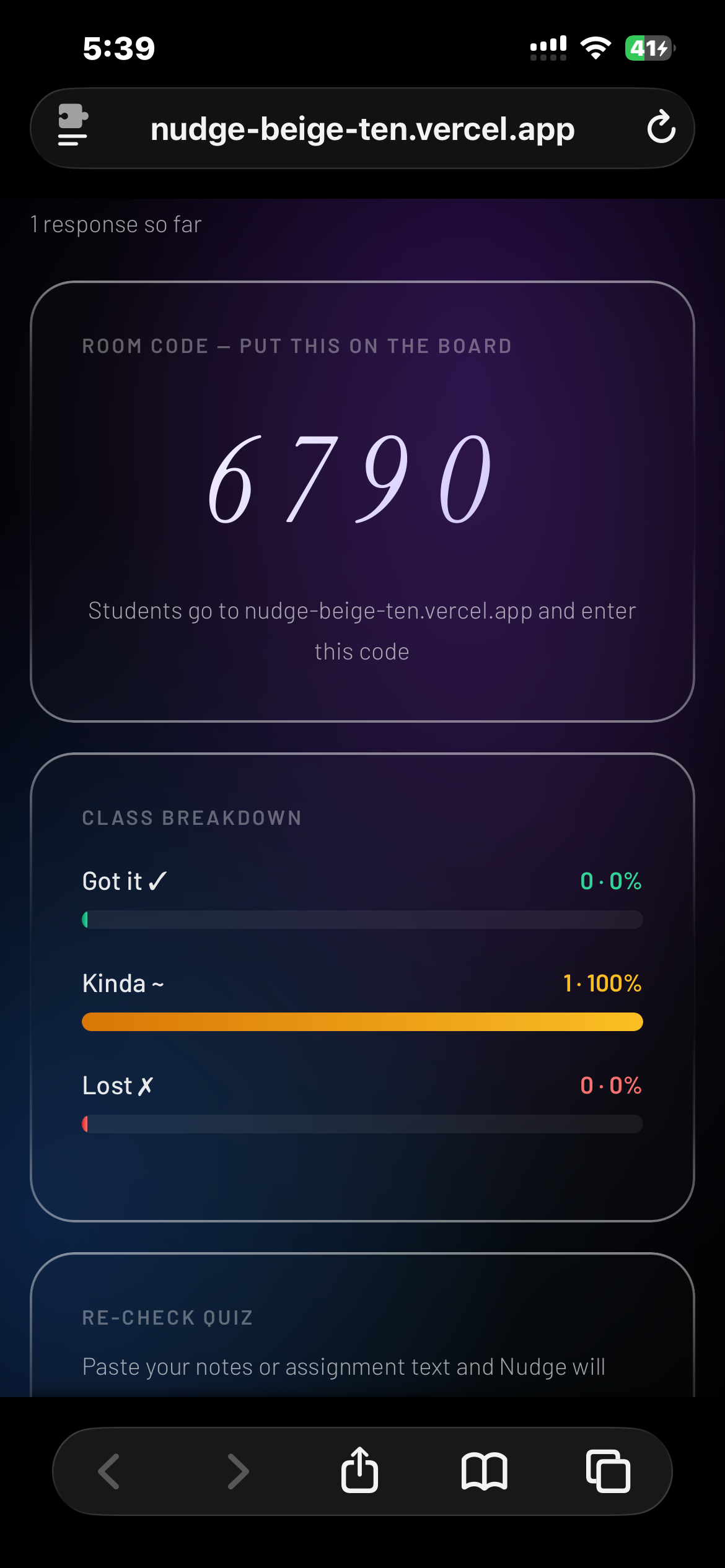
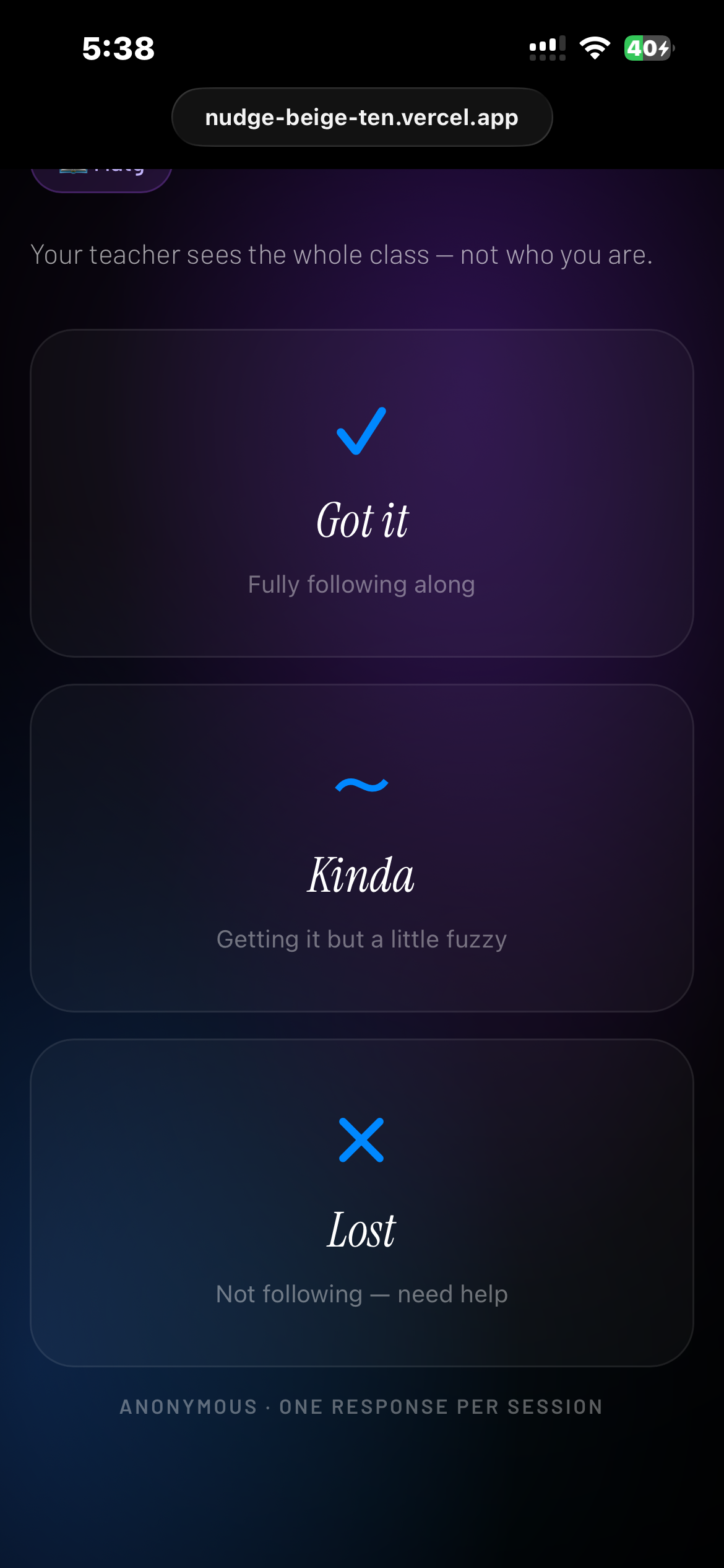
Nudge gives students a silent, anonymous way to tell their teacher they're lost — without raising their hand or slowing the whole class down. A teacher starts a session and gets a room number, puts it on the board, and that's their entire setup done. Students go to the Nudge website on their phone or laptop, type the room number in, and tap one of three buttons — Got it, Kinda, or Lost. No app to download, no account to create, nothing to sign up for. If a student taps Lost, Nudge asks one follow-up question — what's confusing you? There are five options: the vocabulary, the example didn't make sense, I missed something earlier, going too fast, or other. The whole interaction takes about three seconds. The teacher sees a live dashboard that updates in real time, showing the breakdown of the whole class. But what makes Nudge more than just a poll is the AI layer — it doesn't just show the numbers, it tells the teacher what to do about it. If most students are saying the pace is too fast, it suggests slowing down and recapping. If it's a vocabulary issue, it surfaces a plain-English definition of the topic. Teachers can also launch a quick three-question re-check quiz generated by the AI right inside Nudge — no Kahoot, no Google Forms, no switching tabs. How we built it, Challenges we ran into, Accomplishments that we're proud of, What we learned, What's next for Nudge
How we built it
I started with React 18 because it's what I know best, and honestly, because I wanted this to feel fast and responsive, not clunky like some of the classroom tools teachers already use. The architecture is pretty straightforward: teachers and students hit different routes, but they're all connected through Supabase Realtime. When a teacher creates a session, Supabase generates a random 4-digit room code and stores it in a PostgreSQL database. Students join by entering that code, and when they tap "Got it," "Kinda," or "Lost," their response gets written to the database instantly. The teacher's dashboard listens for those changes through WebSocket subscriptions and updates in real-time with no refresh needed. The AI suggestion layer was the trickiest part. I didn't want it to just spit out generic advice like "slow down" or "review the material." I wanted it to actually help. So I set it up to analyze patterns. Like if multiple students are clicking "Lost" and selecting "vocabulary," the AI generates a plain-English explanation of the current topic. It's powered by Google's Gemini API, and I built in some caching so teachers aren't waiting 5 seconds for suggestions to load. I also started building a quiz generator using the same Gemini API. The idea is that teachers can click one button and get three AI-generated questions based on what students are confused about. The backend works (questions get generated), but I ran out of time to build the full student-facing quiz interface before the submission deadline. That's my next priority.To keep it anonymous but not chaotic, I used localStorage to track which device has already responded in a session. One vote per device per session. It's simple but effective. No one can spam the "Lost" button 50 times, but students also don't need to create accounts or log in. For the design, I went with a liquid glass aesthetic using custom CSS. No Bootstrap, no Tailwind, just pure CSS with custom properties. I picked a color scheme that felt calm but clear: soft gradients, glassmorphism effects, subtle shadows. I used Google Fonts, specifically Instrument Serif for headings to give it personality, and Barlow for body text because it's super readable on phones. All the JavaScript is ES6+, nothing fancy, just clean async/await for API calls and solid event handling. I kept the code modular so I can add features later without rewriting everything. The whole thing is deployed on Vercel, which was shockingly easy. Push to GitHub, connect to Vercel, and it's live in like 30 seconds. Supabase handles all the backend infrastructure: database, real-time subscriptions, and session management. I don't have to worry about servers or scaling; it just works.
Challenges we ran into
Real-time sync was harder than I thought. My first version used basic state management, and it worked fine when I was testing solo. But the moment I tried simulating 10+ students clicking at the same time (I literally opened 15 browser tabs), everything broke. Responses were duplicating, some weren't showing up at all, and the dashboard would just freeze. I switched to Supabase Realtime subscriptions and added optimistic updates so students see their vote instantly, even if the database is still catching up. That fixed it, but it took two full days of debugging to get there.
The AI had to be fast. My first attempt at generating suggestions took 6-8 seconds, which is way too slow when a teacher is mid-lesson with 30 kids waiting. I built a caching layer where common confusion patterns like vocabulary or going too fast have pre-generated suggestions stored locally. If it's something unusual, it hits the API. For the common stuff, it's instant.
The quiz generator took longer than expected. I wanted teachers to launch AI-generated quizzes right inside Nudge, and while I got it working before the deadline, it was the last thing to come together. Getting the real-time sync working so the quiz appears on every student's screen the moment the teacher launches it, without a refresh or a page change, was genuinely tricky. But it works now, and watching it pop up on a student's screen in real time is one of the coolest things in the app.
Mobile responsiveness almost derailed the whole thing. I designed everything on my laptop, tested it on my phone, and half the buttons were cut off and the text was unreadable. I rewrote a large chunk of the CSS to be mobile-first. It actually looks better on phones now, which makes sense because that's what students will use in class.
Keeping it anonymous without making it chaotic was a real design challenge. I wanted students to respond without logging in, but I also had to think about how the data would hold up. The key insight was that Nudge shows the teacher a class-wide breakdown, not individual responses. So even if one student is being silly, it doesn't skew the picture. It's the overall distribution that matters. If 80% of the class says Got it and one person spams Lost, the teacher sees that clearly. The aggregate is honest even when individuals aren't. I used localStorage to enforce one response per device per session, which keeps things clean without requiring anyone to create an account.
Testing across different devices was a nightmare. I had to borrow my parents' phones, my sister's tablet, my friend's laptop, anything I could get my hands on to make sure Nudge worked everywhere. Safari handles some CSS differently from Chrome, which was super annoying. I had to patch several layout issues specifically for mobile Safari, but it was worth it because that's what half the classroom will be running.
Scope control was probably the hardest non-technical challenge. I had so many ideas: polls, analytics dashboards, student chat, and LMS integrations. But I had to make hard choices about what to actually build before the deadline. I kept reminding myself that a working product with fewer features is better than a half-broken product with everything. So I focused on nailing the core experience: students vote, teachers see results, AI gives suggestions, quiz follows. Everything else can come later.
Accomplishments that we're proud of
I actually finished it. I've started like a dozen coding projects and never finished any of them. This is the first time I took something from "random idea" to "working product people can actually use." That alone feels huge.
It works in real-time across multiple devices. This sounds simple, but it's not. Getting 30+ devices to all see the same data at the same time, without lag, without crashes. That's legitimately hard. When I opened 20 browser tabs, had them all join the same session, and watched the dashboard update instantly as each one voted, I actually yelled "YES!" out loud. My mom thought I was losing it.
No app download. No account creation. No email verification. Just type a 4-digit code and tap a button. That was hard to build. Turns out making things simple takes way more work than making them complicated. But it was worth it. If it takes more than 5 seconds to use, students won't bother.
The design actually looks professional. I'm not a designer. I barely know what "UX" means. But I spent hours tweaking colors, spacing, and animations until it looked clean. People who've seen it thought I used some fancy design framework, but nope, just vanilla CSS and a lot of trial and error.
I shipped it solo. I'm a high school sophomore. I built this entire thing by myself in about four weeks while juggling school, homework, and everything else. That's 2,800+ lines of code, a working backend, AI integration, real-time sync, and a quiz generator. I learned more in those four weeks than I learned in an entire year of CS class.
I showed it to a few classmates, and they immediately got it, no explanation needed. That told me the design was working.
What we learned
Real-time databases are no joke. I thought I understood how state management worked, but trying to sync data across 30+ devices in real-time was a completely different beast. I learned about optimistic updates, conflict resolution, rate limiting, and all these things that just don't come up when you're building simple CRUD apps. Supabase made it easier, but it was still way harder than I expected.
AI is only useful if it's fast and actionable. There's a difference between "this is technically impressive" and "this is actually helpful." I could've built an AI that writes 500-word essays on why students are confused, but no teacher has time to read that. The AI had to be fast (under 2 seconds) and specific ("try using the coffee analogy for molarity"). That constraint made me a way better developer.
Testing on real devices matters more than I thought. I tested on my laptop for weeks and thought everything was perfect. Then I tried it on my phone and literally nothing worked right. Testing early and often on actual phones and tablets would've saved me so much time. Now I know: if it doesn't work on a 5-year-old iPhone, it doesn't work.
Mobile-first design is non-negotiable. Students live on their phones. If your app doesn't work perfectly on a phone, it doesn't work. Period. I learned to design for the smallest screen first and then scale up, not the other way around. I could've spent another month adding features and polishing the UI, but at some point you just have to push it live and see what happens. The version I have now isn't perfect. There are bugs I know about, features I want to add. But it's real, it's live, and it works. That's what matters.
Building something people actually need is way more motivating than building for a grade. I've done tons of school projects where I'm just trying to get an A and then forget about it. But this? This is something I actually care about because it solves a problem I personally experienced. That made me work way harder than any grade ever could.
High school students can build real products. Honestly, I didn't think I could do this. I thought you needed a CS degree or years of experience or a whole team. But I built something real, it works, and people could actually use it. That's probably the most important thing I learned. I'm capable of way more than I thought.
What's next for Nudge
SHORT TERM (Next 3 months):
- Integrate with Google Classroom (auto-pull roster)
- Add teacher analytics dashboard (trends over time)
- Multi-language support (Spanish, Mandarin)
- A more advanced quick re-check quiz generator (3 questions based on confusion)
MEDIUM TERM (6-12 months):
- Mobile apps for iOS and Android
- Integration with Canvas, Schoology, Blackboard LMS
- Teacher community where they share effective interventions
- Student mode that shows "You're not alone - 12 others are also confused"
LONG TERM (1-2 years):
- Expand to college classrooms
- Corporate training use case (meetings, presentations)
- AI tutor mode - students can ask questions privately
- Predictive analytics - warn the teacher BEFORE students get lost
BUSINESS GOALS:
- Get 1,000 teachers using it by end of school year
- Partner with 5 school districts for pilot program
- Raise seed funding to build a full-time
- Make classroom feedback as easy as breathing


Log in or sign up for Devpost to join the conversation.