-
-
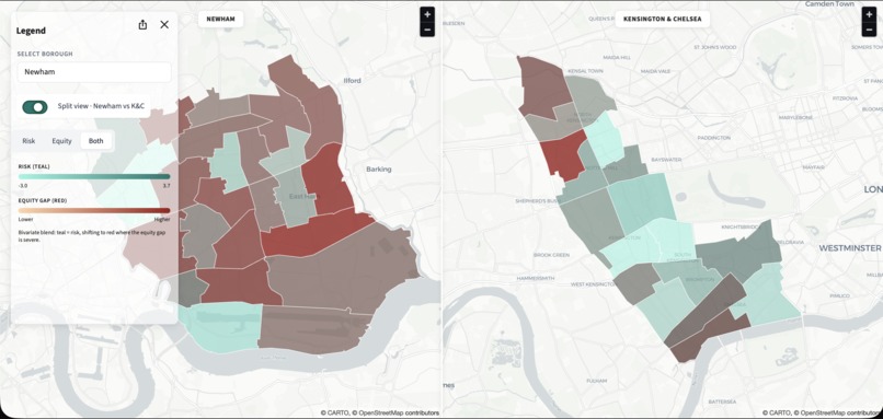
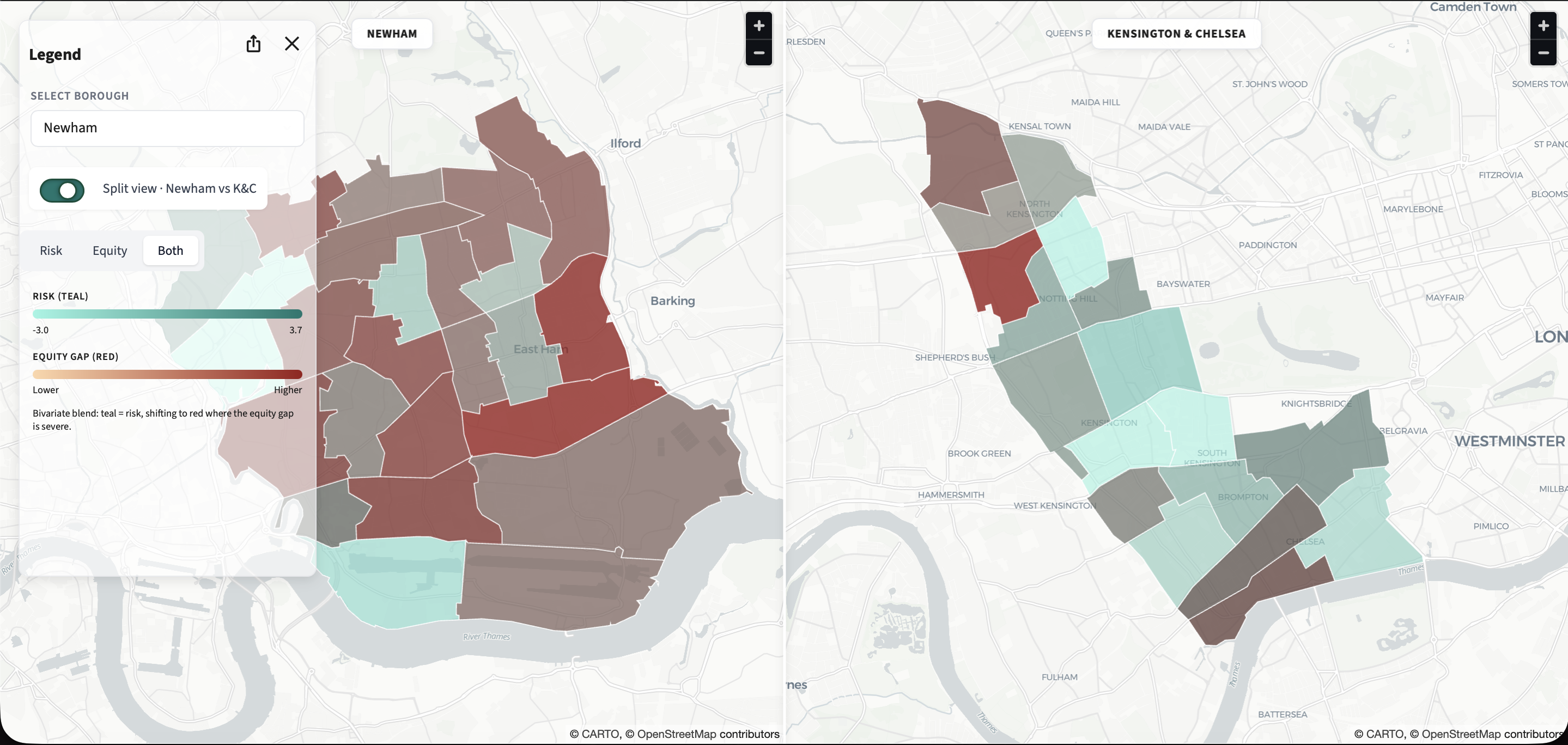
The "Invisible" Gaps (Risk + Equity Overlay)
-
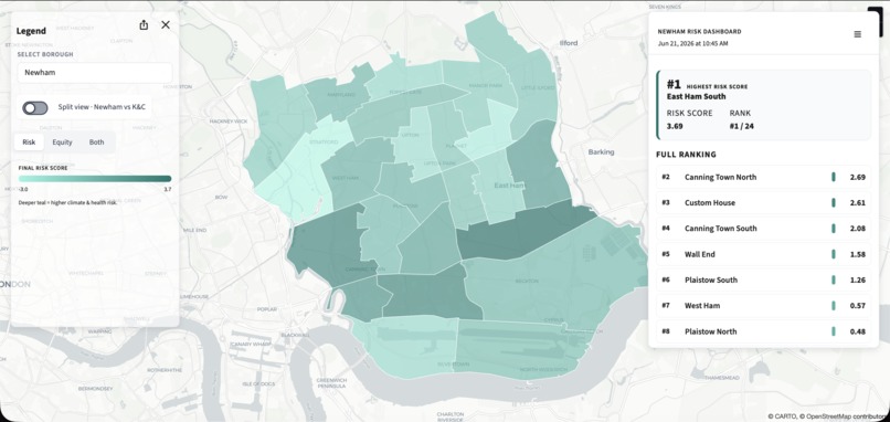
Baseline Composite Risk (Newham)
-
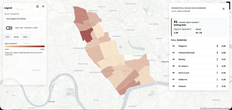
Cross-Borough Scalability (Kensington & Chelsea)


Inspiration
We started with a gut feeling: that London’s climate‑health risks would map neatly onto the usual suspects—places everyone already talks about. Instead, the data flipped our hypothesis. Using ward‑level climate, deprivation, environment, and health‑services data, we kept finding high‑risk communities that sit in the dark just beyond the glow of existing services. That “lantern effect” – bright data where there are GPs, shadows where there are none – inspired us to build a tool that makes those invisible wards impossible to ignore.
What it does
Now What? is an equity‑first risk “radar” for London’s wards. It combines clinical burden, deprivation, environmental exposure, and system capacity into a single, explainable risk score and then breaks it back down so decision‑makers can see not just where risk is highest, but why. In Newham, it highlights service deserts and low‑capacity hotspots; in Kensington & Chelsea, it reveals pockets of hidden deprivation inside a “wealthy” borough and wards with no GP practices at all.
How we built it
We started from the hackathon’s open datasets and documentation, then engineered a pipeline that joined climate hazards, health outcomes, deprivation indices, environmental metrics, and primary‑care capacity at ward level. We normalised each component, created a composite risk score, and built interactive views: borough‑level comparisons, top‑10 ward lists, and risk‑breakdown charts for both Newham and Kensington & Chelsea. Finally, we wrapped it in a lightweight dashboard and a narrative geared to public‑health and climate‑adaptation teams.
Challenges we ran into
Data for climate and health live in different silos, on different time scales, and at different geographies, so getting them to “talk” at ward level was non‑trivial. We also had to balance statistical nuance with explainability: a model that’s perfect on paper but looks like a black box is useless in a real policy meeting. Visualising the “lantern effect” without stigmatising communities or overstating the precision of the data pushed us to iterate repeatedly on both the metrics and the storytelling.
Accomplishments that we’re proud of
We’re proud that the tool surfaces genuinely non‑obvious insights. It doesn’t just confirm that Newham has high climate‑health risk; it pinpoints specific wards where risk is rising fastest and capacity is weakest, and it shows that four of K&C’s top‑risk wards have no GP practice at all. We also like that every chart is explainable in plain language—much closer to Florence Nightingale’s polar diagrams than to a black‑box AI score—and that our equity story resonates across very different boroughs.
What we learned
We learned that “wealth doesn’t equal health,” and that assuming we already know where vulnerability lives is dangerous. The same model revealed different shapes of inequity: service deserts in Newham, hidden deprivation and capacity gaps in K&C, and a strong lantern effect wherever data and services cluster together. We also learned how important it is to design for decision‑makers: the most impactful feature wasn’t a fancy algorithm, but a simple breakdown chart that makes the “why” behind each ward’s risk visible at a glance.
What’s next for Now What?
Next, we want to plug in fresher and eventually real‑time data—heat alerts, hospital admissions, primary‑care activity—so the risk radar can support evolving situations, not just static reports. We’d also like to pilot the tool with one or two London boroughs to co‑design interventions, test whether resources actually shift toward the newly visible “dark” wards, and expand the model to other cities facing climate‑health pressures.
Built With
- geopandas
- london-datastore
- numpy
- openprescribing-api
- pandas
- pydeck
- python
- streamlit


Log in or sign up for Devpost to join the conversation.