-
-
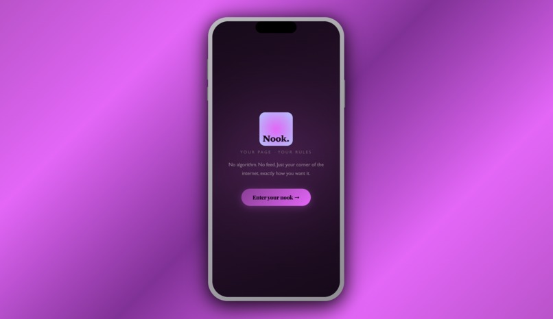
App Mock Up
-
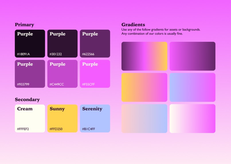
Color Palette
-
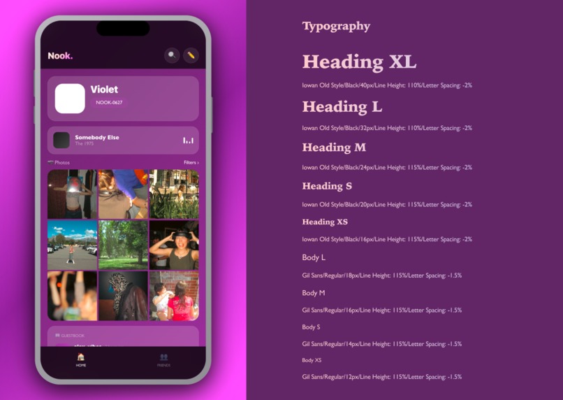
Typography
-
Key Feature 1
-
Key Feature 2
-
Key Feature 3


Inspiration
For older Gen Z and young millennials, 2016 was a cultural sweet spot. The internet had not yet been fully optimized, monetized, and handed over to algorithms. Platforms were simpler. Profiles were personal. You could actually reach the bottom of your feed. We built Nook. because 100% of our survey respondents said they spend the majority of their time passively consuming a feed, and 75% rated their algorithm fatigue at an 8 out of 10 or higher. That number made the project feel urgent.
What it does
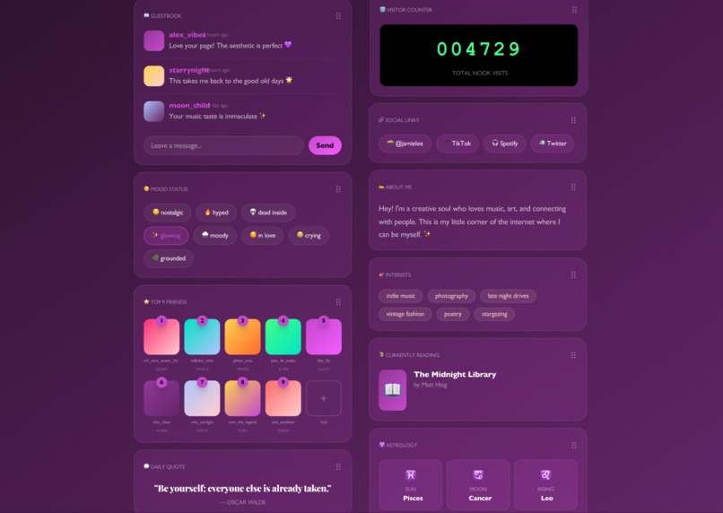
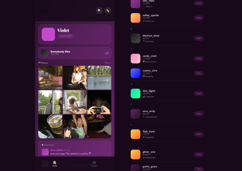
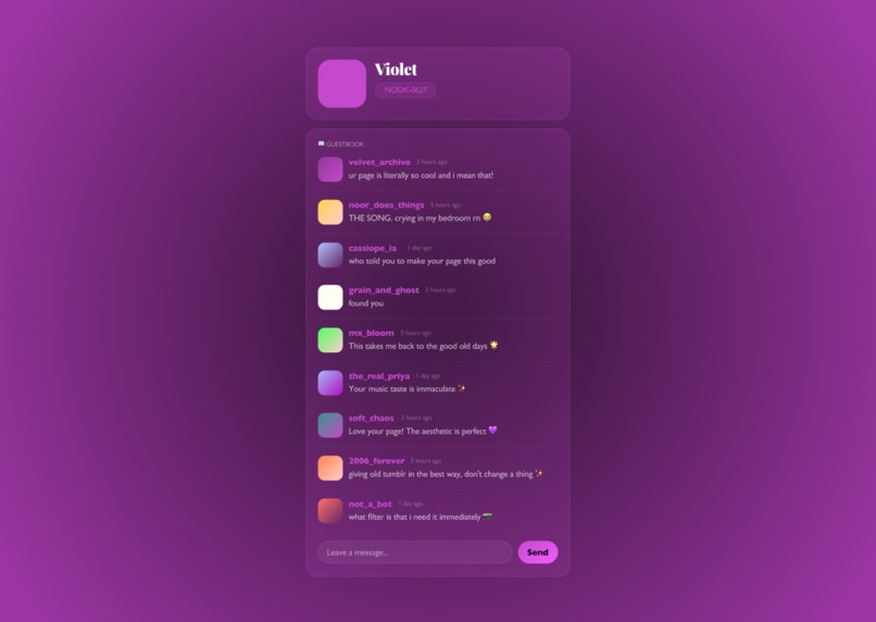
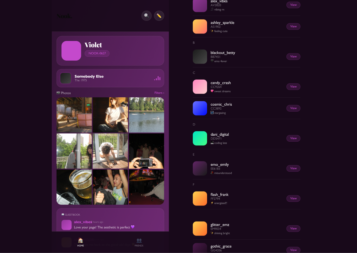
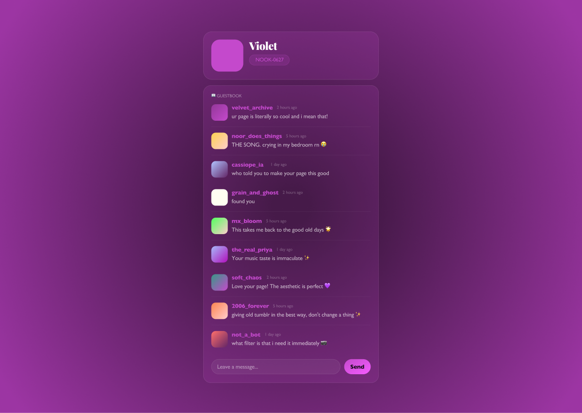
Nook. is a personal profile app with no algorithmic feed. You get a fully customizable page - your background, your fonts, your photo grid, your song, your widgets. People visit your nook directly, the way you used to visit someone's page. A public guestbook lets friends leave notes. A Top 10 friends list makes your inner circle visible. There is nothing to scroll, nowhere to get lost, and no ads anywhere.
How we built it
We started with a qualitative and quantitative survey of 16 participants aged 17 to 26, then synthesized findings into two user personas. From there we ran a full design sprint: naming exploration, competitive landscape, user research synthesis, and high fidelity prototyping. The UI was built in Figma, with a working interactive prototype that goes with it. The Framer site documents the full process.
Challenges we ran into
The hardest problem was tonal. Too much nostalgia and Nook. becomes a novelty. Too little and it loses its entire reason to exist. Every design decision sat on that line. We also found that users want total customisation but freeze when given a blank canvas, so the onboarding live preview became essential. Getting that to update in real time across background, accent color, font, and uploaded photos was technically fiddly but changed everything about how the flow felt.
Accomplishments that we are proud of
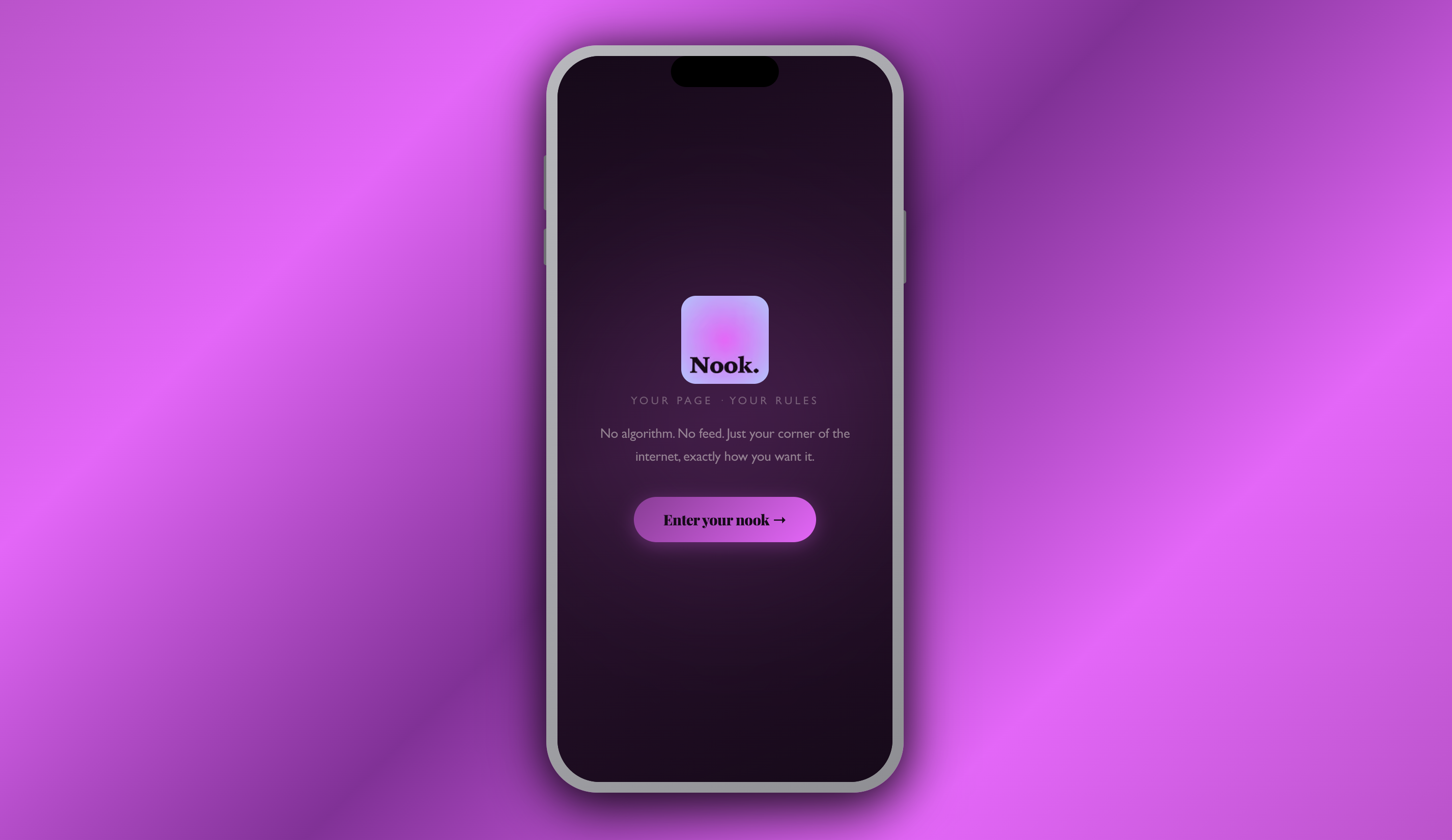
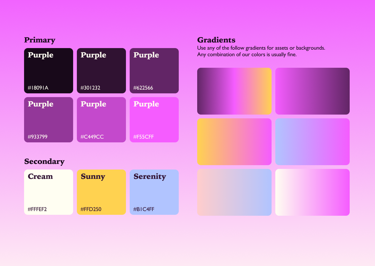
The design system landed exactly where we wanted it. Deep purples, cream, rose quartz, serenity blue - a palette that felt personal and warm rather than another dark mode product. Playfair Display paired with Gill Sans MT created the right tension between editorial weight and everyday readability. The high fidelity mockup sits inside a full iPhone 17 frame, Dynamic Island included, with a seven step onboarding flow, live preview strip, real photo uploads from camera roll, and actual audio playback. All of it built and shipped within the sprint timeframe. The persona cards for Violet and Ben C captured the 2016 feeling without recreating it literally. That was the accomplishment we are most proud of.
What we learned
Nostalgia is a feeling, not an aesthetic. Our survey respondents did not want MySpace back. They wanted what MySpace represented: a space that felt intentional, personal, and theirs. One participant described their ideal profile as a studio apartment cluttered with trinkets. Another said they missed early Tumblr because it was about curating a vibe rather than curating an identity. Those two quotes shaped the product more than any design reference did. We also learned that the absence of a feed is itself a feature. No scroll is a product decision.
What's next for Nook.
Real friend connections via NOOK IDs. A native mobile build. A drop-in feature that lets you visit a friend's nook without needing an account first. A discovery page that surfaces nooks by vibe rather than by engagement metrics. And a community of people who remember what it felt like when the internet was somewhere you actually wanted to live.
Built With
- figma
- framer

Log in or sign up for Devpost to join the conversation.