
Inspiration
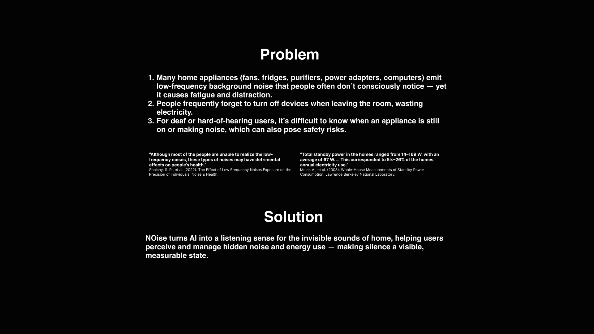
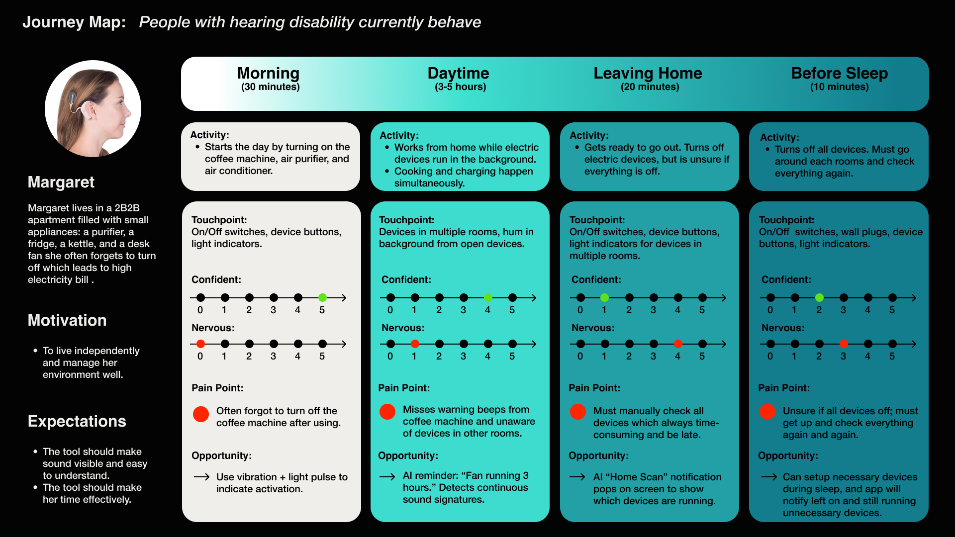
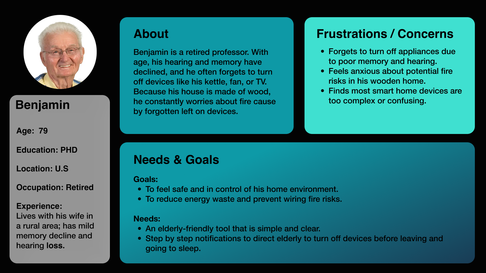
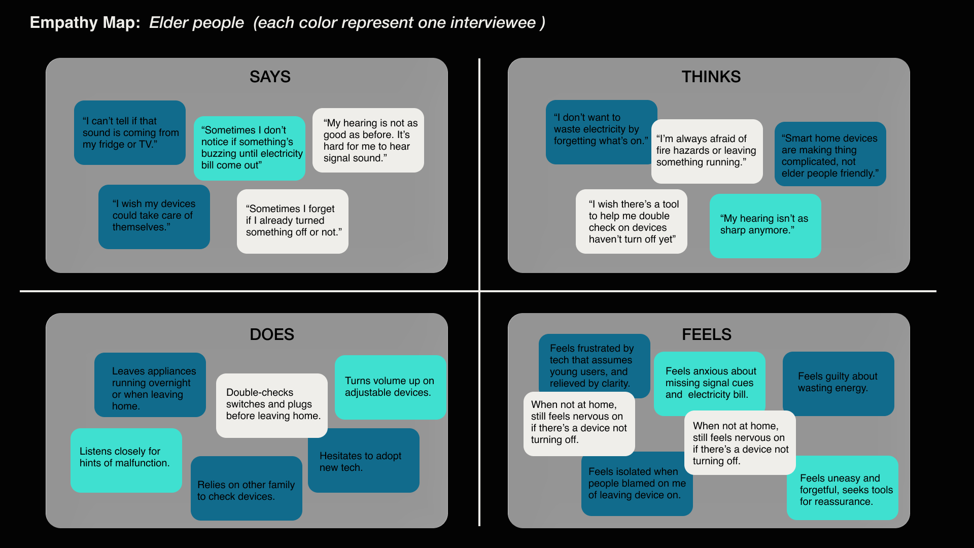
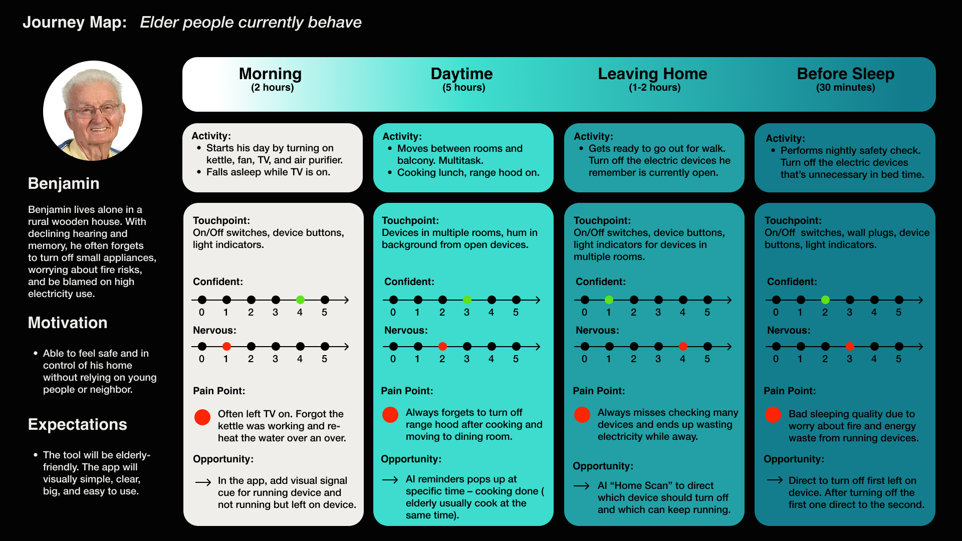
As daily life becomes filled with hidden energy consumption, we often overlook the small appliances that quietly drain power — fans left running, fridges humming, or adapters plugged in all night. For many elderly and hearing-impaired users, these subtle cues go completely unnoticed, making sustainable living harder to achieve.
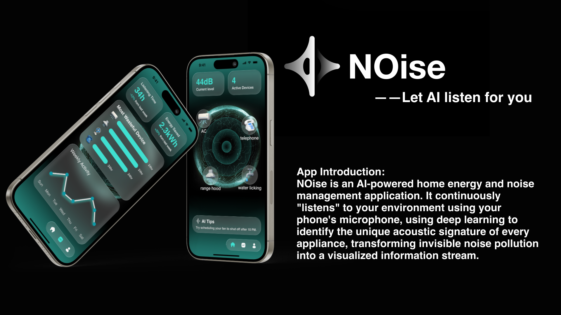
NOise was born from the idea that AI can listen where humans can’t — transforming sound into insight. By detecting and visualizing the acoustic signatures of household devices, NOise helps users see their unseen energy use, make informed decisions, and create a calmer, more sustainable home environment.
What it does
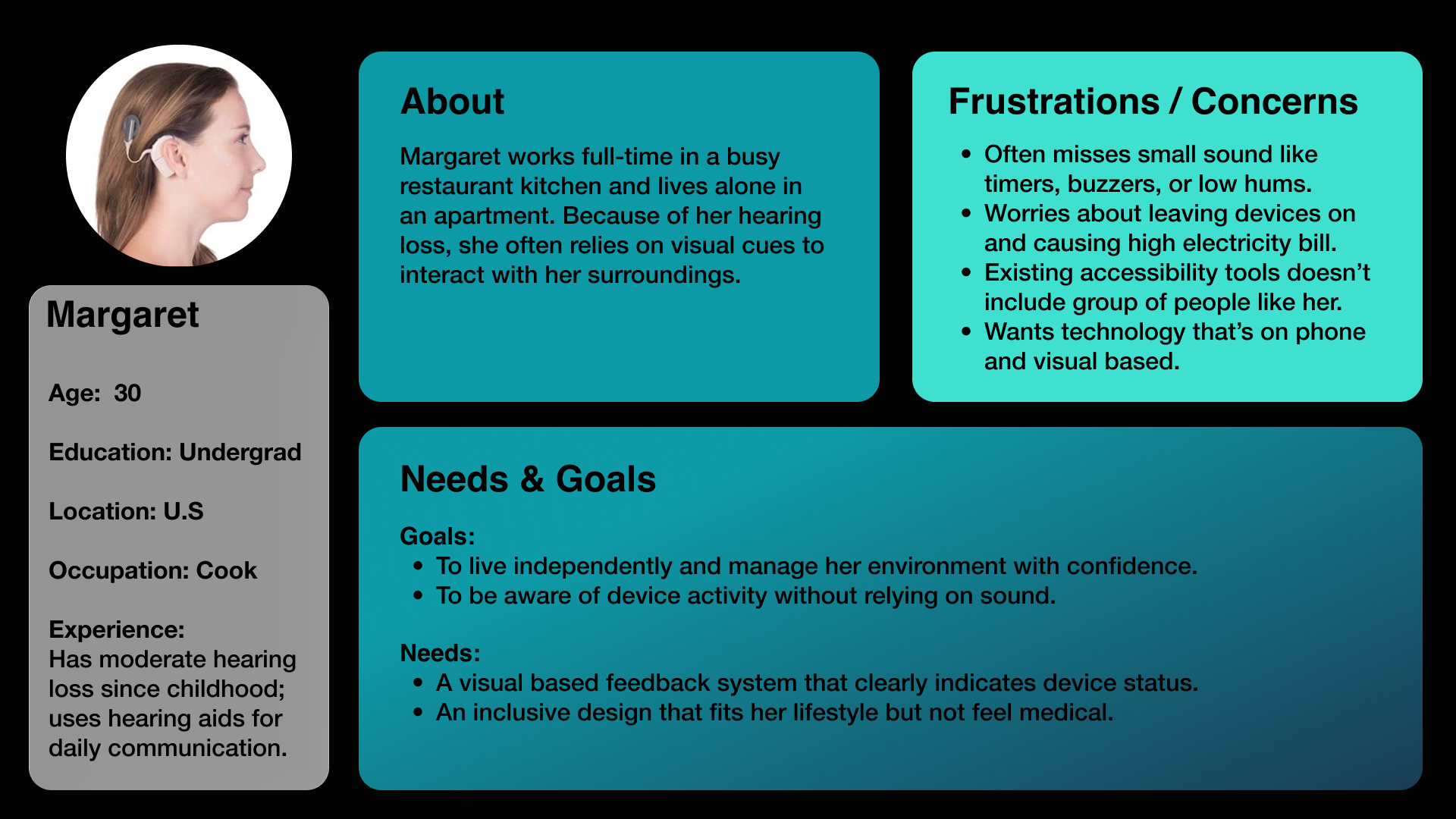
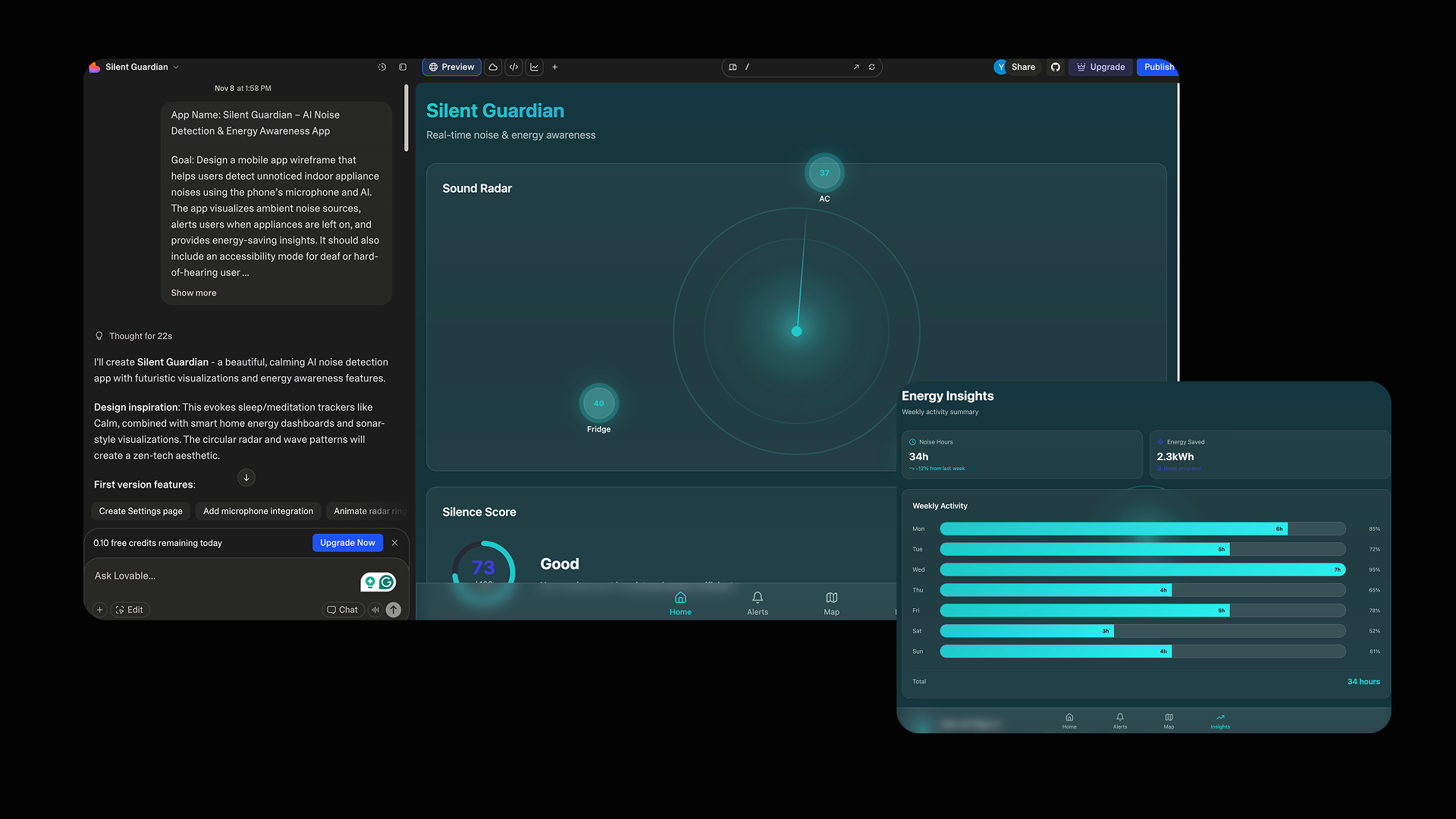
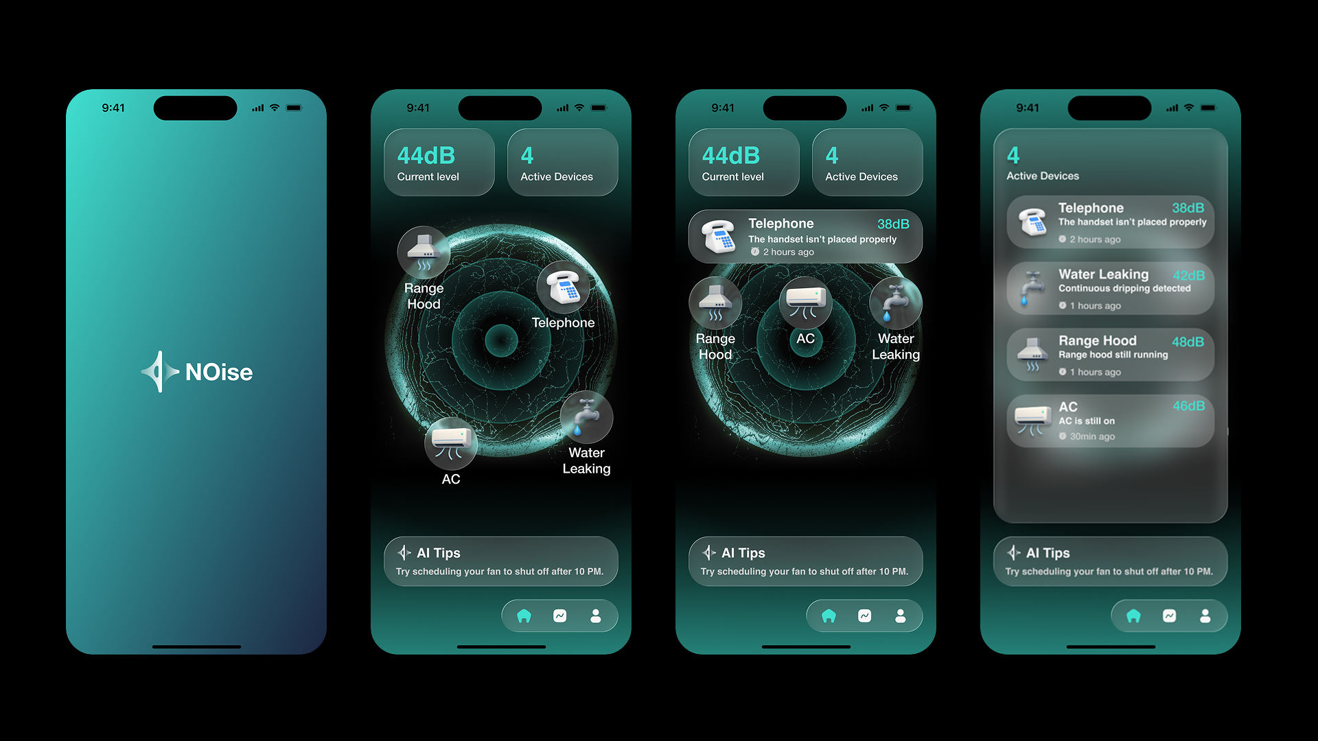
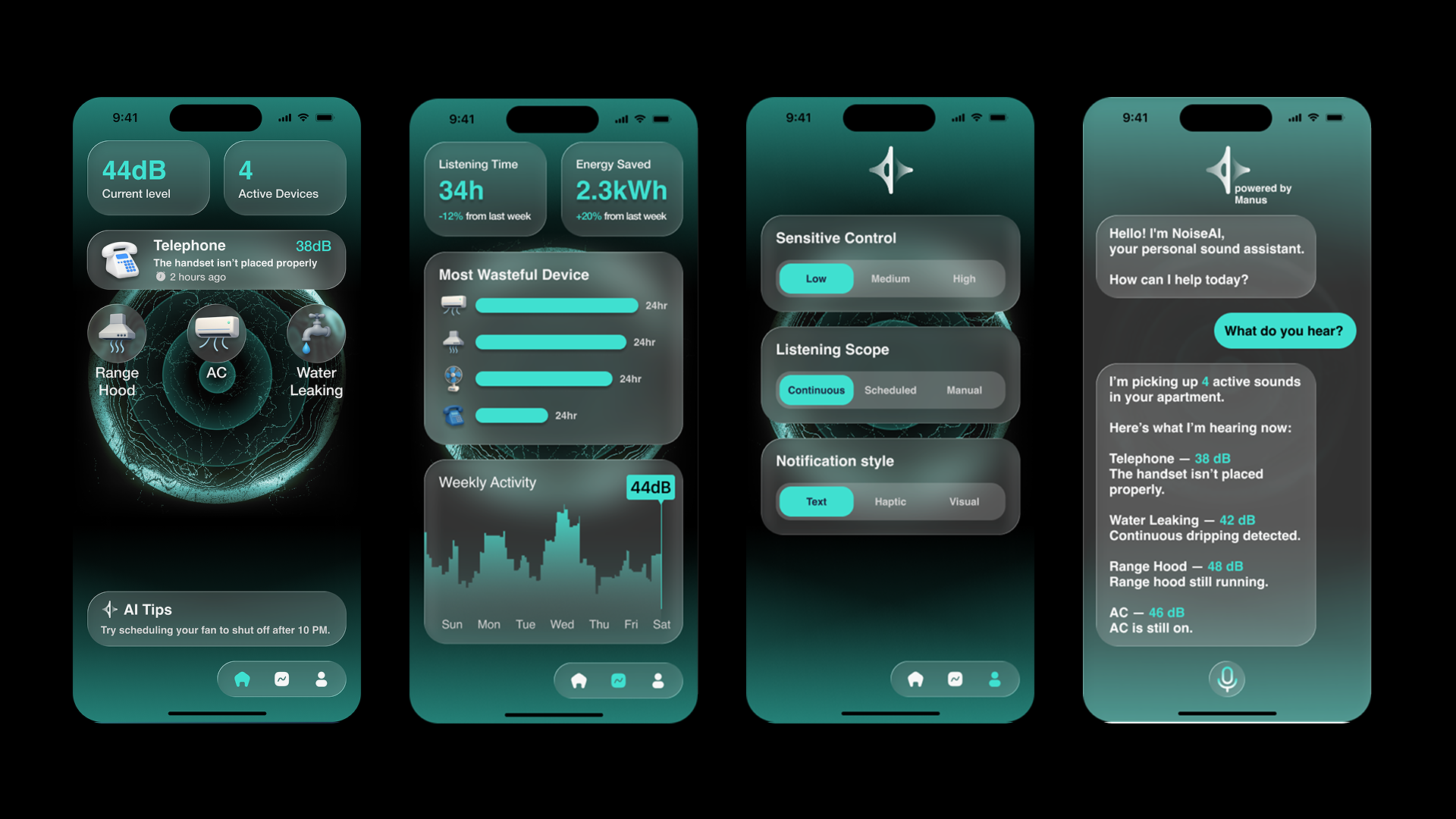
NOise is an AI-powered mobile app that listens to ambient household sounds, detects unnoticed appliances, and visualizes them through clear, glowing icons. The project focuses on sound awareness, safety, and sustainable living, especially for elderly and deaf or hearing-impaired users, who often struggle to perceive subtle background noises or know when devices are left running.
How we built it
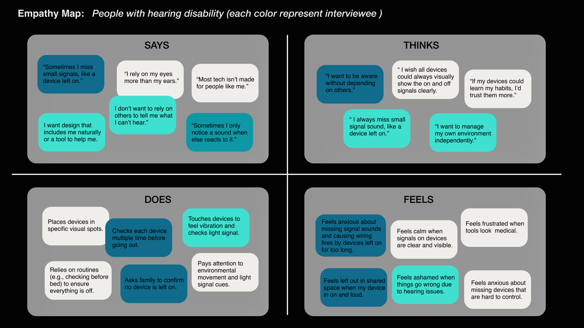
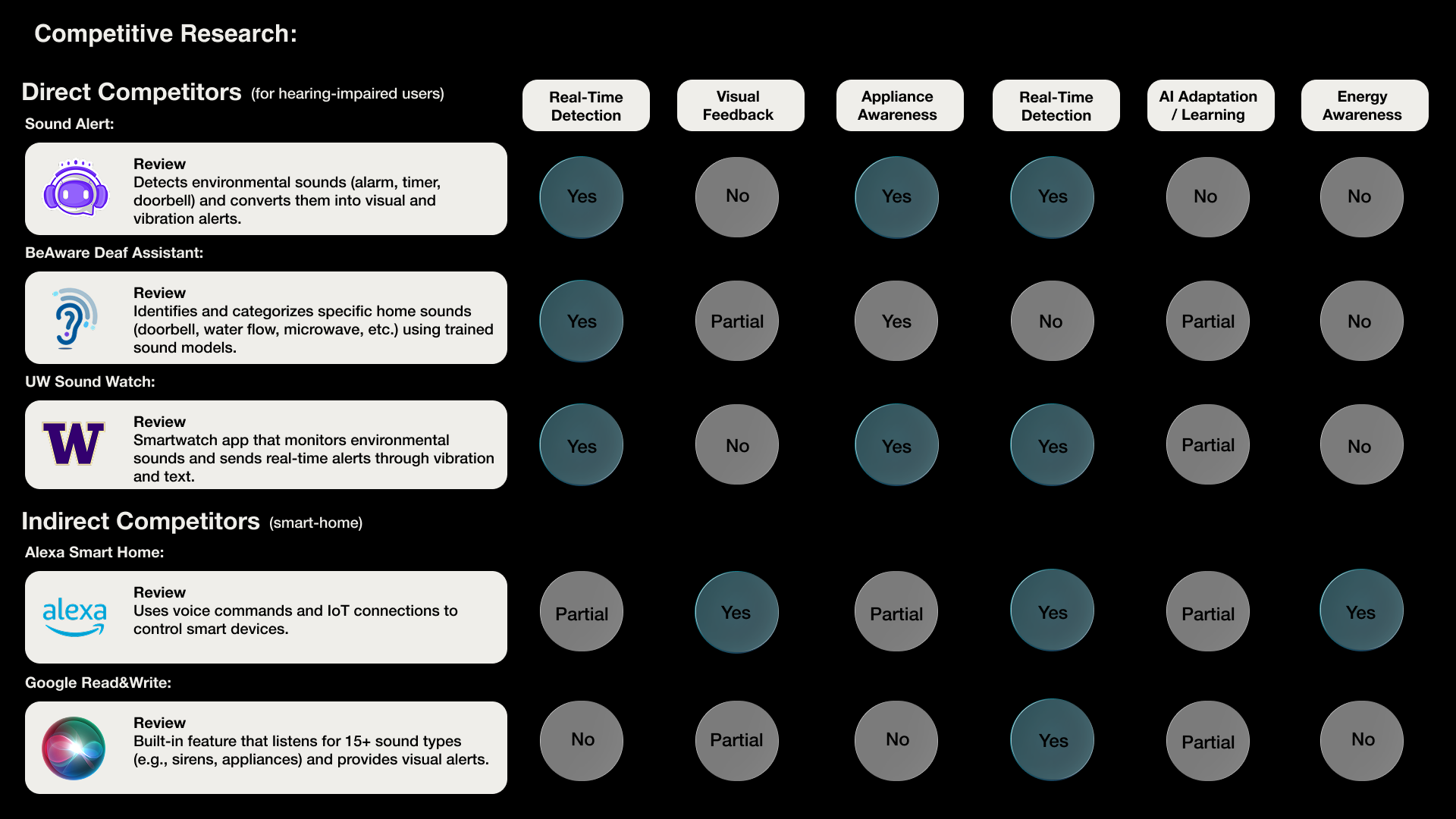
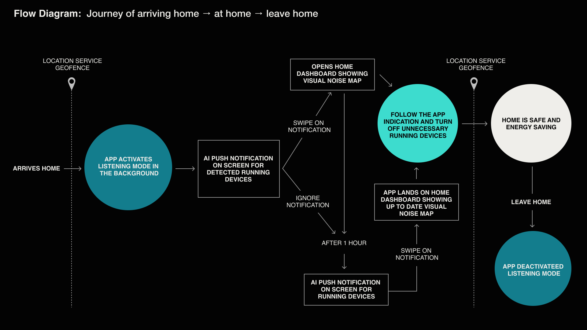
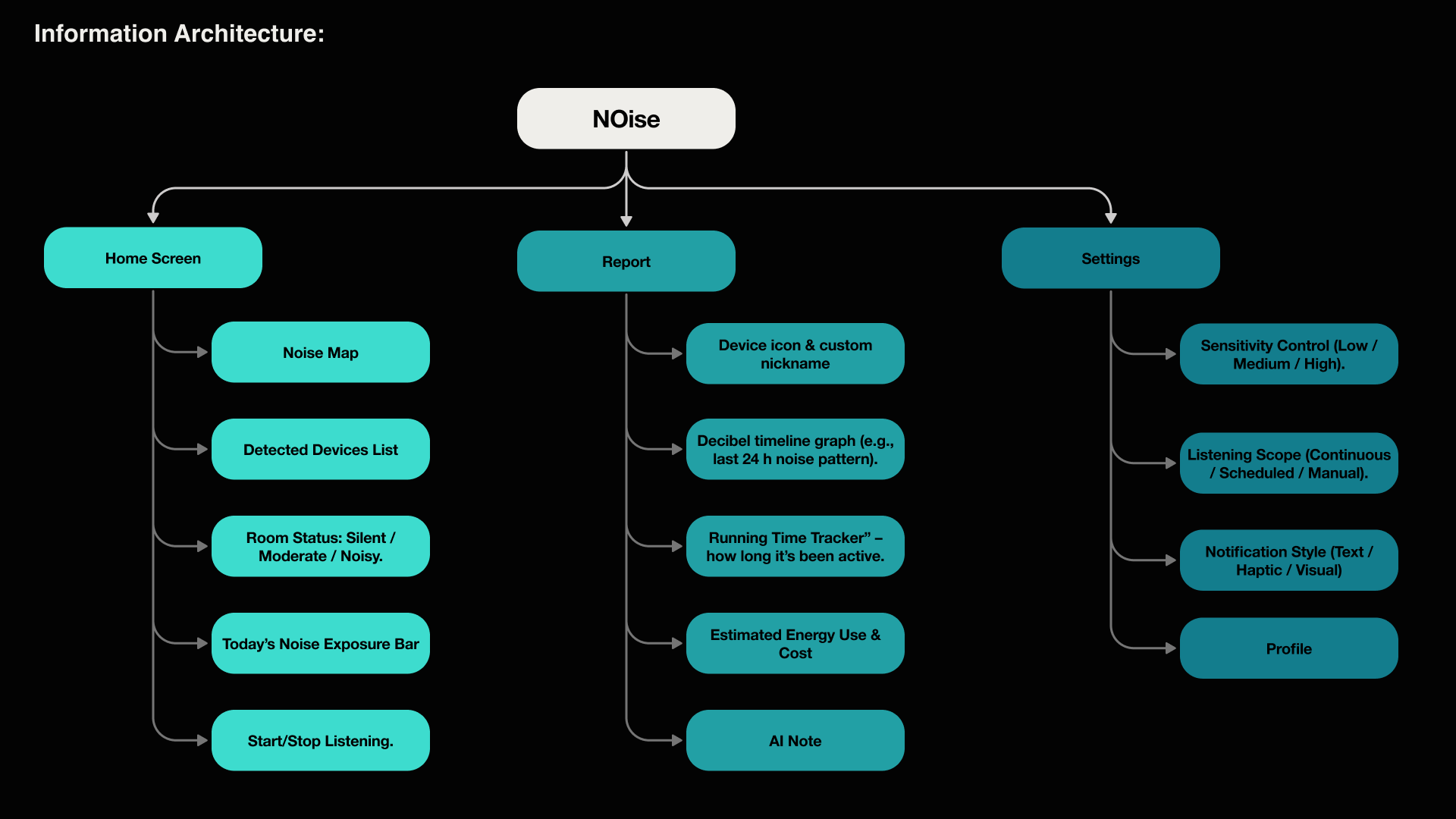
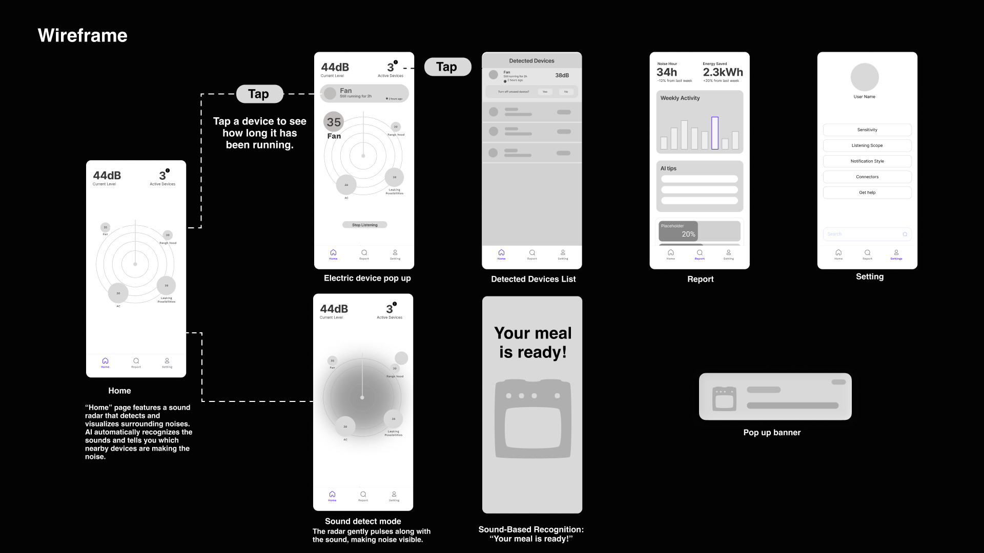
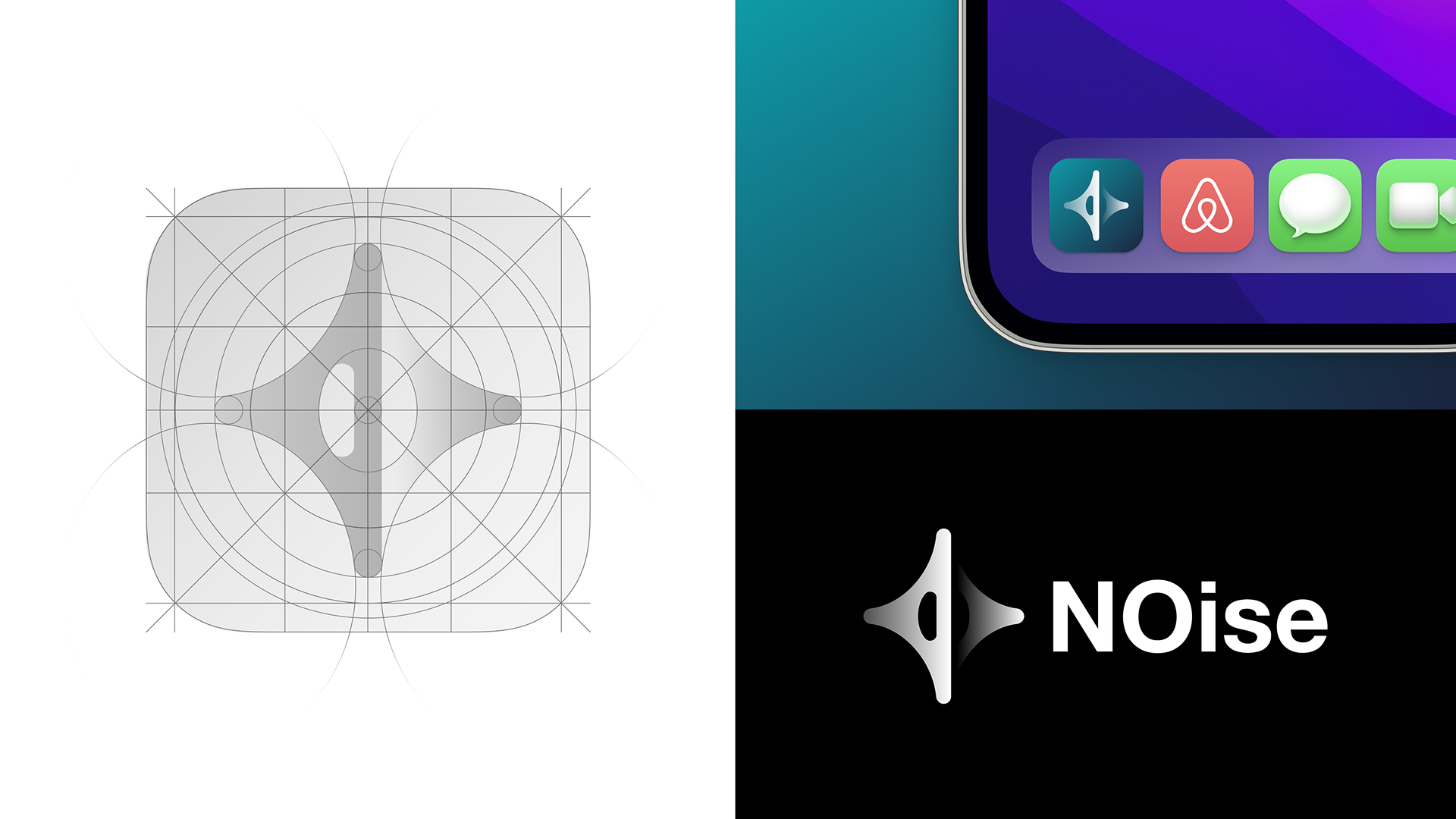
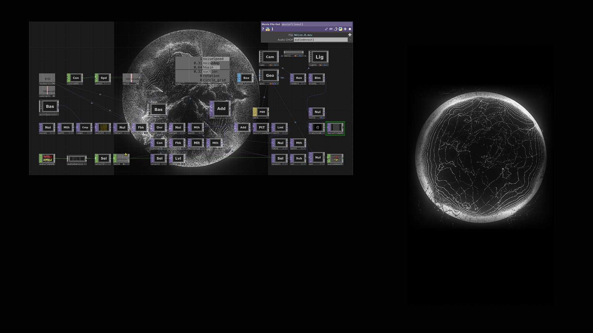
I began with online user research to confirm whether people — particularly older adults and deaf users — face real challenges in noticing home appliance noise and managing energy use. The findings showed a clear need for simpler, more visual tools that support independence and peace of mind. Next, I used Lovable and Manus AI to quickly prototype different interaction flows, exploring how sound feedback could feel intuitive and non-intrusive. Finally, I built high-fidelity interfaces in Figma and created dynamic sound visualizations in TouchDesigner, translating invisible noise into soft, glowing motion.
Challenges we ran into
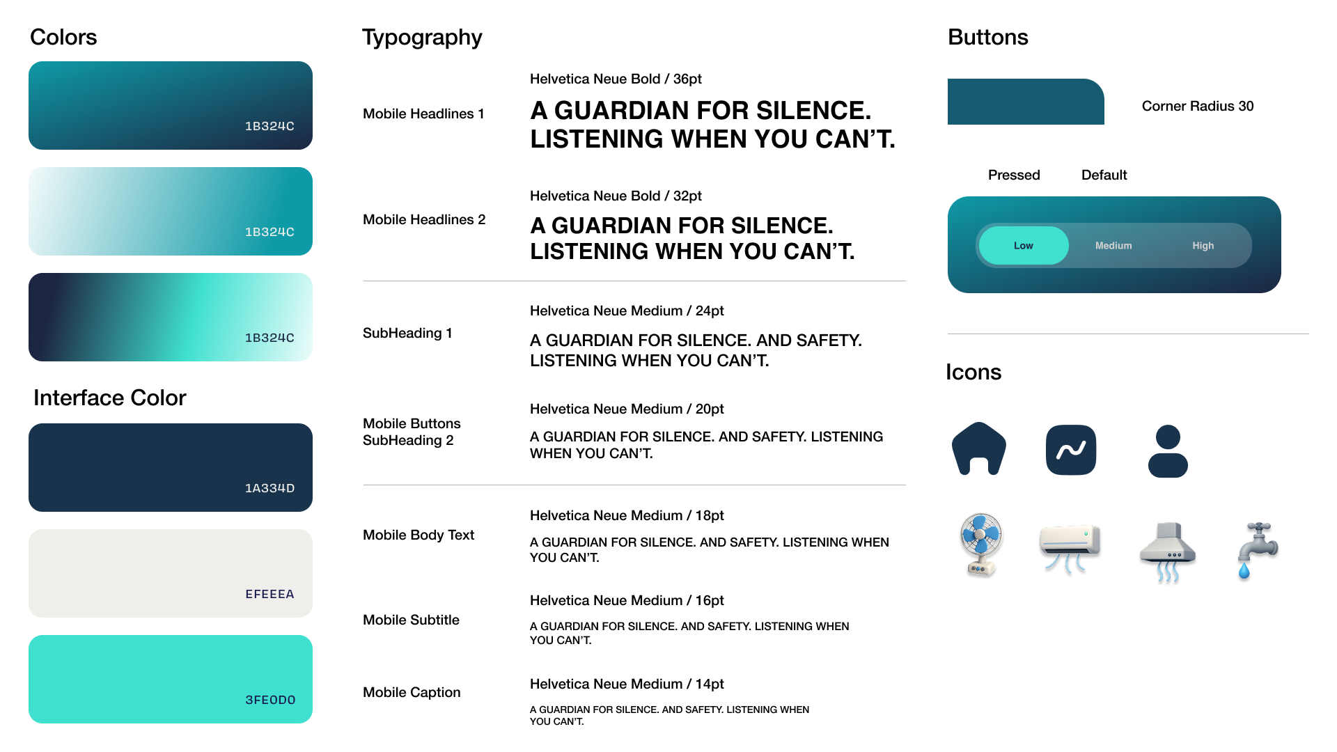
The biggest challenge was designing for accessibility without losing aesthetic appeal. Since many of our users are elderly or hearing-impaired, we: Enlarged all icons and typography for visibility. Simplified the layout by removing unnecessary information. Maintained a clean, modern visual style to keep the design elegant yet easy to read. Balancing clarity and beauty became the key to defining NOise’s visual identity.
What we learned
The biggest challenge was designing for accessibility without losing aesthetic appeal. Since many of our users are elderly or hearing-impaired, we: Enlarged all icons and typography for visibility. Simplified the layout by removing unnecessary information. Maintained a clean, modern visual style to keep the design elegant yet easy to read. Balancing clarity and beauty became the key to defining NOise’s visual identity.
Built With
- figma
- lovable
- manus
- touchdesigner


Log in or sign up for Devpost to join the conversation.