-
-
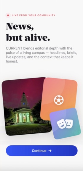
The pulse of campus
-

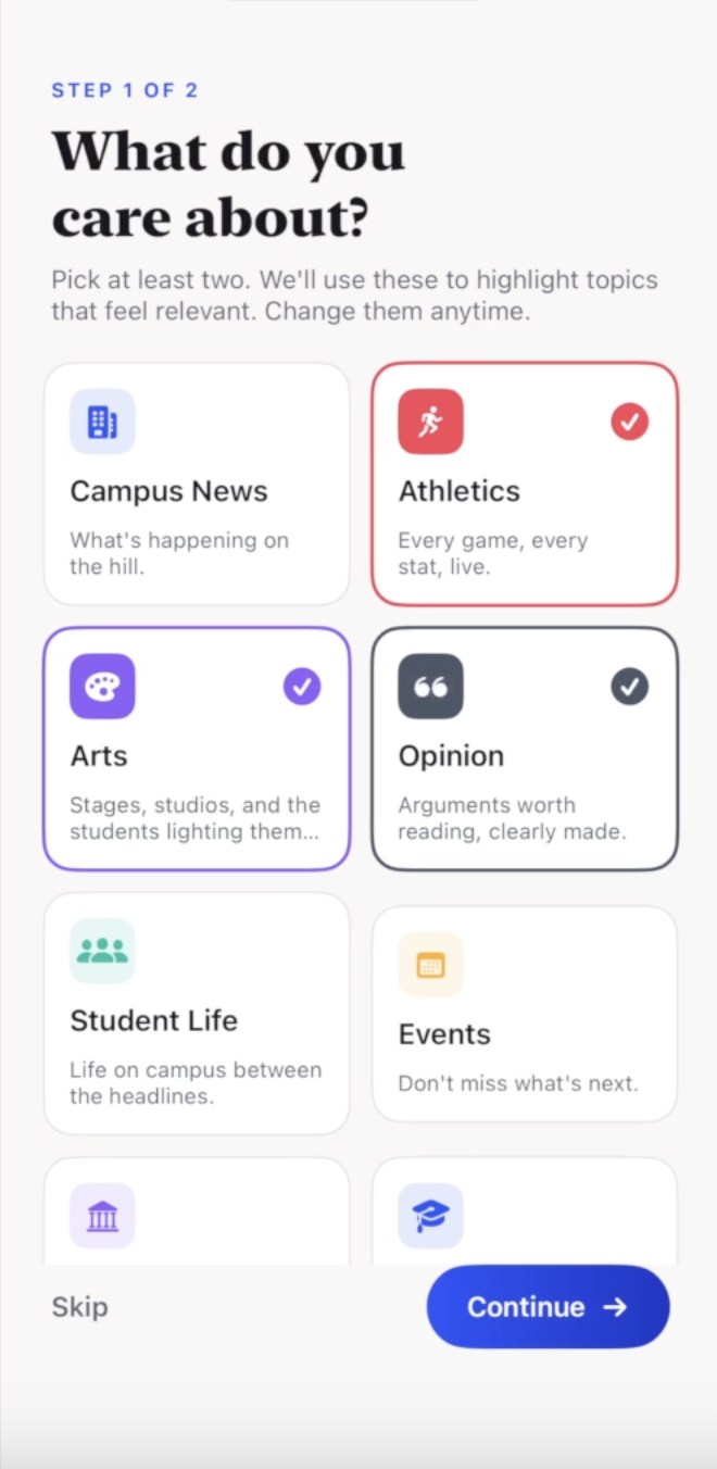
School news feed that adapts to YOU!
-
Where campus stories come alive
-
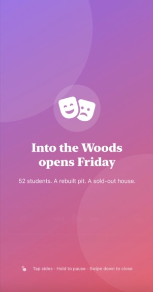
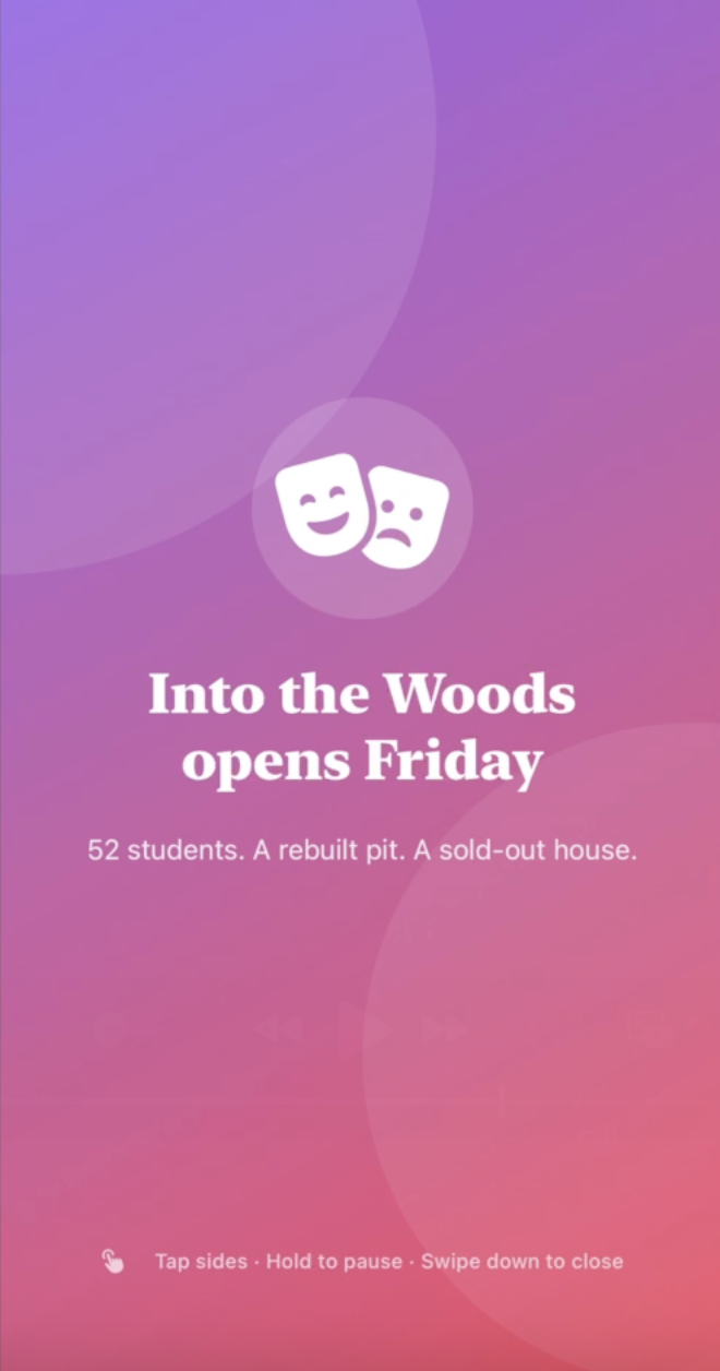
Not just articles, but moments — watch stories!
-
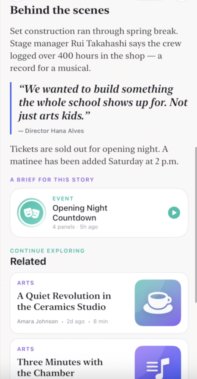
Not blocks of text. Built to be explored.
-
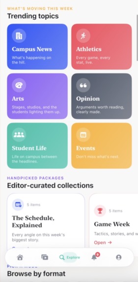
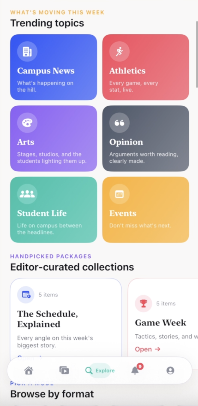
Effortlessly organized. Instantly find what matters
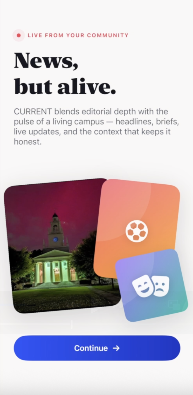
CURRENT · Reviving Campus News
Inspiration
The existing Phillips Academy news experience, which was through the Phillipian app, felt dead.
Campus life moves fast, but our school news platform didn’t reflect that. It was slow, static, and easy to ignore. Students usually heard about things elsewhere first, and by the time they opened the app, it already felt outdated.
So they stopped opening it.
That was the starting point:
If campus news doesn’t feel alive, it won’t be part of student life.
We rebuilt it with one goal:
Make campus news fast, engaging, and something people actually want to check.
How We Built It
CURRENT is a native iOS app built in SwiftUI, designed around speed, flow, and constant activity.
We rebuilt the entire experience from scratch using modern tools:
- Cursor for rapid iteration and building the interface
- ChatGPT to think through product decisions and structure
- Opus (Claude) to refine systems and clarity
- Netlify to ship a clean landing page
This let us move quickly and focus on the product instead of getting stuck on tooling.
At the core, the app is driven by a single state system that controls what the user sees at any moment. Instead of traditional navigation, everything feels immediate:
- Open an article → it appears instantly
- Tap a brief → it becomes a story-style experience
- Select a topic → it expands into a focused view
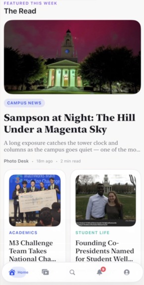
From Static Pages to a Living Feed
The biggest change was rethinking the format of news.
Instead of just long articles, CURRENT introduces multiple ways to engage:
- Briefs: fast, swipeable updates
- In Motion: what’s happening right now
- Full articles: deeper context
- Catch Up: a quick summary of everything important
The idea is simple: make it easy to check quickly so people come back often.
Structured Content
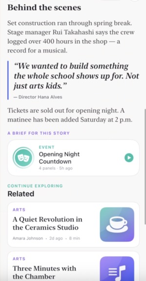
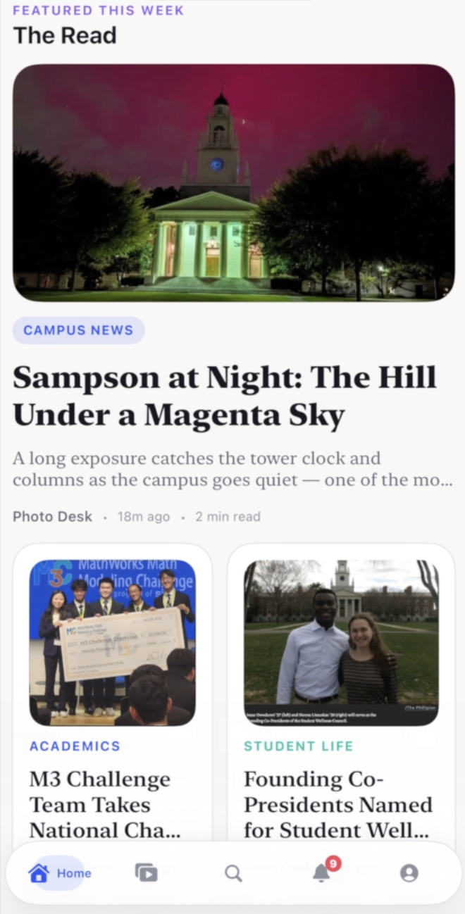
Articles are no longer just long blocks of text. They are built from structured pieces:
- Paragraphs
- Pull quotes
- Stats
- Timelines
- “What changed” sections
This makes content easier to scan, easier to understand, and easier to return to.
Personalization
To feel alive, the app has to feel relevant.
The feed adapts based on:
- Topics you follow
- What you interact with
- What’s happening now
This makes it feel like the app is moving with you, not just sitting there.
What We Learned
The problem wasn’t content quality. It was energy.
A product feels alive when:
- There are constant small updates
- There are multiple ways to engage
- It’s fast to open and easy to use
Speed changes behavior. If something feels slow, people avoid it. If it feels instant, they check it casually.
We also learned that streams work better than static lists. A list feels like work. A feed feels natural.
And depth still matters, but it comes later. People don’t start with long reads, but they get there if the entry point is easy.
Challenges
The hardest part was making the app feel alive without making it chaotic.
It’s easy to add flashy features, but most of them don’t actually improve the experience. We had to stay focused on what genuinely makes people come back.
Another challenge was balancing fun and credibility. If it feels too serious, people ignore it. If it feels too playful, people don’t trust it.
Finally, this wasn’t just a redesign. We had to rethink everything:
- how news is structured
- how people move through it
- why someone would open the app in the first place
Final Thought
The old product delivered information.
CURRENT gives people a reason to check what’s happening.

Log in or sign up for Devpost to join the conversation.