Inspiration
The inspiration for NeuroNest came from the idea that comfort is deeply personal, yet often overlooked in how we design public spaces. Neurodivergent individuals often navigate the world with heightened sensitivity to factors like noise, lighting, and crowd density, but most navigation apps prioritize convenience and speed over emotional well-being. NeuroNest was born from the belief that finding a place where you feel safe and comfortable should be just as important as finding the fastest route.
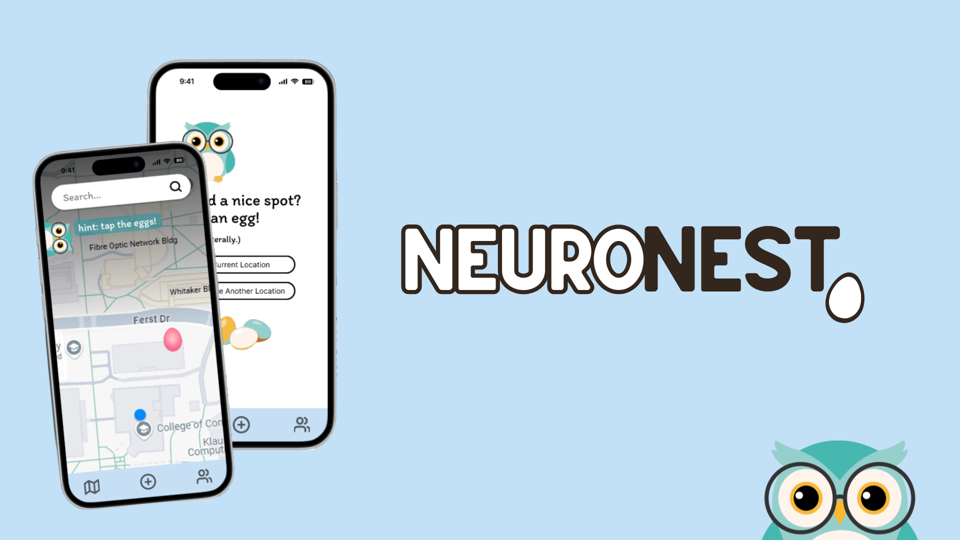
What it does
NeuroNest is a sensory-friendly navigation app designed to help neurodivergent individuals find spaces that align with their comfort needs. The app curates personalized location recommendations based on sensory preferences like noise levels, lighting, and crowd density, helping users feel more at ease in the spaces they navigate. With NeuroNest, the goal is not just accessibility, but comfort — offering people the tools to seek out places where they feel welcomed, not just accommodated. The app rethinks how we approach navigation by centering inclusion and empathy in its design.
Challenges I faced
Building this project solo was both a rewarding and challenging experience. One of the biggest hurdles was finding the right balance between personalization and simplicity. I wanted to create an experience that allowed users to express what makes them feel comfortable without making the onboarding process overwhelming or invasive. Choosing which sensory preferences to include — from quiet environments to dim lighting — required careful consideration. I also focused on using affirming, gentle language to guide users through the app without making the experience feel clinical or prescriptive. This process made me think more critically about how the smallest design choices can shape how welcome or excluded someone feels in a space.
Cool Features and Accomplishments
To give the app a sense of warmth and identity, I decided to maintain a subtle egg theme throughout the interface, with a small owl mascot representing the app's role as a thoughtful guide. Instead of dropping pins to mark locations, users would drop eggs — a playful metaphor for finding places where they could nest and recharge. This theme carried into small microcopy choices while loading suggestions or offering users spots when they needed a sensory break. These small, consistent details helped the app feel more like a companion rather than just another mapping tool.
How I built it
I designed the entire prototype in Figma, prioritizing accessibility from the ground up. The app uses muted, calming colors, spacious layouts, and multi-select preference tags to let users filter locations based on what makes them feel most comfortable. One of the biggest lessons I learned was how even something as small as loading text or button labels could contribute to the overall user experience. The challenge wasn't just making the app work — it was making it feel safe and validating.
What’s next?
If I were to take NeuroNest further, I'd love to integrate crowdsourced sensory reviews and live sensory data like noise levels and crowd density through API integrations. Another future feature could be "Reset Spaces" — nearby locations where users could take a break if they felt overstimulated. The long-term vision for NeuroNest is to not only provide personalized recommendations but to build a community where people can share what makes a space truly inclusive.
Concluding thoughts
This project taught me that inclusion isn't just about making something accessible — it's about designing with care, empathy, and a willingness to rethink how we navigate the world around us. Everyone deserves to find spaces where they can rest, recharge, and simply be — and I hope NeuroNest can help more people find their own little nests.
Figma Prototype (Note: Set to iPhone 13 mini)
Built With
- figma

Log in or sign up for Devpost to join the conversation.