-
Dashboard
Inspiration
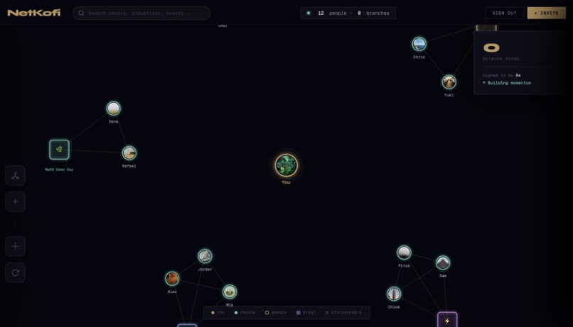
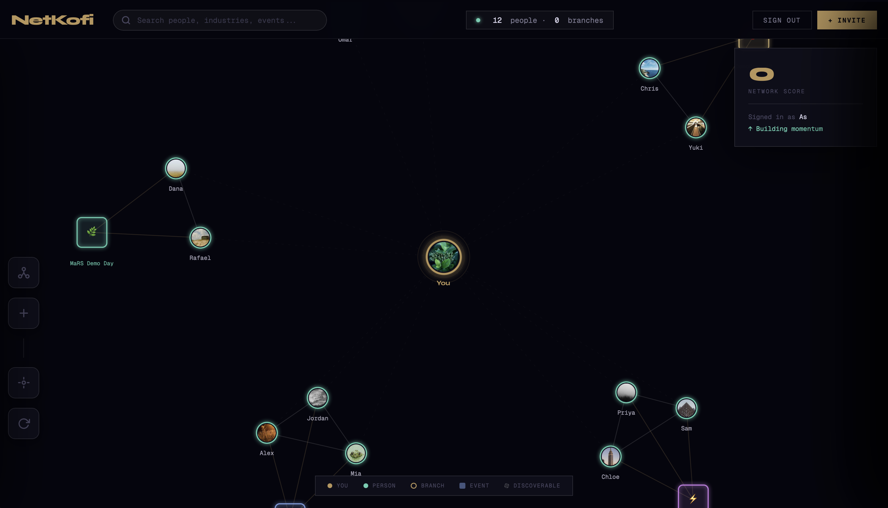
We've all been there — you meet someone incredible at a conference, exchange details, and two weeks later they're just another name in a contact list you never open. LinkedIn is a feed, not a map. Business cards are dead. And the mental overhead of remembering who someone is, where you met them, and why they matter to you is exhausting.The spark for NetKofi came from Obsidian's graph view — that dark, glowing constellation of nodes and edges that makes the invisible structure of your knowledge visible. We asked a simple question: what if your people looked like that? What if your network wasn't a list you scroll through, but a living graph you could navigate, explore, and act on in real time?
How we built it
NetKofi is built as a single-page web app powered by D3.js for the force-directed graph simulation, Supabase for authentication and real-time profile data, and vanilla HTML/CSS/JS for the interface layer.The graph engine uses D3's force simulation with custom charge, collision, and link forces to create the Obsidian-inspired node layout. We designed three distinct node types — people, branches, and events — each with their own visual language, interaction model, and physics behaviour.The UI is built around a dark design system with custom CSS variables, Geist Mono for that terminal-code feel, Instrument Serif for warmth, and Syne for bold headings. Every panel — the node inspector, the Kofi booking calendar, the meetup timeline, the branches manager — slides in as a layered overlay, keeping the graph always present and alive underneath.
Challenges we ran into
The hardest part was making the graph feel alive without being chaotic. D3 force simulations are notoriously difficult to tune — too much repulsion and nodes scatter to the edges, too little and everything collapses into a blob. Getting the right balance of charge, collision radius, and link distance for three different node types took significant iteration. Layering multiple slide-in panels (node panel, Kofi booking, meetup planner) without them conflicting in z-index, state, and animation timing was another real challenge. We also had to design a graceful fallback system — seeding the graph with realistic people and events so the experience feels rich and meaningful from the very first login, before a user has built up any real connections.
Accomplishments that we're proud of
We're most proud of the moment the graph first clicks for a new user — that instant where they see their network rendered as a glowing constellation and it just makes sense in a way a contact list never does. Beyond the visual, we're proud of the Meetup Panel — the feature that pulls together live location status, a full event timeline (past, present, upcoming), and a smart suggestion engine to tell you exactly when and where you could run into someone in real life. It feels like something that should already exist but doesn't. We're also proud of how polished the overall experience feels — the calendar booking flow, the connection memory system, the branch clustering, the invite code mechanic — each piece adds up to something that feels genuinely production-ready.
What we learned
Building NetKofi taught us that data visualisation is a UX problem first. A beautiful graph is useless if clicking a node doesn't immediately reward you with something meaningful. Every visual decision had to earn its place by making the underlying data more legible and actionable. We also learned how powerful local-first state can be for a tool like this. By persisting branches, connections, notes, and memories in localStorage, the app feels fast and personal without requiring a complex backend sync on every interaction. And perhaps most importantly — we learned that the best networking tools aren't the ones that help you collect more contacts. They're the ones that help you remember the ones you already have.
What's next for NetKofi
The graph is just the beginning. Here's where we're taking it: Real-time presence — live location sharing so your graph actually pulses with where your network is right now, not just simulated status data Calendar sync — connect Google or Outlook Calendar so Kofi Chat availability is pulled from real schedules Event integrations — pull from Eventbrite, Luma, and Meetup so upcoming events in your city surface automatically as nodes in your graph AI relationship nudges — surface dormant connections and suggest the right moment to reach back out based on event overlap and time since last contact Mobile app — a native iOS/Android experience so your network graph lives in your pocket, ready at every event you attend Team networks — shared branch graphs for communities, accelerators, and cohorts so entire organisations can map their collective network together
Built With
- css
- d3.js
- html
- javascript
- supabase


Log in or sign up for Devpost to join the conversation.