Inspiration
The idea behind Netflix Content Analytics was to gain data-driven insights into Netflix’s massive content library. With thousands of movies and TV shows released across different countries and genres, understanding content trends, ratings, and release patterns can reveal valuable insights for producers, marketers, and audiences. The goal was to visualize how Netflix’s global content strategy evolved over time using interactive analytics.
What it does
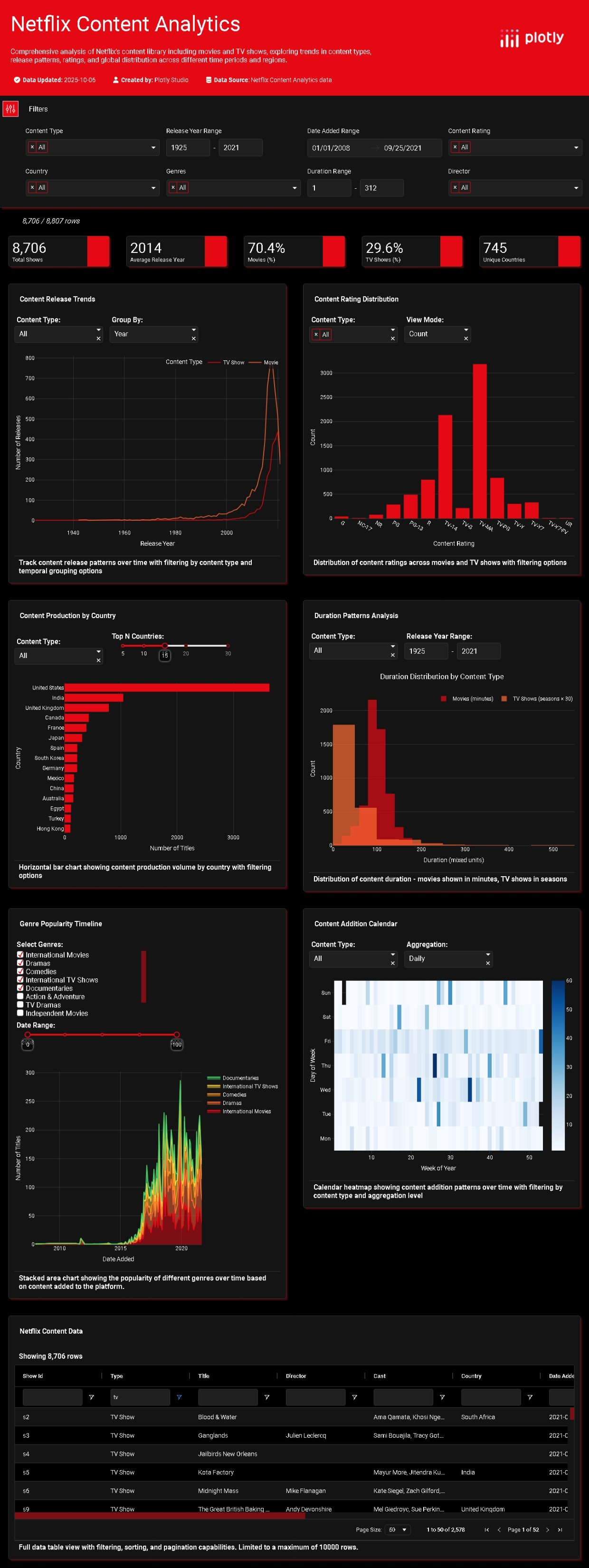
Netflix Content Analytics is an interactive dashboard that provides:
- Comprehensive analysis of Netflix’s movies and TV shows.
- Dynamic filters for content type, release year, country, genre, and rating.
- Visualizations of release trends, content duration, genre popularity, and global content distribution.
- Heatmaps showing when new titles were added to Netflix.
- Interactive tables for exploring detailed metadata (titles, directors, countries, etc.). It enables users to explore how Netflix’s content strategy has changed over time, which genres dominate, and how movies and shows differ by duration, region, and rating.
How we built it
The project was built using: Plotly Dash / Plotly Studio for creating interactive visualizations and layout. Netflix Content Dataset as the primary data source. Python (Pandas, NumPy) for data preprocessing and transformation. Plotly charts for trend visualization (bar charts, histograms, area plots, heatmaps). Dash filters and callbacks to make every graph responsive to user selections. Dark-themed UI for a professional and cinematic look consistent with Netflix’s brand.
Challenges we ran into
Data cleaning: Handling missing or inconsistent values in Netflix’s dataset (especially release years, directors, and genres). Balancing performance and interactivity: Optimizing callbacks and filters to handle over 8,000 records efficiently. Visualization scaling: Ensuring charts remain readable and consistent across varying filters. Time-based aggregation: Aligning release dates and addition dates for meaningful trend analysis.
Accomplishments that we're proud of
Successfully created a fully interactive analytics dashboard. Integrated multiple dimensions — time, geography, and genre — into a single cohesive visualization. Designed a clean, Netflix-inspired dark UI that’s both visually appealing and data-rich. Delivered insightful visual trends, such as the surge in releases post-2015 and the dominance of U.S. and Indian content.
What we learned
How to use Plotly Dash effectively for building professional-grade analytics dashboards. The importance of data preprocessing and feature engineering for clean visualizations. How to design user-friendly interfaces that make complex datasets easy to explore. Deeper understanding of Netflix’s global content strategy and how content trends evolve over time.
What's next for Netflix Content Analytics
Adding predictive analytics to forecast future genre trends or release patterns. Integrating sentiment or rating analysis from IMDb or Rotten Tomatoes. Implementing recommendation insights (e.g., top-performing genres by region). Expanding the dataset to include newer titles post-2021 and real-time data updates. Deploying as a public web app with user accounts and personalized dashboards.


Log in or sign up for Devpost to join the conversation.