-
Footer with agency motto and operational details
-
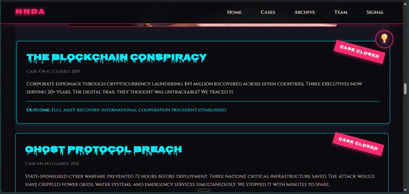
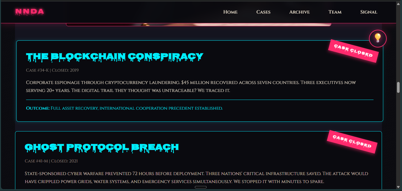
Closed cases showing Blockchain Conspiracy and Ghost Protocol
-
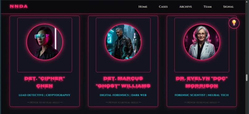
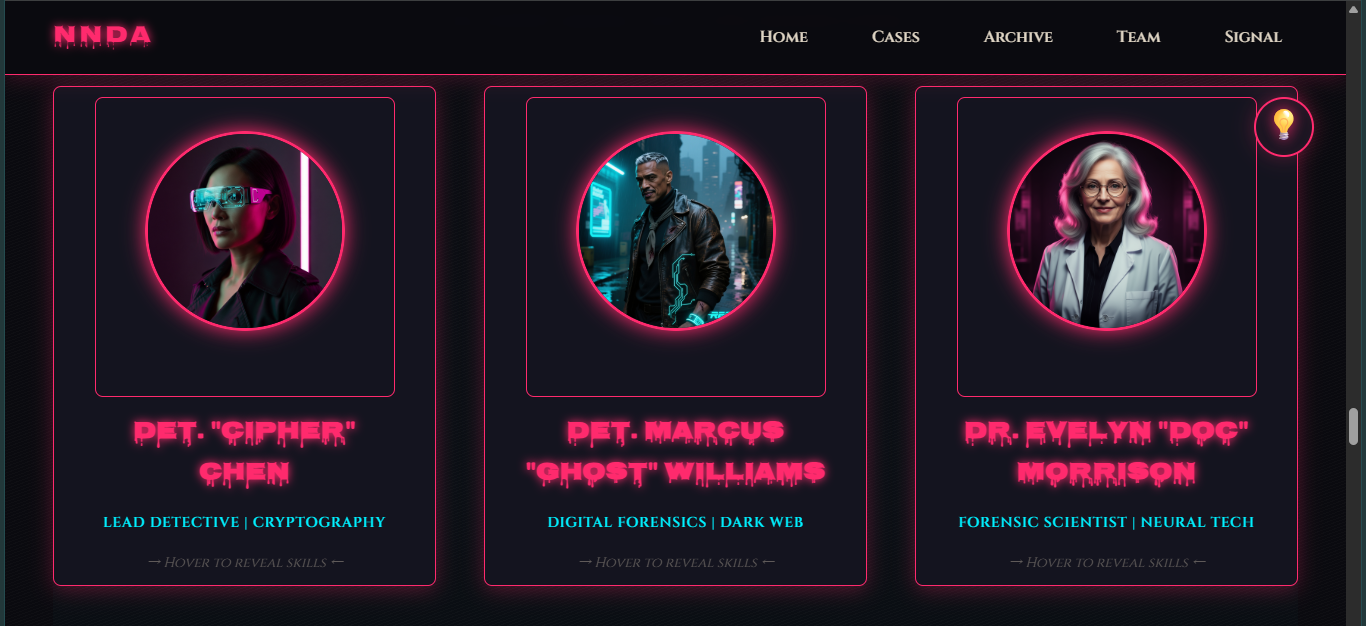
Three detective cards with circular portraits and flip prompt
-
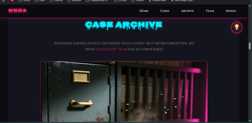
Case Archive with filing cabinet and cyan dripping text
-
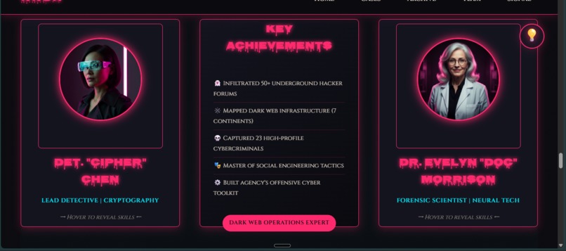
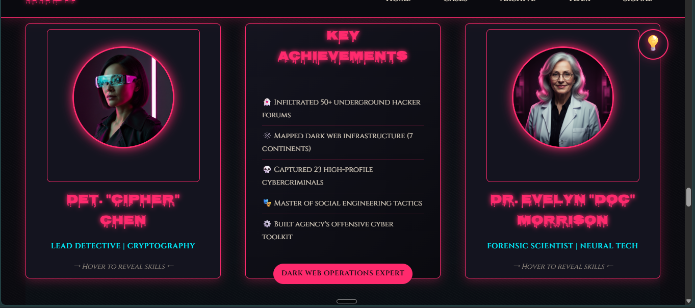
Flipped 3D card showing Detective Chen's achievements
-
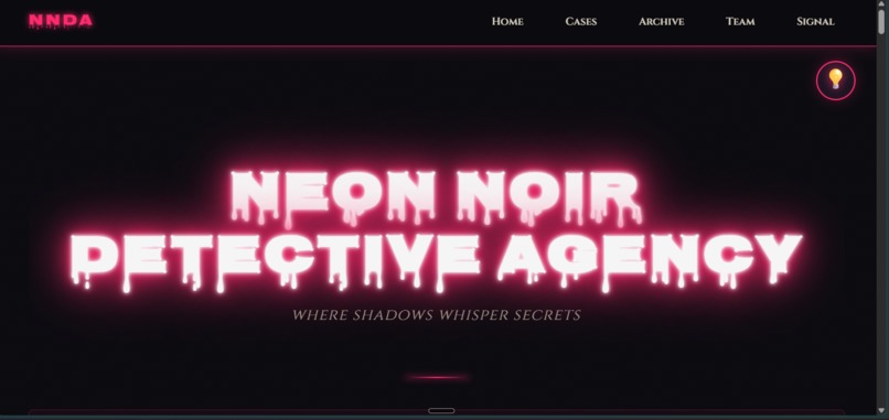
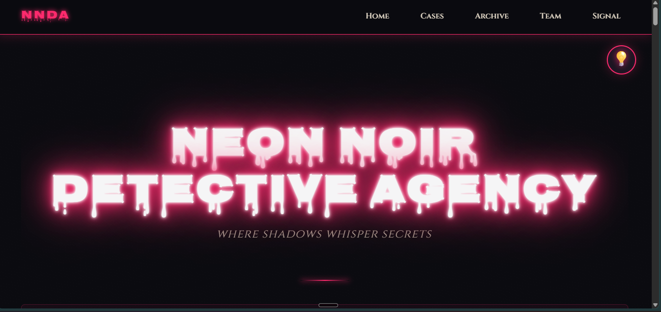
Hero with dripping neon title, navigation, and theme toggle
-
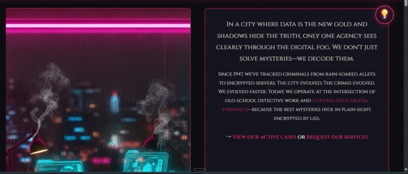
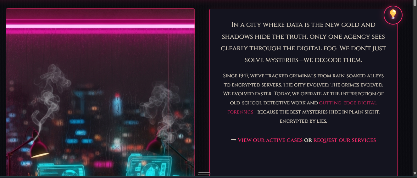
Office interior split with agency intro text and CSS links
-
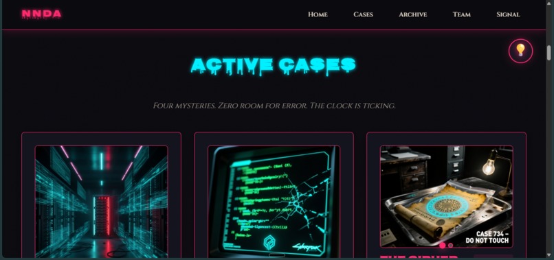
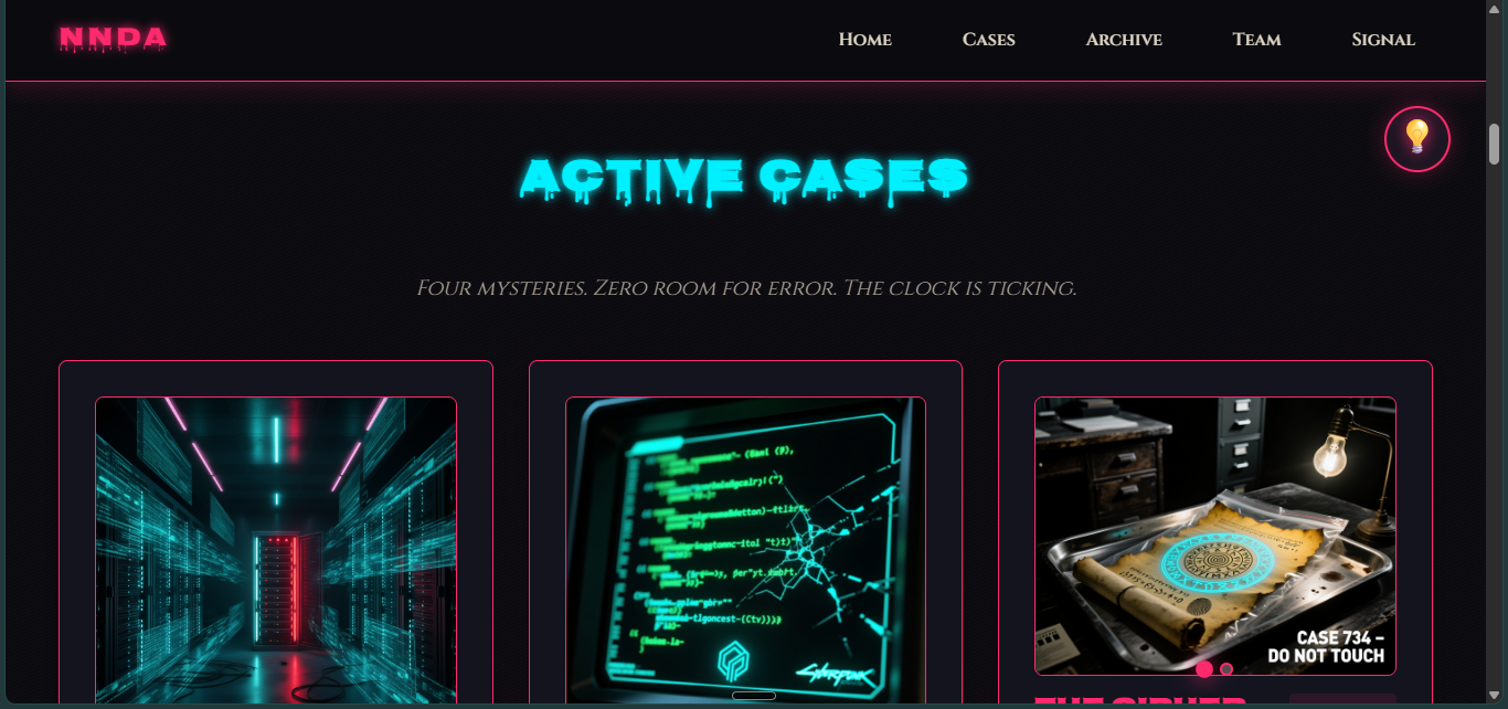
Active Cases with cyan glitch title and three case cards with carousels

Neon Noir Detective Agency - Project Story
💡 Inspiration
The challenge was simple yet daunting: build something interactive with pure CSS—no JavaScript allowed. We asked ourselves: "How far can we push CSS in 2025?"
Inspired by film noir cinematography and cyberpunk aesthetics, we envisioned a detective agency website that didn't just display information—it told a story. Every hover, every animation, every color shift would pull visitors deeper into a neon-lit mystery. We wanted to prove that modern CSS isn't just for styling—it's a storytelling medium.
🎯 What It Does
Neon Noir Detective Agency is a fully interactive, immersive website featuring 10 advanced CSS-only techniques:
- Typewriter Effect - Hero tagline types out character-by-character using
steps()animation - 3D Flip Cards - Detective profiles rotate 180° on hover revealing hidden achievements
- Image Carousels - 4 fully functional carousels (8 images) using radio button state management
- Glitch Effect - Case titles distort with RGB channel separation on hover
- Pulsing Status Indicators - Color-coded animated dots show case priority
- Animated Statistics - Staggered counter reveals (247 cases, 78 years, 100% success)
- Neon Borders - Rotating gradient animations on hover
- Parallax Scrolling - Fixed background creates depth illusion
- Smooth Reveals - Sections fade-in-up as you scroll
- Light/Dark Mode - Complete theme toggle using CSS checkbox hack
Zero lines of JavaScript. Pure HTML and CSS wizardry.
🛠️ How We Built It
Architecture
We structured the project around CSS custom properties for theming and CSS Grid/Flexbox for responsive layouts. Every interactive feature leverages native CSS capabilities:
Carousel mechanism: Radio button
:checkedpseudo-class + sibling combinators#slide1:checked ~ .carousel-slides { transform: translateX(0); } #slide2:checked ~ .carousel-slides { transform: translateX(-100%); }3D flip cards:
perspective+transform-style: preserve-3d+rotateY(180deg)Theme toggle: Checkbox
:checkedstate changes CSS variables globally#light-switch:checked ~ .page-wrapper { --bg: var(--bg-day); --text: var(--text-day); }
Workflow
- Design first - Created color palette (noir vs daylight modes) and chose typography (Nosifer + Cinzel)
- Build modularly - Each feature developed and tested independently
- Optimize - Used
animation-fill-mode,will-change, and hardware-accelerated transforms for 60fps performance - Accessibility - Added ARIA labels,
prefers-reduced-motionsupport, and semantic HTML5
Math Behind the Typewriter
The typewriter effect uses discrete steps to create character-by-character animation:
$$ \text{steps} = \lceil \text{character count} \rceil $$
For "Where Shadows Whisper Secrets" (31 characters): $$ \text{width} = 31\text{ch} + 0.05\text{em} \times 31 \approx 34\text{ch} $$
This accounts for letter-spacing to prevent text cutoff.
🚧 Challenges We Ran Into
1. Carousel State Management
Problem: CSS has no variables or state—how do we track which slide is active?
Solution: Radio buttons! The :checked pseudo-class maintains state, and sibling selectors propagate it:
input[type="radio"]:checked ~ .slides .slide:nth-child(2) {
  transform: translateX(0);
}
2. Typewriter Text Cutoff
Problem: Text "Where Shadows Whisper Secrets" displayed as "Where Shadows Whisper Secr..."
Solution: The letter-spacing: 0.1em added extra width. We adjusted:
- Reduced letter-spacing to
0.05em - Increased animation target from
31ch→34ch - Used
forwardsfill-mode to preserve final state
3. 3D Flip Card Flickering
Problem: Cards flickered during rotation showing both sides simultaneously.
Solution: Added backface-visibility: hidden to both card faces, ensuring only the visible face renders during the transform.
4. Mobile Responsiveness
Problem: Desktop animations felt too intense on mobile devices.
Solution: Implemented progressive enhancement with media queries and prefers-reduced-motion:
@media (prefers-reduced-motion: reduce) {
  * { animation-duration: 0.01ms !important; }
}
🏆 Accomplishments That We're Proud Of
✨ 10 interactive features without a single line of JavaScript - This wasn't about avoiding JS; it was about showcasing CSS's evolution
🎨 Production-ready quality - Complete with accessibility (ARIA labels, semantic HTML, reduced motion support), SEO optimization (meta tags, structured data, longtail keywords), and responsive design
🎭 Storytelling through code - Every animation serves the noir narrative: glitching text hints at digital corruption, pulsing indicators create urgency, parallax adds cinematic depth
📊 Performance - Achieving 60fps animations using hardware-accelerated transforms and optimized keyframes
🧩 Carousel complexity - Building fully functional image carousels with navigation dots using only radio buttons and CSS selectors felt like solving a puzzle
📚 What We Learned
Technical Skills
- CSS Grid & Flexbox mastery - Building complex layouts that adapt fluidly
- Animation choreography - Timing staggered delays for visual rhythm \( t_n = t_0 + n \cdot \Delta t \)
- Pseudo-element creativity - Using
::beforeand::afteras animation layers for glitch effects - State management in CSS - Radio buttons and checkboxes can maintain application state
- 3D transforms - Understanding
perspective,transform-style, andbackface-visibility
Design Principles
- Constraints breed creativity - The "no JavaScript" rule forced us to think deeply about CSS capabilities
- Theme consistency - Every feature should reinforce the narrative (noir mystery + cyberpunk tech)
- Progressive enhancement - Build a solid foundation, then layer interactivity
Problem-Solving
- Debug systematically - When typewriter text cut off, we measured character widths and calculated exact spacing
- Read the specs - Understanding CSS specifications (like animation fill modes) prevented workarounds
- Test cross-browser - Different browsers render transforms and animations slightly differently
🚀 What's Next for Neon Noir Detective Agency?
Phase 1: Enhanced Interactivity
- Rotating tagline easter egg - Cycle through multiple slogans with a rare creepy message appearing randomly
- CSS-only modal system - Click case files to reveal full investigation details
- Animated timeline - Agency history from 1947 to 2025 with scroll-triggered reveals
Phase 2: Expanded Content
- More cases - Add 8 more investigation files with unique evidence carousels
- Client testimonials - Animated testimonial carousel with star ratings
- Blog section - Case studies explaining CSS techniques used in the project
Phase 3: Technical Improvements
- Performance optimization - Lazy-load images, optimize animation paint cycles
- Accessibility audit - WCAG 2.1 AAA compliance, screen reader testing
- Print stylesheet - Noir-themed printer-friendly version
Phase 4: Community
- Open source contribution - Create reusable CSS component library from techniques
- Tutorial series - Blog posts breaking down each of the 10 features
- CodePen collection - Isolated examples of each technique for learning
Long-term Vision
Transform this from a hackathon project into a CSS showcase platform where developers can:
- Learn advanced CSS techniques through interactive examples
- Contribute their own CSS-only features
- Explore the boundaries of what's possible without JavaScript
The truth about CSS It's more powerful than most developers realize. We just need the courage to explore it.
Built With
- 3d-transforms
- advanced-selectors
- css-grid
- css3
- flexbox
- frameworks
- google-fonts
- html5
- keyframe-animations
- libraries
- or-build-tools?just-semantic-html-markup-and-~1
- pure-html5-and-css3-with-google-fonts-api-(nosifer-and-cinzel-typefaces).-zero-javascript
- semantic-html

Log in or sign up for Devpost to join the conversation.