Inspiration
We have discussed how low-income neighborhoods in North Carolina (and the South in general) are far too frequently dismissed as underperforming without anyone questioning why. That reputation is not predetermined; rather, it is the outcome of structural factors that most conventional education dashboards fail to highlight, such as poverty, lead exposure, and broadband availability. Our goal was to create a data-driven solution that would replace the notion that "the South just has bad schools" by outlining the precise causes of non-completion, district by district, along with practical solutions.
What it does
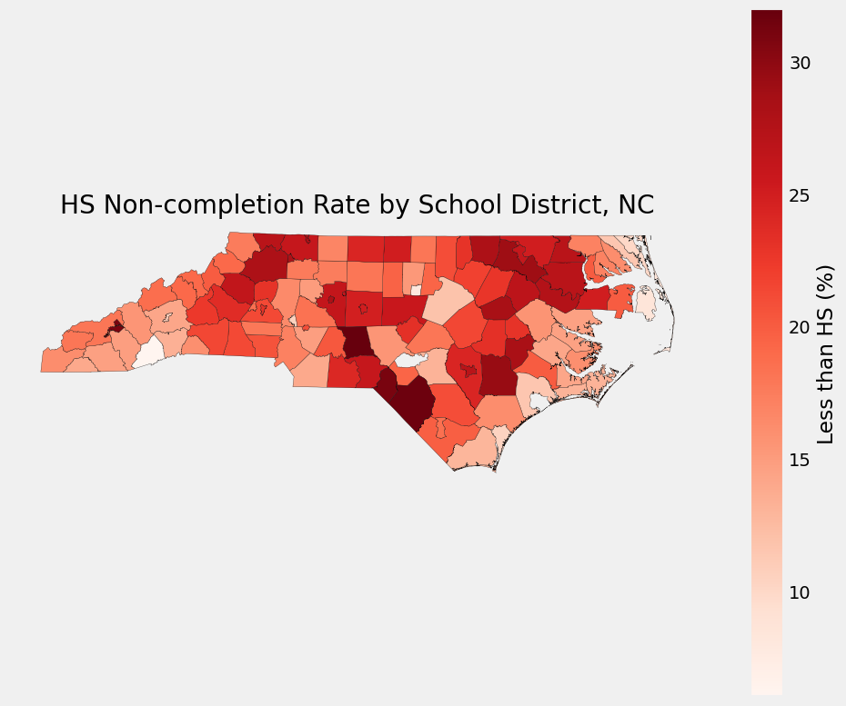
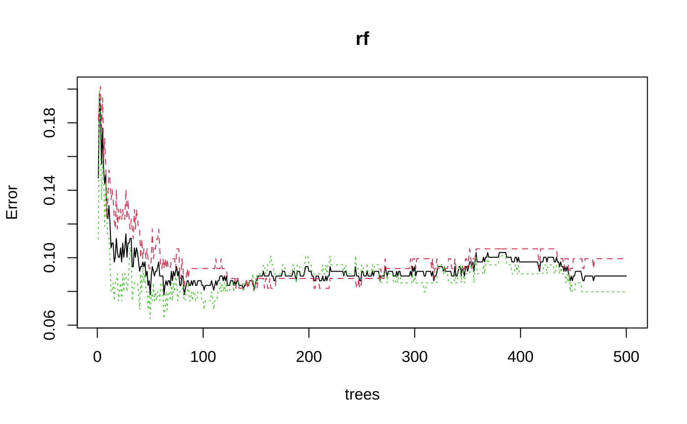
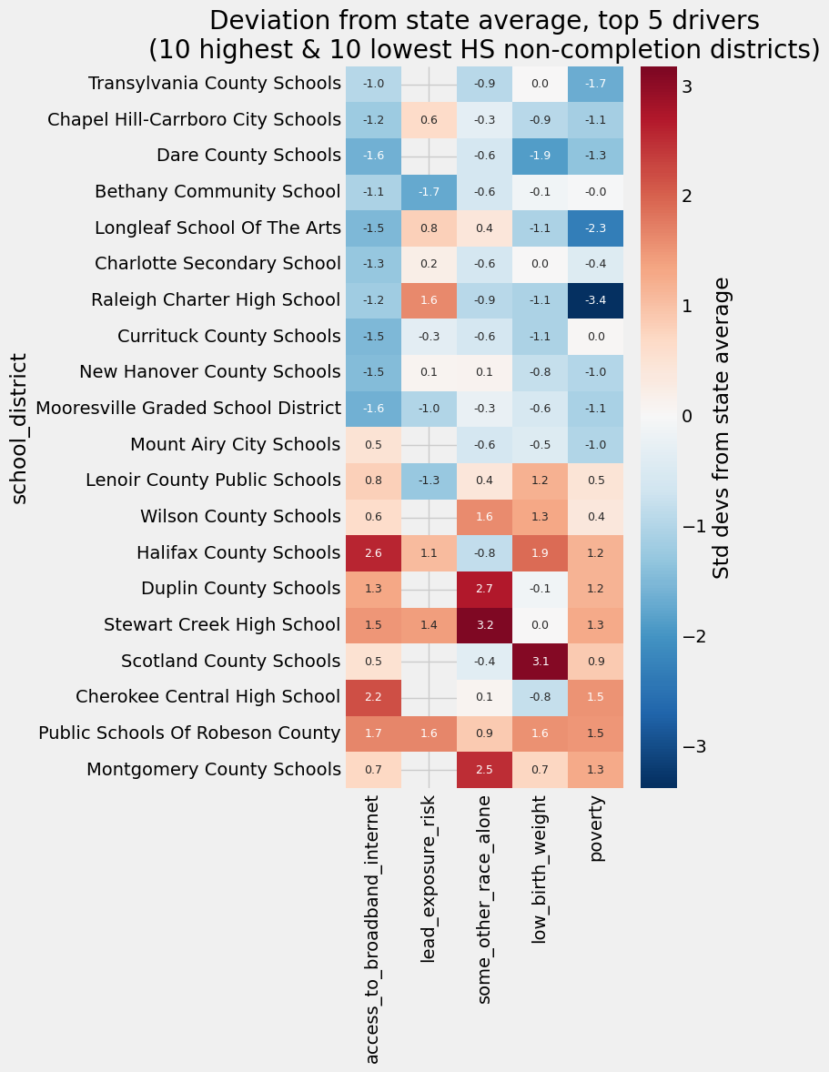
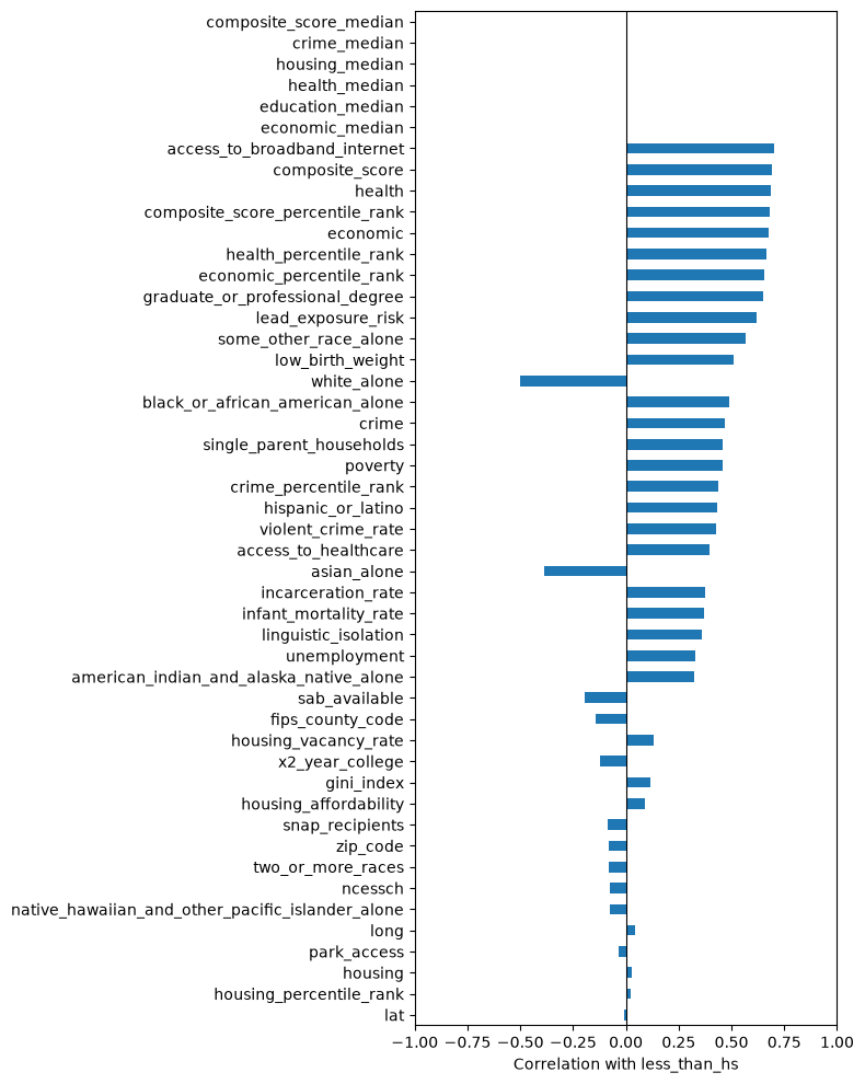
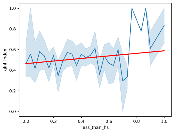
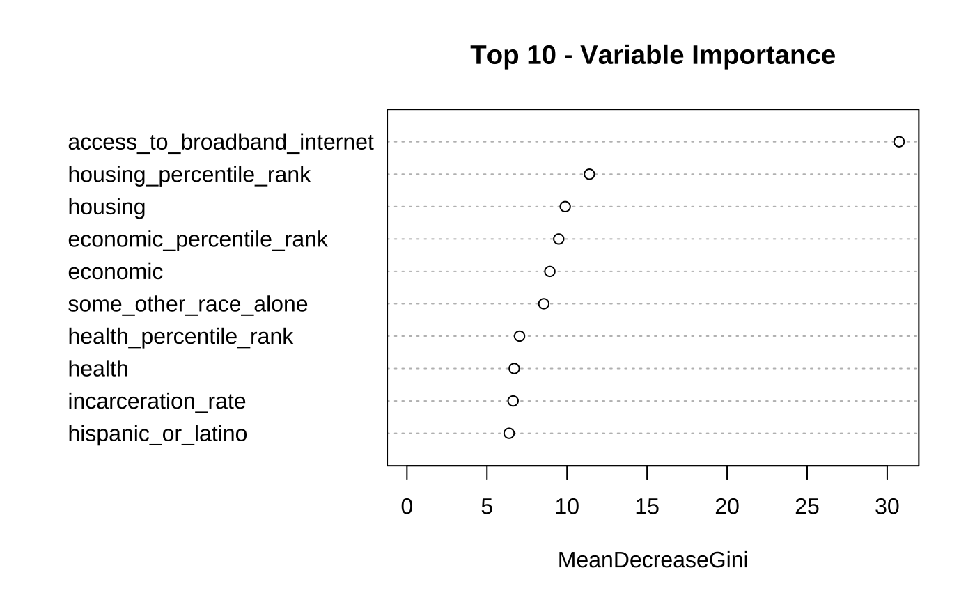
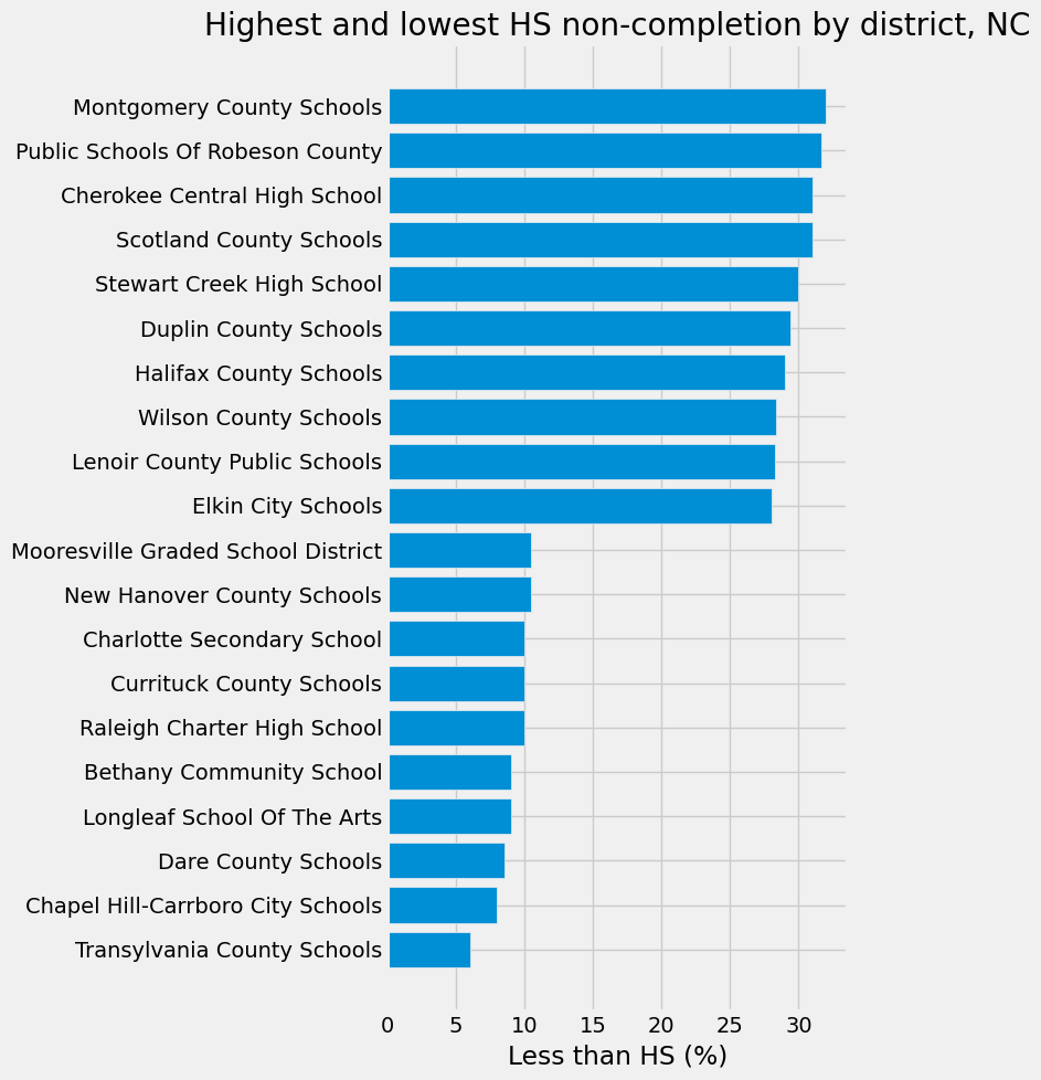
Our dashboard uses an interactive choropleth to map high school non-completion rates across all NC school districts. You can click on any district to view its profile. Broadband access, lead exposure risk, low birth weight, poverty, and racial composition (shown for context, not as a policy lever) are the five main drivers that each district's panel compares to the state average. It also automatically generates a plain-language recommendation identifying the particular factor that policymakers should prioritize for that district. The complete analytic trail, which includes correlation screens, a random forest variable-importance check, and the geographic/statistical visualizations that reduced the number of raw ODIS variables from 56 to 5 actionable drivers, is shown below the map.
How we built it
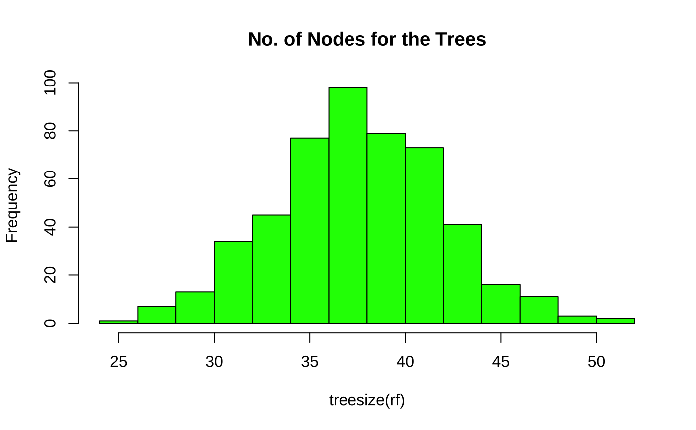
The Johns Hopkins Open Data Index for Schools (ODIS) dataset served as our starting point. While the rest of the team worked in Python (pandas, statsmodels, seaborn) for regression and exploratory analysis, one member cleaned the raw data in R. In order to prevent circular correlations (because HS non-completion is an input to those aggregates), we explicitly identified and eliminated ODIS's own composite/domain-aggregate variables, performed a correlation screen across ten possible predictors, and cross-validated our results using a random forest model. We combined our data with NCES's official school district border shapefiles for geography, manually correcting any naming discrepancies between the two sources. Using Plotly for the interactive map, the final dashboard is constructed in Streamlit and launched from a Python virtual environment.
Challenges we ran into
- WeFor real-time collaborative coding, we first attempted GitHub Codespaces, but it didn't work well for our setup, so we changed course. After that, we attempted Google Colab for live multiplayer editing, but it wasn't loading or successfully syncing updates across teammates, so we switched everyone to a shared local configuration.- We then tried Google Colab for live multiplayer editing, but it wasn't loading or syncing updates reliably across teammates, so we moved everyone into a shared local setup instead.
- We tried visualizing by county using a Tableau version, but we couldn't figure out why some counties silently didn't render. This encouraged us to create the map ourselves using Python and GeoPandas, where we could manage and troubleshoot each stage of the process.
- It was necessary to manually resolve more than a dozen naming inconsistencies (such as "Nash-Rocky Mount Schools" vs. "Nash County Public Schools") in order to match school district names between our ODIS-derived data and NCES's official boundary shapefiles. We discovered that a large portion of "missing" districts were charter schools with no attendance-boundary geography at all.
- We discovered and had to fix a true documentation problem in the source dataset: one of our important variables was described in reverse from what the underlying Census methodology and value distribution truly revealed in ODIS's own README. Before we trusted our findings, we checked the primary technical report to make sure the definition was right.
Accomplishments that we're proud of
In just one day, a raw 56-variable dataset was transformed into a functional, interactive policy tool, complete with a dashboard that converts statistical findings into understandable recommendations that a non-technical policymaker could act upon right away, a real geographic visualization created from scratch, and a defensible, statistically grounded narrowing process (rather than just selecting variables that looked interesting).
What we learned
- Broadband internet access was consistently our strongest, most independent predictor of HS non-completion across every method we used (correlation, regression, and random forest), a more actionable and less obvious finding than the "poverty causes everything" narrative we expected going in.
- The importance of checking whether a "strong correlation" is actually meaningful: several of ODIS's own composite variables correlated highly with our target simply because they're mathematically built from overlapping data, which taught us to always trace a variable back to its construction before trusting it as a "driver."
- How to problem-solve collaboratively under time pressure. When our first two collaboration tools failed, we didn't get stuck debugging them further; we regrouped, picked a new approach, and kept moving, which mattered more with a one-day clock than getting any single tool to work perfectly.
- How to scope, structure, and execute a full data science project (from research question to statistical analysis to a dashboard) with no set instructions, figuring out our own pipeline, tools, and priorities as we went.
What's next for NC High School Non-Completion Dashboard
- Extend the same pipeline to all 50 states, since ODIS covers the whole U.S., not just NC
- Bring in the literacy-specific dataset (NCES's PIAAC Skills Map) to extend the analysis from HS non-completion to adult literacy outcomes directly
- Add a "what if" simulator where a policymaker can estimate the impact of improving a specific driver (e.g., broadband access) for their district
- Partner with an NC education or policy organization to pressure-test the recommendation logic against real on-the-ground knowledge of these districts

Log in or sign up for Devpost to join the conversation.