-
-

Intro Cover
-
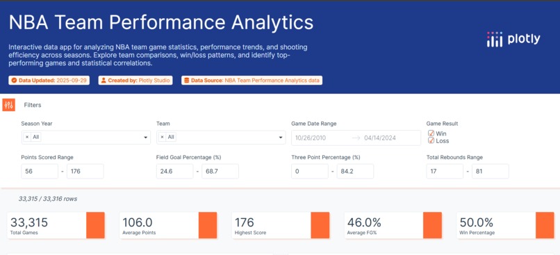
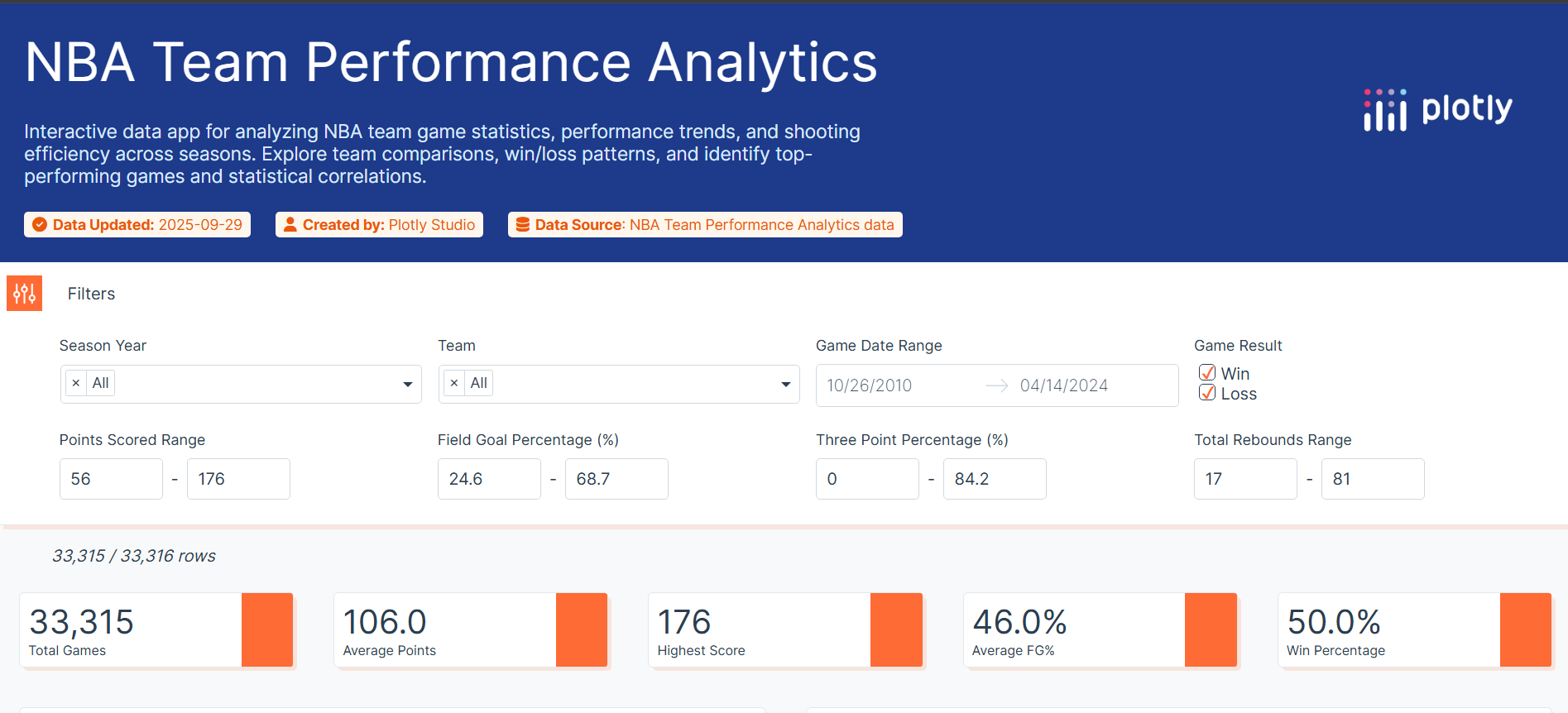
Application Summary
-

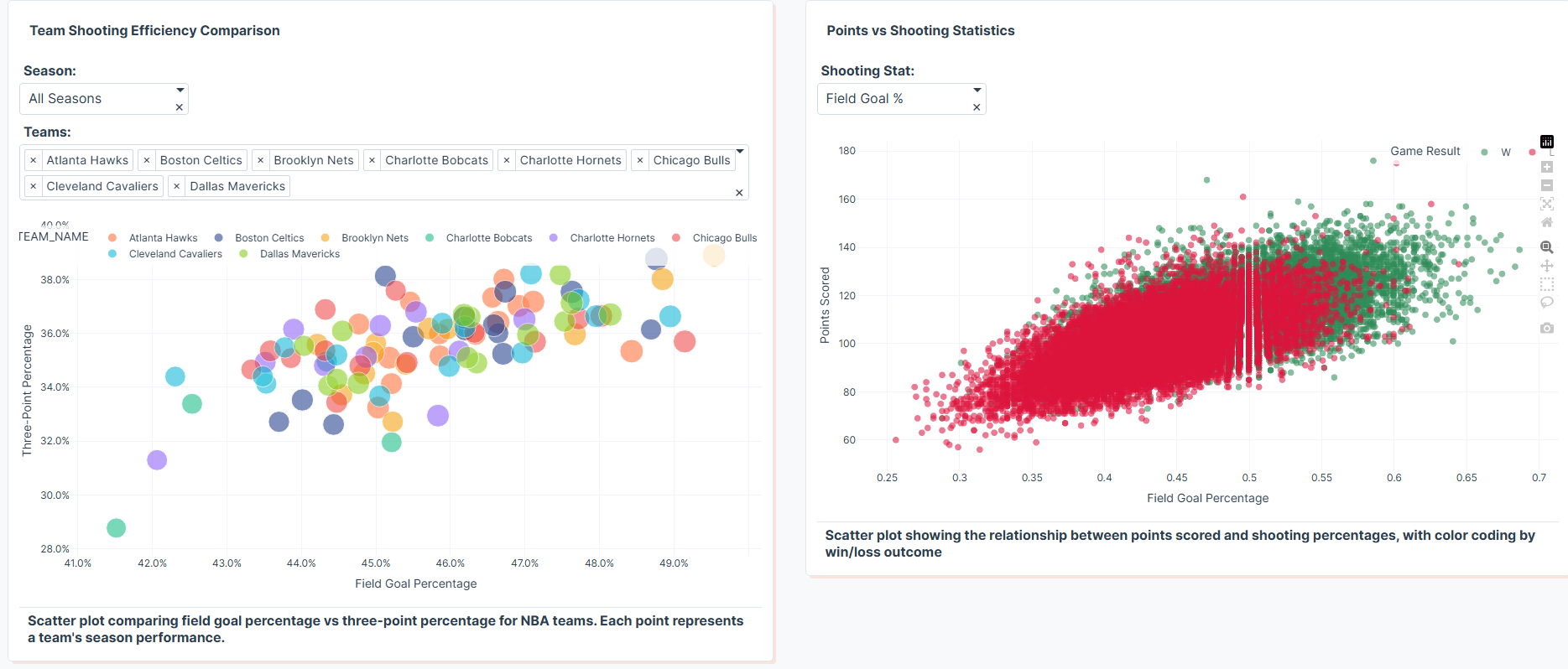
Shooting Statistics
-
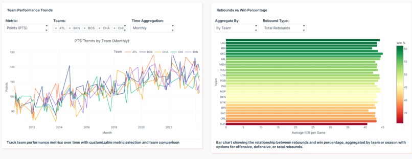
Performance trends over time and rebound V/S win percentage
-
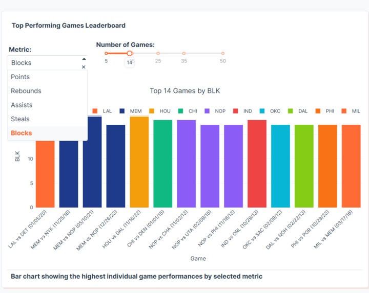
Top performing game leaderboard
-

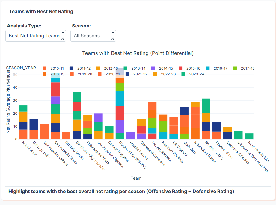
Team with best net rating


🏀 NBA Team Performance Analytics
Inspiration
The NBA is full of data — from shooting accuracy to team efficiency — but making sense of it can be complex.
I wanted to build an interactive, AI-assisted dashboard that turns raw game stats into clear visual insights.
What it does
NBA Team Performance Analytics visualizes team stats like shooting efficiency, points scored, and win/loss patterns across multiple seasons.
Users can filter by season or team and explore insights such as:
- Team Shooting Efficiency Comparison
- Points scored vs shooting accuracy
- Team performance trends over time
- Rebounds vs Win Percentage
- Top Performing Games Leaderboard
- Teams with best overall net rating per season (Offensive Rating − Defensive Rating)
- Complete NBA Game Statistics
How we built it
Built using Plotly Studio, this app leverages AI-assisted chart generation.
I uploaded the NBA dataset (under 75MB), defined analysis goals, and let Plotly Studio generate charts and dashboards, which I refined with filters and dropdowns for season/team selection.
Challenges we ran into
- Managing a large dataset while keeping visualizations clear and fast
- Selecting meaningful metrics for performance comparison
- Staying within Plotly Studio’s AI token limits while iterating
Accomplishments that we're proud of
- Created an interactive, no-code analytics dashboard
- Showcased clear insights from raw NBA data
- Learned how powerful Plotly Studio is for quick, professional-grade visualizations
What we learned
- How to use Plotly Studio effectively for AI-driven data apps
- Importance of defining clear analytical goals before visualization
- Balancing simplicity and depth in interactive dashboards
What's next for NBA Team Performance Analytics
- Add player-level stats for deeper insights
- Introduce predictive analytics (e.g., win probability)
- Share the dashboard publicly for fans and analysts to explore live
Built With
- plotly
- plotlystudio


Log in or sign up for Devpost to join the conversation.