-
-
thumbnail
-
criteria
-
system
-
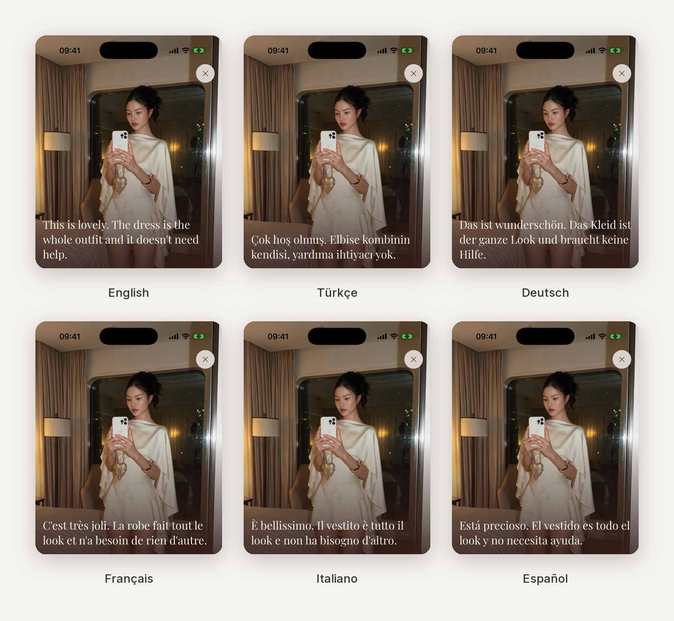
locales
-
hero
Inspiration
It started in an elevator.
Most mornings on the way to work, and again on weekends heading out to meet friends, I'd get as far as the front door and start second-guessing. Do these actually go together? Are the colors fighting? Is the proportion off?
Never enough doubt to turn around and change. Just enough to spend the whole ride down wondering.
So I went looking for an app that would settle it. I found two kinds, and neither did.
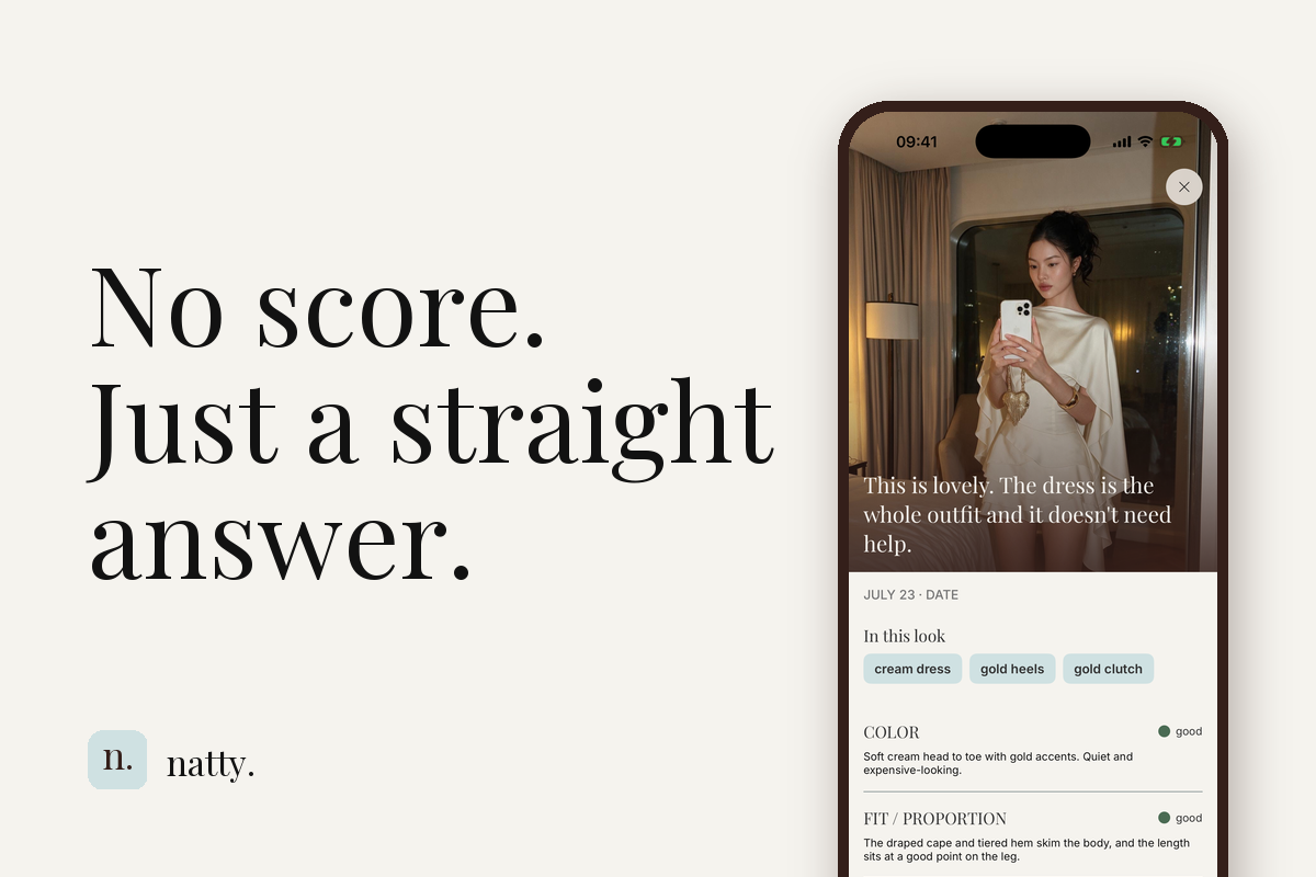
The first kind grades you. 7.4 out of 10. A B+. Three stars. I didn't want a mark. I wanted to know what to fix.
The second kind wants your wardrobe first. Photograph every shirt, every pair of trousers, tag all of it, and then it will suggest outfits for you. Be honest: who actually does that? And even if you did, it's answering the wrong question. It tells you what to put on. I'm already dressed. Keys in hand. That decision is behind me.
And yes, I could just ask ChatGPT, and I did. It gives a genuinely good answer, once. Then it forgets. It has never seen the jacket I wear too often, so it can't tell me I'm wearing it again.
That's the gap. By the time you're standing at the door, "what should I wear" is already answered. The question left over is "I'm wearing this. Does it work, is there one thing I can still fix, and have I been doing this all month?"
The name is the brief, too. Natty is an old word for sharply dressed, a word about the clothes rather than the person wearing them. That's the line the whole app holds. It reads the garment, not the wearer, and it will never hand you a grade.
What it does
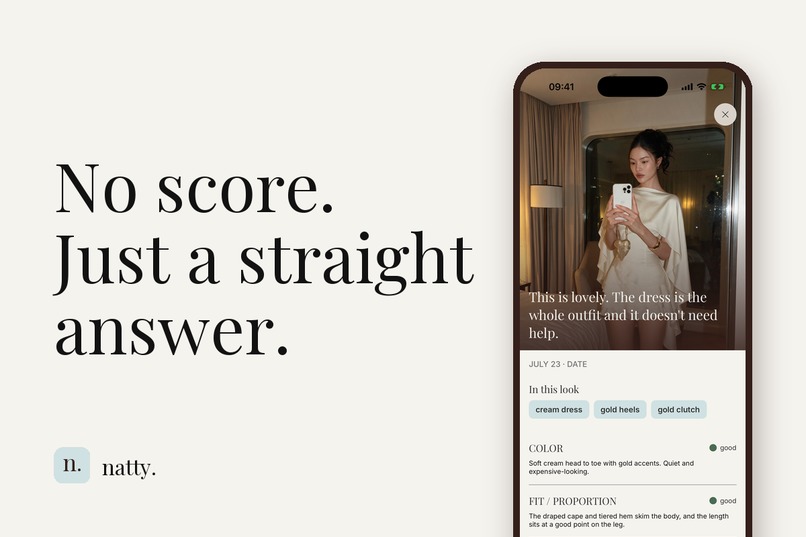
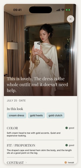
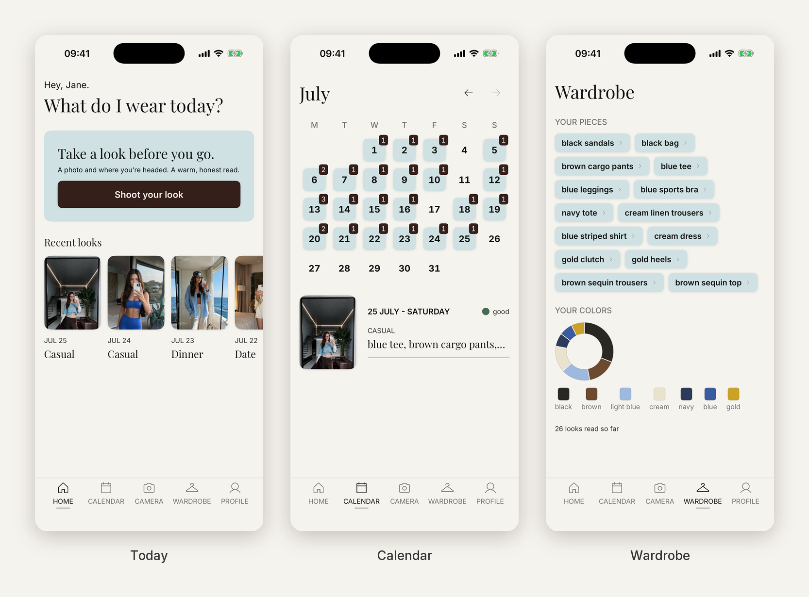
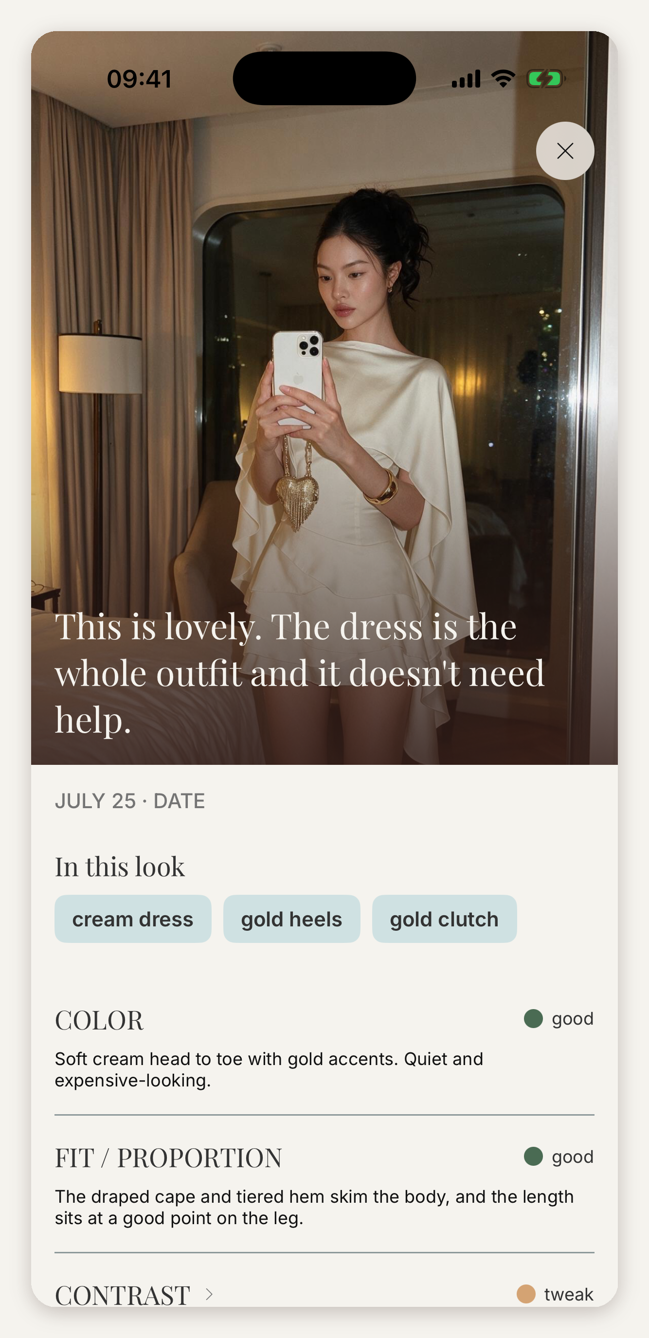
Get dressed. Take one photo. Tell Natty where you're headed, whether that's work, a dinner or a first date, and it reads that outfit for that occasion.
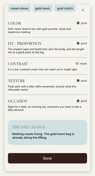
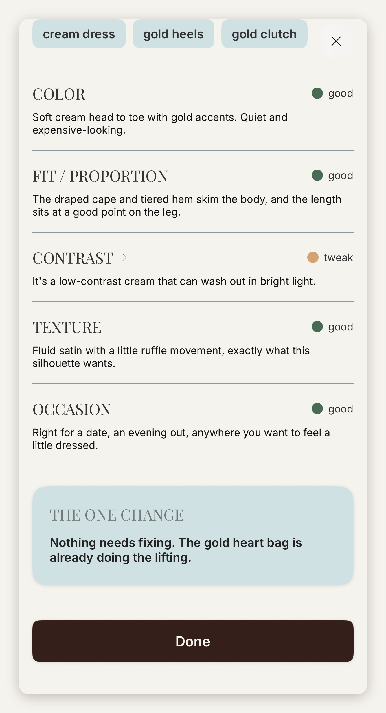
You get back a straight answer first, streamed before anything else loads. Then a read on what's actually there: color, fit, contrast, texture, occasion, each marked good, tweak, or check. Then one thing worth changing. Not a lecture, one change.
The tone I hold it to, from the few-shot example baked into the system prompt:
"You can absolutely go. Sharp for a meeting, just a little one-note."
color,
check: "Everything sits in the same dark grey, so it reads flat rather than intentional."the one change: "Swap the charcoal shirt for a white or pale-blue one. It lifts the whole look in a single move."
Permission first, then something specific, then one thing to do about it. No number anywhere.
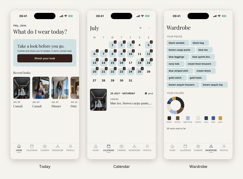
And then the part I actually built this for: the wardrobe fills itself. Every look is saved to your calendar automatically, and the garments in it are pulled out of the photo you already took. After a few weeks you have a catalogue of what you genuinely wear, which colors dominate, which jacket you keep reaching for, without ever having photographed a single item on a hanger. That was the thing that made me quit every other app, and not asking for it is the entire design.
Premium buys two things in plain terms. Unlimited reads instead of three a week, and a noticeably more detailed one, because it runs the deeper model that catches what the fast one skims. The calendar and the archive are never gated, at any tier, ever. Retention has to be earned by the thing accumulating value, not by holding your own history hostage.
The photo goes up for that one read and is never stored on my server, and never used for training. The text of each read does land on the server, keyed to a pseudonymous id, so I can monitor quality. That's declared as linked data in App Privacy, and I'd rather say it here than have you find it there.
How we built it
Solo, in about five weeks, in Swift. Empty repo on July 2nd. Final build submitted August 5th and approved on the next pass.
Design: building a product that refuses to score you
Credit where it's owed. The visual language is a UI/UX designer's Figma system, foundations plus roughly forty components. What's mine is the implementation, the audit, and the calls about where the spec had to lose.
The interesting work was making one product rule survive across four channels that could each have quietly broken it.
Type. Sentence-case serif, not the uppercase poster voice the app shipped with first. A headline that SHOUTS A VERDICT is exactly the register we're trying to avoid, so the poster system was retired.
Color. The status mark carries hue in a dot. The word beside it stays neutral grey. The dot says which state, the word says it out loud for anyone who can't see the difference, and color never carries meaning on its own.
Motion. Nothing that renders a judgement is allowed to bounce. A sheet can spring. A verdict can't, because emphasis is a score by other means.
Touch. There is no success or error haptic anywhere in the app. Those exist, they'd have been one line each, and mapping them to good and check would have meant the app started grading you through the Taptic Engine.
One thing I'd rather own than be caught with: the paywall's purchase button ships at 2.65:1 contrast, below WCAG AA, on the highest-intent action on the screen. It's in the spec, it's logged in my own gaps file as a question back to the designer, and it's wrong. It's the first thing I'm fixing.
Engineering
iOS. SwiftUI on iOS 18+, @Observable, layered View to Store to Manager to Repository. Local-first: SwiftData holds the archive, and photos live in FileManager where they never touch the database.
Backend. A deliberately thin Supabase Edge Function (Deno) in Frankfurt. It holds the model key, verifies who you are, enforces quota, and streams the response back. The client never talks to a model provider directly, so there is no key to pull out of the binary.
AI. Claude by Anthropic, Haiku 4.5 on the free tier and Sonnet for premium. Responses stream so the first line lands while the rest is still generating. The output is a strict JSON schema, and the verdict channel is an enum:
{ "mark": "good | tweak | check", "reading": "...", "suggestion": "..." }
There is no rating field, so a score can't come back as structured data at all. There is nothing for the UI to render even if the model wanted to give one. That constraint cost me the easiest engagement mechanic in the category, on purpose.
RevenueCat. Entitlement-gated premium: one offering with a monthly and an annual package, and a 7-day trial on annual. The part I like most is server-side. Before the proxy spends a cent of model budget, it verifies the caller's entitlement against the RevenueCat v2 REST API. RevenueCat decides who is premium. Postgres only holds counters and the read text.
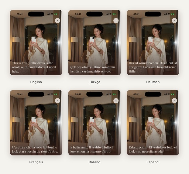
Also. Firebase GA4 behind a closed-enum tracking plan. Firebase Remote Config as the flag plane, with safe in-app defaults so a failed fetch can never switch a feature on by surprise. Six locales (English, Turkish, German, French, Italian, Spanish), each with hand-written store metadata rather than machine passthrough.
The economics, since this is a hackathon about making money
Most apps have zero marginal cost. This one doesn't, so the numbers are the product decision.
Annual is $29.99, which nets about $2.12 a month after Apple's cut. A premium read on Sonnet costs $0.016 to $0.036. Break-even sits at roughly 3 reads a day. Realistic use is about one, which leaves a healthy margin. The 12-a-day ceiling is an abuse stop rather than a margin guard, and I should stop describing it as one.
The free tier runs on Haiku at roughly $0.10 per active user per month, cheap enough to leave the first read unconditional and unmetered.
Then there's the exposure I haven't closed. A 7-day trial can burn up to about $2 of Sonnet before anyone pays, and nothing currently caps trial reads to the cheap tier or a lower daily limit. That's the next thing to fix, and I'd rather name it than have a judge find it.
Challenges we ran into
Refusing the score is harder than adding one. Prompt instructions leak under pressure, so the constraint had to move into the type system.
And here is the honest limit of that. good | tweak | check is still an ordinal scale. Five cards is a rubric, and a determined user can do the arithmetic the app refuses to do for them. What the enum actually buys is narrower than it sounds: the app never aggregates. There is no total, no trend line, nothing to beat last week. You are never handed a number to feel about.
The rule I couldn't put in the type system, I had to measure instead. "Read the garment, never the wearer" is enforceable only by prompt. So I ran ten real photos through the cheap tier with fit as the stated priority, the hardest possible setting for this rule, and counted. The word "flattering" appeared in 3 of 10, alongside heavier leaks like "your waistline" and "overwhelming you". Two rounds of tightening closed the heavy ones and took the set to 9 of 10 clean, with one stubborn case: a fitted dress where the cheap model still reaches for it. That's written down as the floor of the free tier rather than papered over. It is a floor and not a fix, and on that tier the promise holds about nine times in ten rather than always.
Hallucinated memory is worse than no memory. "You've worn this jacket a lot lately" is delightful when true and trust-destroying when invented. The model gets only a short canonical history, has to find a visible match in the current photo, and is required to return null when it isn't sure. Which means a working memory and an absent one look identical most of the time. I took that trade knowingly.
Auditing my own output caught what tests never would. Reading 16 real analyses end to end, I found one where the contrast card was marked tweak, "soft-edged rather than crisp", while the headline change said "Nothing to change — you're good to go." The app contradicted itself on a single screen. No test would have failed.
The same audit turned up something sillier. The model was joining half its sentences with em dashes, which made the writing read exactly like what it was: generated. I banned the character from every text field in the prompt. An app whose whole promise is sounding like a friend cannot write like a chatbot.
A fallback that doesn't announce itself is an outage. My server-side entitlement check was calling RevenueCat's v1 /subscribers endpoint with a v2 secret key, which returns 401. The code caught the error and did the safe thing: it fell back to free. So a real purchase never registered as premium, and nothing crashed and nothing logged. It hid for about five days and surfaced on my own first live purchase in pre-launch. Failing safe was right. Failing silently is what cost me the week. The failure path now emits a server-side alarm, so a misconfiguration can never again present itself as a working app.
App Review rejected v1.0. Guidelines 5.1.1(i) and 5.1.2(i), verbatim: the app "appears to share the user's personal data with a third-party AI service but does not clearly explain what data is sent, identify who the data is sent to, and ask the user's permission before sharing", and, pointedly, "only including this information in the Terms of Service or Privacy Policy is not sufficient."
They were right. The fix wasn't a screen. It was a consent gate at the single point where the network call fires, so sending without consent became structurally impossible rather than a step someone could route around. v1.0 cleared review on the next pass.
Accomplishments that we're proud of
Let me be straight about what this is. It's a pre-launch app with zero users and zero revenue. v1.0 is approved by App Review in six languages and is scheduled to go live on August 12th. Everything below is execution rather than traction, and I'd rather say so than let a pre-order page imply otherwise.
- Empty repo to App Review approval in about five weeks, solo, with just over 400 commits, 10 builds to App Store Connect, and six locales of hand-written store metadata.
- Rejected by Apple over AI data disclosure, then approved, with a structural fix rather than a cosmetic one.
- 147 analyses through the production pipeline, zero schema parse failures. Those are my own runs and not usage, but the strict schema held against a live model every single time, and a parse failure would have written a row saying so.
- A no-score product where the core constraint is enforced by types, and where the constraint that couldn't be typed got measured, with its residual published rather than buried.
- Privacy claims I can actually defend. The photo is read once and never stored. And I refused to overclaim the rest: the app does use analytics, the App Privacy label says so, and every marketing line is scoped to the photo alone rather than a blanket "we collect nothing".
- Accessibility verified against the running app rather than asserted. Dynamic Type scales content to AX5, two non-reflowable chrome surfaces are deliberately capped with the tab bar given the Large Content Viewer instead, and a live accessibility-tree scan checked VoiceOver labels and selection traits.
- The loading screen never lies. An earlier build had a progress ticker that finished in 3.6 seconds while the analysis took nine. It's gone. Indefinite motion is honest about not knowing.
What we learned
Guardrails belong in types, not in prompts. And when a rule can't be typed, the honest move is to measure it and publish the residual rather than assume the prompt held.
Know which system is authoritative for which fact. RevenueCat is authoritative for who owns what entitlement. App Store Connect is authoritative for price, duration and trial. Reading trial state from the wrong one produces confident, wrong answers.
Apple wants the AI disclosure standing next to the ask, at the exact moment the data leaves the device, rather than buried in a policy page. Fighting that would have been a waste. It turned out to be better product design than what I had.
A fallback that doesn't announce itself is a silent outage. Failing safe is right. Failing quietly is how you lose a week.
Refusing a metric costs you the metric. No score means no progress chart, no streak, no number that goes up. I think that's the right trade for the person standing at the door, but it is a trade, and I'm about to find out what it costs.
What's next for Natty: Outfit Check & Style
- Launch, then find out. The memory loop is the bet this whole product rests on and it has never been tested on a single other person. That's the first thing to learn rather than the last.
- Cap trial reads to the cheap tier, closing the one unit-economics hole I know about.
- Fix the paywall CTA contrast and re-run the accessibility pass on that screen.
- Telling apart two garments that look identical on paper, same type and same color but a different item. The wardrobe fills itself today, but it can't yet separate two black tees, and that ceiling gets lower the more you use it.
- Standing up the consent-placement A/B once there's traffic, then a trial-length experiment once there's enough volume to read it honestly rather than eagerly. Both consent variants already ship behind a flag.
Built With
- anthropic
- claude
- deno
- fastlane
- figma
- firebase
- google-analytics
- ios
- postgresql
- revenuecat
- supabase
- swift
- swiftdata
- swiftui

Log in or sign up for Devpost to join the conversation.