-
-
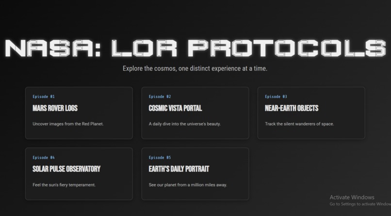
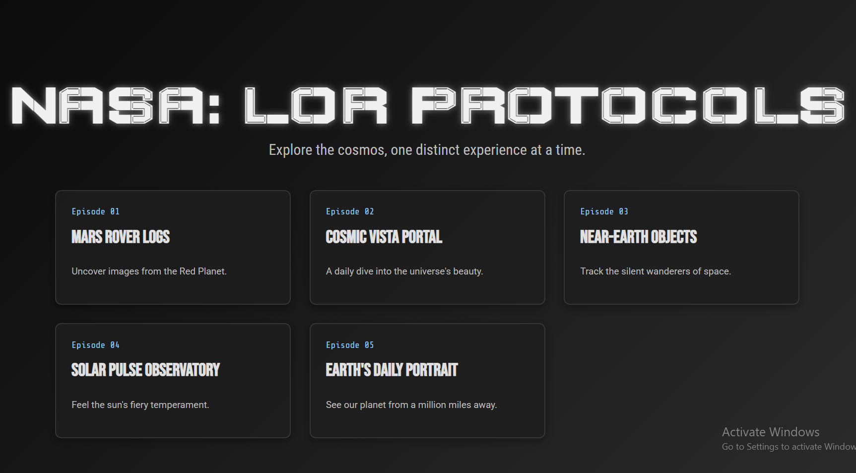
home page
-
-
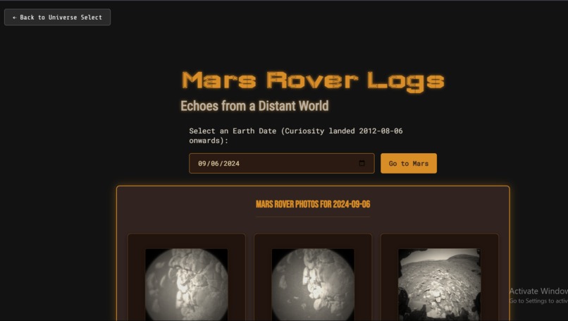
mars rover page to see mars images
-

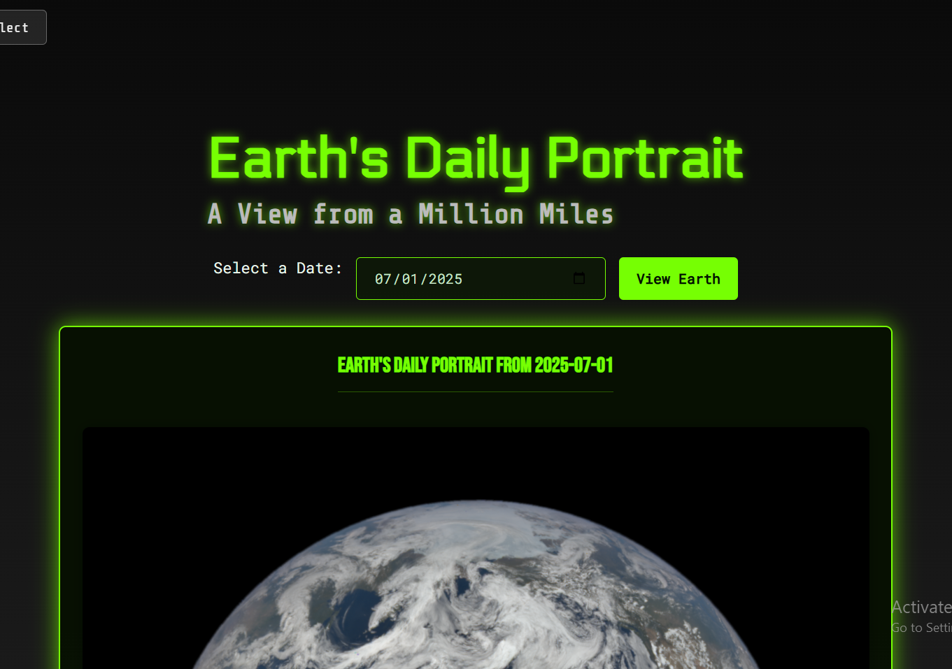
earth page to see full earth
-
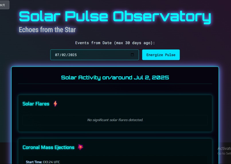
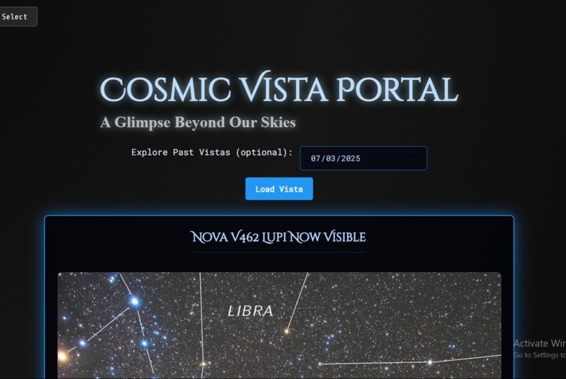
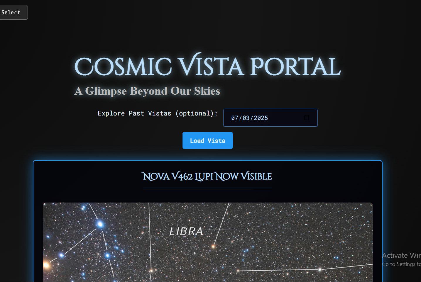
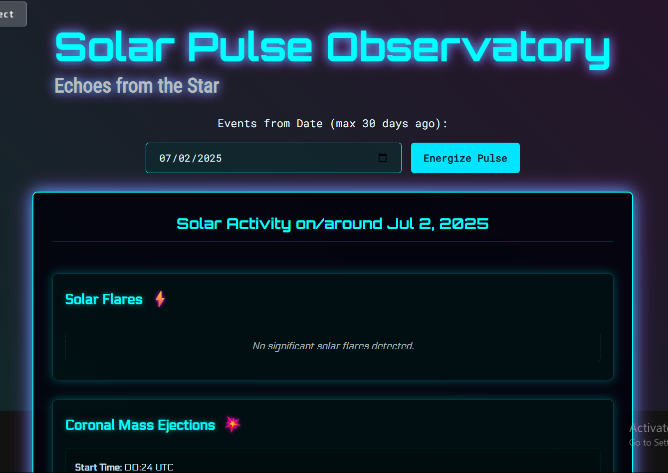
solar weather page
-
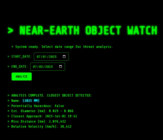
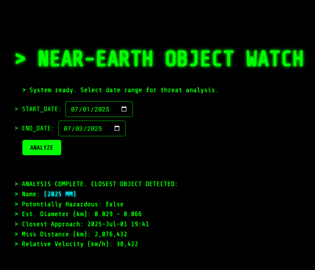
asteroid page to determine the closest one

About the Project: NASA: Love, Death + Robots Style
Inspiration
The primary inspiration for this project stemmed directly from the visually stunning and thematically diverse animated anthology, Love, Death + Robots. Each episode of the show boasts a completely unique artistic style, ranging from hyper-realistic CGI to classic 2D animation, cyberpunk neon to gothic horror. I wanted to translate that same sense of distinct visual identity and surprise into a web application that explores scientific data. The goal was to make knowing about space engaging, beautiful, and a truly novel experience rather than just a data dump. Integrating NASA's rich array of public APIs provided the perfect thematic canvas for this vision.
What I Learned
Building this project was an excellent exercise in frontend development, pushing me to consider not just functionality but also creative user experience and architectural decisions:
- Diverse API Integration: I gained hands-on experience integrating a variety of NASA APIs (Mars Photos, APOD, NeoWs, DONKI, and EPIC). This involved understanding different JSON structures, handling various data types (images, text, numerical data), and implementing robust error handling for API failures or missing data.
- Dynamic Content Generation: Mastering the dynamic generation of HTML content based on API responses was crucial. For example, building the Mars Rover photo gallery or structuring the complex space weather event cards required careful DOM manipulation.
- CSS Theming & Modularity: A significant learning curve was achieving distinct visual identities for each section within a single CSS file. This involved extensive use of ID-specific selectors, custom properties for color palettes, background manipulation (gradients, blend modes, animations), and strategic font choices to evoke specific moods, all while ensuring no styles bled into unintended sections.
- Frontend Architecture : Initially, the project used a Single-Page Application (SPA) approach with content sections hidden/shown dynamically. The shift to a multi-page structure (separate HTML files for each section) provided valuable insight into traditional web navigation and state management across different pages, specifically how to maintain a consistent header and seamlessly navigate back to the home screen.
- User Experience (UX) Enhancements: Implementing global loading states, detailed error messages, and intelligent default date selections significantly improved the user experience, making the application feel more polished and user-friendly.
How I Built It
The project is structured using standard web technologies:
- HTML: Each major section of the application (Home, Mars Rover, APOD, Asteroids, Space Weather, Earth's Daily Portrait) is now its own dedicated
.htmlfile. This helps with modularity and clearer separation of content. Common elements like theheaderandloading-overlayare included in every HTML file. A key structural addition was thesection-inner-wrapperdivwithin each main content<section>, which allowed for precise control over padding and enabled independent scrolling of content, solving issues where parts of the page were obscured by the fixed header. - CSS: A single
style.cssfile houses all the styling. The coreLove, Death + Robotsaesthetic is achieved by:- Defining distinct background images/gradients and blend modes for each
#section-id. - Using varied Google Fonts (
Wallpoet,Orbitron,Share Tech Mono,Cinzel Decorative,Electrolize,Exo 2,Spectral) to create unique typographic voices per section. - Applying section-specific color palettes for text, borders, and backgrounds, often incorporating glowing effects using
text-shadowandbox-shadowto amplify the futuristic/digital feel. - Implementing subtle CSS animations (like
panBackgroundorneonGlow) to add dynamic visual interest. - For the "Near-Earth Objects" section, specific CSS rules were crafted to replicate the monochrome CRT terminal display, focusing on flat green borders, pure black backgrounds, and a monospace font with subtle text glow.
- Defining distinct background images/gradients and blend modes for each
- JavaScript: The
script.jsfile handles all client-side logic:- Navigation: It detects the current HTML file loaded and initializes only the relevant section's functionality. Clicking episode cards on
home.htmltriggers awindow.location.hrefredirect to the respective.htmlfile. The "Back to Universe Select" button performs the reverse, always leading back tohome.html. - API Calls:
async/awaitis used for fetching data from NASA's REST APIs. Each API has a dedicated function (fetchMarsRoverPhotos,fetchAPOD,fetchAsteroids,fetchDonkiEvents,fetchEPICImages). - DOM Manipulation: JavaScript dynamically injects and formats the fetched data into the appropriate
results-containerfor each section. This includes image display, video embedding (for APOD), and detailed information cards (for DONKI and Asteroids). - Date Handling: Date inputs are managed to set max/min attributes and parse user input for API queries.
- Loading & Error States: A global loading overlay provides visual feedback during API fetches, and basic error messages are displayed when requests fail.
- Navigation: It detects the current HTML file loaded and initializes only the relevant section's functionality. Clicking episode cards on
Challenges Faced
Several challenges arose during development, particularly in balancing the ambitious design goals with practical implementation:
- Maintaining Stylistic Diversity without Overwhelm: The core Love, Death + Robots theme required each section to feel genuinely unique. The challenge was preventing a chaotic or visually jarring experience when transitioning between them. This was addressed by carefully curating distinct but harmonious color palettes and font pairings, along with consistent use of shadows and border treatments that linked back to a broader sci-fi aesthetic.
- Fixed Header & Scrolling Content: Initially, content in longer sections (like Mars Rover or Space Weather) was hidden behind the fixed header and couldn't be scrolled. This was resolved by introducing a
section-inner-wrapperwithin each section and applyingpadding-topto it, pushing the content down whileoverflow-y: autoon the maincontent-sectionallowed for scrolling within that specific area. - Replicating the "CRT Terminal" Aesthetic (Asteroids): Achieving the exact look of the provided "Near-Earth Object Watch" image was surprisingly intricate. It involved:
- Stripping all default browser styling from date inputs and buttons.
- Precise control over green glowing borders and text shadows.
- Using
display: flexandgapproperties to arrange input elements and labels in the desired horizontal-then-vertical flow. - Careful formatting of the API response data to match the ">" prompts, numerical precision, and line-by-line output of a classic terminal.
- Transitioning from SPA to Multi-Page: The shift from a single
index.htmlmanaging all sections withdisplay: none/display: blockto entirely separate HTML files required rethinking the JavaScript's routing and initialization logic. Each page now loads its own script and initiates its API calls only when that specific HTML file is accessed, demanding a more decentralized JS approach. This also meant ensuring any active intervals (like the previous ISS tracker) were correctly cleared before navigating away. - API Data Interpretation and Display: Some APIs, like DONKI, return complex nested data. Extracting specific fields (e.g., CME half-angle from
cmeAnalysesarray) and formatting them clearly within the chosen design framework required careful parsing and conditional rendering logic.
Built With
- apod-api
- asteroid-api
- css
- donki-api
- epic-api
- html
- javascript
- mars-rover-photos-api
- nasa-api


Log in or sign up for Devpost to join the conversation.