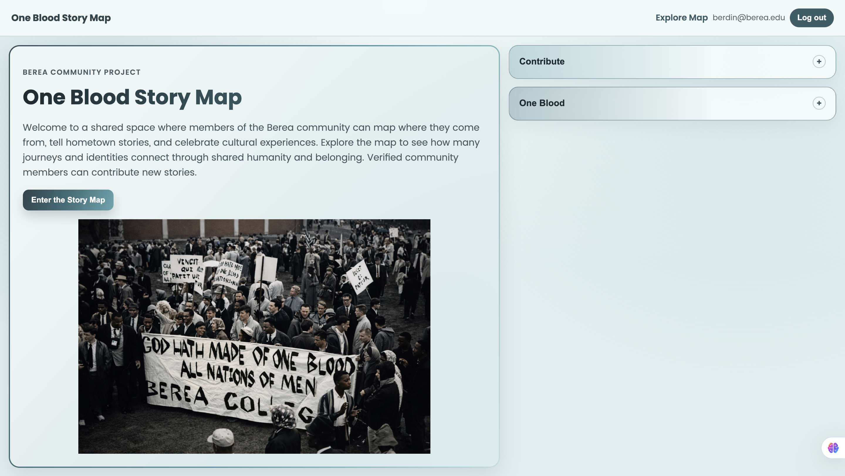
Inspiration
One Blood Story Map was inspired by a simple question:
“How can we make the diversity of the Berea community visible, personal, and interactive?”
At Berea, people come from many places and carry different languages, traditions, and life stories. We wanted to build something that honors those backgrounds while reinforcing a shared sense of belonging. The project is rooted in the idea that even with different journeys, we are connected.
What it does
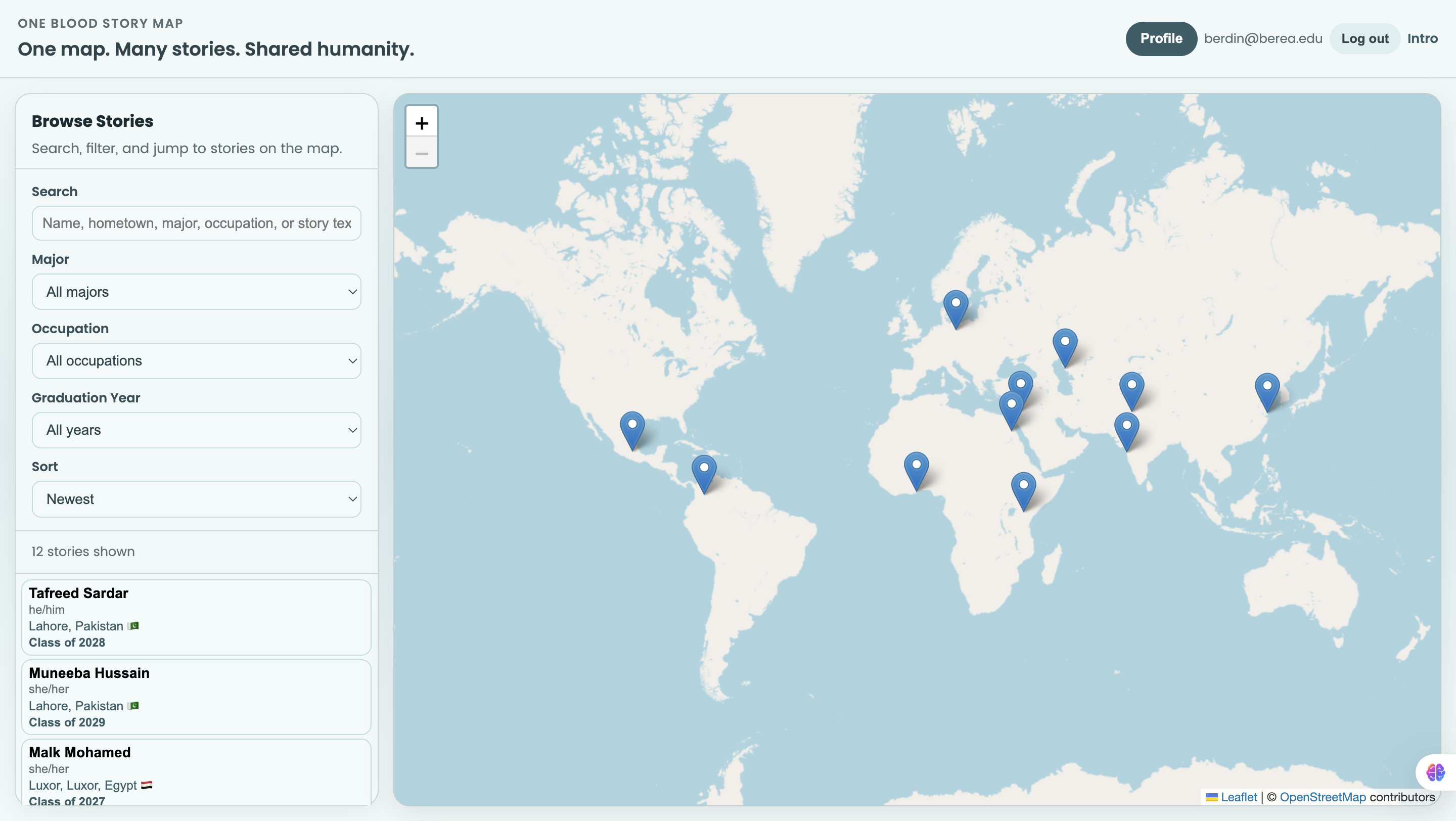
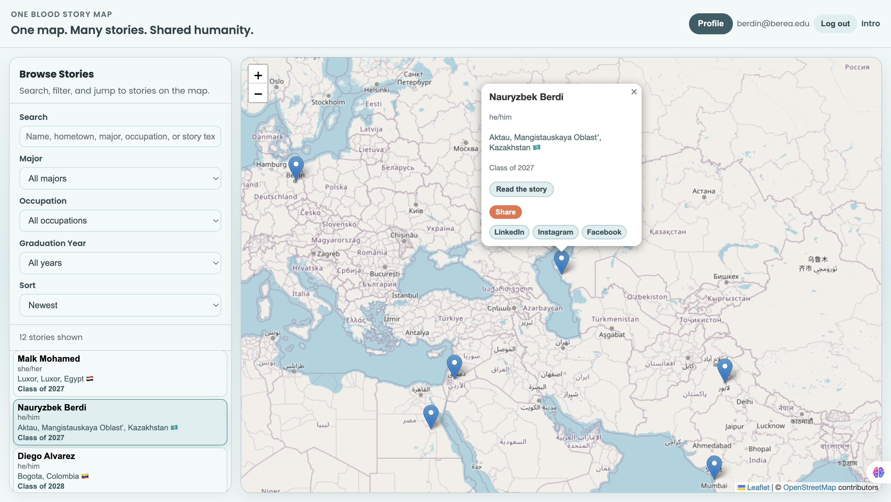
One Blood Story Map lets community members:
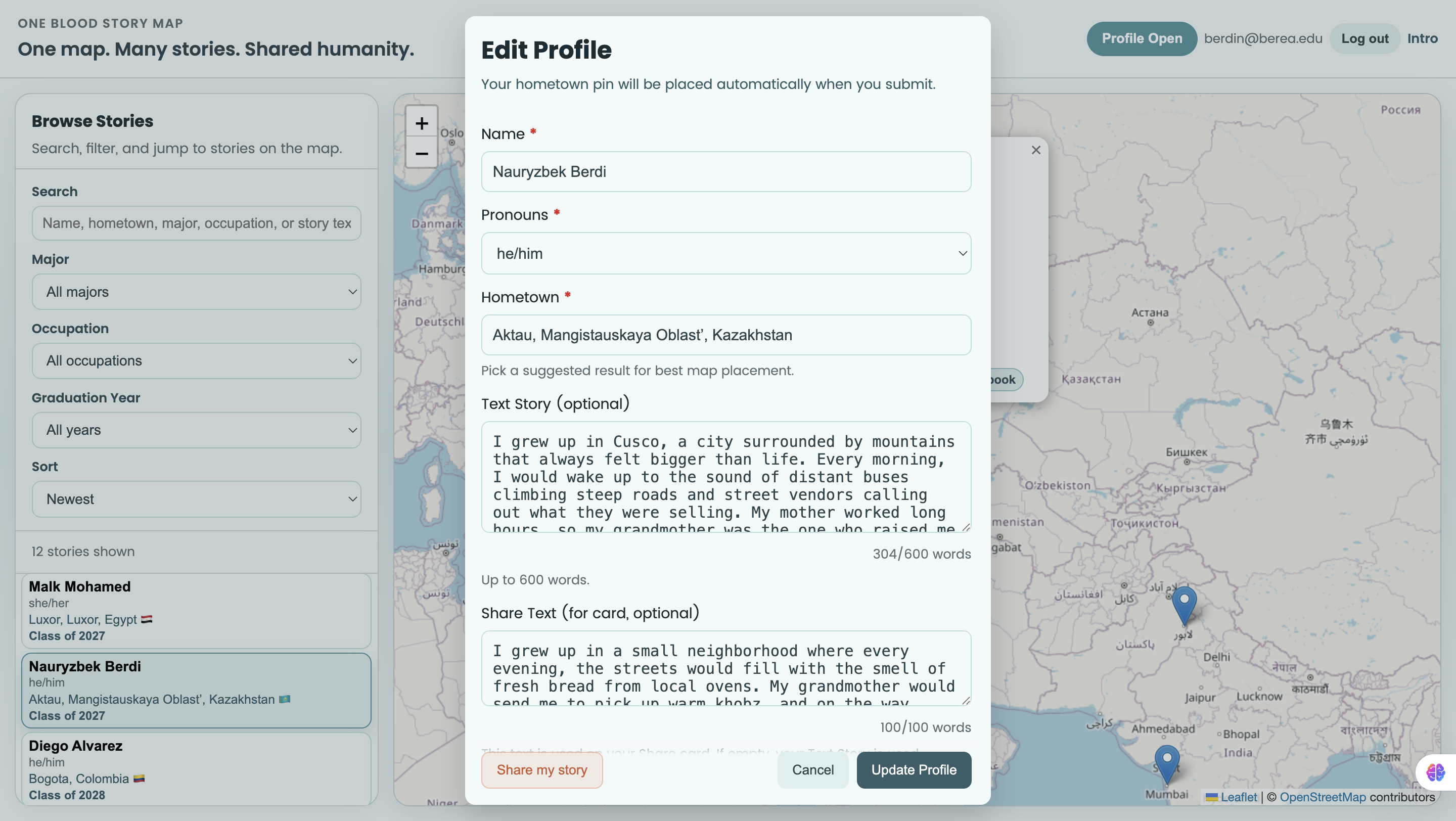
- Create a profile with hometown, pronouns, graduation year, majors, and occupations
- Add an optional text story and optional audio story
- Place their story on an interactive world map
- Browse and filter stories by search, major, occupation, and class year
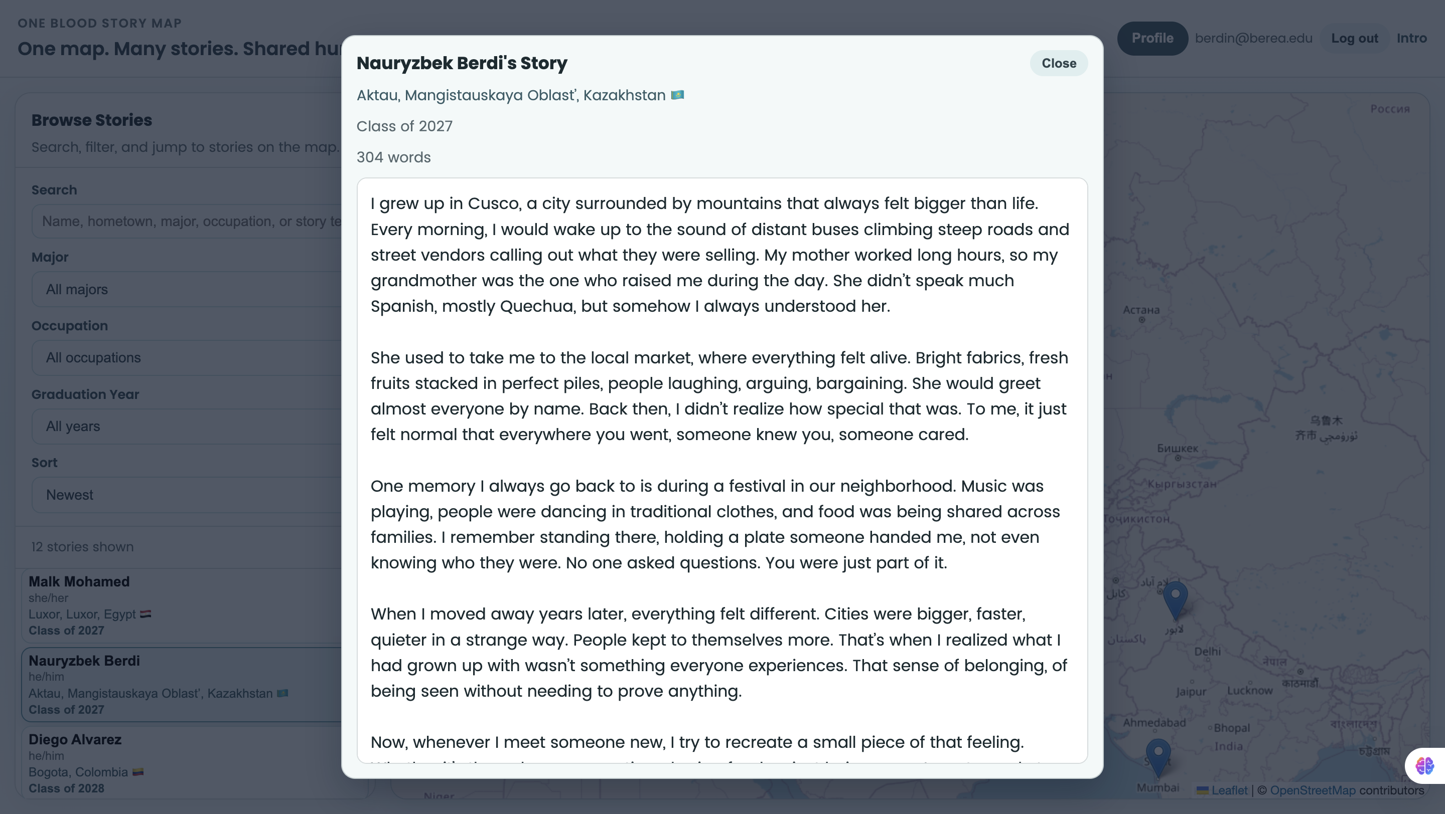
- Read full stories in a modal and listen to audio in a dedicated player modal
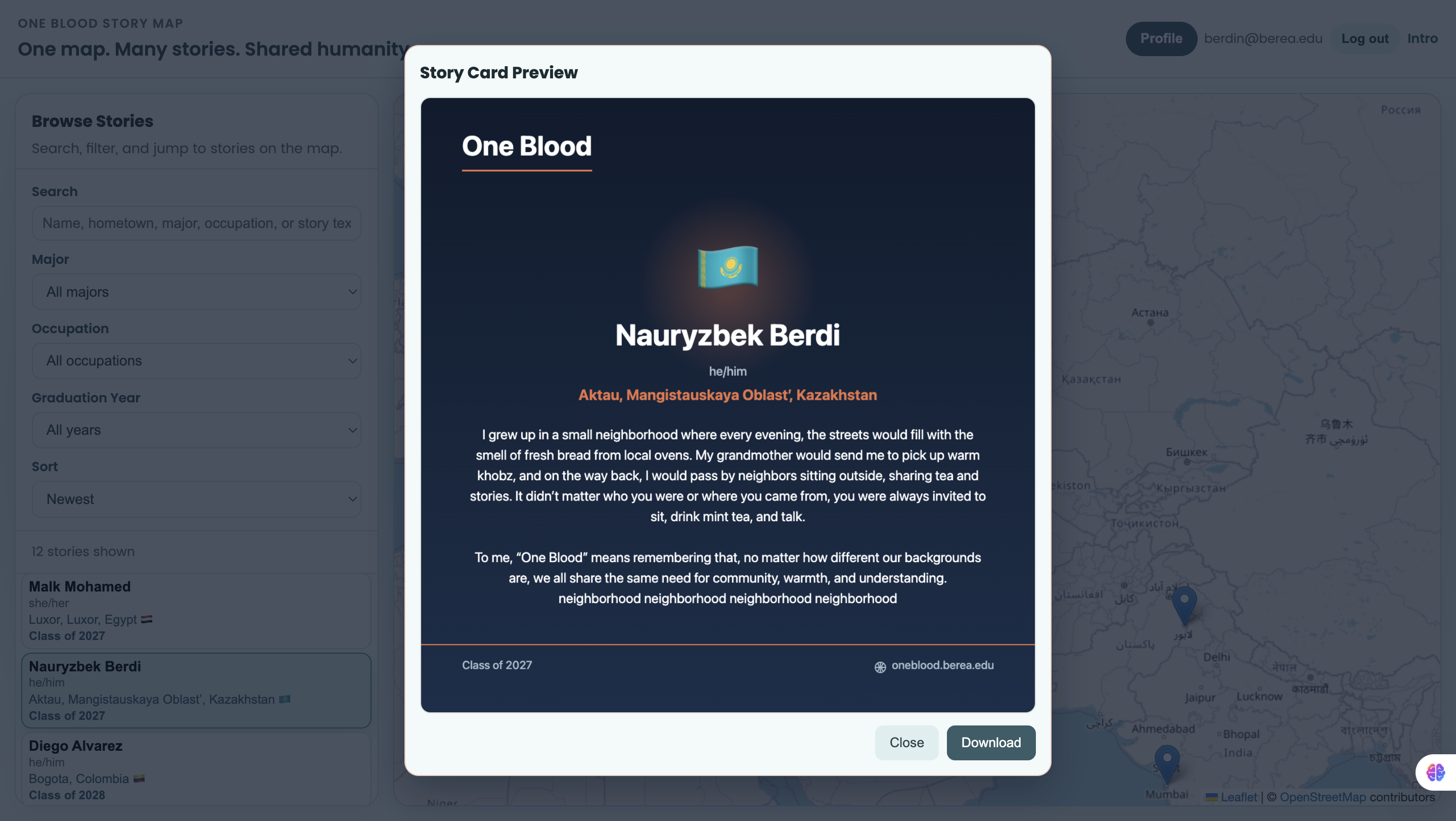
- Generate a shareable story card image (PNG) from profile/story data
It also handles cases where multiple users share the same location by cycling through stories on repeated pin clicks.
How we built it
We built the app using:
- Frontend: React + Vite
- Map: Leaflet (via React Leaflet)
- Backend/Data/Auth: Supabase (Postgres + Auth + Storage)
- Media sharing: Native Canvas 2D API to generate story card images client-side
Key implementation pieces:
- Profile create/edit modal with validation
- Modal workflows for reading stories, listening to audio, and previewing share cards
- Supabase storage for audio uploads
- Dynamic filtering and sorting in the sidebar
- Fallback logic for evolving database schema (e.g., new optional columns)
For example, our filtering logic combines multiple signals like: $$ \text{Match} = \text{Search} \land \text{MajorFilter} \land \text{OccupationFilter} \land \text{YearFilter} $$
Challenges we ran into
- Schema evolution: Adding fields like
share_text,majors, andoccupationswithout breaking older tables - Validation consistency: Keeping frontend and database constraints aligned
- Overlapping pins: Making same-location stories understandable and easy to navigate
- UX performance: Ensuring modals, pin popups, and share generation feel responsive
- Media flow: Supporting audio upload, playback, replacement, and removal cleanly
Accomplishments that we're proud of
- Built a complete end-to-end storytelling experience with map + text + audio + share cards
- Added robust optional-field handling so users can contribute even with partial data
- Implemented clean, user-friendly modal interactions for story reading/listening/sharing
- Solved same-location pin usability with story cycling
- Removed distracting visual elements and improved clarity based on iterative feedback
What we learned
- How to design for real user behavior, not just ideal flows
- How much database constraints affect frontend UX
- Better patterns for state management across map interactions and modals
- Practical lessons in accessibility, progressive enhancement, and error handling
- The value of iterating quickly with user feedback on UI and interaction details
What's next for NA
Next, we want to:
- Add marker clustering and better high-density map behavior
- Add richer profile discovery (e.g., combined filter chips, saved filters)
- Improve moderation/admin tools for submissions
- Add analytics to understand engagement patterns
- Expand sharing options (e.g., direct social share integrations)
- Continue polishing mobile responsiveness and accessibility across all flows
Built With
- css3
- html5
- javascript
- leaflet.js
- postgresql
- react
- supabase
- vite

Log in or sign up for Devpost to join the conversation.