-
-
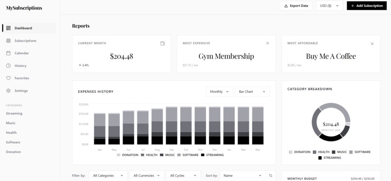
Dashboard 1
-
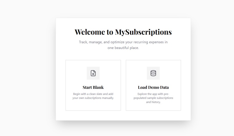
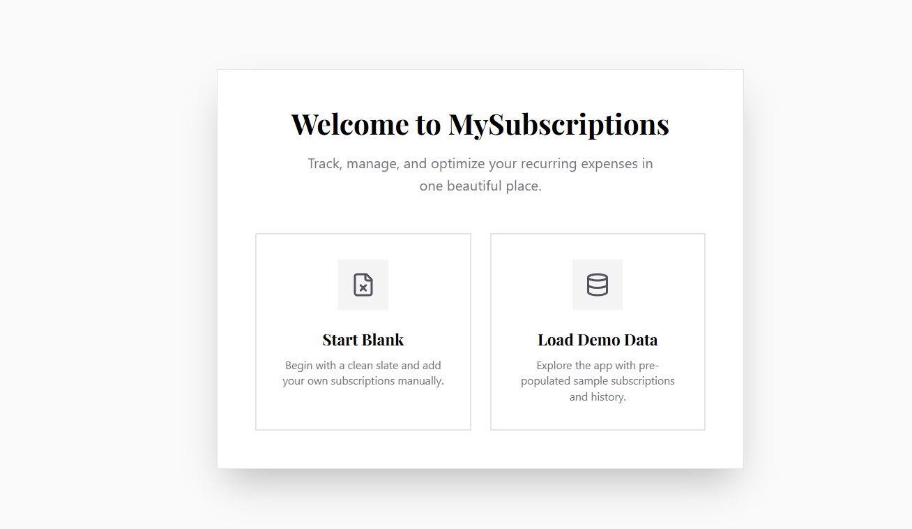
LandingPage
-
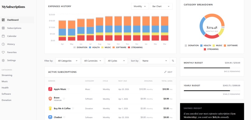
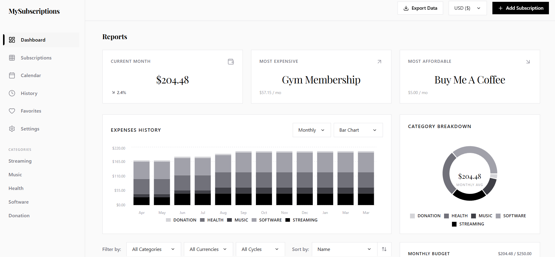
Dashboard 2
-
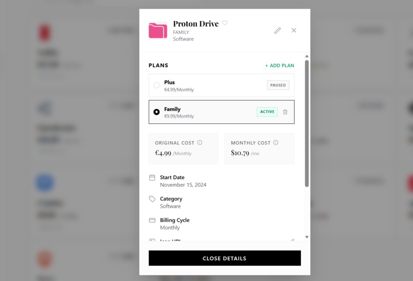
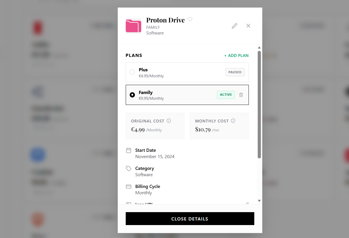
Edit
-
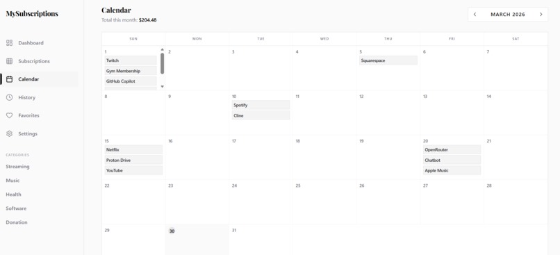
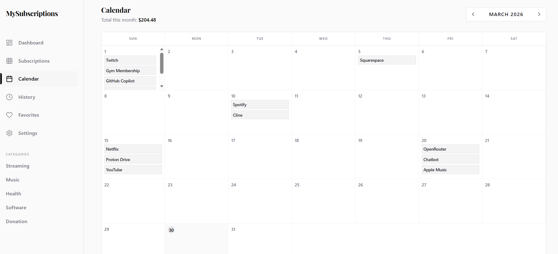
Calendar
-
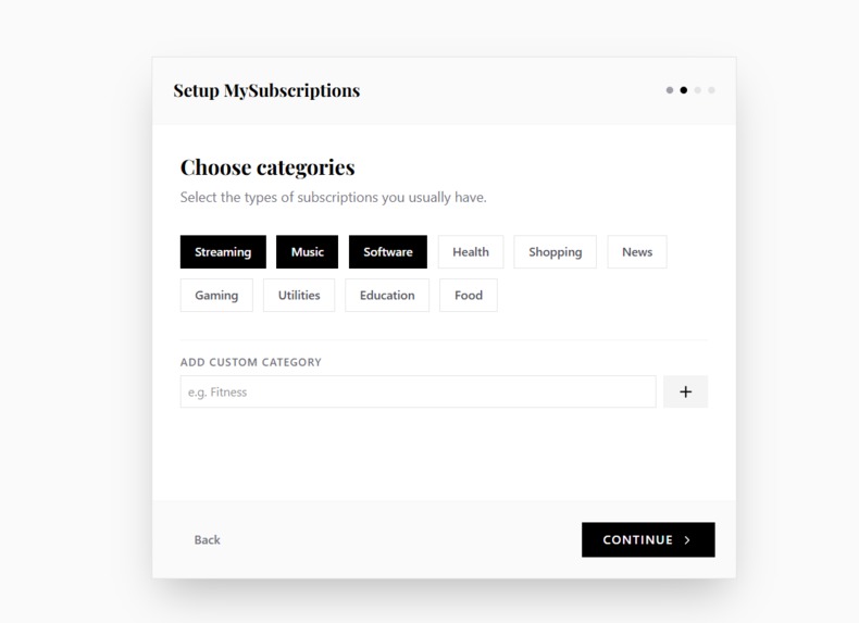
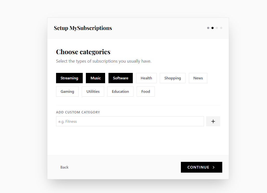
Setup
-
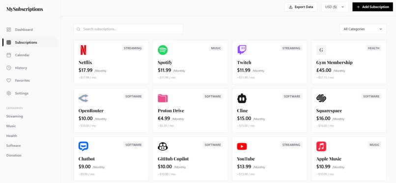
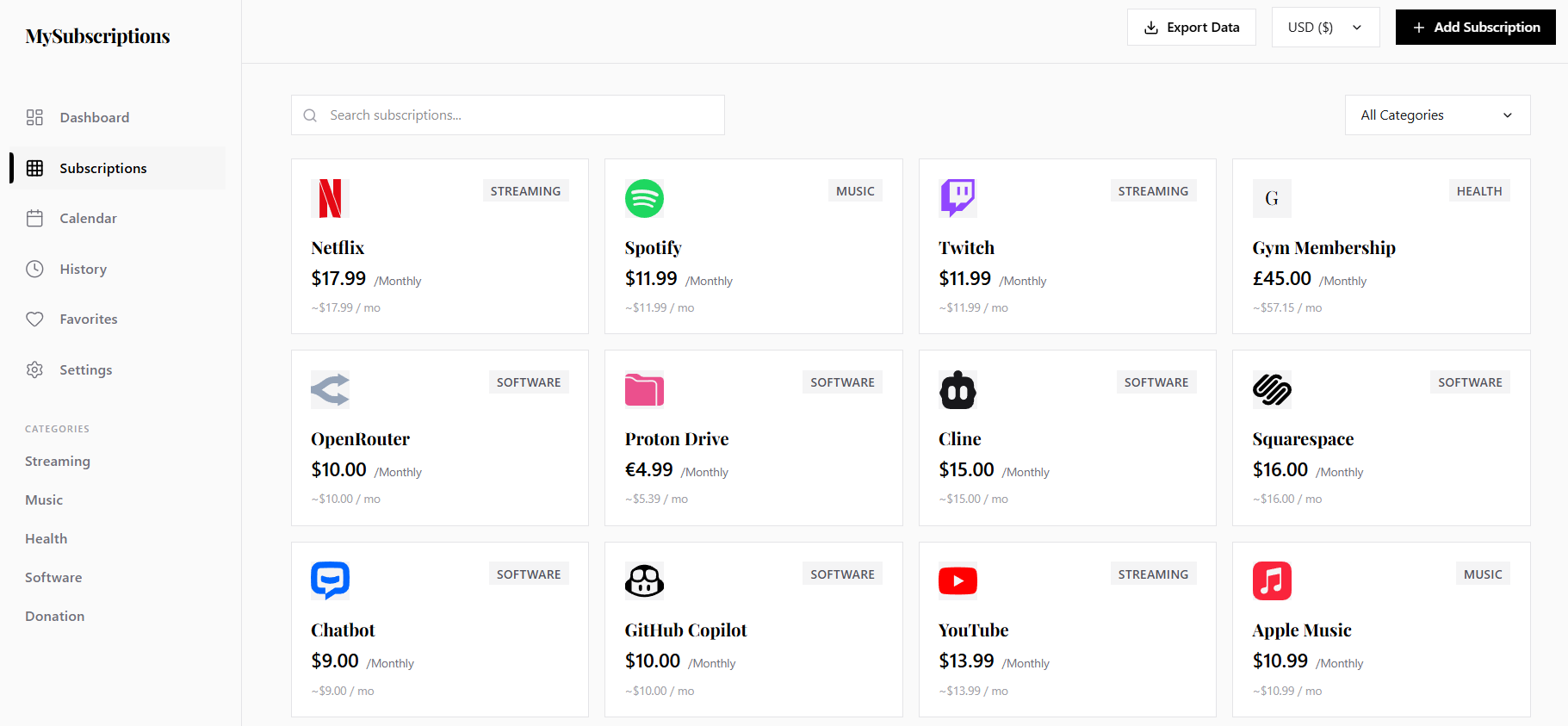
Subscriptions

Inspiration
Subscriptions are everywhere — streaming, storage, productivity tools, memberships — and they quietly stack up. Most people don’t realize how much they’re spending until it’s too late. I wanted a simple, transparent way to visualize recurring costs without the clutter or complexity of full finance apps. MySubscriptions started as a way to bring clarity back into everyday spending.
What it does
MySubscriptions gives users a clean, minimal dashboard to track their recurring expenses. You can add subscriptions, categorize them, and instantly see how much you’re spending each month. It’s designed to make subscription management intuitive and stress‑free, helping users stay aware of renewals and avoid unnecessary costs.
How we built it
MySubscriptions was built as a lightweight prototype to demonstrate the concept, design direction, and user experience of a future full-featured app. The focus was on crafting a clean, intuitive interface that makes subscription tracking effortless.
Because this version is purely a presentation prototype, no data is stored or persisted — everything resets on refresh. This allowed rapid iteration on layout, flow, and visual clarity without needing a backend or database. The site is deployed on Netlify for fast, simple hosting, and the structure is intentionally minimal so the idea can shine through.
Challenges we ran into
- Designing a layout that feels simple without feeling empty
- Balancing visual clarity with the need to display meaningful financial information
- Managing state cleanly while keeping the prototype lightweight
Accomplishments that we're proud of
- Creating a clean, modern interface that clearly communicates the concept
- Building a functional prototype that effectively demonstrates the user experience
- Delivering a polished, responsive design within the timeframe
- Establishing a strong foundation for a future, fully functional version
What we learned
Throughout the process, I learned how much small design decisions influence the usability of financial tools. Prototyping early proved invaluable for validating layout and flow before committing to a full build. I also gained a deeper appreciation for the balance between simplicity and functionality — especially in tools meant to reduce stress rather than add to it. The experience reinforced the idea that even a lightweight prototype can communicate a strong vision when executed thoughtfully.
What's next for MySubscriptions
Looking ahead, the next steps involve turning this prototype into a fully functional application. That includes adding persistent storage, user accounts, and smart reminders for upcoming renewals. I also plan to introduce visual analytics such as spending trends and category breakdowns, along with import and export options for easier data management. Eventually, I’d like to explore AI‑powered insights to help users optimize their subscription spending and consider building a dedicated mobile version for even easier access.

Log in or sign up for Devpost to join the conversation.