-
-

MySquishi
-
-
-
-
-
-

Inspiration
Three hundred squeezes a week, and nobody knows if any of them helped.
Hand rehabilitation has a measurement problem. A patient squeezes a foam ball at home all week, and neither they nor their clinician has any idea whether those squeezes accomplished anything. The next appointment produces a single dynamometer reading, and one number six weeks apart cannot distinguish real recovery from a good day.
Meanwhile the signal is right there. The muscles doing the work are broadcasting their electrical activity through the skin, and a $40 sensor can read it.
We wanted to know two things:
- How much of a genuine clinical instrument can you build out of that?
- How much can you not, and will you say so out loud?
That second question became the project's actual thesis.
A rehab tool that overstates what it measured is worse than no tool, because a clinician might believe it.
What it does
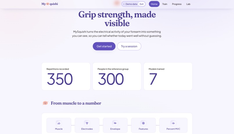
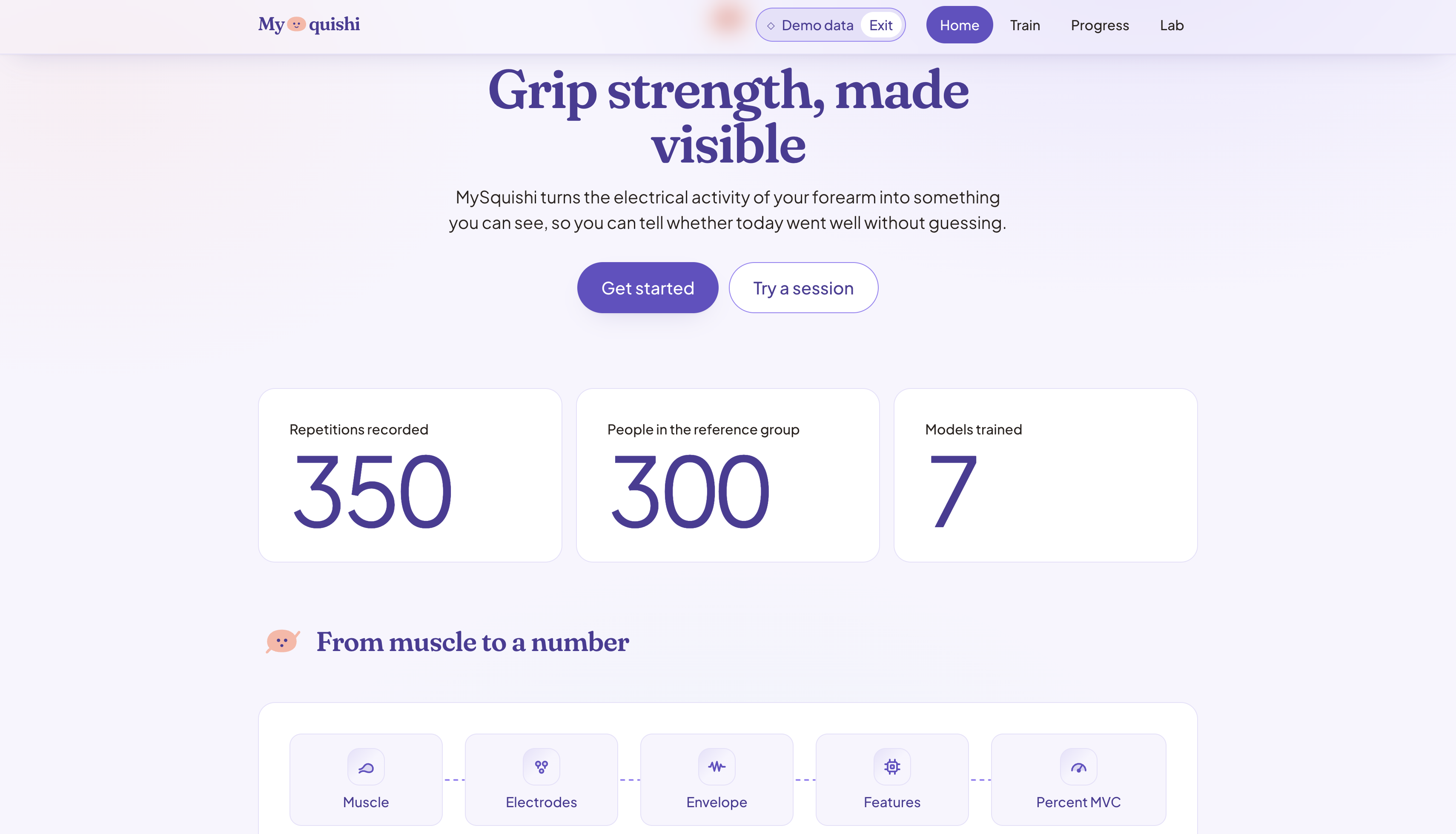
MySquishi turns muscle activity into rehabilitation feedback you can defend.
Live
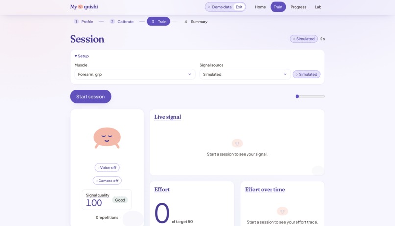
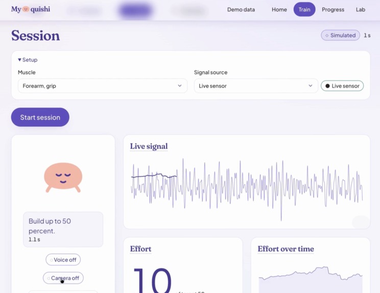
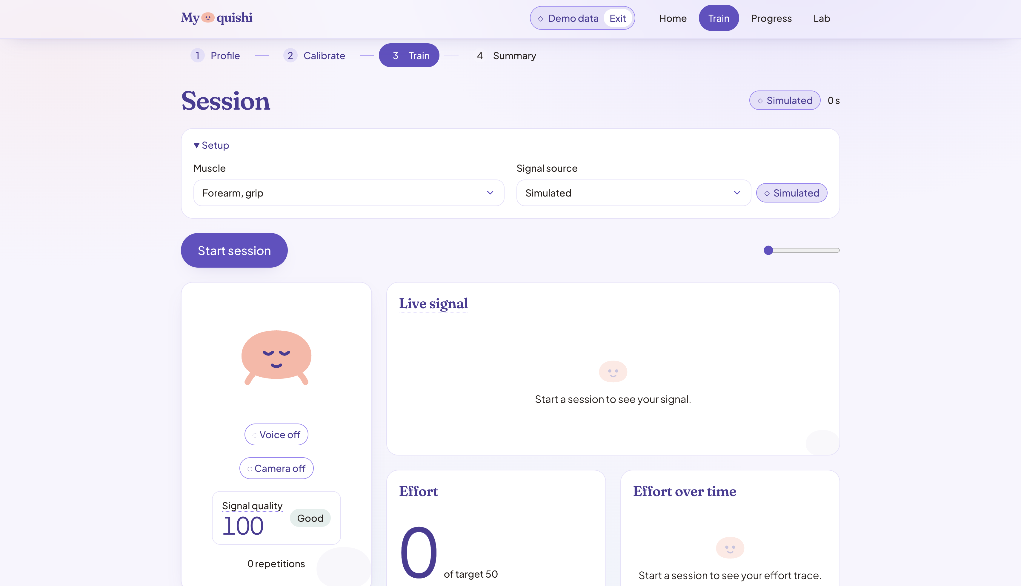
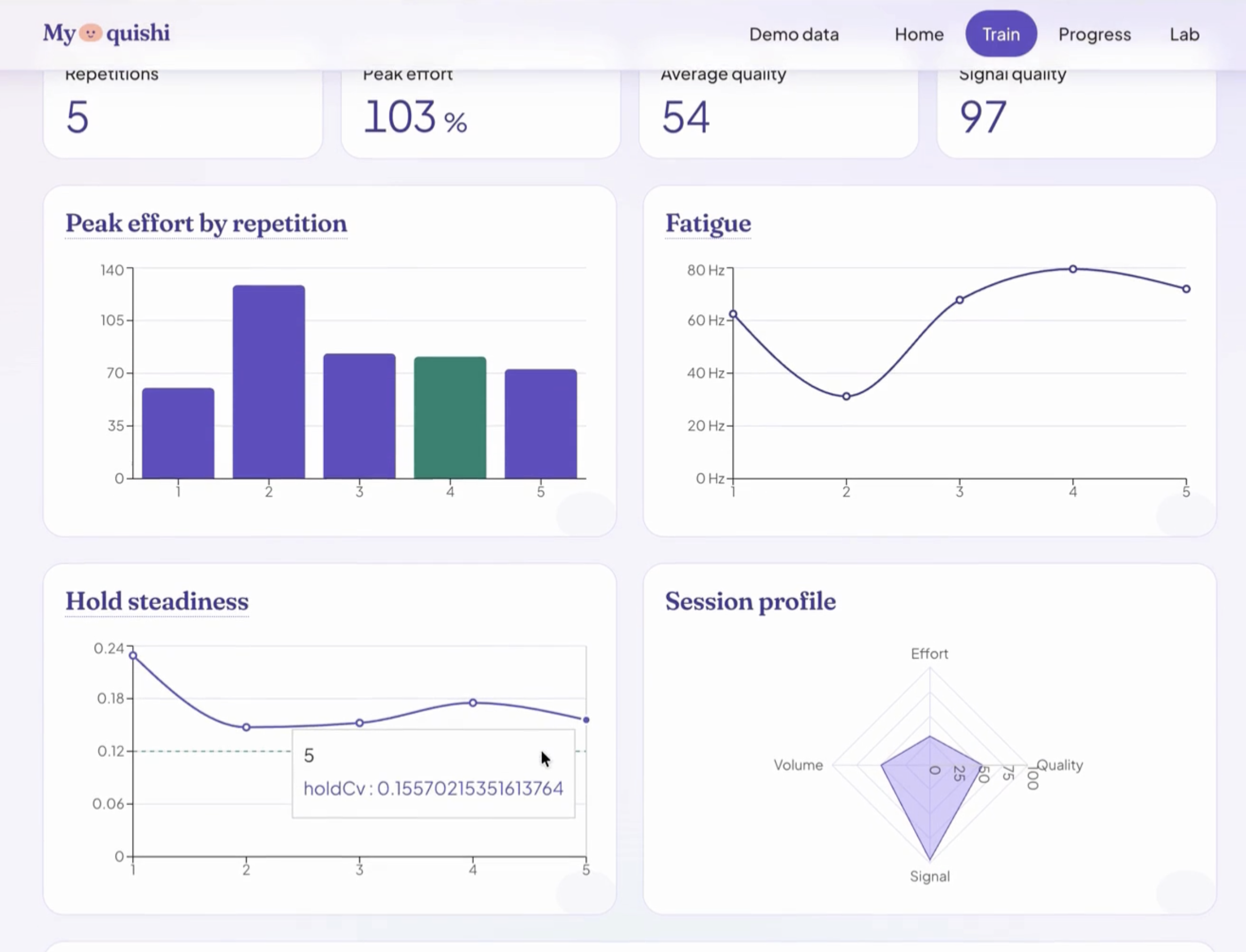
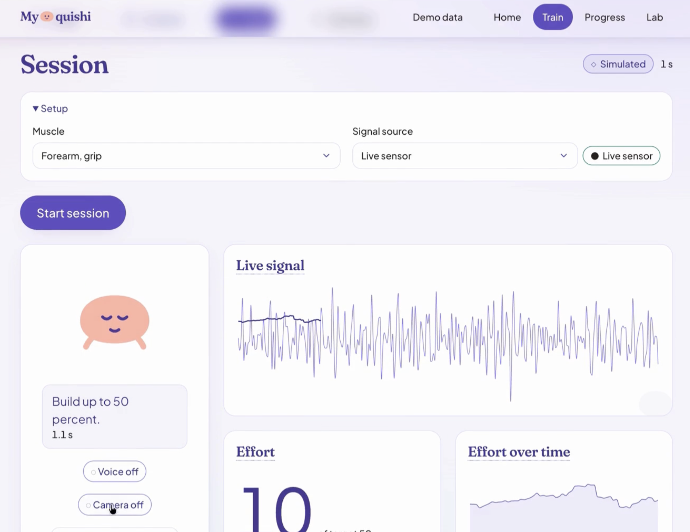
Surface EMG streams from the forearm at 5 frames per second. The app segments individual repetitions in real time, scores each one, and coaches the next:
- hold steadier
- release slower
- ease off
Effort is displayed as a percentage of your own maximum (\( \%\text{MVC} \)) rather than an absolute. This is the standard normalization in surface EMG, and the only thing that makes two sessions comparable.
Fatigue, measured rather than guessed
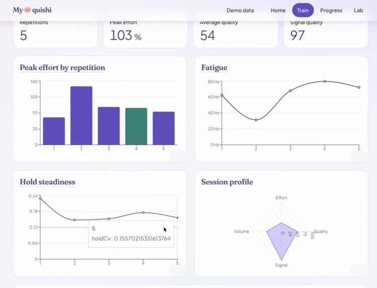
Each repetition gets an FFT, and the median frequency of the power spectrum is regressed against repetition index:
$$\text{MDF}_i = \beta_0 + \beta_1 \cdot i + \varepsilon_i$$
As a muscle fatigues its spectrum shifts downward, so \( \beta_1 < 0 \) is objective evidence of fatigue rather than a patient's impression of it. The app reports the slope with a confidence interval, an \( R^2 \), and a p-value.
Longitudinally
Fifteen model slices (M1-M15) cover signal quality, rep quality, session anomalies, perceived-versus-actual effort, plateau detection via CUSUM, adherence risk, cohort percentiles, and a weekly rollup.
The centerpiece fits three candidate recovery curves and picks between them on evidence:
| Candidate | Form | Why it is in the race |
|---|---|---|
| Linear | \( y = a + bt \) | Honest baseline |
| Exponential plateau | \( y = a + (b-a)(1 - e^{-kt}) \) | The physiologically realistic shape, and the usual winner |
| Gaussian process | RBF + linear kernel | Gives a principled uncertainty band |
$$y = a + (b - a)\left(1 - e^{-kt}\right)$$
Selection uses expanding-window time-series cross-validation.
Shuffled CV leaks the future into the past and flatters the linear model, so it is never used here.
From the winner's posterior we sample the first crossing of the patient's goal and report median weeks to goal with 10th and 90th percentiles, plus the share of draws that never cross at all.
Honestly
Every predictive output is an interval, never a bare point estimate, and that is enforced structurally rather than by discipline:
// A bare point estimate is a type error, not a code review comment.
interface IntervalReadoutProps {
  point: number;
  lower: number;   // required
  upper: number;   // required
  level: number;
}
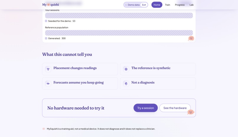
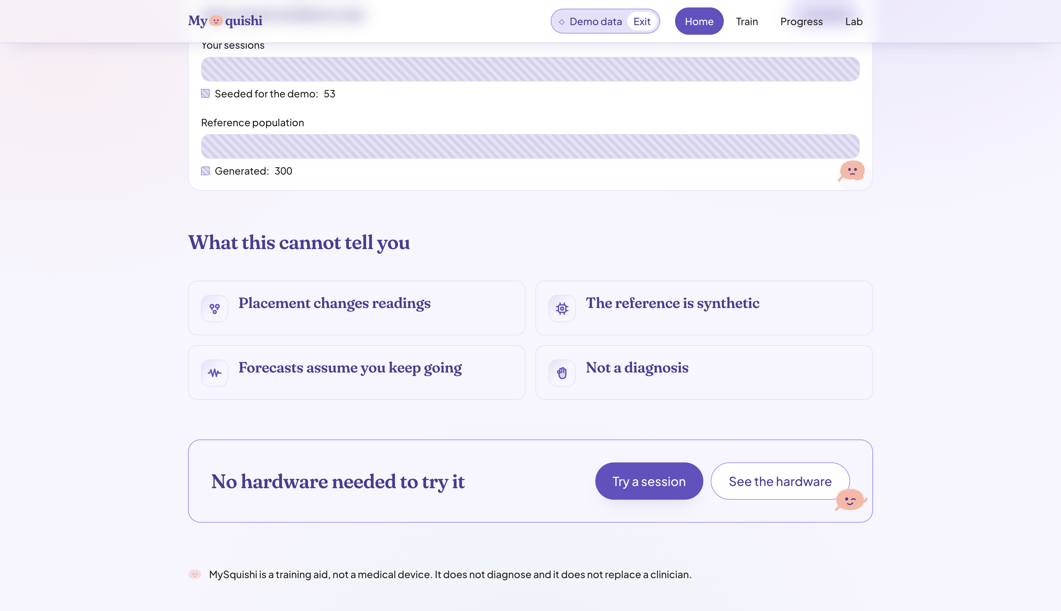
- Synthetic data is labeled synthetic, and the label derives from the signal source object rather than from page copy, so a source cannot be displayed dishonestly.
- Kilograms and EWGSOP2 sarcopenia thresholds appear for grip only, because those references are validated on hand dynamometry and are meaningless over a biceps.
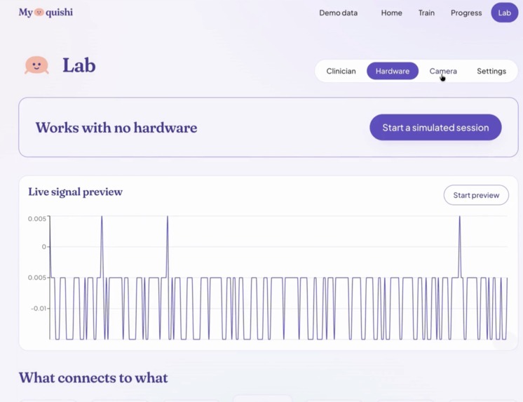
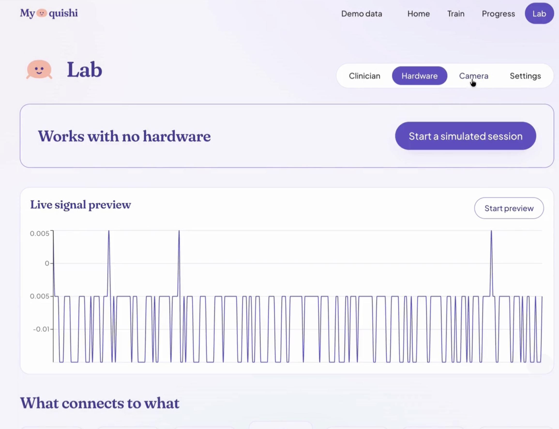
And it runs completely with no hardware attached. That is a design rule, not a fallback.
How we built it
React + Vite + TypeScript + Tailwind  (Recharts, Zustand)
                  |
                  |   REST  +  WebSocket
                  |
          FastAPI  +  SQLModel / SQLite
     scikit-learn  .  SciPy  .  NumPy  .  Pandas
                  |
                  |   SignalSource  <-- THE HARDWARE BOUNDARY
                  |
   SimulatedSource     SerialSource      ReplaySource
   (synthetic)         (real MyoWare)    (recorded csv)
Roughly 700 tests across the two halves.
The decision everything else hangs off is a single structural Protocol:
@runtime_checkable
class SignalSource(Protocol):
    def connect(self) -> bool: ...
    def read_window(self) -> np.ndarray: ...
    @property
    def sample_rate(self) -> int: ...
    @property
    def is_live(self) -> bool: ...
    def disconnect(self) -> None: ...
We built Phase 1 entirely against a synthetic EMG generator written to that interface, including all fifteen models and the full UI. When the real MyoWare hardware arrived, adding SerialSource and ReplaySource meant registering two classes in a factory.
No base class changed. No consumer was edited. The hardware arrived and the boundary did not move.
Two details made this hold up.
1. Sample rate is per-source, not global.
| Source | Samples | Rate | Window | Frames/sec |
|---|---|---|---|---|
| Simulated | 200 | 1000 Hz | 200 ms | 5 |
| Live sensor | 100 | 500 Hz | 200 ms | 5 |
Both are 200 ms, so the socket carries 5 frames per second either way, and every consumer reads fs off the frame instead of assuming a constant.
2. Serial code is quarantined to one module, enforced by four guard tests that fail the suite if import serial appears anywhere else under backend/app. The import is deferred inside a function, so a missing driver surfaces when someone requests a live session rather than breaking application startup.
The zero-hardware path cannot regress.
Model artifacts train to joblib with a manifest recording version, seed, timestamp and per-model CV metrics.
Challenges we ran into
The sensor could not do what we assumed
We planned per-finger decoding. The bring-up data killed it. Measuring separability as Cohen's \( d \) over pooled spread:
| Pair | \( d \) | Reading |
|---|---|---|
| middle vs ring | 0.03 | Statistically identical |
| index vs middle | 1.38 | Amplitude difference, not identity |
| index vs ring | 1.50 | Amplitude difference, not identity |
| hard grip vs wrist flexion | 0.12 | The same event |
Index versus middle at 1.38 sounds usable, until you notice what actually varies across those poses is how hard the finger was pressed, not which finger moved.
One differential electrode pair sits over the finger compartments of flexor digitorum superficialis, and they sum. No amount of better placement or filtering recovers that. It needs an 8-to-16 channel array.
So we deleted the feature and wrote down why. What survived was effort grading, cleanly:
| State | Multiple of rest |
|---|---|
| Rest | 1.0x |
| Light | 1.4x |
| Medium | 2.9x |
| Maximal | 14.4x |
Tightest adjacent pair: \( d = 1.54 \). Three effort levels are defensible and ten are not, so the app offers three.
A protocol artifact nearly got blamed on the hardware
Two bring-up runs graded Tier C, which would have forbidden force regression entirely.
The cause was our own measurement script. It printed each prompt and started timing in the same instant, so the seconds the subject spent reading the prompt landed inside a 5-second window. Contractions began 1-2 s late and, in the light-effort phase, lasted about a second inside that window. The grader averaged mostly rest and correctly concluded the levels overlapped.
The fix: a countdown before each window, 8-second holds, and 1.5 s trimmed from each end. The same rig then separated effort cleanly at Tier A, with 33.8x rest-to-contraction contrast.
We kept the Tier C traces in the repo as evidence rather than deleting them, and the lesson generalized into a rule:
When a bring-up result disagrees with a free run on the same hardware, suspect the protocol before the sensor.
The response is badly non-linear, right where patients live
$$\text{rest } 0.34 \;\longrightarrow\; \text{light } 0.49 \;\longrightarrow\; \text{medium } 0.98 \;\longrightarrow\; \text{maximal } 4.89$$
Rest to a quarter effort barely moves the envelope, while half to maximal nearly quintuples it. A linear bar would look completely dead through the entire low-effort range, which is exactly the range a rehab patient works in.
Effort is therefore mapped on a square-root scale and calibrated per person.
Two silent failures in normalization, found late
Bug one: the calibration did nothing. Percent MVC divides by a stored reference, and we were writing a hardcoded constant instead of the measured maximum:
- const mvcReferenceRms = 0.9;
+ const mvcReferenceRms = referenceRmsFor(sourceId, Math.max(...trials, 0));
On a sensor whose real peak sits an order of magnitude below that constant, a maximal squeeze reported single-digit percent, and the coach never advanced past "when you are ready, squeeze" because its threshold is 8 percent.
Bug two: the mirror image, in rep detection. A session that starts mid-contraction measures "rest" on a contraction, which puts
$$\mu + 3\sigma$$
above everything that follows and detects zero repetitions for the entire session, while the trace looks completely normal.
Both are now caught. The baseline is treated as provisional until enough history exists to disbelieve it against the session's own quietest quartile.
Neither of these announced itself. Both would have read as "the app just doesn't count my reps."
Accomplishments that we're proud of
The honesty is load-bearing rather than decorative.
- Intervals are a type error to omit.
- The synthetic label comes from the source object, not page copy.
- The kilogram gate is enforced per muscle.
- Every clinical term in the UI is real and carries a tooltip definition, because decorative fake jargon is worse than none when judges include people who will know.
We scoped down on evidence. Per-finger decoding, gesture recognition, and more than three effort levels were all cut with measurements attached. And the finding that effort grading is muscle-independent turned a grip-specific gadget into something that works over any skeletal muscle you can place electrodes on.
The hardware boundary paid off exactly as designed: a full app built and tested with no sensor in the room, then real hardware added without touching a consumer.
The fatigue metric is textbook rather than invented for a demo. The generator's per-repetition spectral decrement is set large enough that statistical significance at ten reps is asserted in a test.
What we learned
Building against a synthetic source first was the highest-leverage decision of the project, and not mainly for convenience. It forced the hardware interface to be explicit and narrow before any real device could tempt us into leaking its assumptions upward.
Measure the instrument before designing the product on top of it. Nearly every feature we lost, we lost to a number, and losing them to a number early is cheap.
Silent failures deserve more fear than loud ones. A crash gets fixed in ten minutes. A rep counter that reads zero while the waveform looks perfect can survive a whole demo, and the two worst bugs we found were both of that kind.
And one limitation we state rather than hide. At 500 Hz, Nyquist is 250 Hz:
$$f_{\text{Nyquist}} = \frac{f_s}{2} = \frac{500}{2} = 250\ \text{Hz}$$
So the 250-450 Hz part of the sEMG band is unobserved, and our median-frequency values are not comparable to published figures. The within-session trend, which is what fatigue actually measures, holds regardless. The UI says so wherever fatigue appears on a live session, because the honest move is to state the limitation rather than quietly hope no one checks.
What's next for MySquishi
Multi-channel. Per-finger decoding is the one capability we genuinely wanted and provably cannot reach on one channel. An 8-to-16 channel forearm array plus a trained classifier is the real path, and the existing SignalSource boundary is where it plugs in.
Validation against a Jamar dynamometer. The kilogram estimate is calibrated to a self-reported reference today and labeled as an estimate everywhere it appears. Paired readings against the clinical gold standard would turn that into a defensible claim, with a real error distribution instead of fit residuals.
Other muscles, measured rather than assumed. Biceps and calf should read better than the forearm, being larger muscles with more motor units under the electrode. The placement rules already carry over. Confirming that means re-running the probe per site, not assuming.
Real cohort data. Every population percentile in the app is drawn from a synthetic cohort and labeled as such. Replacing it with real longitudinal data is what would make the recovery-trajectory and time-to-goal models clinically meaningful rather than merely structurally sound.
Clinician workflow. PDF export exists. Scheduled reports, multi-patient triage by adherence risk, and EHR-shaped export are the obvious next steps toward something a clinic would actually adopt.
Built With
- arduino
- fastapi
- machine-learning
- mediapipe
- myoware
- numpy
- pandas
- python
- react
- scikit-learn
- scipy
- semg
- sqlite
- sqlmodel
- tailwind
- typescript
- vite
- websockets


Log in or sign up for Devpost to join the conversation.