-
-

MyPillPal
-
-
-
-
-
-

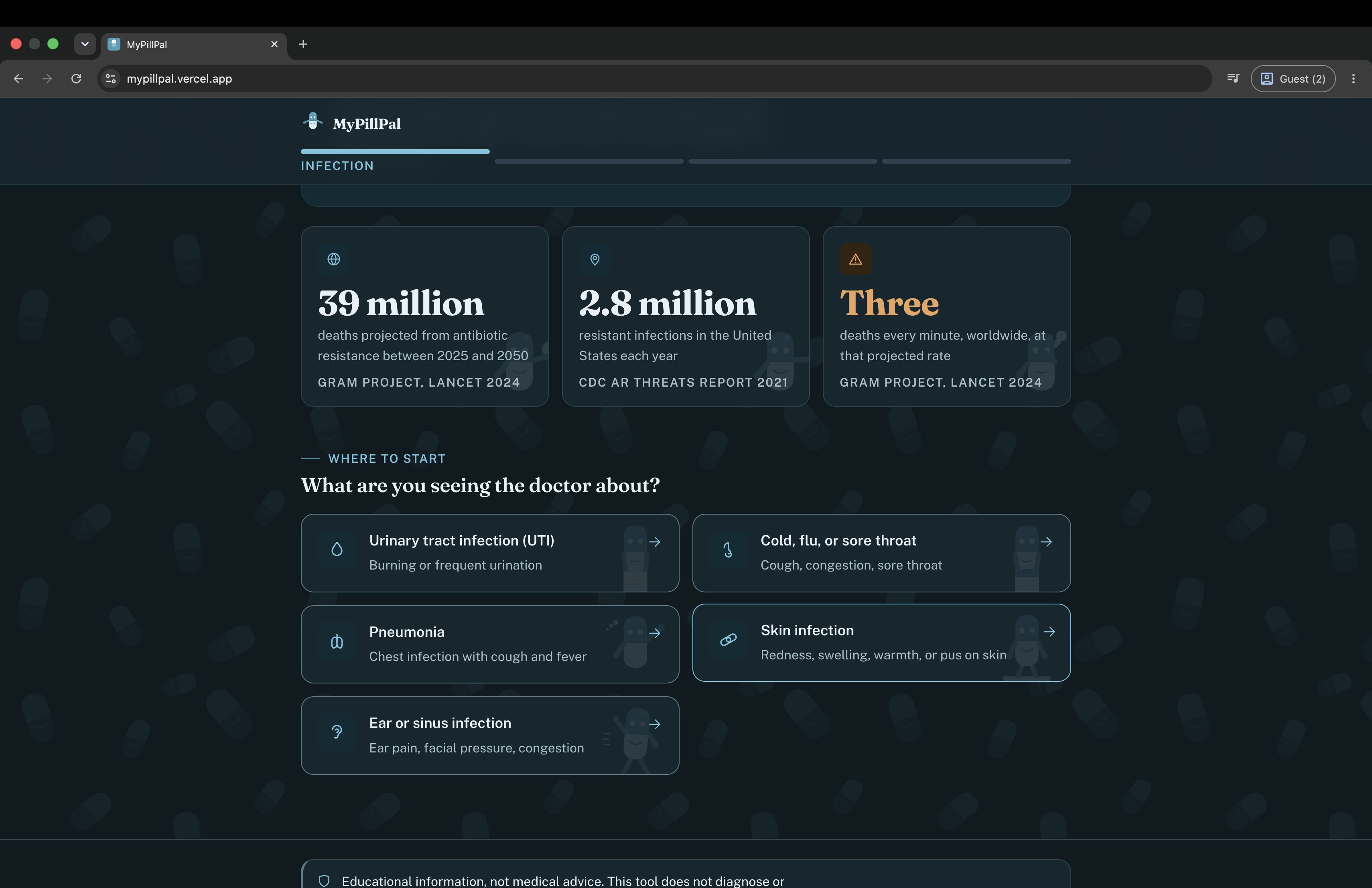
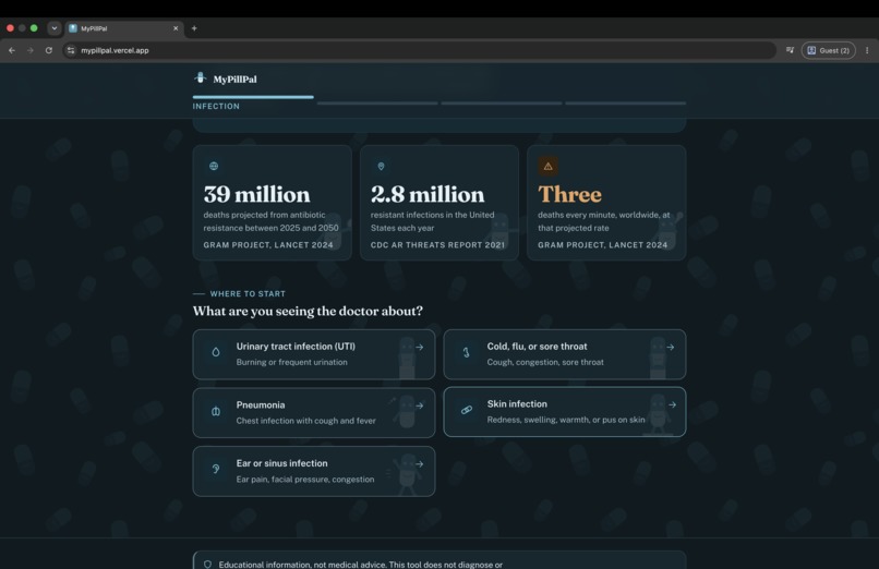
Inspiration Antibiotic resistance is projected to directly cause 39 million deaths between 2025 and 2050, roughly three deaths every minute (GRAM Project, Lancet, 2024). In the US alone, over 2.8 million antimicrobial resistant infections happen every year. A huge driver of that is inappropriate prescribing, and part of that is a communication gap: patients pressure doctors for antibiotics that will not help them, and when they do need one, they walk out with a prescription and zero context for why that drug, or why not a "stronger" one.
The data to close that gap already exists. Antibiograms and resistance surveillance reports are published every year by the CDC, the WHO, and state health departments. None of it is written for the person actually swallowing the pills. It is locked in dense PDF tables and paid clinical tools like Epocrates and the Sanford Guide. Public data, funded by the public, inaccessible to the public it is meant to protect. That gap is what MyPillPal exists to close, not by diagnosing anyone, but by translating.
What it does MyPillPal takes a patient through four screens in under two minutes:
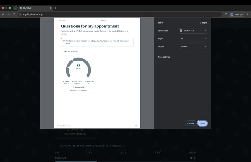
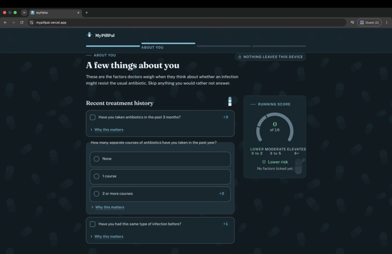
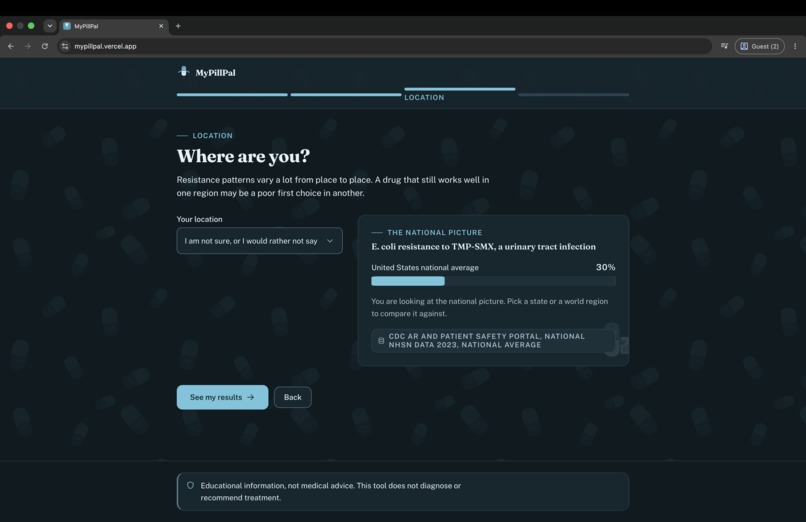
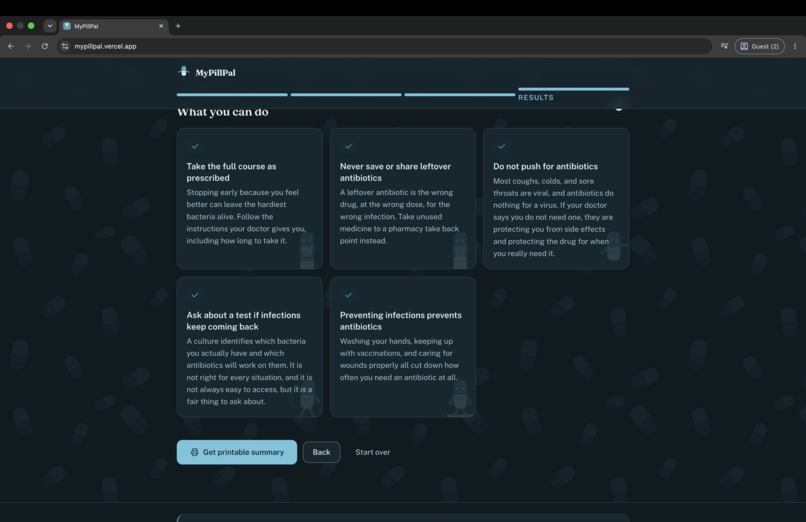
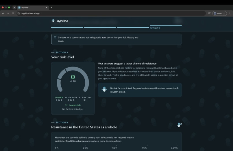
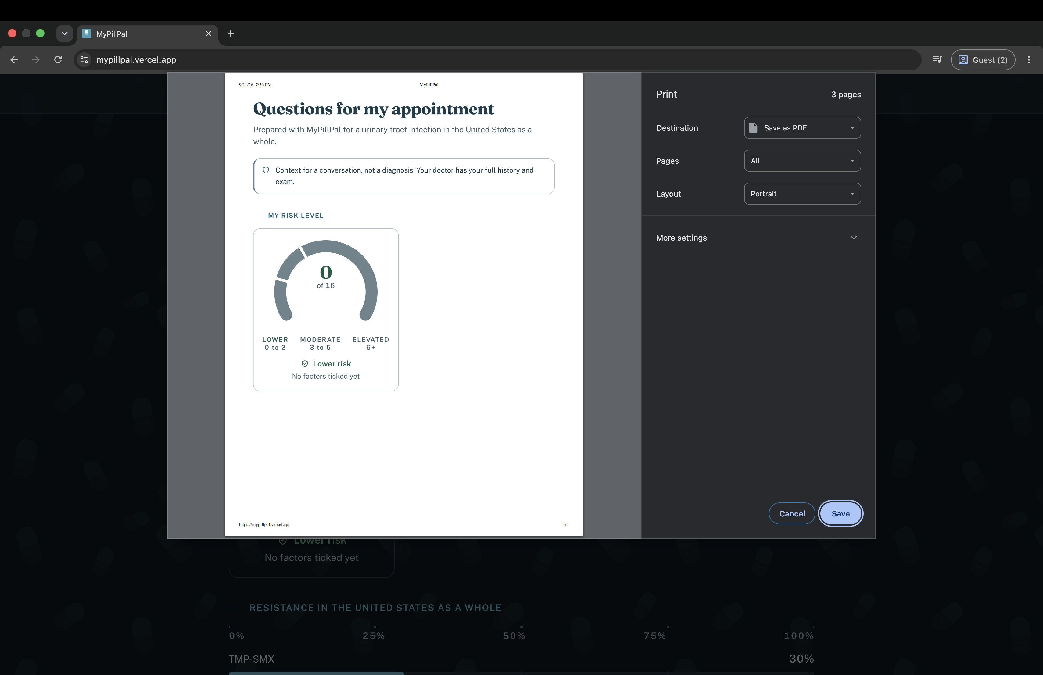
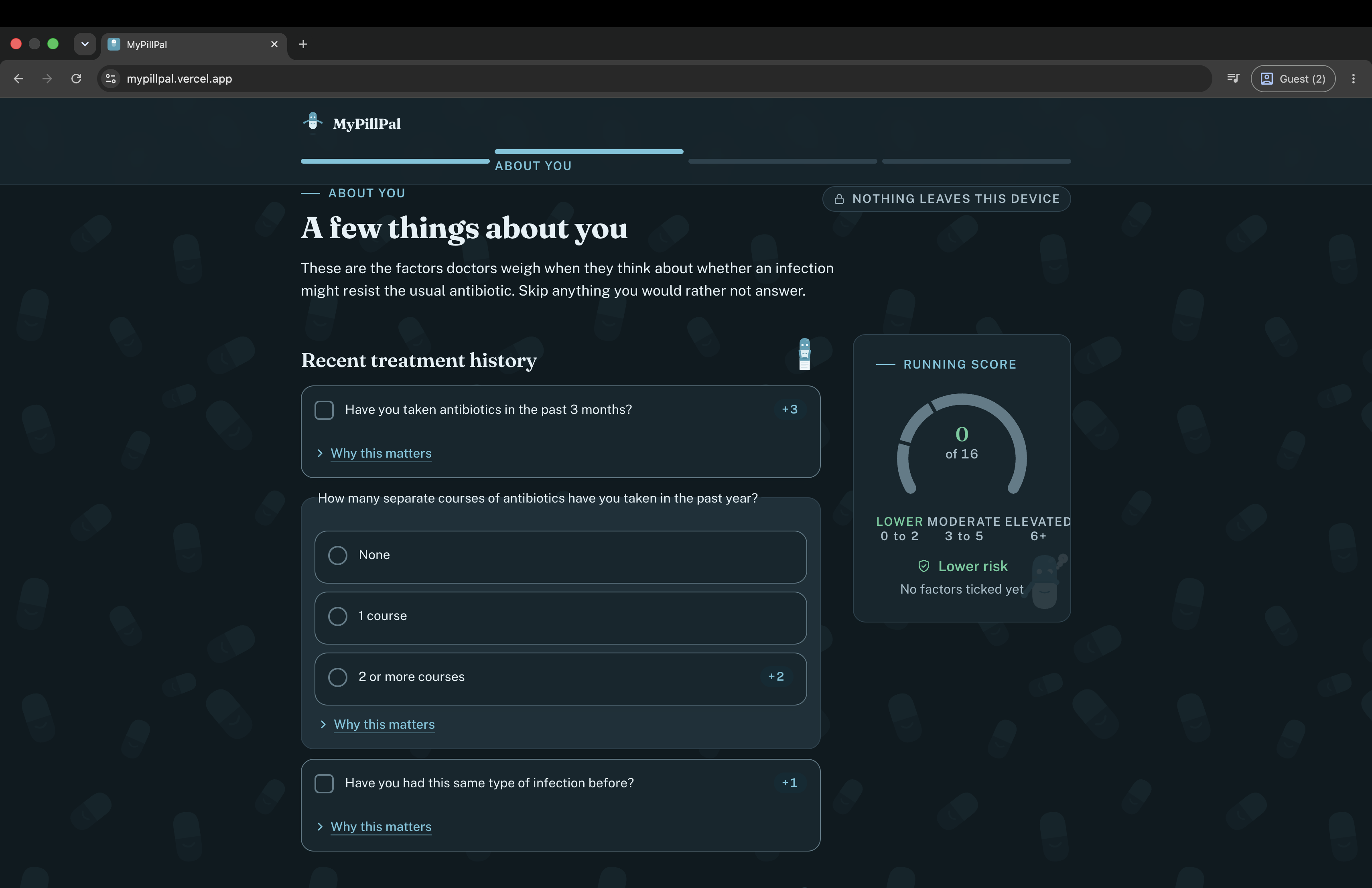
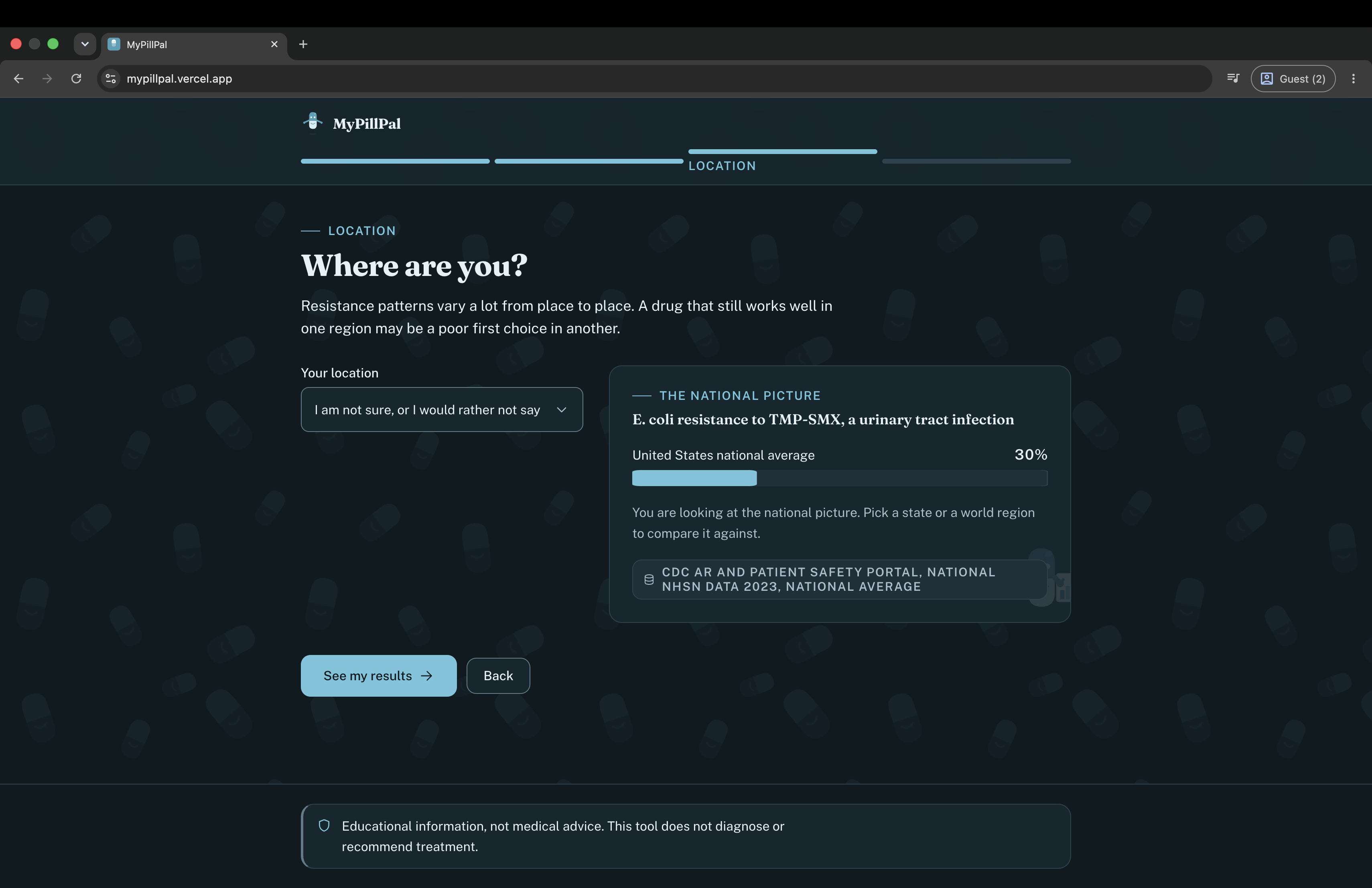
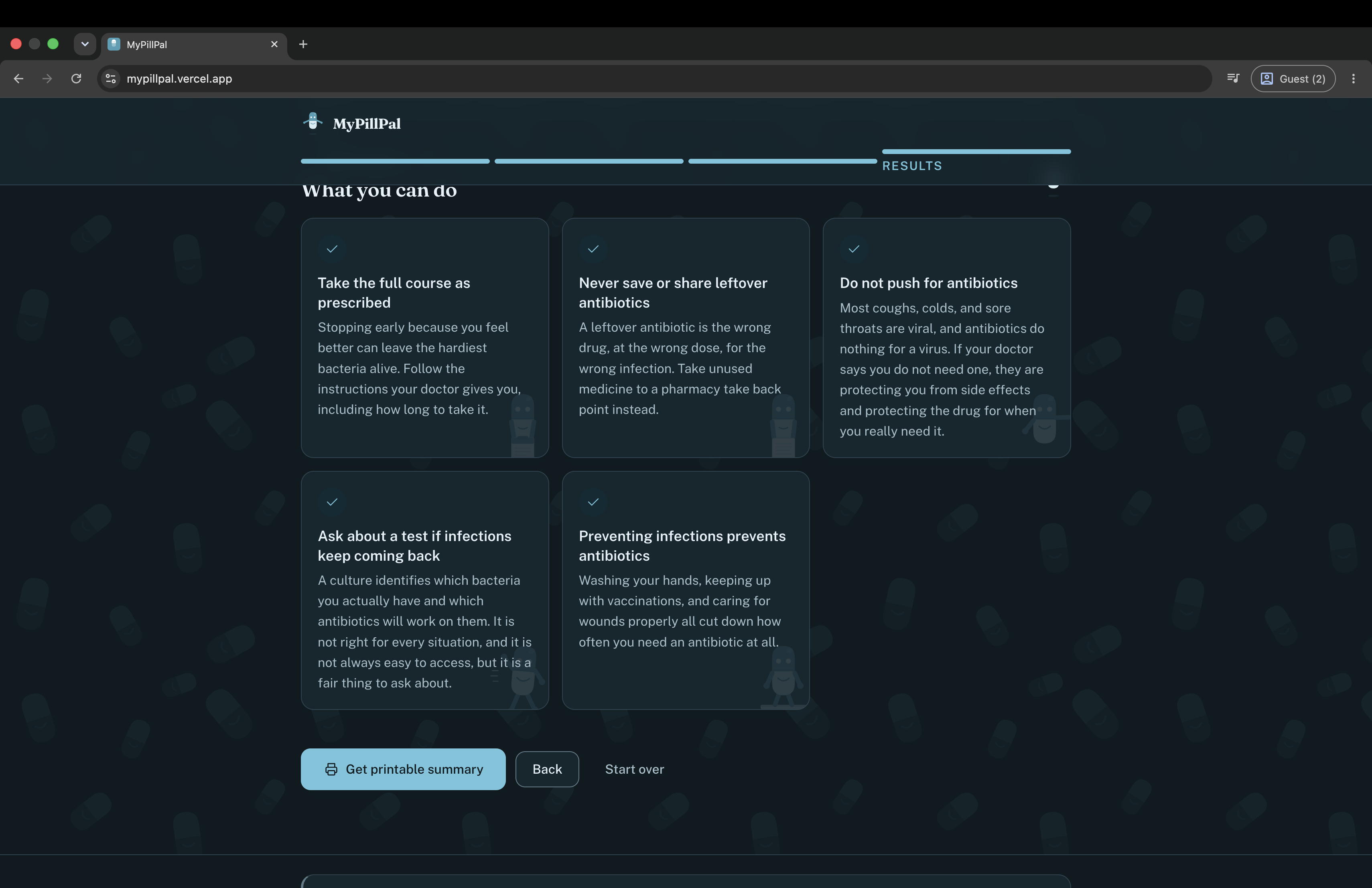
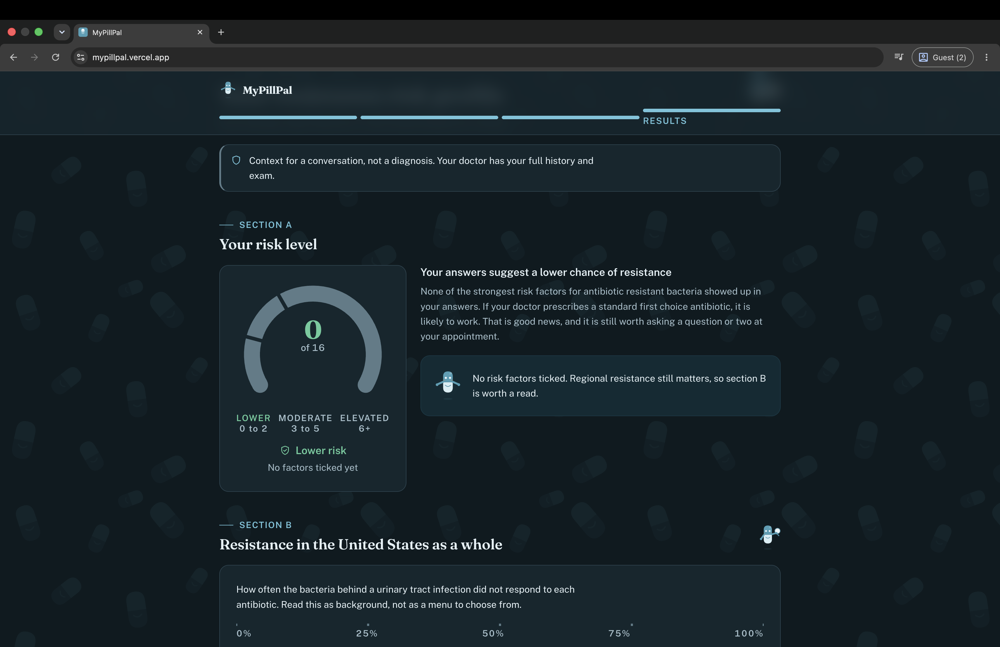
Pick an infection type. Five common ones: UTI, cold or sore throat, pneumonia, skin infection, ear or sinus infection. Check risk factors. Recent antibiotic use, diabetes, recent hospitalization, international travel, age, and more, each with a "why this matters" note and a live risk gauge that updates as you answer. Pick a region. Resistance rates vary a lot by geography, and the screen shows how that region compares to the national picture immediately. Get a risk profile, with four parts: a risk tier and what it means, the actual resistance rates for that infection in that region with a cited source, a personalized doctor conversation guide of 3 to 5 specific questions, and plain language stewardship tips. The risk model is a transparent weighted additive score, not a black box and not machine learning:
$$ S = \sum_i w_i x_i $$
where (x_i) is 1 if the user has risk factor (i) and 0 otherwise, and (w_i) is that factor's weight, drawn from published studies. Recent antibiotic use in the past 90 days carries the heaviest weight, (w = 3), grounded in an odds ratio of 2.9 to 5.7 for resistant infection. The tiers are just thresholds on the total: 0 to 2 is Low, 3 to 5 is Moderate, 6 or higher is Elevated.
Everything it is not matters just as much as what it is. MyPillPal never diagnoses an infection, never tells anyone to take or avoid a specific drug, and never claims to replace a doctor. Every output is framed as a question to bring into the room, not an instruction to follow.
How we built it React, Vite, and Tailwind, entirely client side. No backend, no accounts, no analytics, no tracking. Every answer a user gives is processed in the browser and discarded the moment the tab closes, which became a hard architectural constraint from day one rather than an afterthought.
The data layer is five infection types mapped to their common pathogens and empiric antibiotics from IDSA guidance, a regional resistance dataset covering 10 US states (sourced from real published state antibiograms where available, clearly labeled as national estimates where not) plus 6 WHO regions, and a rule based conversation guide generator that picks 3 to 5 questions based on the specific combination of infection, risk tier, and regional resistance pattern a user landed on, so the output actually changes meaningfully with the input instead of reading like boilerplate.
On top of that sits a full design system built for this project: a custom type scale (Fraunces for display, Public Sans for text), a teal and coral palette with every value checked against WCAG AA contrast in light, dark, and print, custom Select and ChoiceCard components with full ARIA semantics in place of native controls, and a set of visualization primitives (RiskGauge, FactorWeightBar, ResistanceChart) built as lightweight SVG rather than pulling in a charting library for four small charts. PillPal, the mascot, was drawn as fifteen poses so the same character could appear in the header, the results, and the empty states without ever standing next to a disclaimer, since a mascot beside a risk score can too easily read as reassurance it should not be giving.
Challenges we ran into Being personalized without being reckless. The line between "here is context for your conversation" and "here is what to do about your infection" is thin, and the entire architecture, the disclaimers, the framing of every guide question as something to ask rather than something to do, the refusal to ever name a specific drug as a recommendation, exists because that line matters more than any feature.
Data that will not sit still. State antibiograms publish annually with a one to two year lag, individual facility data is not publicly aggregated anywhere, and antibiograms themselves skew toward sicker hospitalized patients, which can overstate community resistance. Every figure in the app is labeled with its source, year, and scope, and estimated figures are flagged as loudly as the real ones so nothing gets mistaken for more precise than it is.
Keeping the tone honest without being either clinical or cutesy. Early drafts either read like a pamphlet or like a mascot was trying too hard. The fix was mechanical as much as editorial: no small print, no grey note paragraphs, every caveat promoted into a real, designed component instead of shrunk into the corner where nobody reads it.
Solo, one weekend. Data model, risk scoring, four screens, a full visual identity, and accessibility all had to happen in roughly 10 to 15 hours, which meant deciding early that the risk model would be a documented additive formula rather than anything resembling a trained model, both because it was buildable in the time available and because a transparent sum is something a patient can trust and a doctor can sanity check on the spot.
Accomplishments that we're proud of Shipping a fully working, four screen product solo in a weekend, when most submissions in this field are slide decks only. Every resistance figure on screen traces to a real, named source and year, nothing is asserted from memory. The risk model is fully explainable: a user can see exactly which of their own answers produced their score, with no hidden logic anywhere. The whole visual identity, palette, type system, mascot, and accessibility pass (WCAG AA across light, dark, and print) was designed and built from scratch rather than templated. And the hardest thing to get right, the ethical boundary between informing a patient and diagnosing or prescribing for them, holds on every single screen, not just in a disclaimer at the bottom.
What we learned The biggest lesson was how much of responsible health tech is not a disclaimer at the bottom of the page, it is a design decision made at nearly every screen: what gets asked, what gets skipped when a user declines to answer, what a mascot is and is not allowed to stand next to. I also learned a lot of resistance epidemiology I did not expect to: how much CAP prescribing in practice diverges from IDSA guidance, how strongly recent antibiotic exposure predicts future resistance compared to almost every other factor, and how uneven the public availability of this data is even though the underlying data is collected almost everywhere.
What's next for MyPillPal A lightweight symptom pre-screener to help users find the right infection category before they even open the risk checklist, and an "is this viral?" educational interstitial specifically for cold and flu symptoms, reinforcing stewardship before a single resistance figure is even shown. A side by side region comparison view, so the geographic variation in resistance becomes something a user can see directly rather than infer from one region at a time. Longer term, individual facility antibiograms would be far more useful than state level averages if they were ever aggregated in a public, consumer accessible format, and validating whether a tool like this actually changes prescribing conversations would need a real prospective study, not just a prototype.
Built With
- amr
- antibiotic-resistance
- antimicrobial-stewardship
- data-visualization
- health-literacy
- healthtech
- javascript
- patient-education
- privacy-first
- public-health
- react
- social-impact
- tailwindcss
- vite


Log in or sign up for Devpost to join the conversation.