Myki Inspector Dashboard
Inspiration
Melbourne's transport network loses millions annually to fare evasion while 500+ Myki inspectors work with outdated tools and manual processes. We witnessed inspectors spending hours checking stations based on gut feeling rather than data, missing high-risk areas where fare evasion actually occurs. With 2024 losses approaching $30m—up from pandemic-affected $19m in 2022—it became clear that reactive, manual monitoring wasn't working. We were inspired to build a solution that transforms how revenue protection operates, moving from chasing yesterday's problems to preventing today's losses.
What it does
The Myki Inspector Dashboard is an operational cockpit that provides real-time intelligence for fare evasion prevention. It features:
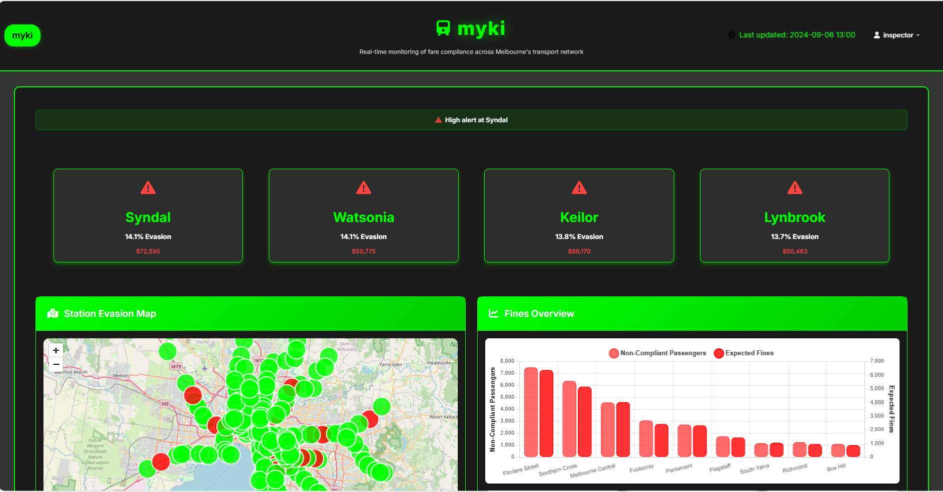
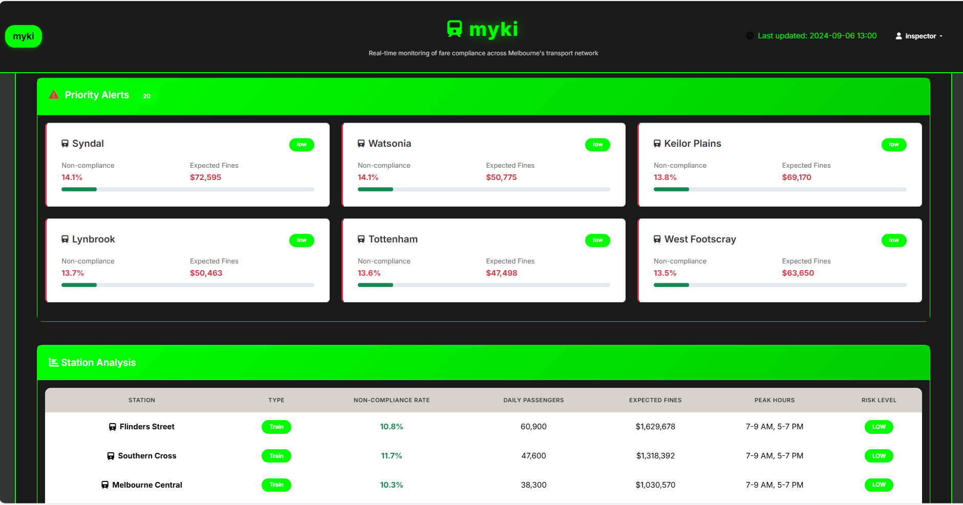
- Real-time Risk Alerts: High-contrast carousel highlighting the top four stations needing immediate attention
- Interactive Network Map: Color-coded visualization where deeper reds indicate higher evasion risk, updating live
- Live Analytics: Compliance trends, expected fine revenue, and emerging hotspots with contextual insights
- Role-Based Access Control: Secure dashboards for inspectors, controllers, and managers with appropriate permissions
- Mobile-First Design: Optimized interface that works seamlessly in the field, not just at headquarters
- PTV-Matched Branding: Familiar color scheme and design language for seamless adoption
The system transforms reactive patrolling into proactive, data-driven deployment, ensuring inspectors are in the right place at the right time.
How we built it
Our technical stack prioritizes reliability and real-time performance:
- Backend: Flask (Python) with robust real-time data processing capabilities
- Data Layer: Pandas for advanced analytics, JSON for streamlined user management
- Frontend: Bootstrap 5 for responsive design, Chart.js for dynamic visualizations
- Mapping: Leaflet for interactive network visualization
- Mobile Optimization: Touch-friendly interface designed for field use, even with poor connectivity
We built this mobile-first, recognizing that inspectors need actionable data while moving through the network, not just when sitting at a desk. The architecture handles real-time updates while maintaining performance across devices.
Challenges we ran into
Time Constraints: With only 48 hours, we had to prioritize core functionality over polish—building the MVP while keeping the bigger vision intact
CSV Data Merging: Combining multiple fare evasion datasets with station location data proved tricky—mismatched station names and inconsistent formatting caused hours of debugging
Responsive Map Implementation: Getting Leaflet maps to render correctly across mobile and desktop while maintaining performance was more complex than expected, especially with real-time data overlays
UI Design Consistency: Balancing rapid prototyping with professional design standards—we spent significant time ensuring the interface looked polished enough for a compelling demo
Team Coordination: Balancing frontend development, backend architecture, and UX design across team members with different sleep schedules
Scope Creep: The problem space is so rich that we constantly had to resist adding "just one more feature" and stay focused on the demo
Demo Pressure: Building a system that works smoothly for live presentation while handling edge cases that might crash during the pitch
Accomplishments that we're proud of
- User-Centric Design: Matching PTV branding and creating intuitive workflows that require minimal training
- Mobile Excellence: Building the only field-optimized solution in this market space
What we learned
- Domain Expertise Matters: Understanding the daily reality of revenue protection officers was crucial for building practical solutions
- Mobile-First is Essential: Field workers need tools that work where they work, not just where it's convenient to test
- Stakeholder Alignment: Different user types need the same data presented differently—inspectors need alerts, managers need trends
What's next for Myki Inspector Dashboard
Phase 1 (Next 60 days): Pilot deployment at five high-risk stations including Flinders Street and Southern Cross, proving immediate ROI
Phase 2 (3-6 months): Integration with live Myki tap-on feeds for real passenger counts, not estimates—this is when the platform reaches full potential
Phase 3 (6-12 months): Scale to all 200+ Melbourne stations with automated deployment and city-wide analytics
Long-term Vision: Expand platform to Sydney, Brisbane, Perth, and other major Australian cities. With similar challenges across the country, this represents a $5M+ annual market opportunity.
Advanced Features: AI-powered predictive analytics, passenger flow optimization, integration with crowd management systems, and real-time passenger information displays.
The technology is ready, the market need is proven, and the partnership opportunity with Myki/PTV could transform how Australia approaches smart transit management.


Log in or sign up for Devpost to join the conversation.