Inspiration
Inspired by my personal project Vibelines, which helps analyse an individual's liked songs on Spotify to generate a personalised timeline of moods based on song characteristics.
What it does
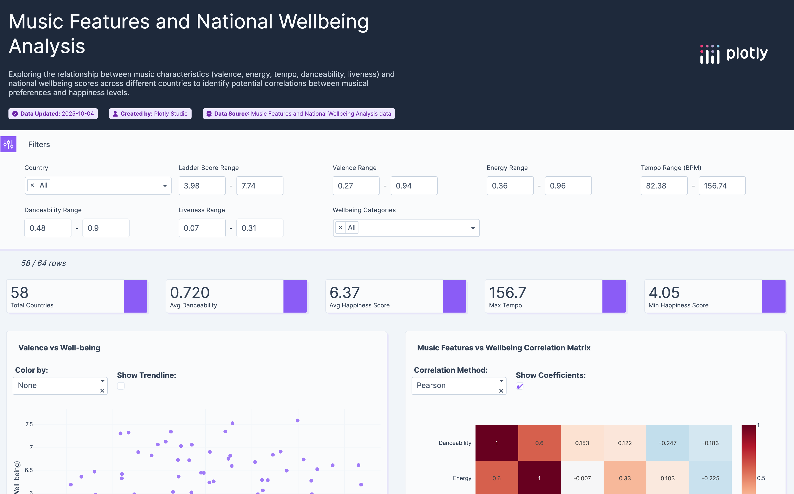
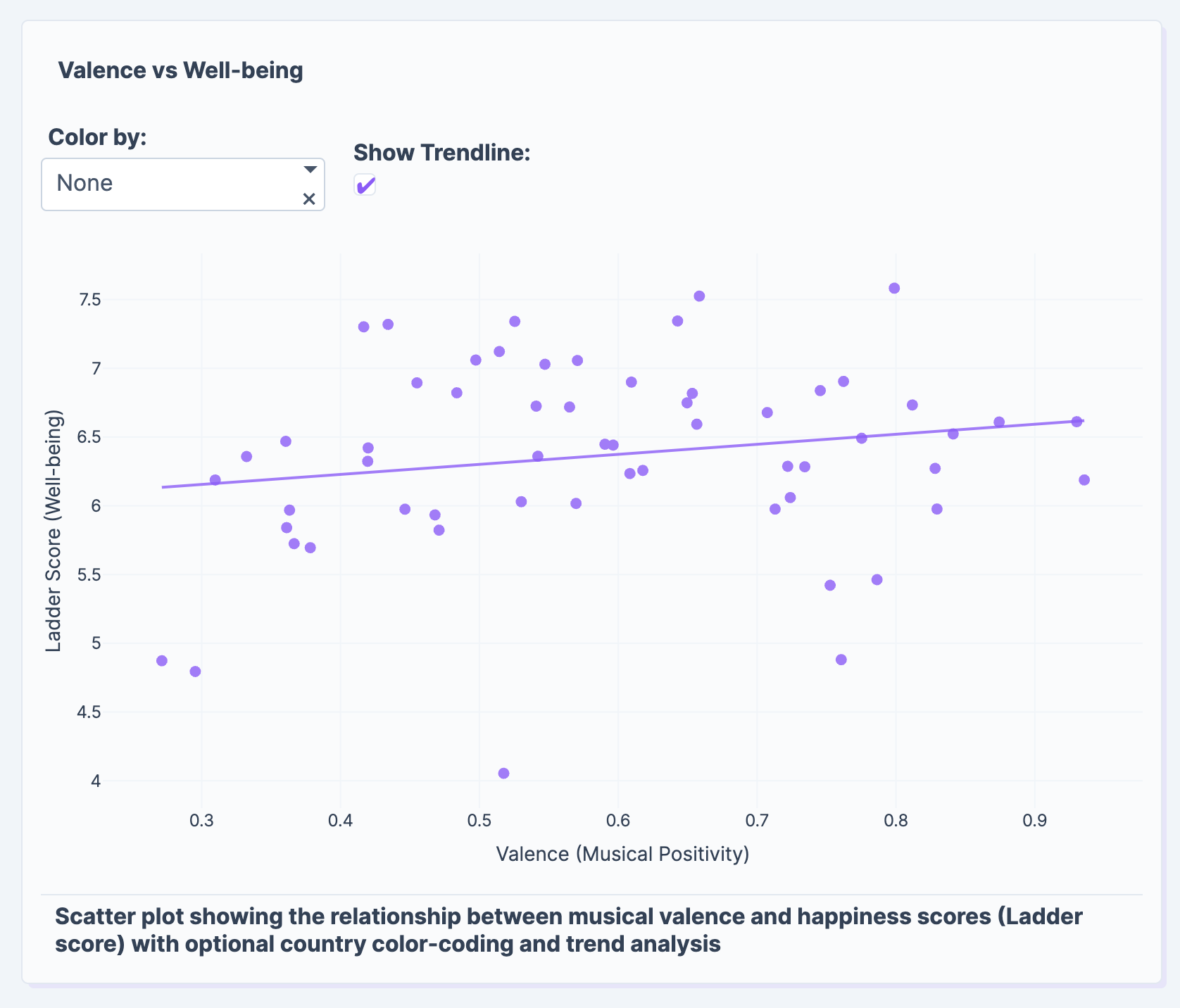
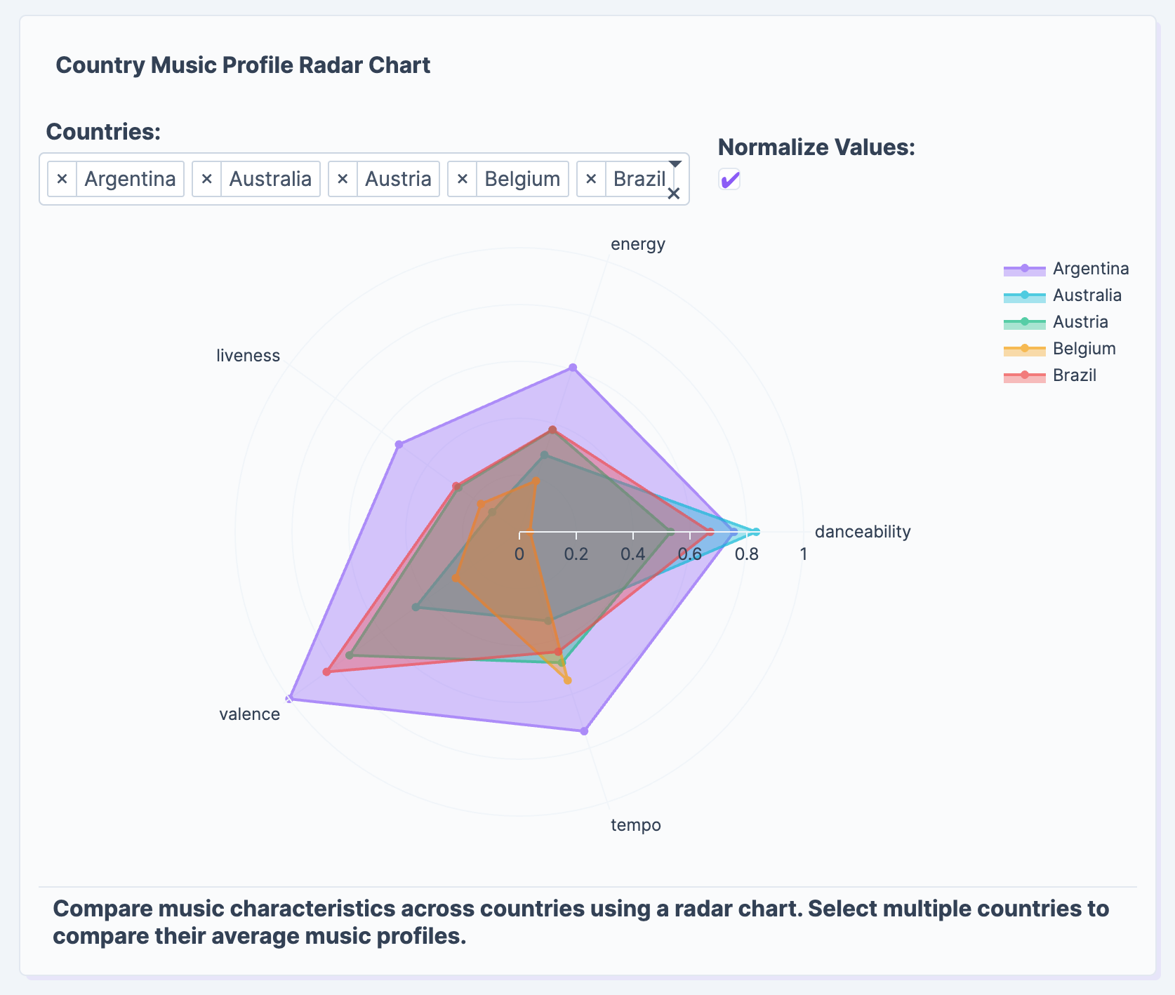
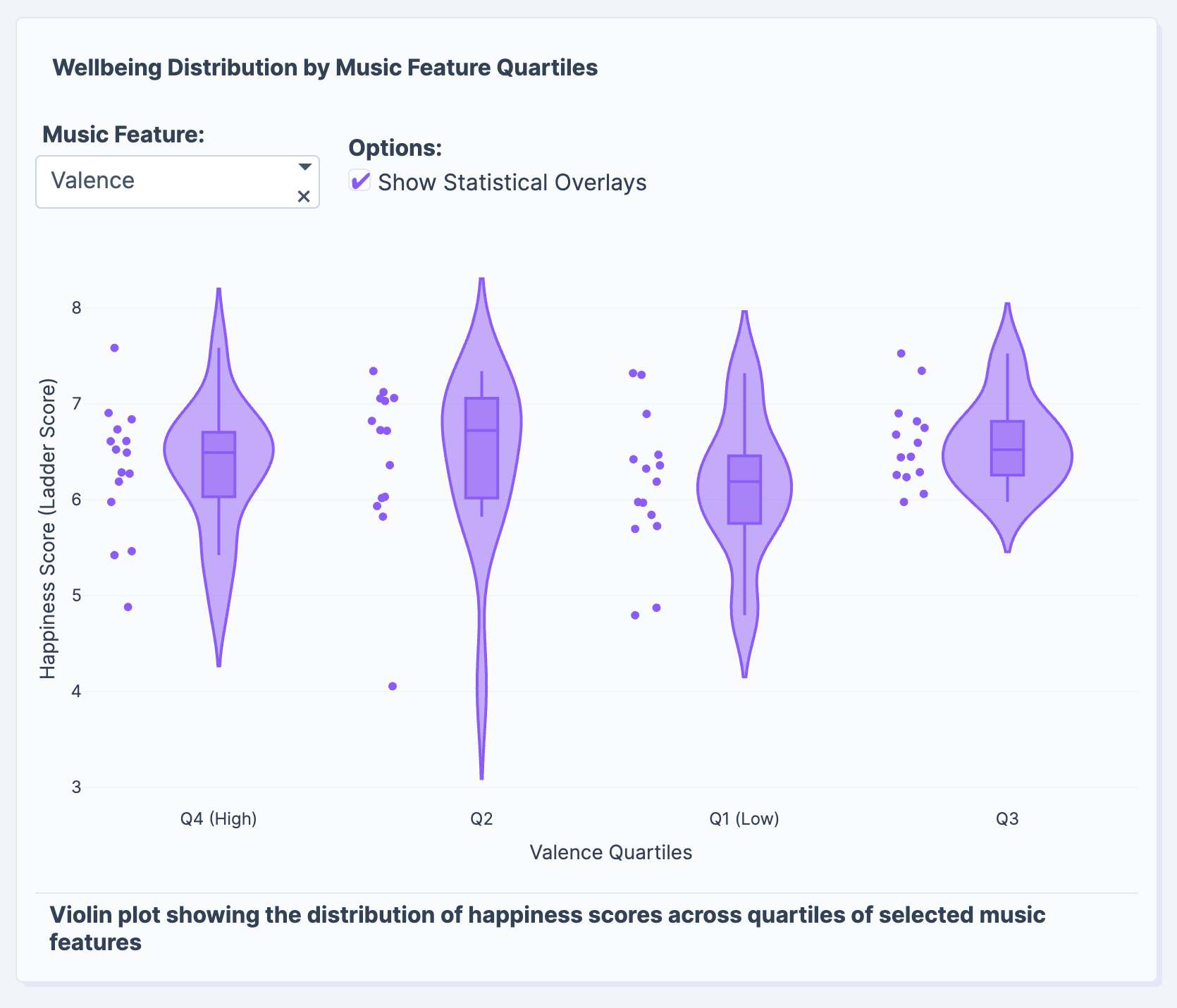
This Music Features and National Wellbeing Analysis takes it further by examining the hypothesis that the top song of each country correlates with the country's happiness. i.e. a happy country tends to have a happier song as its top song.
How we built it
Using the datasets,
- Top Spotify Songs in 73 Countries (Daily Updated)
- World Happiness Report 2024 I cleaned and combined both data using Pandas in Python. Afterwards, uploaded the CSV file with the data into Plotly for it to analyse.
Challenges we ran into
Insufficient data to plot a graph to show the changes in top song mood vs happiness score over time per country.
Accomplishments that we're proud of
Experiencing the power of Plotly.
What we learned
How to use Pandas.

Log in or sign up for Devpost to join the conversation.