


Inspiration
Music has always reflected human emotion, culture, and technology — yet we rarely see that evolution captured through data.
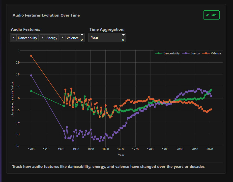
I wanted to explore how sound, energy, and emotion have changed across decades — from the soft acoustic tones of the early 1900s to the energetic digital anthems of today.
The goal was to tell the story of music through data — to visualize how we’ve changed not just what we listen to, but who we are as listeners.
What it does
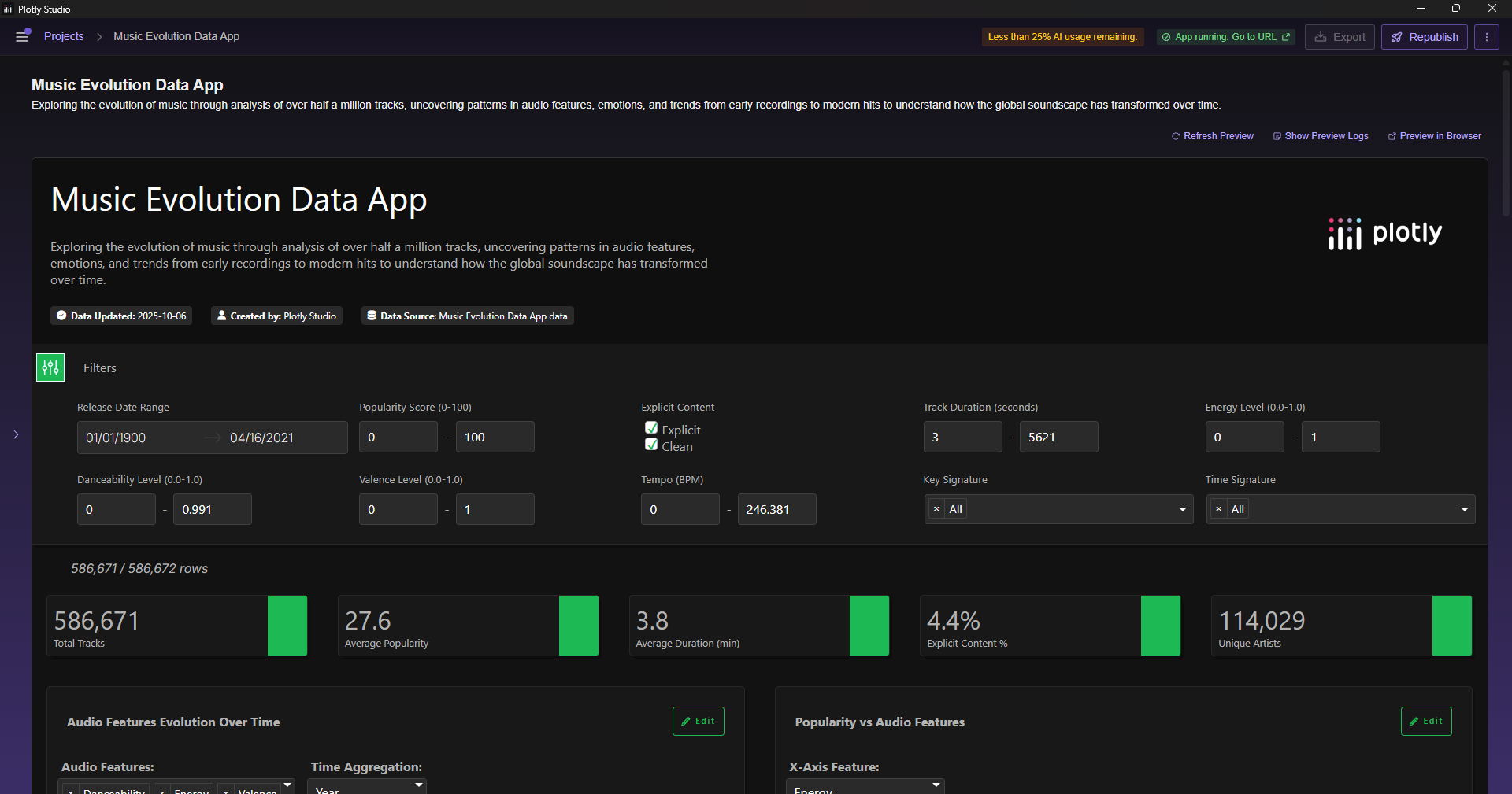
The Music Evolution Data App is an interactive dashboard that visualizes how music evolved over the past 120 years.
It analyzes 586,000+ songs and lets users explore patterns across time, mood, energy, and popularity.
Users can:
- Filter tracks by decade, mood, energy, tempo, or explicit content
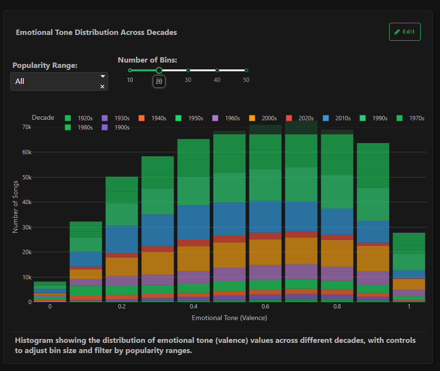
- Explore audio features over time (danceability, energy, valence)
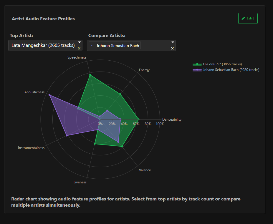
- Compare artist sound profiles through radar charts
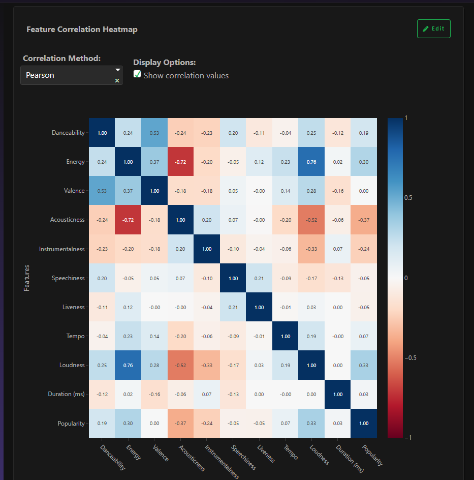
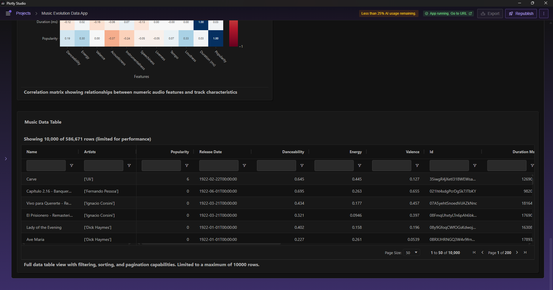
- Examine correlations between features and what makes songs popular
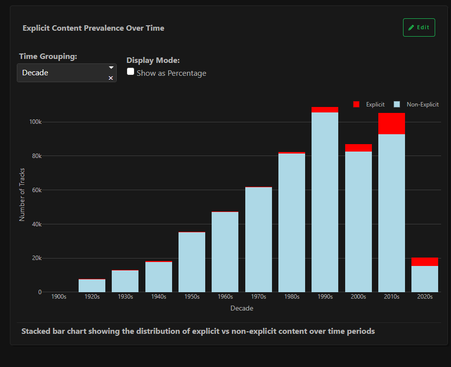
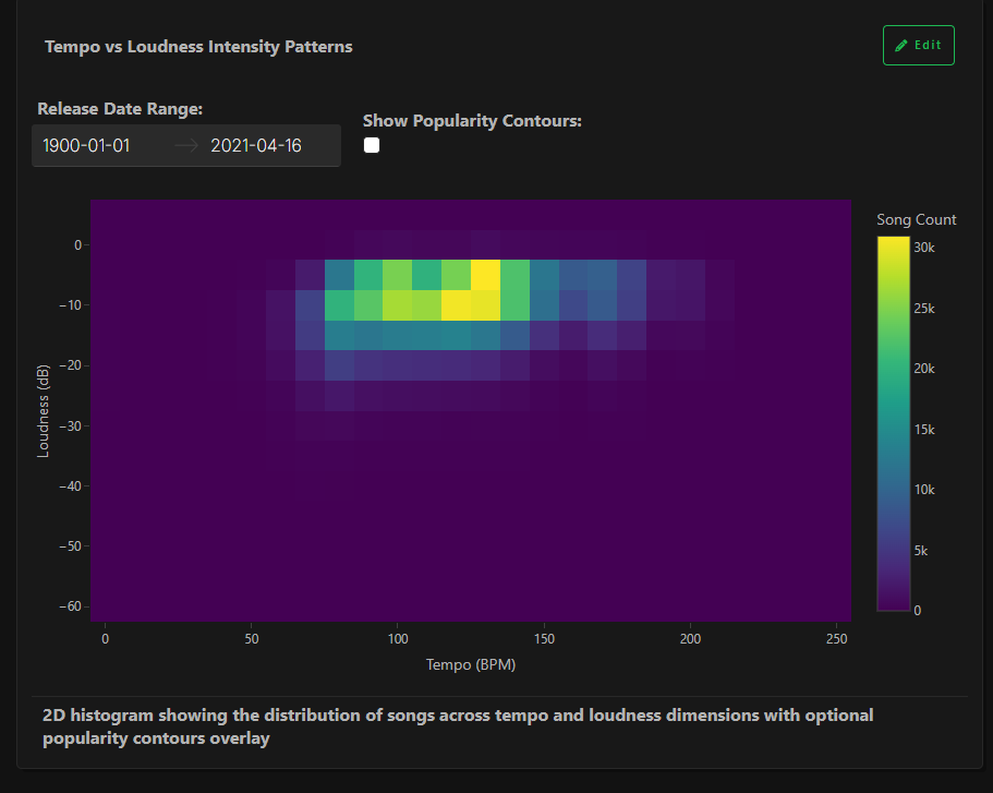
- Understand cultural shifts — like the rise of explicit lyrics and louder production in modern music
In short, the app transforms massive music data into a story of human emotion and creativity told visually.
🛠️ How we built it
- Discovered and selected a large, public music dataset (~586K tracks) with rich audio features (danceability, energy, valence, tempo, loudness, popularity, explicit flag).
- Validated the fields (dates, popularity, audio features, key/time signature) and mapped them to questions we wanted to answer (e.g., “What makes a song popular?” “How did energy change by decade?”).
- Wrote a clear Context/Aim for Plotly Studio so the tool could auto-suggest meaningful visuals aligned to our goals.
- Started from Plotly Studio’s auto-generated outline, then edited and refined it: tightened the chart list, ensured every chart used real columns (no placeholders), and added decade/year groupings where insight mattered.
- Built the interactive dashboard entirely in #PlotlyStudio: configured filters (date, popularity, energy, danceability, valence, tempo, duration, explicit), chose encodings, and tuned bins/aggregations for clarity.
- Applied a Spotify-inspired dark theme for visual consistency and accessibility; optimized titles, subtitles, and annotations to guide the story.
- Performed quick QA in Studio: checked that filters never blank charts, legends are readable, tooltips are informative, and every visualization supports the narrative.
- Published the dashboard, created a short video walkthrough, and posted a social update tagging #PlotlyStudio for the submission.
Challenges we ran into
- Handling and cleaning such a massive dataset without crashing Plotly Studio
- Making sure every filter and chart dynamically connected to the right subset of data
- Ensuring that each chart wasn’t just decorative but carried meaning and insight
- Publishing the dashboard — data sources initially broke when deployed, so I created optimized pre-aggregated CSVs for each visualization to keep it responsive
Accomplishments that we're proud of
- Successfully visualized a century of music history using data storytelling
- Built a smooth, interactive dashboard that feels both analytical and artistic
- Transformed a raw dataset into meaningful insights that explain why music changed, not just how
- Designed a cohesive, visually appealing dark theme inspired by Spotify
- Learned how to turn large, messy data into an elegant, narrative-driven data product
What we learned
- How to optimize and visualize large-scale music datasets for storytelling
- The importance of designing for insight, not just aesthetics — every chart should answer a question
- How interactive filtering can turn static visuals into a real exploration tool
- That data visualization can make cultural history tangible and emotional
What's next for Music Evolution Data App
- Add a genre-based filter to study how specific genres evolved (e.g., Jazz vs. Pop vs. Rock)
- Integrate AI-based music emotion detection using waveform analysis
- Create an audio playback mode — so users can hear sample tracks while exploring charts
- Deploy the full dashboard online with user authentication and shareable insights
- Expand the analysis to include Spotify streaming trends and lyrical sentiment

Log in or sign up for Devpost to join the conversation.