Inspiration
Kids usually get spending power before they get judgment. A lot of “kid money” tools only answer how much they can spend. Parents still worry about where it goes—random merchants, places you didn’t agree to, or impulse buys that are hard to unwind.
Payground is the product we want in the world: real independence for kids, with guardrails parents can actually reason about. The name is deliberate—money as a playground where it’s safe to try, mess up a little, and learn without the stakes of a wide-open card.
What it does
Payground is a parent-controlled allowance experience built around three checks:
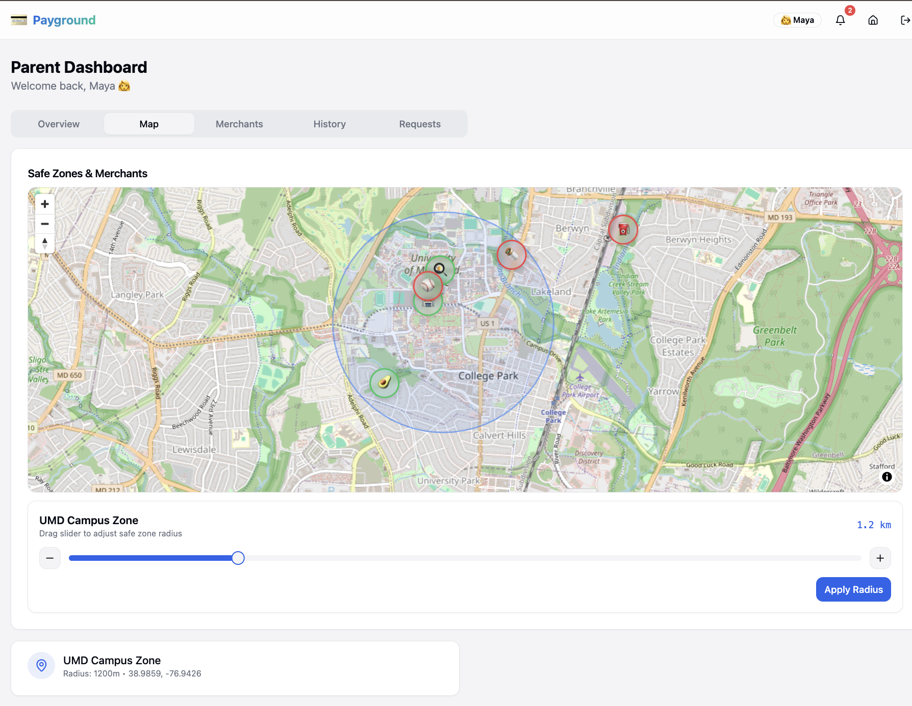
- Geo-fenced safe zones — a charge only goes through if the purchase happens inside areas parents define on the map.
- Merchant rules — parents choose which stores are allowed and set per-purchase limits so small purchases stay small.
- Clear feedback — approve or decline in real time, with history, notifications, and a simple kid → parent request flow when something needs to change (for example, asking to add a new store).
You can walk it end-to-end: parent dashboard, kid dashboard, a POS simulator to fake a swipe against the rules, and a guided demo that hits the main approve/decline paths.
How we built it
We separated policy (the rules) from presentation (the screens) so we weren’t copy-pasting logic between views.
- Frontend: React and TypeScript on Vite, with Tailwind and shadcn/ui (Radix under the hood). The goal was something that feels like a real product when you click through it—not a wireframe with a story taped on.
- Maps: MapLibre so zones and merchants aren’t abstract toggles. You can see where spending is allowed, which makes the pitch obvious in thirty seconds.
- State: Zustand keeps one shared session across parent, kid, and POS. When you run a simulated charge, the same data shows up in history and notifications everywhere it should.
- Rules: Every transaction runs the same pipeline: inside a zone → merchant allowed → under the limit. Location uses each zone’s center and radius against the purchase coordinates; merchant flags and caps live in one place keyed by merchant id, so every surface agrees on the answer.
Challenges we ran into
- Two users, one product. Parents want control and detail; kids need something they can understand without a manual. We leaned on separate dashboards with the same underlying state so neither side felt like an afterthought.
- Rules have to feel real. A list of checkboxes doesn’t sell the idea. Map + POS turned policy into something you can see, click, and deliberately break in a demo.
- Scope. We picked a narrow rule set we could implement cleanly and explain in a short walkthrough, instead of pretending we built a bank backend.
Accomplishments that we're proud of
- Declines are explainable—zone, merchant, or limit—every time.
- One rule pipeline feeds the parent view, kid view, and POS—no duplicated or drifting logic.
- MapLibre turns abstract guardrails into something you can see and trust.
- The flow includes requests and history, not just an approved transaction toy.
What we learned
- Clarity beats a wall of settings when trust is the product.
- Putting safety on a map makes the value obvious faster than paragraphs of explanation.
- One place for the rules saved us when we added the POS and a second dashboard—everything stayed consistent by default.
What's next for Payground
- Real issuer / payments plumbing and production-grade auth—moving from simulation to something you could actually ship.
- Richer policies: time windows, categories, recurring allowance, better summaries—not only per-purchase caps.
- Helping kids learn: savings goals, chores, age-appropriate nudges—so Payground stays a teaching tool, not only a remote control.
- Mobile-native flows for parents and kids who live on their phones.
Built With
- css
- form
- gl
- hook
- html/css
- maplibre
- query
- radix
- react
- recharts
- router
- shadcn/ui
- tailwind
- tanstack
- typescript
- ui
- vite
- zod
- zustand

Log in or sign up for Devpost to join the conversation.