-
-
Home Page
-
Inspiration
We were inspired by the need to make satellite data more accessible and useful for climate monitoring, disaster management, and environmental analysis. Many datasets exist, but they are scattered across platforms. Our goal was to bring them together in one simple and powerful dashboard.
What it does
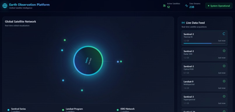
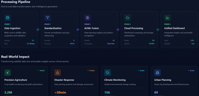
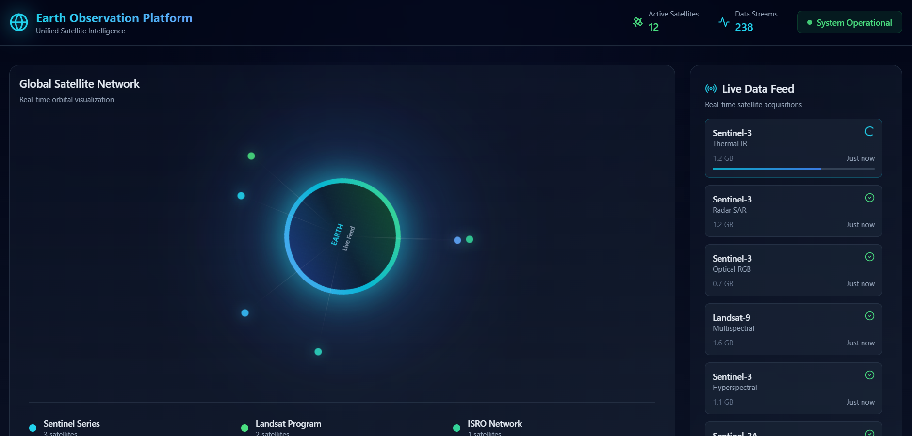
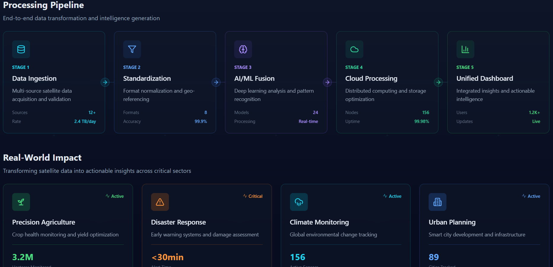
Our project collects and fuses data from multiple satellite sources into a single interactive dashboard. It visualizes climate trends, environmental changes, and geographic insights in real time, helping users make faster and smarter decisions. How we built it
We built the dashboard using web technologies for the frontend and APIs to fetch satellite datasets. The backend processes and integrates multiple data streams, while the user interface displays maps, charts, and analytics in a clean and easy-to-use format. Challenges we ran into
One of the biggest challenges was handling large satellite datasets and aligning different formats into a single unified view. We also faced issues with performance optimization and data accuracy, which we solved through preprocessing and efficient visualization techniques. Accomplishments that we're proud of
We successfully created a working prototype that integrates multiple satellite datasets into one platform. We are proud of the clean UI, real-time visualization, and the ability to make complex satellite data easy to understand. What we learned
We learned how to process large datasets, work with satellite APIs, optimize performance, and build meaningful data visualizations. This project also improved our teamwork, problem-solving, and technical skills. What's next for Multi-Satellite Data Fusion Dashboard
In the future, we plan to add AI-based predictions, more satellite sources, real-time alerts, and advanced analytics for agriculture, disaster forecasting, and climate research.


Log in or sign up for Devpost to join the conversation.