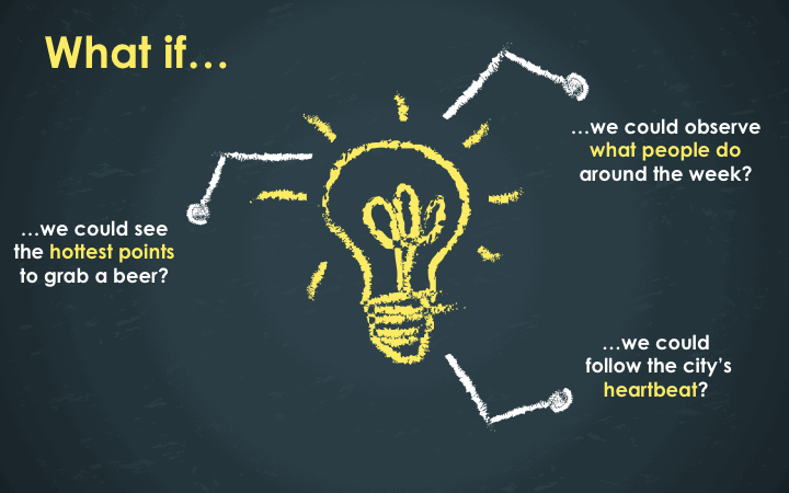
Inspiration
We wanted to build a cool visualisation of Montreal's activity that shows how the people in the city live.
What it does
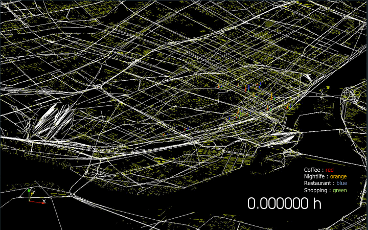
A 3D histogram built on top of a map of Montreal that shows where people check in, what they do, every hour of the week.
How we built it
We collected mapping data from OpenStreetMap and the checking data from the Yelp Academic Dataset. Then we preprocessed all of this with Python so that it could be easily imported into the Visualisation Tool Kit.
Challenges we ran into
Accomplishments that we're proud of
Our final visualisation is pretty cool!
What we learned
The city really has a "pulse" and having the right tool for the job is have of the journey towards the final result.
What's next for MTL Pulse
Grabbing a beer at the expo-sciences :D

Log in or sign up for Devpost to join the conversation.