What inspired Moxie
I spent ten years in product roles, and the same pattern showed up everywhere. People who know exactly what they should do and can't start. Not because they need more information. Not because they need a better plan. They already have the plan. They have ten plans. And they're not doing any of them.
I think most apps in this space are trying to close that gap with more structure, more actions, more programs. But when someone already knows what to do, giving them more to do just means more things to look at instead of act on.
But I also watched people who did cross that gap. The women in my family.
My mother raised three kids alone and reinvented herself seven times. My older sister has lived in five countries and switched professions more times than I can count. She's pursuing a PhD at almost 50. My ex-wife struggled to return to work after our son was born. Something about how she saw herself had shifted, and she couldn't find her way back.
Starting was never easy for any of them. But they started. And every time, it wasn't a plan that got them there. It was a moment where they decided to become someone new.
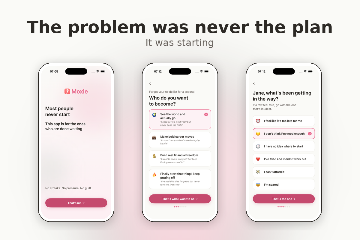
I think that's what the gap actually is. It's not a planning problem. It's an identity problem. She doesn't start because she doesn't yet see herself as the kind of person who does. That's what Moxie is built around.
What I believe
This is not just an app with fewer features. It's a set of beliefs about how people actually change. Every design choice follows from them.
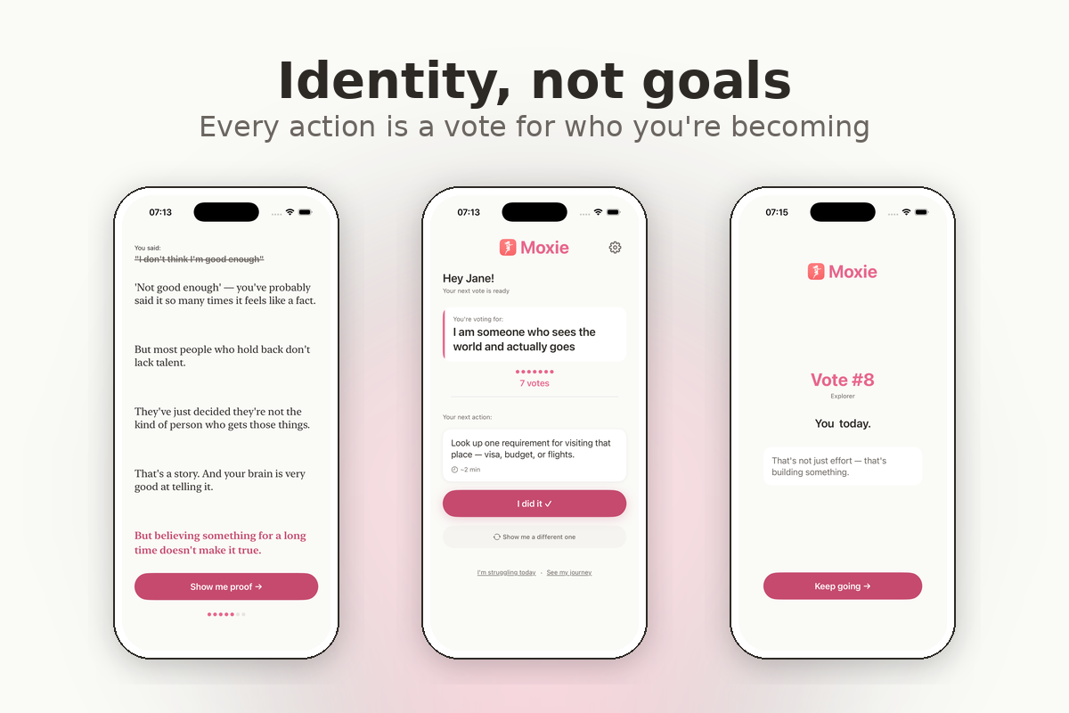
Identity before action. The app doesn't ask what she wants to do. It asks who she wants to become. "I'm someone who explores the world" is a different starting point than "I want to travel to Japan." Goals live in the future. Identity lives now. Research on self-perception says people figure out who they are by watching what they do. One action becomes evidence. That's what the vote mechanic does.
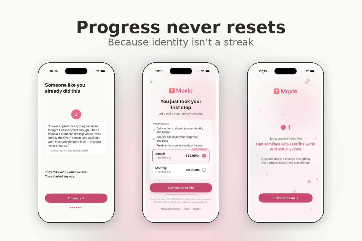
Progress never resets. Votes don't expire. There's no reset button. If she disappears for a week, her count is exactly where she left it. Because a streak measures consistency. A vote count measures growth. And the person who misses a day is the person most likely to quit. Resetting her progress at that moment is the worst design choice I could make.
Less is more, and I mean it. One screen. One action. Under two minutes. No community tab, no progress dashboard, no action library. If a two-minute action isn't happening, the answer is almost never "she needs more features." Something else is in the way. I won't add a single feature until I'm certain its absence is the reason she's not acting.
When she struggles, the app gets softer. "I'm struggling today" leads to a compassionate reframe and a gentler action. Not a push. The moment someone is closest to quitting is the moment they need the most support, not the most pressure.
Celebrations are intentional. Confetti only at milestones: 5, 10, 25, 50, 100 votes. Not every time. When every action gets a reward, the reward becomes the reason. I wanted the action to be the reason.
How I built it
My background is product, not engineering. I built Moxie with Claude Code, directing every decision, every screen, every interaction. 35 commits, each following a 10-step process: plan, review, branch, build, verify, test on a physical device, external code review, fix, demo, merge. 311 automated tests.
The celebration confetti took four sessions to get right. Three different animation approaches failed silently. Turned out the particles were rendering at 0.48 pixels. Sub-pixel. Invisible to the human eye. Finally switched to a completely different framework. Some things just fight you.
At one point, every identity statement in the app read "I am someone who I am someone who..." The content already had the prefix. The display layer added it again. Nobody caught it in code review. The physical device caught it.
123 content pieces across four identity paths, six barriers, reframe stories, proof stories, 56 daily actions, celebrations, and struggle responses. Each one reviewed and iterated for tone and authenticity. Writing a barrier reframe that feels genuine instead of preachy took more iterations than any screen in this app.
Monetization
The whole breakthrough flow takes about five minutes. She names her fear, sees it reframed, takes her first action, casts her first vote. The paywall appears one minute later, at the moment of highest emotional investment.
The free tier works fully. Offline, on-device, no account needed. Breakthrough flow, daily actions, vote tracking, celebrations. It works. Not a trial, not a teaser.
Premium ($9.99/month or $59.99/year, 7-day free trial) unlocks AI personalization: daily actions adapted to her specific identity, her specific barrier, and where she is in her journey. RevenueCat handles subscriptions. OpenAI powers the AI. Everything else runs on the device.
What I learned
The hardest part of building a behavior change app is not code. It's content. Finding the line between supportive and patronizing. Between honest and discouraging. Between simple and shallow.
Simplicity takes more discipline than complexity. Almost every day I had to say no to features that sounded good. Community sharing. Detailed analytics. Progress dashboards. All reasonable ideas. All deferred. Because the question was never "would this be nice to have?" It was "is the absence of this feature the reason she's not acting?"
I also learned to read the documentation before guessing. I spent ten sessions troubleshooting a payment integration by refreshing and retrying. The setup guide had the answer the entire time. Three missing credentials, clearly listed. Ten sessions of guessing versus one session of reading.
And I learned that the simulator lies. A lot of the bugs I caught only appeared on the physical device. Keyboard behavior, layout on small screens, animation timing. If you're building for real people, test on a real phone.
What I'd share with fellow builders
If you're building for behavior change, here's what I found along the way.
When someone can't do something that takes two minutes, the answer probably isn't more features. Something else is stopping them. The most useful question isn't "what should we add?" It's "what's in the way?"
The action was never the hard part. The identity shift was. If your app starts with the action, you might be skipping the part that actually matters.
And if your app resets progress when someone misses a day, think about who that hurts most. It's not the person on a 30-day streak. It's the person on day 2 who just needed one more chance.
I don't have this all figured out. But I think we're asking the right questions.


Log in or sign up for Devpost to join the conversation.