-
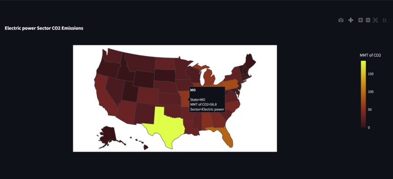
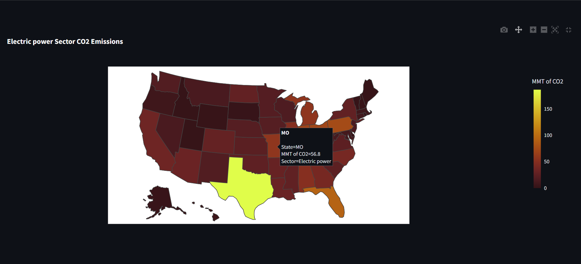
Explore CO₂ emissions by sector across states, highlighting Commercial, Electric Power, Residential, and more.
-
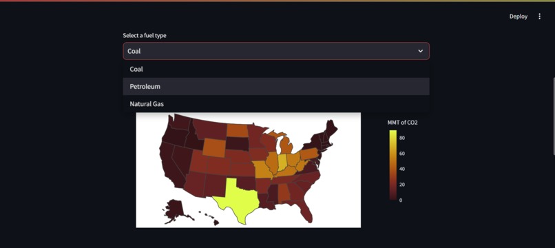
See CO₂ emissions by fuel type (Coal, Petroleum, Natural Gas) in each state for a deeper emissions breakdown.
-
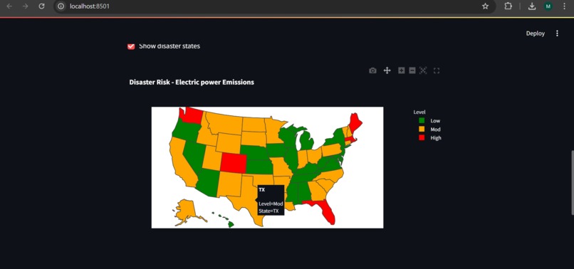
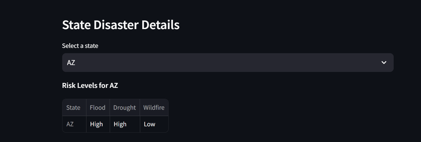
Overlay emissions data with flood, drought, and wildfire risks, showing climate threats linked to CO₂ levels.
-
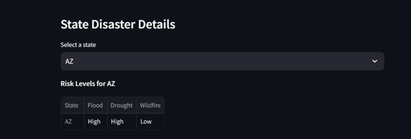
Select a state to view its flood, drought, and wildfire risks categorized by threat levels like High and Low.
-
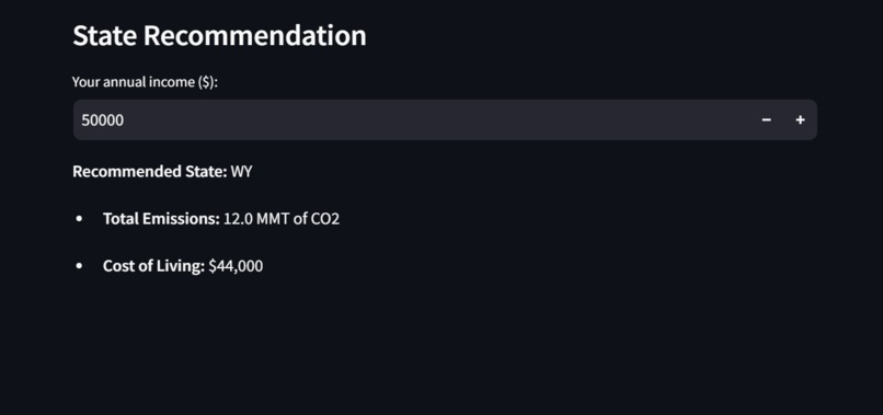
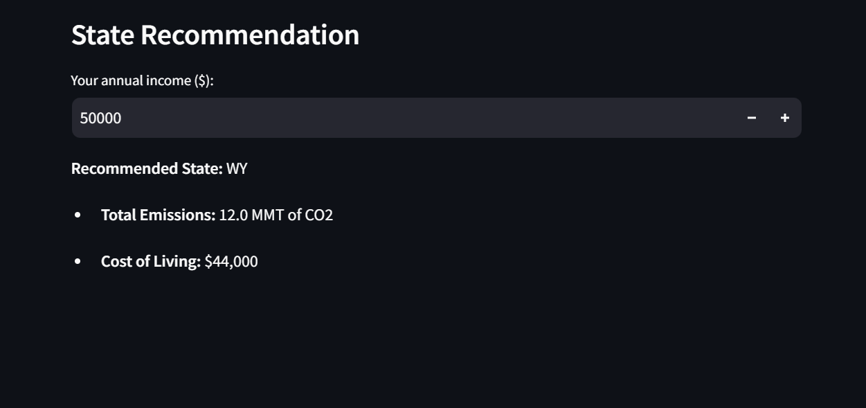
Get state recommendations based on your income and find areas with lower CO₂ emissions for a greener move.


Inspiration
With rising risks of climate change we felt we needed to make an impact in the space providing a useful tool that can help those with the same views to make insightful decisions of where to move next.
What it does
Provides helpful insight into where to move based on carbon emission data and natural disaster risks while staying within a budget.
How we built it
We used Streamlit for the user interface, Plotly for creating interactive maps, and Pandas for data processing. First, we loaded CO2 emissions data by sector and fuel type, then reshaped the data to create sector and fuel emissions maps. Then, we added disaster risk data (floods, droughts, wildfires) for each state. Using user-provided income data, we calculated a list of affordable states based on living costs and recommended the one with the lowest total emissions.
Challenges we ran into
Finding accurate and up to date data, formatting the data to be readable for the code. We also faced challenges ensuring accuracy in the cost of living analysis to provide one state as output.
Accomplishments that we're proud of
We're proud of how Moving Green turned out as a user-friendly tool to help people make eco-friendly relocation choices based on carbon emissions, climate risks, and their budget. We successfully integrated multiple data sources and visualized them to highlight both environmental and financial factors, making the app informative and actionable. Creating a streamlined, impactful UI was another accomplishment, as we aimed to make exploring the data engaging and clear.
What we learned
Working on Moving Green taught us a lot about data cleaning and reshaping, especially when dealing with complex datasets that require alignment for accurate comparisons. We also learned more about carbon emissions and the impact of energy use by sector and fuel type, which helped us think about climate change from a data-driven perspective. Finally, using Plotly and Streamlit effectively was a valuable learning experience, as we honed our skills in building interactive, visually appealing web apps.
What's next for Moving Green
Next, we’d like to improve Moving Green by incorporating more data on climate resilience and infrastructure, so users can see how different areas are preparing for climate-related issues. We also plan to add a feature that tracks emission trends over time and provides recommendations for eco-friendly actions in each state. Integrating user feedback is a priority to enhance the app’s usability and make it even more helpful for relocation and environmental awareness.

Log in or sign up for Devpost to join the conversation.